China Taiping Insurance Logo PNG
Insurance covers health, property, and financial interests, allowing people to prepare for potential risks in advance. Policies and programs address a range of life situations and needs. The China Taiping Insurance logo represents an insurance company that provides life, property, and business insurance services and operates in both domestic and international markets.
China Taiping Insurance was founded in 1929 in Shanghai. It was one of China’s first national insurance enterprises. The company was established as a response to the dominance of foreign insurers and offered property, marine, and life insurance services. By the mid-1930s, Taiping had a branch network in major cities in China and abroad.
During the Japanese invasion from 1937 to 1945, the company moved its headquarters to Chongqing. It continued operations in territories not occupied by the enemy. After the war, Taiping returned to Shanghai. The civil war and hyperinflation severely weakened its position. In 1949, after the founding of the People’s Republic of China, the company was nationalized. By the 1950s, it had become part of the state system, PICC, and lost its independence.
Maintaining a presence in Hong Kong, Taiping became one of the few Chinese companies to continue operating abroad. In 1956, the company officially resumed work as a state enterprise. It focused on international business and serving the Chinese diaspora. In the 1980s, after Deng Xiaoping’s reforms, Taiping expanded its presence in Southeast Asia again.
In 2000, China Taiping Insurance Group was established. It brought together life insurance, property insurance, and reinsurance operations. In 2006, the group became a central state enterprise. In 2013, the group carried out a major restructuring. As a result, the group created the listed company China Taiping Insurance Holdings.
From 2015 to 2018, the group invested in digitalization and international development. The company supported the Belt and Road Initiative. In 2020, it focused mainly on health and pension insurance. These areas became key for the business. In 2022, the company strengthened its asset management division. In 2024, the company expanded its operations in Southeast Asia.
China Taiping Insurance Group is among the largest insurance organizations in China. The company operates in more than 20 countries and provides comprehensive financial and insurance services to millions of clients worldwide.
Meaning and History
What is China Taiping Insurance?
A major insurance holding company from Hong Kong and China, part of a state-owned financial group. Its history dates back to Taiping Marine & Fire Insurance, founded in Shanghai in the 1920s. The company’s main areas include life and property insurance, reinsurance, pension and group programs, and digital services under Taiping E-Commerce. The holding serves more than 14 million clients and collaborates with Ageas and other partners in Asia and Europe.
2000 – 2009
The brand’s history began on November 20, 1929. Jincheng Bank established Taiping Fire and Marine Insurance Company in Shanghai under the Chinese name 太平水火保险公司. The company insured marine transportation, fires, ships, and automobiles. After its capital was increased in 1933, the words Fire and Marine were removed, and the company continued operating as Taiping Insurance Company. Taiping, 太平, translates as “peace” or “tranquility” and relates to the purpose of insurance protection.
During its early years, Taiping used a taiji emblem. A group publication connects it with the Chinese concept 生生不息, which refers to continuous life and renewal. The taiji represented the brand’s cultural foundation during the Shanghai insurance company period.
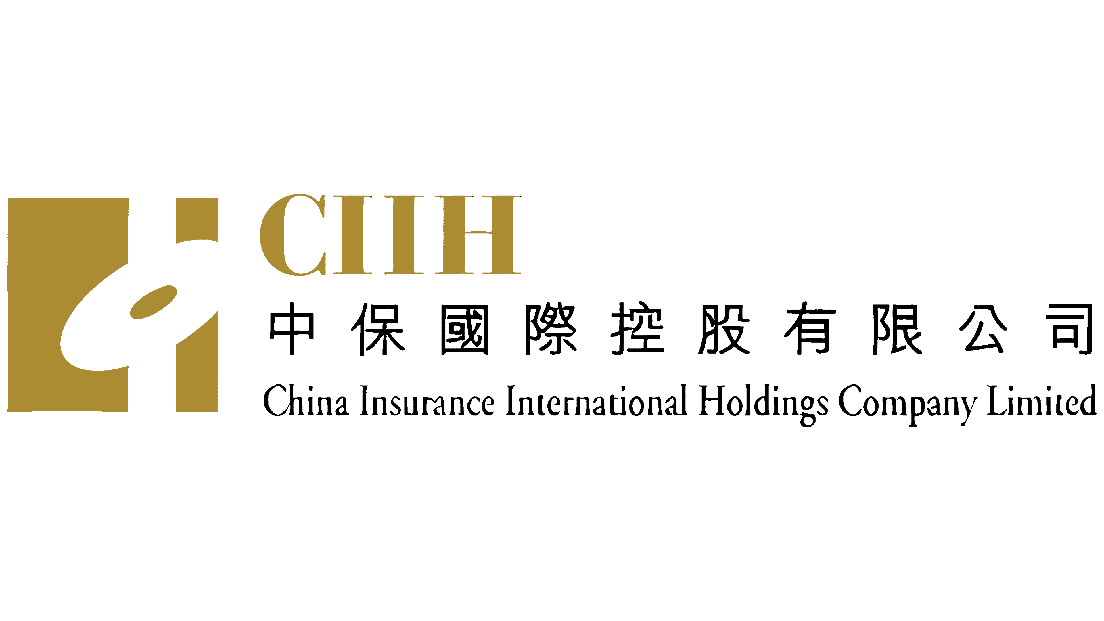
In the 2000-2009 China Insurance International Holdings Company Limited logo, a structure featuring vertical stripes and an oval replaced the circular taiji form. The emblem occupied the left side, while the abbreviation CIIH and two lines of the full name appeared on the right. The layout combined the abbreviation, Chinese name, and English version within one text block.
The emblem had a rectangular outline. Inside were two ocher-gold rectangles extending vertically. The left figure was wider than the right. A white stripe, approximately equal in width to the right-colored section, ran between them. The entire structure was divided into three vertical zones.
A large white oval slanted to the right crossed the three zones. It extended across the left rectangle, central white stripe, and right section. A smaller ocher-gold oval appeared inside. The combination of angular and rounded forms created a multilayered emblem.
The abbreviation CIIH used uppercase ocher-gold letters. The serif typeface had strokes of varying thickness and the proportions of a traditional Roman typeface. A black line of 10 Chinese characters with equal spacing appeared below. The lowest level contained the name China Insurance International Holdings Company Limited. The first letter of each word was uppercase, while the remaining letters were lowercase. The English line used a softer serif typeface.
2009 – today
China Taiping introduced a shared emblem in 2009 as part of the insurance group’s restructuring. Its assets returned to state control and were consolidated under the China Taiping name. The new system covered Taiping Insurance, China Insurance, and Ming An Insurance, which had previously operated under separate names and identities. China Taiping Insurance Group began operations on June 29. In August, the publicly listed China Insurance International Holdings became China Taiping Insurance Holdings.
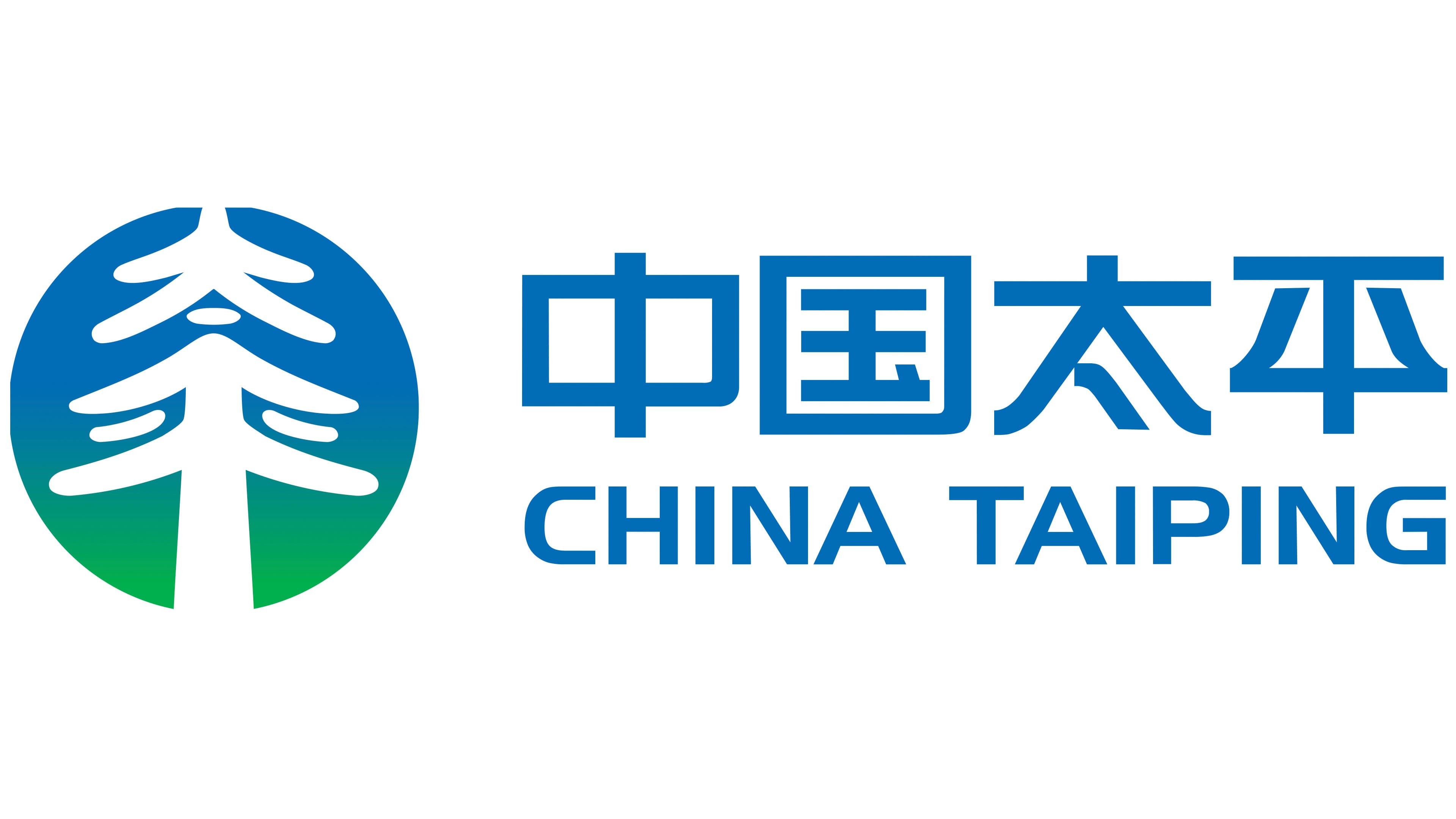
The emblem is a circle containing a white image. The Chinese characters 太平 are combined to form the silhouette of a large tree. The lower lines resemble roots, the middle section forms the trunk, and the upper curves become branches and a crown. In its simplified form, the tree resembles a fir and fits compactly within the circle.
The group connects the tree with China Taiping’s long history, vitality, and renewal. The roots represent its historical foundation, while the branches symbolize future development. The circle represents China Taiping’s international presence. The group describes itself as the first Chinese insurance organization with a multinational structure.
The upper section of the circle is blue, while the lower section is bright green. Blue refers to the sky, tranquility, and insurance protection for customers. Green represents the earth, nature, and life. The characters and tree are white. The crown sits above the green zone, while the roots sit at the base.
Two lines of the name appear to the right of the circle. Four large blue Chinese characters occupy the upper line. Their letterforms use even lines, angular shapes, and uniformly thick strokes. The words CHINA TAIPING appear below in uppercase blue letters. The English name uses a sans-serif typeface. The Chinese name occupies the primary position.
During 2009 and 2010, the China Taiping name was extended across subsidiaries in China, Hong Kong, Macao, and other countries. Branches, life and property insurance operations, reinsurance, asset management, and overseas divisions received the shared identity. The group moved from the separate China Insurance, Taiping, and Ming An brands to the unified China Taiping name.