 Gjensidige Logo PNG
Insurance covers homes, vehicles, and health, helping to cover expenses in unforeseen situations. These services support everyday life and relate to risk management and financial stability. The Gjensidige logo is associated with a Norwegian insurance company that provides policies for private clients and businesses.
Gjensidige began in 1816. In the Lillehammer area, farmers founded a mutual insurance organization called Land Gjensidige Brandkasse. It was created to protect property from fire. In 1847, a new structure appeared under the name Christiania almindelige gjensidige forsørgelsesanstalt. It provided life insurance. Over time, the organization became known simply as Gjensidige and became a key participant in the Norwegian insurance market.
In 1932, the company created a corporate logo that became a symbol of the company in Scandinavia. In the 1970s, two structures, Samtrygd and Gjensidige Liv, began working together under the single Gjensidige brand while maintaining their mutual ownership form.
In the 1990s, the company expanded its operations. In 1992, it acquired Forenede Forsikring. In 1993, it established Gjensidige Bank. In 1999, the Gjensidige NOR alliance was formed. In 2003, it became part of DnB NOR, but the insurance division remained independent.
In 2007, Gjensidige became Storebrand’s largest shareholder. In 2010, the company demutualized and listed its shares on the Oslo Stock Exchange. The Gjensidige Foundation retained a controlling stake, owning more than 60% of the shares.
After listing, the company focused on modernization and expansion in Scandinavia and the Baltic countries. In 2017, the company introduced dynamic pricing in the Danish market.
In 2019, Gjensidige sold its bank to the Nordea group. After that, the company fully focused on insurance. An active digital transformation began. The company began using technologies such as Azure and GitHub to automate processes.
By 2024, the company’s revenue reached 41.94 billion Norwegian kroner. Profit amounted to 5.01 billion kroner.
The company restructured its Danish division. Gjensidige maintained its status as one of the leading insurers in Northern Europe and demonstrated financial results.
Meaning and History
What is Gjensidige?
A Norwegian insurance group based in Oslo, it operates in general insurance and is one of Scandinavia’s oldest companies. Today, the group serves about two million customers. The Gjensidige Foundation holds the controlling stake (over 60%). Gjensidige sold the Baltic subsidiaries to ERGO to focus on the Scandinavian market.
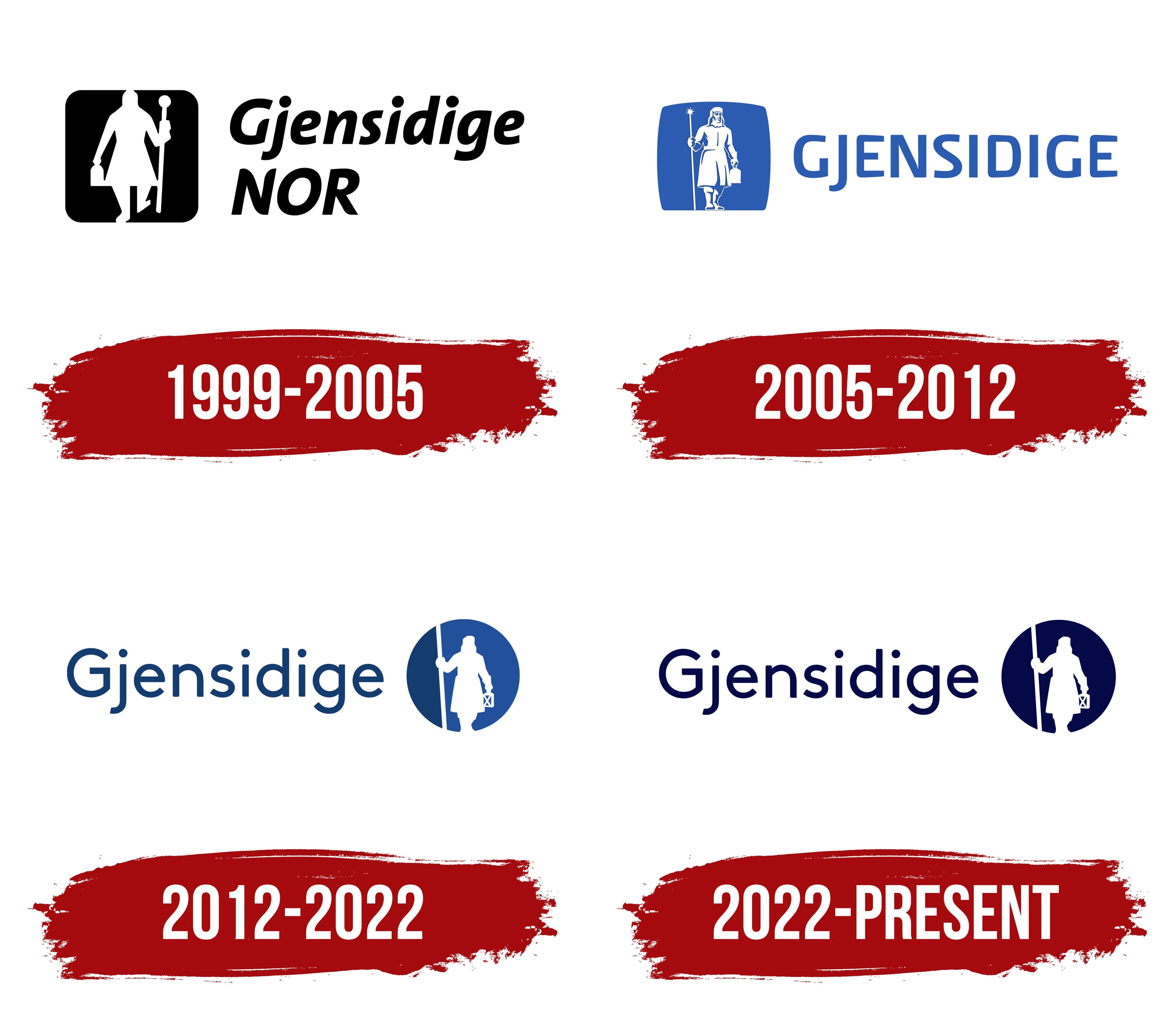
1999 – 2005
The night watchman became part of Gjensidige’s identity long before the Gjensidige NOR group was created. In 1932, the life insurance company began using a figure carrying a lantern and a long spear or staff. It appeared with the slogan “Tiden går, Gjensidige består,” meaning “Time passes, Gjensidige remains.” Corporate materials presented the watchman as a protector of life and property. He was later associated with customer closeness, security, protection, and punctuality. The character eventually became one of the best-known images in Norway’s insurance industry.
The group traces its history to a mutual fire insurance society that customers established in 1816. The Gjensidige name came from another area of the business. Christiania almindelige gjensidige Forsørgelsesanstalt, a life insurance company, began operating in 1847. The company later shortened the name to Gjensidige. The Norwegian word “gjensidig” means “mutual” and refers to participants collectively sharing risk in an insurance system.
In 1974, the Gjensidige life insurance company and Samtrygd-NBG agreed to operate under one brand. The Gjensidige name entered general insurance in 1976. In 1999, Gjensidige’s insurance business combined its operations with Sparebanken NOR. Both organizations retained separate legal structures while using the shared Gjensidige NOR name in public materials.
The 1999–2005 logo combined the historical watchman with the banking and insurance group’s name. A black block with rounded corners appeared on the left. Inside was a white figure walking in a short coat or cape. His raised left leg showed the watchman making his rounds. He held a long staff with a round finial in his right hand and a lantern in his left. The white silhouette against the black background retained objects associated with night patrols. It brought the 1932 character into a compact block.
The name appeared on the right across 2 lines. Gjensidige occupied the upper line with an uppercase “G” followed by lowercase letters. The larger uppercase NOR appeared below. Both parts leaned to the right and were black. Gjensidige used bold rounded forms, while NOR had a heavier style. The 2 names reflected the combination of Gjensidige and Sparebanken NOR, while the watchman connected the group with the company’s insurance history.
2005 – 2012
The merger with DNB changed the business structure and affected the insurance operation’s name. In 2003, Gjensidige NOR’s banking and insurance businesses entered a combined structure with DNB. The general insurance division continued operating separately. Under the new conditions, NOR lost its former connection with customers and employees. The annual report cited this as the reason for returning to the Gjensidige name.
The board approved the name and corporate brand change in 2004. Implementation began in 2005. The company retained the night watchman associated with Gjensidige for many years and updated his appearance. NOR was removed, the italic wordmark received a new style, and the historical character remained the foundation of the insurance brand.
The logo adopted a horizontal structure. The watchman appeared on the left, with GJENSIDIGE on the right. The character stood inside a light blue 4-sided shape. Its lower edge was straight, while the other sides curved slightly outward. The white figure occupied almost the entire height of the colored field and showed the watchman from head to toe. A more detailed illustration distinguished the 2005 version from the simplified Gjensidige NOR silhouette.
The character held a vertical staff in his right hand and a lantern in his left. The top of the staff received a star-shaped finial, while a small flash of light appeared above the lantern. His historical clothing included a long belted coat, headwear, and boots. Fabric folds and outlines of the hands, face, and footwear added detail. They strengthened the connection to the night watchman profession.
The name used narrow uppercase letters in the same light blue as the field behind the figure. The upright sans-serif typeface appeared more formal than the earlier italic version. The “J” extended below the baseline and stood out from the other characters. Open space between the watchman block and wordmark divided the 2 sections.
Gjensidige introduced the brand and watchman in other national markets in 2007 and 2008. The updated identity accompanied the company’s expansion across Scandinavia and the Baltic states. The short name, shared blue color, and historical figure united divisions in different countries under the Gjensidige name.
2012 – 2022
The 2012 version placed Gjensidige to the left of the historical watchman for the first time. Earlier versions used the reverse arrangement and enclosed the character in a 4-sided frame. The redesign placed him inside a circle that could be used on its own. The company introduced the updated identity on October 24, and implementation began in December.
Industry publications linked the project with Oslo agency Dinamo Design. The update accompanied the development of Gjensidige’s customer services and digital channels. The company needed a system that could maintain brand recognition even when the full wordmark appeared infrequently. Brand Director Anne Margrete Børjesson explained that the goal was to preserve Gjensidige’s recognition across all materials.
The name used LL Brown. The narrow uppercase letters from the previous version were replaced by mixed-case lettering with an uppercase “G” followed by lowercase characters. The dark blue wordmark had rounded sans-serif forms and a lighter weight. The even letter construction contrasted with the detailed 2005 illustration and worked well across digital channels.
The watchman retained his historical clothing, including a long coat, belt, and headwear. Details of his face, clothing, and footwear were reduced, turning the character into a white silhouette. He faces the viewer, appears from head to toe, and stands in a walking pose. A vertical staff in his right hand crosses the circle from top to bottom. The watchman carries a small lantern with a cross-shaped frame in his left hand.
The staff divides the circle into 2 colored fields. The left side is blue, while the right uses a lighter shade. The white figure occupies the center and extends across both areas. Open sections define the clothing and lantern. Replacing the 4-sided frame with a circle made the emblem more compact. This allowed it to stand independently of the Gjensidige name.
The updated system expanded the watchman’s role in advertising and informational materials. Colored characters and supporting forms appeared in communications covering different insurance topics. The historical watchman remained a consistent part of the identity, while new figures accompanied materials about products and customer services. The full logo appeared in formats requiring the company name.
2022 – today
The night watchman’s lantern became the foundation of Gjensidige’s updated identity. The concept was named Illuminate and developed the historical role of a character who lit the streets and protected people and property. The theme of light extended from the emblem into photography, illustration, digital interfaces, and animation. It connected Gjensidige’s insurance history with modern forms of audience communication.
The work was completed through the Merkevareløftet project, which ran from January 2021 through September 2023. The primary corporate system was introduced in 2022. Gjensidige’s internal team, Neue Design Studio, and Anorak Advertising Agency participated in its development. Neue handled the brand identity, while Anorak worked on communications. Magnus Rakeng developed the typography, Robin Snasen and ByHands created illustrations, and Babusjka handled animation.
Neue retained the circle and night watchman long associated with Gjensidige’s history. The redesign prepared the brand for use in different countries and across digital platforms. The new system simplified the presentation of insurance topics and united the company’s numerous channels. Implementation formed part of Builders Core, covering identity components and rules for their combined use.
The logo retained its established structure. Gjensidige appeared on the left, while the circle containing the watchman stood on the right. The white silhouette still held a lantern and long staff. The primary visual change involved color. A single rich dark blue replaced the former combination of blue and light blue. The circle became darker, and the wordmark received the same color.
The name retained mixed-case lettering with an uppercase “G” followed by lowercase characters. The rounded sans-serif style remained close to LL Brown from the previous version. A shared color united the wordmark and circular emblem while preserving their established arrangement and the watchman’s historical image. The expanded system included large typography, photography, and functional illustrations based on the lantern’s light.
Join Forces later created animated versions of the watchman in 2D and 3D. Many scenes featured the lantern beam and a lens flare effect. The original silhouette remained consistent across all versions. Joon Brandt served as Creative Lead, while Rufus Tangen was the producer. Join Forces handled production, and Join Animation created the animation.