 CK Hutchison Logo PNG
The urban environment includes a wide range of services, from neighborhood stores to mobile communications, ports, and energy facilities. Often, a large holding company sits behind these operations, integrating various sectors into a single management system. The CK Hutchison logo is associated with an international group that operates in the retail, telecommunications, infrastructure, transportation, and energy sectors.
CK Hutchison Holdings was established in 2015. It was formed through the merger of Cheung Kong Holdings and Hutchison Whampoa. The group’s history dates back to the mid-19th century. Hutchison Whampoa was founded in Hong Kong in 1863. It began as a trading and shipping company. Later, it expanded into port and infrastructure operations.
Cheung Kong began operations in 1950. Its founder, Li Ka-shing, opened a plastic manufacturing factory. By the 1970s, the company had become one of Hong Kong’s largest developers. In 1972, Cheung Kong listed its shares on the stock exchange.
In 1979, Li Ka-shing acquired a controlling stake in Hutchison Whampoa. He became the first Chinese entrepreneur to lead a British conglomerate. Under his leadership, the company expanded its business areas. Its activities grew to include telecommunications, energy, and retail.
In the 1990s, Hutchison launched the mobile operator Orange. After selling it in 2000, it directed the proceeds toward developing 3G networks under the brand 3 in Europe and Australia. At the same time, the company expanded its port assets and retail chain A.S. Watson.
The 2015 reorganization separated the assets. CK Hutchison focused its operations on international business. It allocated real estate to a separate entity, CK Asset Holdings.
In the following years, the holding sold telecommunications towers in Europe for 10 billion euros. It strengthened cooperation with Vodafone and invested in expanding ports in Asia.
CK Hutchison manages business across five key areas. These are the ports, retail, telecommunications, infrastructure, and energy sectors. The group operates in 25 countries and remains under the control of the Li Ka-shing family.
Meaning and History
What is CK Hutchison?
An international conglomerate headquartered in Hong Kong, founded by Li Ka-shing, operating in more than fifty countries, and employing over three hundred thousand people. The main areas include ports, logistics, retail, infrastructure, telecommunications, investments, and energy. The company manages hundreds of terminals, including the Port of Felixstowe in the United Kingdom. A.S. Watson Group owns a network of sixteen thousand stores under the brands Watsons, Superdrug, Kruidvat, PARKnSHOP, and Fortress. The assets cover energy, water supply, transportation, and waste management in Europe, Australia, and Canada.
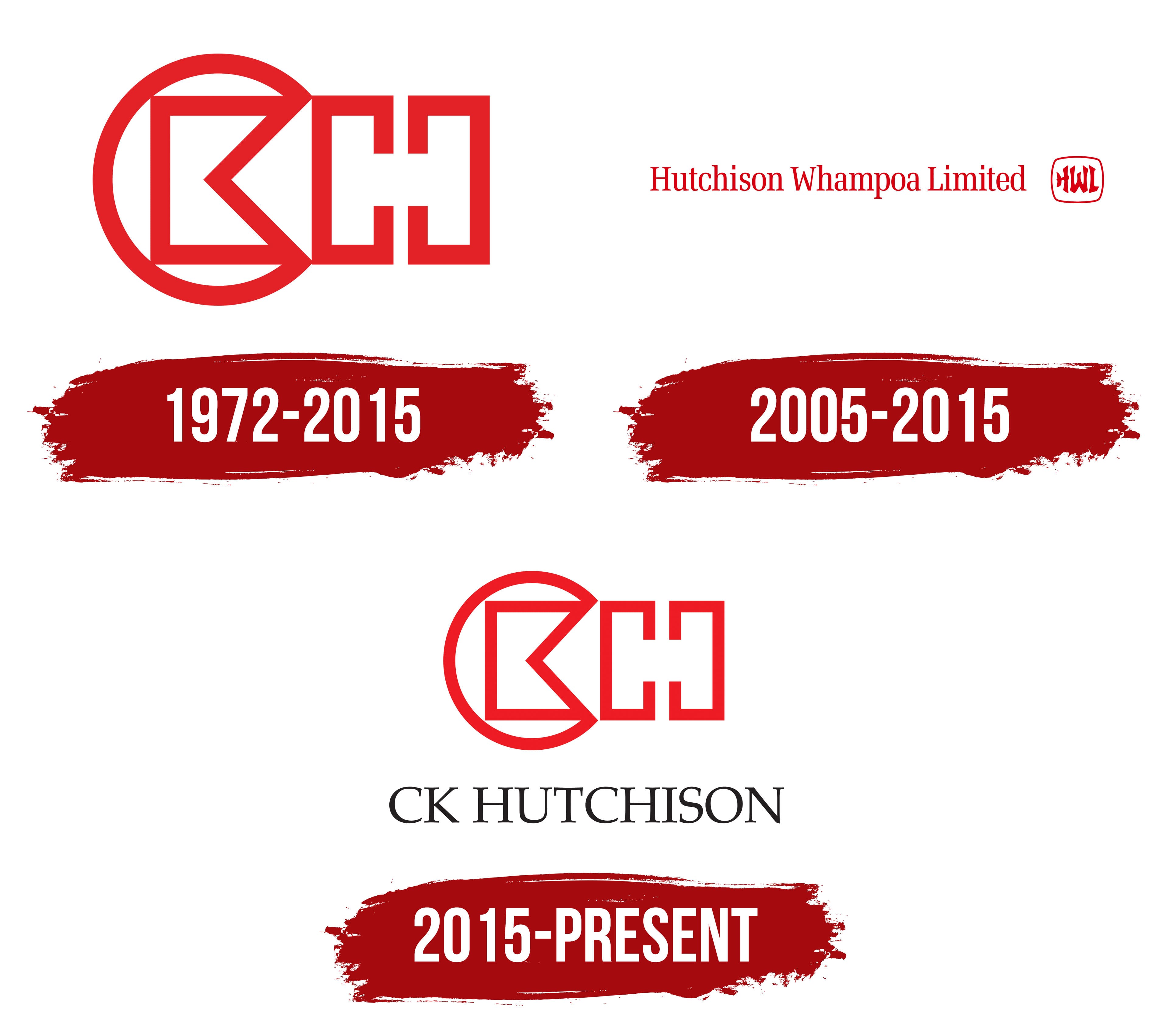
1972 – 2015

The red monogram represented Cheung Kong Holdings from its 1972 listing on the Hong Kong Stock Exchange until Li Ka-shing’s group was reorganized in 2015. The angular composition combined the initials “CK” with a large “H”-shaped figure. After Cheung Kong and Hutchison Whampoa consolidated their assets, the former emblem became the basis for the CK Hutchison Holdings logo. The connection maintained continuity between the previous company and the new holding group.
The Cheung Kong name originated with Cheung Kong Industries, founded by Li Ka-shing in 1950. It is the Cantonese pronunciation of the Chinese name for the Yangtze River, 長江. The company explains the name through the image of a great river collecting numerous streams and tributaries. Li Ka-shing associated the metaphor with combined effort. The business began by manufacturing plastic products and later moved into real estate. The letters “CK” became the abbreviation for Cheung Kong.
The logo’s foundation is an open circular form made of red lines of equal thickness. The outer curve formed a “C” with an opening on the right. Inside was a pointed angular section with its tip facing left. Together with the neighboring lines, it formed the letter “K.”
A large geometric figure based on mirrored lines appeared on the right. Its contours resembled an “H” and extended the monogram beyond the “C.” A thick red outline united all the letters, while the hollow construction preserved open spaces between them. The “C” and “K” occupied the circular section. At the same time, the “H” extended to the right and later became associated with the Hutchison name.
The pointed ends of the “K” and “H” contrasted with the rounded curve of the “C.” The arrangement combined circular and angular forms. The entire monogram appeared in one shade of red. Its compact proportions worked across stock exchange documents, corporate materials, and other applications used by the holding company.
The transition to CK Hutchison Holdings involved several legal stages. The new company was incorporated in the Cayman Islands on December 11, 2014. On March 18, 2015, it became Cheung Kong’s holding company and replaced it in the Hong Kong Stock Exchange listing. On June 3, 2015, CK Hutchison Holdings consolidated the assets of Cheung Kong and Hutchison Whampoa. Both groups transferred their real estate assets to a separate company called Cheung Kong Property Holdings. Structurally, the transaction was a corporate reorganization, though brief accounts often describe it as a merger of the 2 groups.
2005 – 2015
A small frame containing the letters “HWL” accompanied the full Hutchison Whampoa Limited name and served as its abbreviated form. The logo occupied one line and appeared entirely in red. The company name filled most of the space, while the compact monogram completed the horizontal composition on the right.
Hutchison originated from the name of John Duflon Hutchison. He joined Robert Walker and Company in 1877, later became its head, and established John D Hutchison and Company Ltd. His surname passed to subsequent companies and remained after the creation of Hutchison Whampoa Limited.
Whampoa came from another part of the group’s history. The Hongkong and Whampoa Dock Company was established in 1863 to operate docks and repair ships. It merged with Hutchison International in 1977. The new organization became Hutchison Whampoa Limited, combining the names of the 2 companies involved in the merger.
The logo displayed the full corporate name. Hutchison Whampoa Limited appeared in a serif typeface resembling Times New Roman. All 3 words began with uppercase letters followed by lowercase characters. A moderate contrast between thin and thick strokes kept the long line visually unified.
A frame with rounded corners and the HWL monogram appeared on the right. The outline and letters used the same red as the company name, uniting both parts of the logo. Large uppercase “H,” “W,” and “L” letters filled almost the entire interior and formed a compact group.
The initials differed from the typeface used for the full name. Lines of varying thickness and free-flowing curves resembled brush calligraphy. The contrast between the serif wordmark and handwritten HWL form separated the roles of the 2 components. The text presented the company’s full name, while the monogram worked in compact formats.
Following the 2015 reorganization, Hutchison became part of CK Hutchison Holdings. It preserved the connection with John Duflon Hutchison and Hutchison Whampoa Limited. HWL remained associated with the former corporate structure. At the same time, the new name combined the Cheung Kong abbreviation with the historical Hutchison name.
2015 – today

In 2015, Cheung Kong’s red monogram was transferred to the new holding company, linking the former group to CK Hutchison Holdings Limited. Management retained the familiar geometric construction, revised its proportions, and added the CK HUTCHISON name. The upper emblem carried Cheung Kong’s visual heritage, while Hutchison appeared below.
CK Hutchison emerged through the reorganization of Cheung Kong Holdings and Hutchison Whampoa. The new holding company was first placed above Cheung Kong and later received the combined assets of the 2 groups. Hutchison Whampoa entered the holding structure and was delisted from the stock exchange. Management told employees that it would retain its name, logo, assets, and obligations. Divisions continued operating under their existing names and emblems.
The CK Hutchison name combined 2 historical lines within the group. “CK” is the abbreviation for Li Ka-shing’s Cheung Kong. Hutchison preserves the surname of John Duflon Hutchison and the connection with Hutchison Whampoa. The full English name, CK Hutchison Holdings Limited, appeared during the reorganization. At the same time, the primary logo uses the shorter CK HUTCHISON name.
The monogram combines stylized “C,” “K,” and “H” letters into a single red form. Lines of equal thickness unite rounded and angular forms. The “C” creates an open circle on the left. Its opening appears on the right and connects the curve with the neighboring section.
Inside the “C” is a pointed angle with its tip facing left. Together with the interior lines, it forms a “K.” An “H”-shaped section based on mirrored lines appears to the right of the circle. The circular form encloses “CK,” while the external “H” extends the monogram to the right.
Compared with the former Cheung Kong emblem, the circle became smaller, and the geometric letters moved closer together. Red maintained continuity with the company’s previous identity. Open space between the monogram and name divided the logo into 2 levels.
CK HUTCHISON appears beneath the emblem in black uppercase serif letters. The style resembles Times and Didot. Thin sections alternate with heavy vertical strokes, contrasting with the monogram’s uniform red lines. The centered text presents the company’s shortened name.
The Chinese name 長江和記實業有限公司 appears beside the English name in corporate documents. The primary version features the red monogram and the CK HUTCHISON line. Following the reorganization, former Hutchison Whampoa divisions retained their established identities. At the same time, the holding company received a unified logo combining the Cheung Kong letters with the Hutchison name.