 CP Axtra Logo PNG
Wholesale purchasing of food and household goods involves buying in large quantities, a practice used by both businesses and individual shoppers. These retail outlets combine a wide product range with volume-based pricing. The CP Axtra logo is associated with a company that operates shopping centers and stores for wholesale purchases, offering food and household goods.
CP Axtra was formed in 2021 through a merger of the Charoen Pokphand Group’s retail assets, including the Makro and Lotus chains. Makro began in 1988, when a joint venture between CP and the Dutch company SHV Holdings opened the first cash-and-carry wholesale store in Bangkok. In the 1990s, the chain expanded across Thailand and Southeast Asia. After the 1997 crisis, the company focused on improving operational efficiency.
In 2003, CP Group increased its stake in Makro. In 2011, it fully acquired the Thai operations from SHV Holdings for $600 million. At the same time, since 1998, CP had been developing a joint project with the British company Tesco, creating the retail chain Tesco Lotus. In the 2000s, it became one of the market’s largest players, expanding its hypermarket and convenience store networks.
In 2020, CP Group acquired Tesco’s Asian business for $ 10.6 billion. As a result, the transaction gave the company control over more than 2,000 stores in Thailand and Malaysia. In 2021, the chain was renamed Lotus’s. Makro and Lotus management merged into the public company CP Axtra.
In November 2021, CP Axtra held an initial public offering on the Thai Stock Exchange. The company raised 60 billion baht. It used the funds for digitalization, store renovation, and online retail development. In 2022, the company created a unified e-commerce platform by combining Lotus’s and Makro’s platforms. That same year, it launched a logistics delivery network.
In 2023, Lotus began large-scale modernization of its hypermarkets. The main focus was on expanding the range of fresh products and developing food courts. In 2024, the company announced plans to enter the Vietnamese and Indonesian markets.
CP Axtra operates more than two thousand Lotus stores and 130 Makro shopping centers in Thailand and Malaysia. The company is one of Southeast Asia’s largest retail operators.
Meaning and History
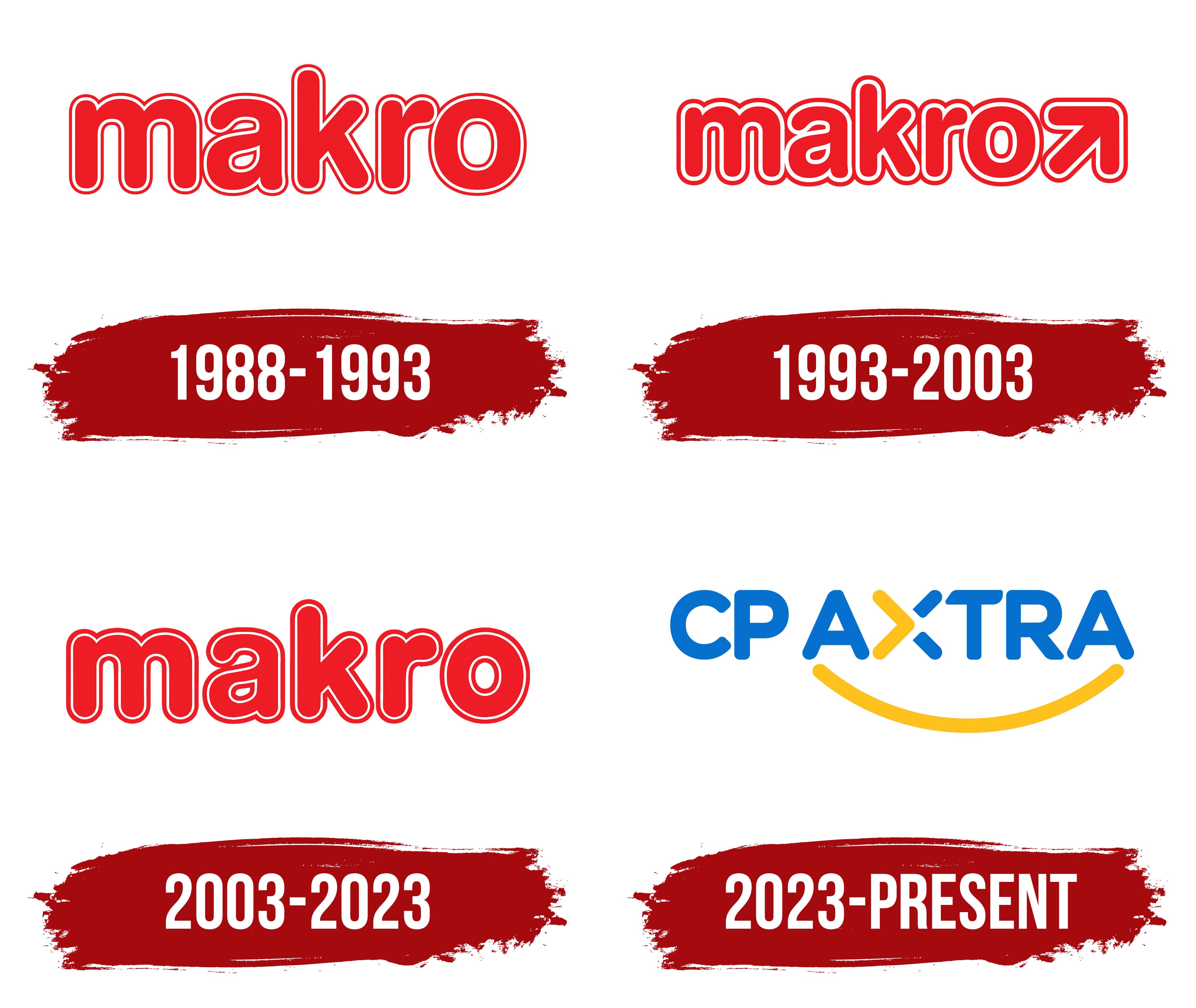
What is CP Axtra?
A Thai retail and wholesale corporation headquartered in Bangkok, created after the merger of two retail chains. It operates more than 160 cash-and-carry stores and 2,500 retail outlets in the region. The main business areas include Makro and Lotus. The first works with wholesale clients, while the second combines hypermarkets, supermarkets, and the premium Lotus Privé chain with the Clubcard program. The company develops online platforms, cashierless stores, food courts, and hybrid complexes, and has implemented the i-Trace system and Cainiao logistics.
1988 – 1993

The red Makro wordmark entered Thailand as part of SHV’s international retail system. The brand had been created earlier and was already used by wholesale stores in several countries. The first Makro opened in Amsterdam in 1968. The Thai company received the right to develop the established brand in its local market.
Siam Makro Company Limited was established in 1988 by Charoen Pokphand Group and the Netherlands-based SHV Holdings. The company developed cash-and-carry stores for business owners, retailers, and food service companies. It opened its first location in Bangkok’s Lat Phrao district in 1989. Siam Makro listed its shares on the Stock Exchange of Thailand under the ticker MAKRO in 1994.
Makro retained its international spelling in Latin letters. Siam appeared in the local company’s legal name. The stores operated under SHV’s shared retail brand, while the Thai operator had a separate corporate name.
The logo consisted of the lowercase word “makro” without a separate emblem. Five letters formed a compact horizontal line with tight spacing. Thick rounded strokes had consistent width. The sans-serif style resembled VAG and related rounded typefaces.
The letters had a bright red fill. A thin white line ran along their edges, surrounded by another red outline. The name therefore received a double border. The white gap separated the inner fill from the outer edge. It preserved the letterforms on signs, printed materials, and colored surfaces.
Rounded contours united the entire wordmark. The “m,” “a,” “k,” “r,” and “o” had distinct forms but retained the same stroke thickness and similar spacing. The enclosed “o” completed the line, while the broad “m” added visual weight on the left. The dense arrangement worked well on large building signs and merchandise used by the wholesale network.
CP ALL acquired SHV’s stake in 2013, while Siam Makro continued operating under the Makro brand. The company acquired Lotus’s business in 2021 by transferring CPRH’s entire operation. The Makro wholesale business and Lotus’s retail network entered one public corporate structure. The parent company became CP Axtra in 2023, while the red lowercase Makro name remained with the wholesale stores.
1993 – 2003

An upward-and-right arrow became the main new feature of the 1993 Makro logo. It completed the red name and extended the wordmark. Matching treatment connected the arrow with the letters and turned the composition into one unified image.
Makro remained in lowercase sans-serif letters. The characters had heavy rounded contours, broad counters, and strokes of consistent thickness. Tight spacing brought the name together in a dense horizontal line. The style resembled VAG and other rounded sans-serif typefaces.
The letters had a bright red fill. A narrow white line ran along the edges, enclosed by an additional red outline. The double border separated the wordmark from the background and supported its use on signs, documents, and retail materials. The white layer created a gap between the inner fill and outer edge without changing the established proportions.
A large arrow appeared to the right of the name. Its line rose toward the upper-right corner and ended in a rounded arrowhead. The red fill, white interior outline, and outer red edge repeated the letter treatment. Matching line thickness united all parts of the logo.
The arrow expanded the early Makro version, which consisted solely of the name. Its direction could be associated with the network’s growth and the development of wholesale trade, though the interpretation remains speculative. Available company materials use the arrow as a visual accent within the international brand.
Siam Makro used the version from 1993 to 2003. The company listed on the Stock Exchange of Thailand in 1994 and expanded its shareholder base. The Makro brand continued to represent the cash-and-carry store network. At the same time, the identity maintained the Thai company’s connection to SHV’s international system.
Following the Asian financial crisis, Charoen Pokphand reduced its stake in Siam Makro. At the same time, SHV increased its control of the local business. The arrow logo represented the company during the period when the Dutch group held a dominant ownership position. The version remained in use in Thailand until 2003, while Makro divisions in other countries kept it longer.
2003 – 2023

Makro returned to a name-only logo in 2003. The arrow disappeared, leaving the red lowercase word as the entire composition. Rounded letters and the double-outline treatment remained. The restrained revision preserved the familiar brand image while the Thai cash-and-carry network continued to develop.
Makro appeared in a heavy sans-serif typeface similar to VAG Rounded. All characters had soft curves, broad counters, and smooth connections. Stroke thickness remained consistent across straight and rounded sections. Tight spacing united the 5 letters in a compact horizontal line.
A bright red fill formed the wordmark’s foundation. A thin white line ran along the edges and was surrounded by an outer red outline. The border followed the characters around their full perimeter, creating several color layers. The white section separated the inner fill from the outer boundary and kept the name visible against different surfaces.
After removing the diagonal arrow, the word “makro” took on the full identifying role. The letter proportions remained almost unchanged, allowing the logo to continue SHV’s international brand history. The 2003 revision differed from the 1993 version by adopting a more compact form, limited to the name’s length.
Siam Makro began remodeling its stores in 2003. The company expanded fresh food sections and continued developing the wholesale cash-and-carry format.
The red wordmark continued to represent Siam Makro after ownership changes. CP ALL acquired a controlling stake in the Thai company in 2013 and retained the familiar Makro identity. The name had already become strongly associated with wholesale stores and professional customers.
Siam Makro used the red logo in corporate and partnership projects in 2019. After acquiring Lotus’s in 2021, both brands entered a single public corporate structure. Makro retained the wholesale business, while Lotus’s continued operating in retail. The red Makro wordmark remained the independent name of the network that began operating in Thailand in 1989.
2023 – today

The blue-and-yellow CP AXTRA wordmark was introduced in 2023 for the parent company combining Makro’s wholesale business with Lotus’s retail operation. The new name separated the corporate level from the consumer brands. Stores retained their established names, while the holding company received its own logo for business materials, stock exchange announcements, and international operations.
In February 2023, the Siam Makro board proposed changing the company’s name. Following shareholder approval and government registration, CP Axtra Public Company Limited became the legal name on June 15. On June 21, the Stock Exchange of Thailand replaced Siam Makro Public Company Limited with CP Axtra Public Company Limited. CPAXT replaced MAKRO as the ticker symbol.
Management connected the renaming with the creation of a shared structure for the wholesale and retail businesses. Siam Makro primarily referred to one retail chain, while the expanded company included Lotus’s. CP Axtra gave each consumer brand separate roles and gave the parent company an independent corporate name.
The letters “CP” refer to Charoen Pokphand Group, which controls the combined business. The abbreviation occupies a compact area on the left, while AXTRA forms the larger section of the wordmark. All letters are uppercase and sans-serif, with strokes of equal thickness and softly rounded corners. The style resembles Nunito, Baloo, and Rounded Gothic.
Most of the wordmark is blue. The color appears on CP, both “A” letters, “T,” and “R.” The large proportions of AXTRA give it the primary role. At the same time, the compact CP signals its connection to Charoen Pokphand Group. Matching letter heights unite the name in one horizontal line.
The “X” stands apart. Its left side consists of a large yellow angular form resembling an arrow. Two diagonally slanted blue bands appear on the right. The upper band points upward and to the right, while the lower one points downward and to the right. The 3 sections preserve the form of an “X” and emphasize the center of the name through the blue-and-yellow combination.
A broad yellow curve with rounded ends passes beneath AXTRA. It begins under the left section of the wordmark, extends to the right, and rises near the edge, resembling a smile. Its color matches the yellow side of the “X” and connects the 2 color accents. The line extends the composition vertically and forms its lower boundary.
The transition to CP AXTRA formalized the structure created after the 2021 acquisition of Lotus’s. The parent company received a blue-and-yellow logo, while the red Makro wordmark and Lotus’s name remained with the stores. The separation supported the development of both networks and hybrid retail formats under distinct consumer brands.
CP Axtra and Ek-Chai Distribution System, the operator of Lotus’s in Thailand, completed their legal merger on October 1, 2024. CP Axtra assumed the assets, rights, and obligations of both organizations. Following the restructuring, the company retained the CP AXTRA name, CPAXT ticker, and blue-and-yellow logo.