


 Eggo Logo PNG
The Eggo logo symbolizes progress and growth, representing the brand’s commitment to offering new flavors alongside traditional, beloved recipes. It highlights the unique product composition hidden within the packaging and demonstrates that the company continues to grow and evolve.
Eggo began in San Jose, California, in the 1930s, when brothers Frank, Anthony and Sam Dorsa operated a mayonnaise business. In 1953, Frank Dorsa developed a machine for producing frozen waffles. The first product was called Froffles, a blend of “frozen” and “waffles,” before the name changed to Eggo in 1955 after buyers began using the nickname.
Early sales were concentrated in California, where the waffles offered a faster breakfast without batter or a waffle iron. Kellogg’s acquired the brand in 1968 and expanded production and national distribution during the 1970s. The “L’eggo my Eggo” campaign began in 1972 and remained part of the advertising for decades.
During the 1980s and 1990s, the range expanded into pancakes, French toast, waffle sticks, mini waffles and other frozen breakfast products aimed at families and younger buyers. Whole-grain and lower-fat versions followed in the 2000s. In 2009, flooding at an Atlanta plant and equipment failures in Tennessee caused a nationwide shortage that lasted several months.
Protein, filled, and gluten-free waffles appeared during the 2010s. Grab & Go Liège-Style waffles launched in 2020 with a denser texture and caramelized sugar. In 2021, the brand entered cereal and introduced Thick & Fluffy waffles with 12 grams of protein per serving. Packaging was revised in 2022 for easier portioning, while the 2023 anniversary campaign featured limited products based on 1950s recipes and a stronger social-media presence.
Meaning and History
What is Eggo?
It is a brand of frozen waffles, pancakes, and French toast manufactured by Kellogg Company. The brand is best known for its round, pre-made waffles that can be quickly reheated in the toaster or oven for a convenient breakfast. The company offers various flavors and styles, including original, buttermilk, chocolate chip, blueberry, and whole grain options. In addition to waffles, the brand’s product line has expanded to include pancakes, French toast, and waffle sticks to cater to different breakfast preferences and on-the-go lifestyles. The brand has been recognized for its crispy exterior and soft interior, making it a popular choice for children and adults alike.
1955 – 1965
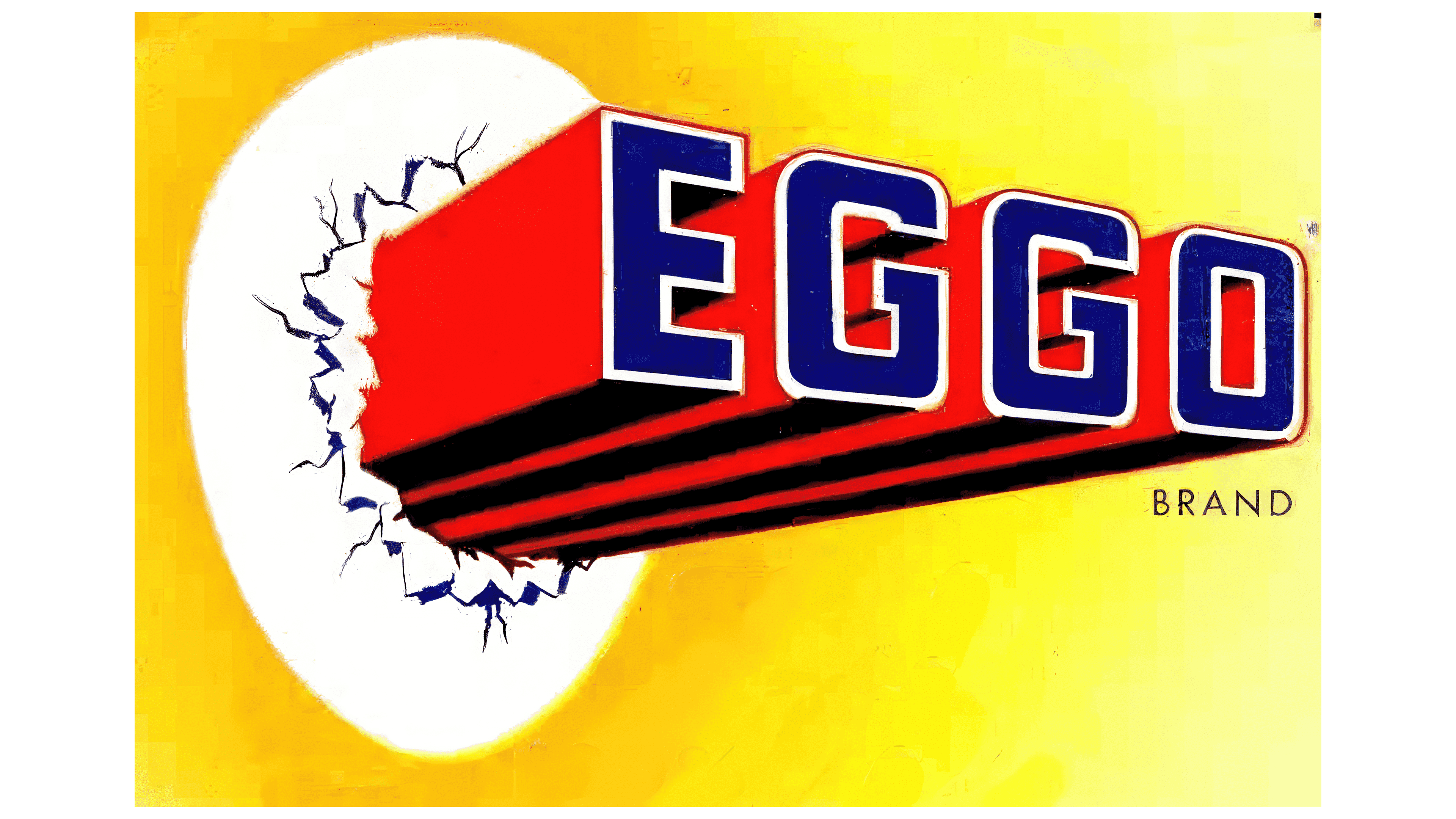
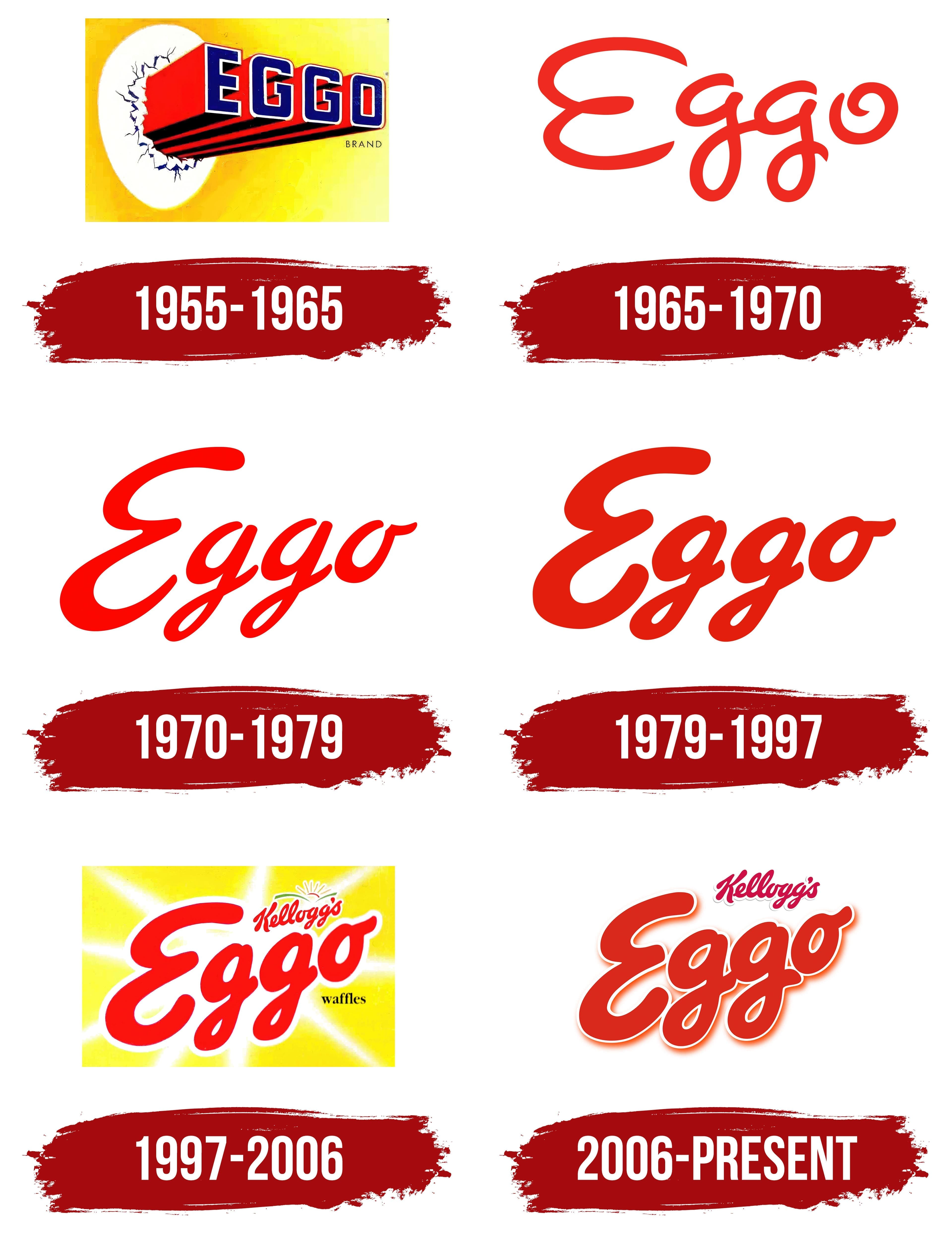
The company’s first emblem was original and conveyed not only the essence of the product but also the brand’s name. The yellow rectangular base resembled the packaging and color of waffles. Straight waffle rods in the upper-left corner appeared to break through a layer of ice, symbolizing hot, delicious waffles. Each waffle was rendered in red to emphasize its freshness and appetizing appearance. A letter formed the brand name at the end of each rod.
The name “Eggo” is phonetically similar to the word “egg” and suggests the use of natural ingredients, as the waffles contain a significant amount of eggs. This name is reflected in the emblem: the mass of ice is shaped like an egg, symbolizing the birth of waffles, as if they were hatching from an egg.
Although the product was available before 1955, in that year the founders changed its name from “Froffles” to “Eggo,” based on the nickname given to it by Americans for its pronounced egg flavor.
1965 – 1970
During this period, the Dorsa brothers began offering chips and syrups in addition to waffles. The new emblem lost its direct connection to frozen treats and became more simplified. The handwritten logo seemed to reflect the brand’s search for new paths and directions for growth. The design emphasized the two “g” letters, merged and set apart from the other characters. This element hinted at the two brothers, the creators of the waffle empire, working closely together.
1970 – 1979
By the early 1970s, the company had come under Kellogg’s leadership, and the logo had been updated. The new design featured the brand name, with the letters bolder, giving them a sense of weight and significance. The lines of the characters were stylized to appear as if they were poured from waffle batter. The emblem was tilted to the right with a slight upward curve at the end of the word, emphasizing the company’s growth and development. A connecting hook was added to the letter “O” at the end, creating a sense of continuous forward motion and ongoing progress.
1979 – 1997
The letters of the logo became even more substantial to emphasize the brand’s success and achievements. This period was marked by the popularity of the slogan “L’eggo my Eggo” and a partnership with Lego, which contributed to Eggo’s growth and strengthened its position in the market.
1997 – 2006
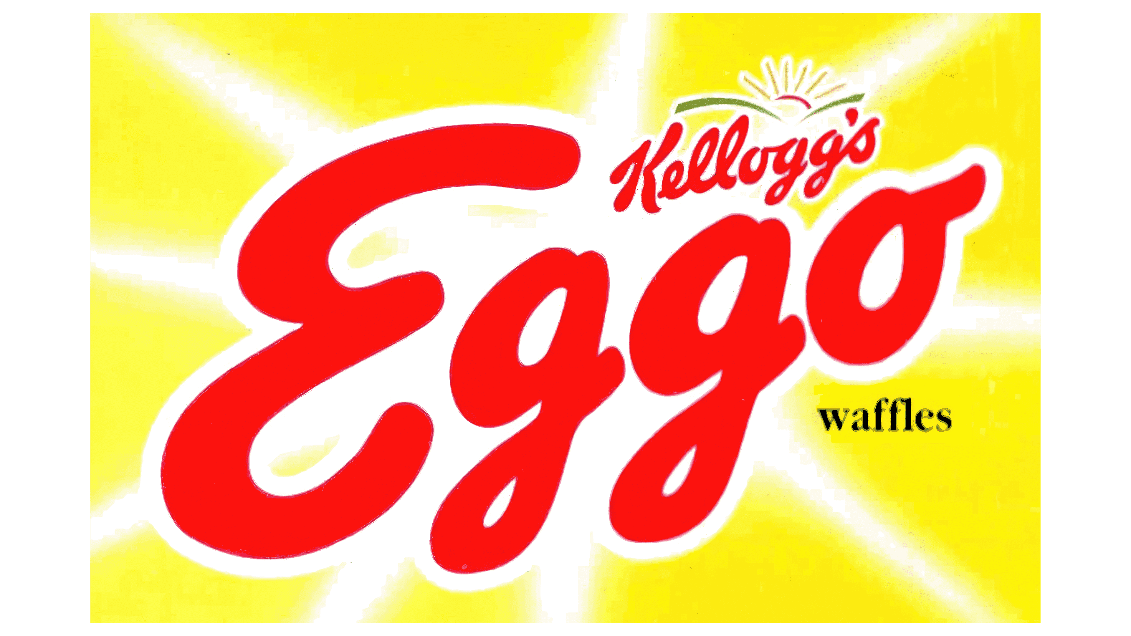
During this period, Eggo became the market leader in frozen waffles in the United States, and the new logo reflected this triumph. The brand name was placed on a golden background, symbolizing the product’s value and prestige. Each letter radiated a glow, transforming the logo into something akin to a jewel. A bright halo surrounded each letter, highlighting the product’s uniqueness and quality.
At the top of the logo was the brand owner’s name, Kellogg’s, and its miniature logo. This reinforced consumer trust, as the well-known name of a large company was associated with a guarantee of high quality. At the bottom of the logo, a small inscription reading “waffles” was added, aimed at customers in new markets where the brand was just beginning to gain popularity.
2006 – today
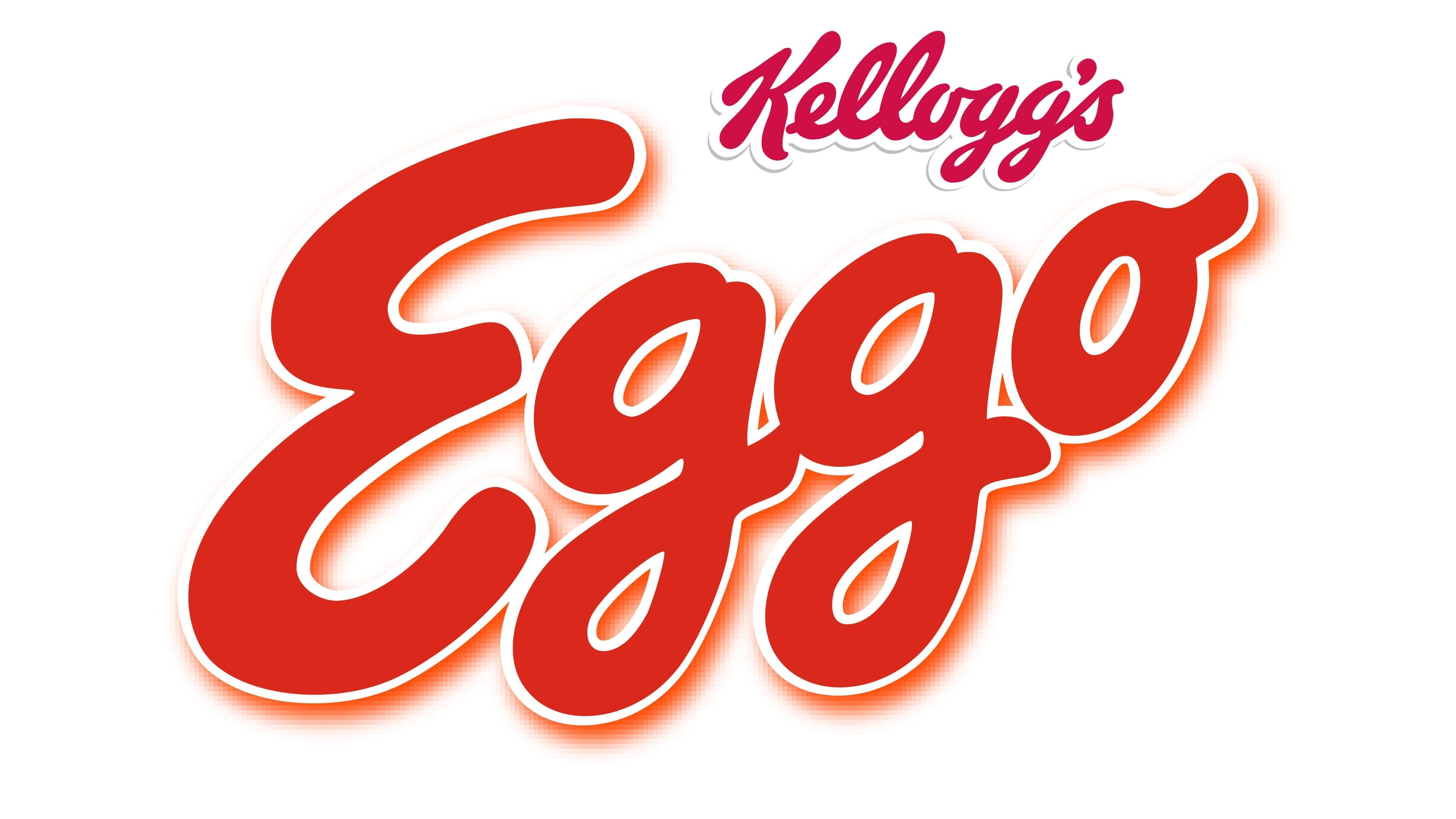
Eggo waffles became popular due to their natural ingredients and great taste, and the logo was designed to reflect these qualities. The designers aimed to create a simple and memorable symbol while conveying the brand’s energy and dynamism.
The Eggo logo is a bright and dynamic image. The modern design is rich red, symbolizing energy, passion, and appetite, perfectly aligning with a product intended for breakfast. The red color makes the emblem stand out and is easily recognizable on store shelves, attracting customers’ attention.
The letters have a smooth, rounded shape, which is associated with the softness and lightness characteristic of Eggo waffles. The “Eggo” text appears to rise upward, symbolizing the brand’s confidence in its product and commitment to continuous improvement. Each character is outlined with a thin white line, adding depth to the emblem and enhancing its clarity. A subtle shadow behind the letters amplifies this effect, making the logo visually more vivid and expressive.
The “Kellogg’s” inscription, placed above the brand name, signifies the brand’s association with a well-known and respected company. This adds additional weight and authority to the logo, emphasizing the high quality of Eggo products. The connection to the Kellogg’s brand instills trust and confidence in customers, assuring them that they are choosing a product that meets the highest standards.