


 FanDuel Logo PNG
The FanDuel logo combines fantasy and epic battles with modern technology. The platform provides users with a secure way to feel part of exciting tournaments, immerse themselves in the competitive atmosphere, and imagine themselves as unbeatable athletes. The design elements feature clear lines that symbolize stability, reliability, and a hint of substantial winnings worth fighting for.
The emblem’s aesthetics emphasize the dynamics of sports tournaments and confidence in the process’s safety and fairness. It reflects the concept of victory, achievements, and personal involvement in events that offer real rewards.
FanDuel was founded in Edinburgh in 2009 by Nigel Eccles, Leila Janah, Tom Griffiths, Rob Jones, and Chris Stafford after the team shifted from its prediction site, Hubdub, to daily fantasy sports. The platform replaced season-long leagues with one-day contests. In 2010, Pentech Ventures and Scottish Enterprise invested $1.2 million to fund hiring and product development.
In 2011, FanDuel signed early partnerships with several NBA teams. Comcast Ventures led an $11 million Series C round in 2012, the same year the company launched a mobile app. New contest formats and interface updates followed in 2013. In 2014, FanDuel raised $70 million, partnered with NFL teams, and introduced a championship with a $1 million prize pool.
Another $275 million arrived in 2015, alongside agreements with media companies and sports leagues. In 2016, the US Federal Trade Commission blocked a proposed merger with DraftKings over antitrust concerns. Paddy Power Betfair, now Flutter Entertainment, acquired a controlling stake in 2017 for $465 million.
After the federal sports-betting ban was overturned in 2018, FanDuel became the first licensed sportsbook in New Jersey. The company expanded into several states in 2019, accompanied by interface updates and new betting features. From 2020 to 2022, the company entered new regions, launched an online casino platform, added products, signed media and league partnerships, and invested in technology, analytics, infrastructure, and user services.
Meaning and History
What is FanDuel?
This leading sports entertainment platform offers a wide range of betting options, including traditional sports gambling, daily fantasy contests, and thrilling horse racing. Sports fans can test their skills by creating fantasy lineups, making calculated bets, or playing casino games on a platform that combines modern technology with intuitive interfaces, delivering an engaging experience. Competing for real cash prizes, users can add even more excitement to their favorite games, making it a one-stop shop for those looking to heighten the thrill of sports competitions.
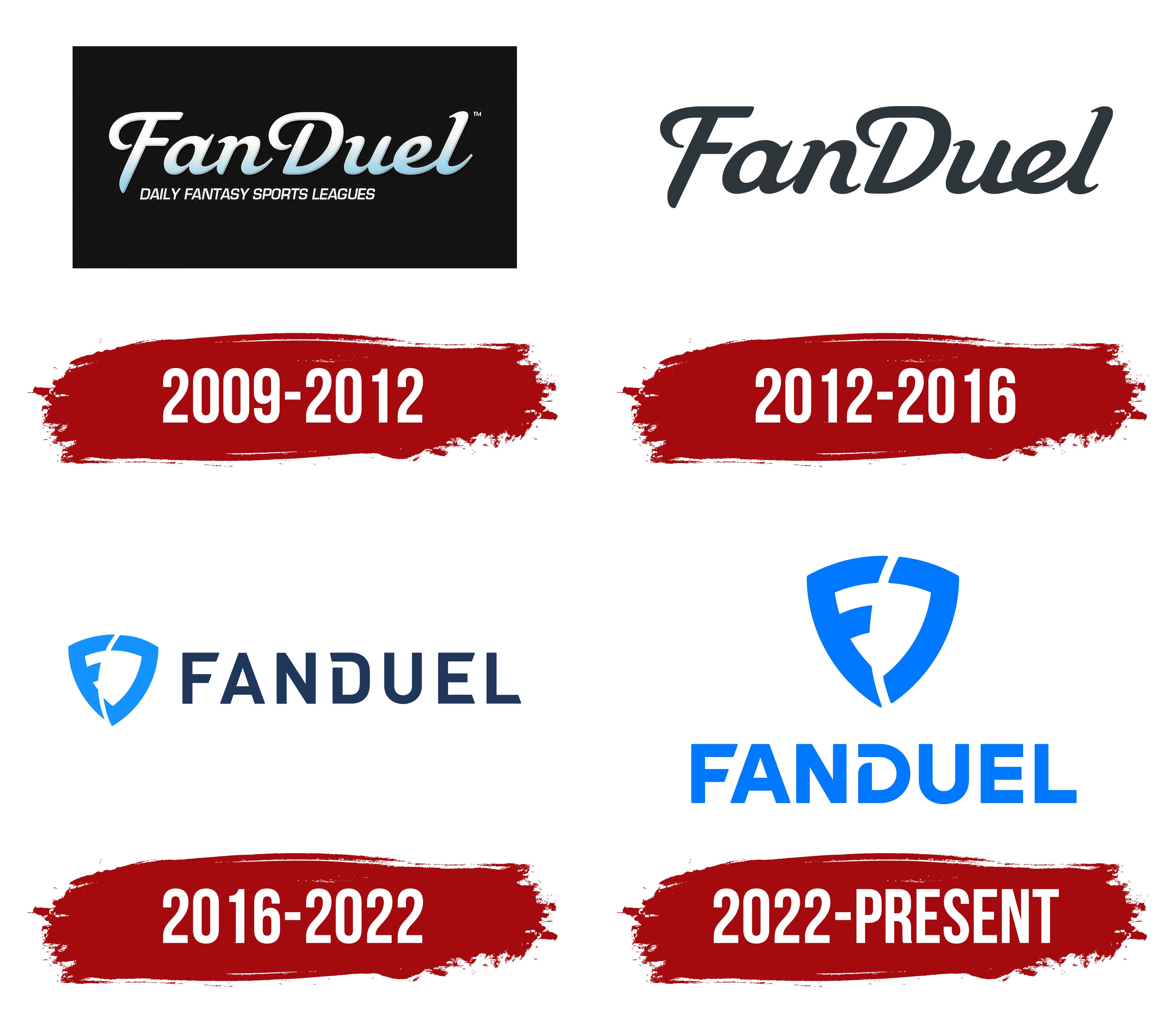
2009 – 2012
The brand’s emblem resembles a computer or movie theater screen, where the title appears in large letters before the film begins. This symbol announces an upcoming spectacle, like the introduction to an exciting performance.
The white script with a blue gradient visually transports the viewer to a fantastic world where imagination envelops the surrounding objects in a light mist. The elongated glyph of the first letter visually resembles a sharp sword, symbolizing future battles and intrigues. The name itself was not chosen by chance; it comes from the abbreviation “Fantastic Duel” and refers to fans of this type of entertainment.
Below the name is the brand’s motto, which emphasizes the company’s main offering: “Daily fantasy sports leagues.” This reflects the platform’s idea of providing the opportunity for daily participation in fantasy sports leagues, creating a sense of constant immersion in the world of tournaments and competitions, where everyone can showcase their skills.
2012 – 2016
The emblem was updated in preparation for the first fantasy football championship. The dark black background was removed, leaving the focus on the name itself. The font’s fantastic style was preserved, but the color was changed to black-gray to give the logo a new character. The white base now symbolizes freedom, emphasizing the essence of football as a sport played in open spaces.
The black color in the logo remains an important element, reflecting the players’ strength and endurance, as well as the seriousness and intensity of the upcoming competition. In this updated form, the emblem conveys intense competition and readiness for decisive action on the field while maintaining a connection to the world of fantasy, making it relevant to fantasy-format tournaments.
2016 – 2022
After the merger with DraftKings began, a new graphic element appeared in the design: a shield. This is likely a nod to the crown in the partner’s logo and to it as a symbolic attribute of the fantasy world. The shield emphasizes battles and competitions, reflecting the essence of fantasy sports tournaments.
The curved white stripe on the shield forms the left side of the symbol as an “F” and the right side as a “D,” symbolizing the unification of the two brands. The company’s name is in capital letters, giving it a more substantial and confident look. The diagonal lines and the open semicircle in the letter “D” harmonize with the cut on the shield, creating a cohesive and dynamic image.
2022 – today
The FanDuel logo is designed in a minimalist style, focusing on blue and the simplicity of its lines. The blue color is associated with digital technology, confidence, and modernity, emphasizing the brand’s connection to the online world. This shade of blue might remind one of a TV’s “blue screen,” which logically ties the brand to television and sports, especially considering the relaunch of FanDuel TV.
The shield, positioned to the left of the name, symbolizes protection and stability. Its shape is visually divided, giving a sense of dynamism and development. It echoes the company’s forward movement and adaptation to new market realities. Inside the shield is a stylized letter “F” that appears cracked or split in the middle, adding dynamism and suggesting the company is ready to challenge conventional standards.
The letters in the name “FANDUEL” are uniform in style and equally bold, adding a sense of stability and strength. The letter “D” is an interesting detail, which looks unusual due to its truncated left edge. This design choice adds individuality and memorability to the logo. The massive and clear lines of the font convey confidence and reliability, showing that this is a platform one can depend on. All elements, from the shield to the font, are harmoniously combined, creating a cohesive visual image.
One of the main elements, the shield, adds symbolism to the emblem, representing protection, reliability, and support. It signals to users that the platform prioritizes ensuring safety and confidence in its use, whether for sports betting or participating in fantasy sports.
The name consists of “Fan,” meaning “supporter,” and “Duel,” meaning “competition”. This name highlights the platform’s competitive aspect, where users engage in a competitive environment. It easily conveys the company’s essence: creating a space for fans to compete.