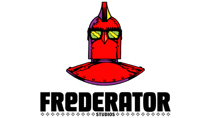
The stylish and ultra-modern Frederator Studios logo indicates that this company is very creative in its responsibilities. Designers have created a creative image that looks as bright as animated films and series developed by the studio’s employees.
Frederator Studios: Brand overview
Frederator Studios is an independent producer of animated series, shorts, and feature films. It is part of the media company Frederator Networks, Inc., which, in turn, is part of the Canadian holding Wow Unlimited Media. The studio is based in the California city of Burbank and collaborates with partners such as Cartoon Network, Sony Pictures Animation, Nick Jr., Nickelodeon, and Netflix.
Fred Seibert, the CEO and founder of Frederator Studios, is a well-known television producer and a pioneer in media branding. Seibert dedicated a significant portion of his career to creating the visual identities of various U.S. television networks. His company, Fred/Alan Inc., founded in 1983, played a crucial role in transforming Nickelodeon from the lowest-rated cable network into the top network, a position it held for 25 years.
After closing Fred/Alan Inc. in 1992, Seibert began working with animators, establishing a new studio to support independent artists and produce content for multiple American television networks. Over time, the studio launched numerous projects and expanded its reach.
The Frederator studio officially began on January 6, 1997, when Seibert, a former Hanna-Barbera executive, founded the company in New York. With his extensive experience in animation, Seibert aimed to create a studio that fostered artistic independence and produced innovative works.
The first major project was Oh Yeah! Cartoons, an animated short series for Nickelodeon. Debuting in 1998, the series became a launchpad for many talented animators, leading to popular shows like ChalkZone and The Fairly OddParents.
The studio achieved significant success in 2001 with the premiere of The Fairly OddParents on Nickelodeon. Created by Butch Hartman, the series became a hit and brought international recognition to the studio.
In 2004, the studio showcased its creative prowess with My Life as a Teenage Robot, another successful project for Nickelodeon.
The company expanded its operations in 2005 by founding a division that produced feature-length animated movies.
Further success came in 2006 with the release of Wow! Wow! Wubbzy! on Nick Jr., allowing the studio to enter the educational content market for young children.
In 2008, the company made a critical move into the digital age by launching an online platform for distributing animated content.
In 2010, the studio began production on Adventure Time for Cartoon Network, one of its most successful shows. The series became a cultural phenomenon and received widespread critical acclaim.
The company continued to innovate by launching Cartoon Hangover, a YouTube channel for experimental and avant-garde animated projects, in 2012.
In 2013, the studio successfully crowdfunded Bee and PuppyCat on Kickstarter, highlighting the potential for direct audience engagement.
To enhance its online presence, the company partnered with Otter Media in 2015 to form a new network.
In 2016, the network merged with Rainmaker Entertainment, a Canadian company, to create WOW! Unlimited Media.
The studio successfully entered adult-oriented content in 2017 by producing Castlevania for Netflix. The show’s success continued in 2018, establishing the studio’s reputation in the streaming world.
Throughout 2019, the studio continued to work on various projects, solidifying its position in the animation industry.
The company has consistently focused on fostering creativity and talent in animation. It has been instrumental in creating numerous hit animated shows and has maintained its distinctive approach to content creation while adapting to the evolving media environment.
Meaning and History
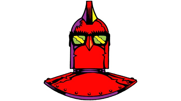
Fred Seibert left the animation studio in 2020, but the ex-directors creativity has been reflected in every aspect of their work, from product concepts to visual identity. At the same time, an important part of the brand identity is the logo with the image of the robot’s head. The original character’s name is Fredbot, which stands for “Frederator” and “bot.” However, the emblem featuring the iconic mascot only appeared in 2010, and before it, there were several wordmarks with different designs.
What is Frederator Studios?
Frederator Studios is a company formerly known as Frederator Incorporated. She is engaged in creating animated films, series, short films, and television shows. The studio was founded on January 6, 1997, but it had predecessors that arose much earlier: Fred / Alan, Inc. and Chauncey Street Productions.
1983 – 1992
In the first half of the 1980s, Fred Seibert teamed up with fellow college student Alan Goodman to form the production company Fred/Alan Inc. She was engaged in the marketing promotion of TV channels. Its logo contained a two-line inscription in black. The first row was occupied by the brand’s name, with “INC.” written in small capital letters, and was in the upper right corner above “Fred/Alan.” These words used a high-contrast serif font similar to SoftMaker’s Riccione Serial Regular.
The bottom line indicates the company’s existence period: “1983-1992.” The presence of years suggests that the presented version of the logo did not appear immediately, but after the exact closing time, Fred / Alan Inc. became known.
1988 – 1997
In 1988, Fred Seibert’s production company partnered with Chauncey Street Productions. At the time, introductory videos for video content featured an animated city skyline emblem. The black silhouettes of the high-rise buildings stood out against the orange-red sky. The gradient was linear, with lighter colors at the top fading to darker ones at the bottom.
In the right corner above the roofs of high-rise buildings hung the sun – a large white circle. The company’s name was also there: “Chauncey Street” in the first line and “Productions Inc.” in the second. The words were not written evenly but diagonally. At the same time, black sans-serif letters “jumped” and leaned in different directions. A gray-blue rectangular frame surrounded the picture.
1998 – 2009
In the early weeks of 1997, Fred Seibert created Frederator Incorporated to produce animated films and series. A year later, the studio’s debut cartoon was released. Its logo featured a large black word, “Frederator,” written at the top and a small “INCORPORATED” centered below it.
The designers chose a geometric, bold, sans-serif font for the first half of the title. Its complete analog is HWT Unit Gothic 717 from Hamilton Wood Type Foundry. For the second part, something similar to Falling Sky Condensed by Cannot Into Space Fonts was used with reduced letter spacing. In addition to the inscriptions, the logo included 23 four-pointed stars lined up in one row: 12 to the left of the word “INCORPORATED” and 11 to the right.
2009 – today
In 2009, the company got a logo that is still relevant today. It is similar in structure to the previous one but uses a different font: the word “FREDERATOR” is written in bold black capital letters. It is noteworthy that the first “E” looks like a lowercase, and the second – looks like an uppercase, although they are the same size.
Because the brand has received a new name – Frederator Studios – the lower term is no longer “INCORPORATED” but “STUDIOS.” There are four-pointed stars to the right and left, 11 on each side. They are white on the inside and outlined in black on the outside.
2010 – today
In addition to the wordmark, the production company uses a red robot emblem. Only its upper part is visible: a cylindrical head attached to a plate that acts as the shoulders and chest. A high mohawk, nose, and dark yellow-green glasses complement the character’s head. Interestingly, thick eyebrows or eyelashes stick out above the glasses.
Font and Colors
The main symbol of Frederator Studios is a red robot known as Fredbot. As it turned out, this iconic image was invented by illustrator and designer Arlen Schumer in 1997. Creating the notorious character for the Frederator brand, he was inspired by the Gigantor robot from Japanese anime. After that, Fredbot was redesigned many times, and now one of the versions of his head adorns the studio emblem.
The bold sans-serif font the designers chose for the word “FREDERATOR” is roughly similar to SoftMaker’s Deko Display Serial Bold. Perhaps this is one of his modifications. Interestingly, the “E” after the “R” looks like a lowercase letter, although the other “E” after the “D” has the standard appearance of a capital glyph. However, they are both the same size.
If the word mark is completely black, then the red color prevails in the emblem with the image of the robot’s head. Additionally, purple, yellow, light green and black are used.
