


 Wow! Wow! Wubbzy! Logo PNG
The Wow! Wow! Wubbzy! logo conveys the joy and playfulness of the cartoon, reflecting the brightness and cheerfulness of its characters. The design is bright and features rich colors, inviting viewers into a magical, fantastic world full of fun and adventure.
The central character, Wubbzy, a funny yellow mouse, symbolizes friendliness and openness. He embodies childhood joy and helps young viewers easily absorb important lessons about friendship, communication, and interaction with others. The logo sets a positive tone, showing that learning can be exciting and engaging.
Wow! Wow! Wubbzy! began in the early 2000s, when creator Susan Miller developed Wubbzy, a cheerful yellow character with a long tail, and built the idea around his friends and small preschool adventures. In 2006, Frederator Studios and Bolder Media, part of Mixed Media Group, started production, giving the series a bright look, simple shapes, music, and short stories for young viewers.
The show premiered on Nick Jr. on August 28, 2006. The first season included 26 episodes, with each episode divided into two stories. Wubbzy’s world centered on curiosity, friendship, mistakes, and problem-solving, with characters such as Widget and Walden adding a practical and educational side to the plots. A second season followed in 2008 after the first season found a steady children’s audience.
The brand moved beyond television in 2008 with its first DVD collection. In the same year, Playmates Toys licensed playsets, plush toys, and figures based on the characters. In 2009, the longer DVD special Wubb Idol was released as a connected episode event. In 2010, the Nintendo DS game Attack of the 50 Foot Fleegle gave children an interactive way to spend time with the same characters.
Production of new episodes ended in 2010, yet reruns kept the series visible on television in many markets. By 2014, it had aired in more than 60 countries. Educational app plans were announced in 2015, and the tenth anniversary in 2016 brought new toy lines and DVD editions. Streaming platforms renewed interest in 2018. By 2023, the franchise remained present through reruns, merchandise, and online viewing.
Meaning and History
What is Wow! Wow! Wubbzy!?
This colorful animated sitcom captivates young viewers with its charming characters and fantastic setting. The show focuses on the adventures of a cute yellow square creature with a springy tail in the lively city of Wuzzleburg. The main character discovers the joys and challenges of life alongside his best friends, the wise purple bear Walden and the inventive pink rabbit-like figure Widget. The series stands out for its distinctive visual aesthetic, combining 2D and 3D animation elements to create a bright, striking look. With memorable melodies and inventive storylines, the show conveys important lessons about creativity, problem-solving, and the value of friendship, making it a favorite choice for young audiences.
2003
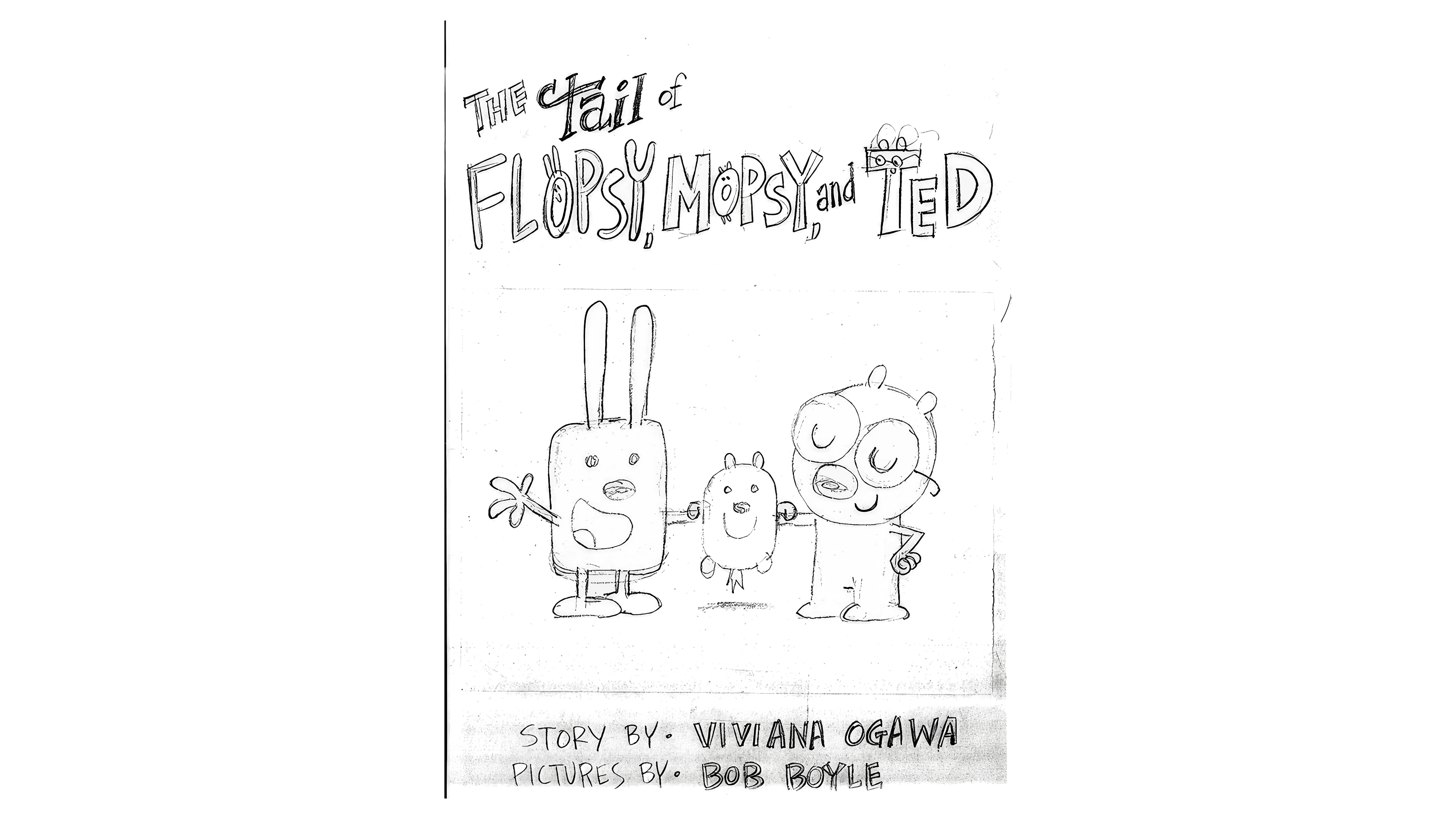
The story of the future show and its characters originates from a comic titled “The Tail of FLOPS, MOPSY, and TED.” The cover features a hand-drawn pencil sketch of the characters holding hands, symbolizing friendship and unity. The comic’s title is at the top, and the creators’ names are listed at the bottom.
The story was produced by Bob Boyle, who would later create a popular Nickelodeon show. His niece, Viviana Ogawa, actively assisted him, whose name also appears on the cover as the concept’s creator. This early collaboration became the starting point for the animated series’ future success, which won a young audience’s hearts.
2005
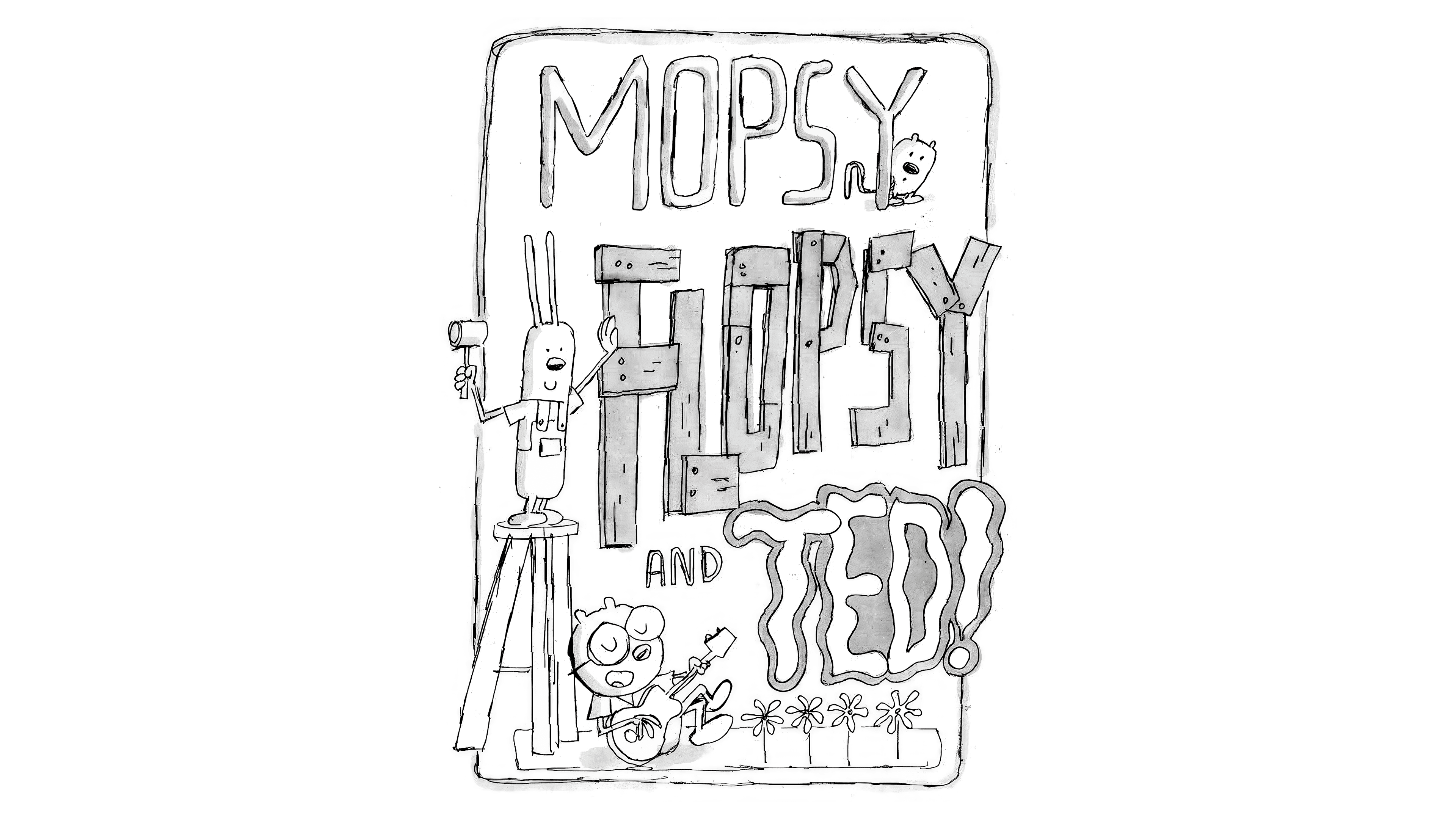
The story continued with a fully illustrated book titled “Mopsy, Flopsy, and Ted.” Although it was never published, the cover is designed in a unique pencil style. Each name in the title stands out with its design, reflecting the characters’ personalities:
- “Mopsy” is written in thin, playful letters, emphasizing the character’s lightness and cheerfulness. It peeks out from behind the last letter.
- “Flopsy” is a tall, hardworking character. His name appears to be hammered together from wooden boards by the rabbit, holding a hammer in his paw, symbolizing his work in a repair shop.
- “Ted”: the name wavers like a melody, hinting at the character’s creative nature, which solves all the story’s problems through song.
Some drawing elements extend beyond the cover, giving the image a special dynamic. This artistic approach highlights that being original and going beyond the usual boundaries is normal and exciting.
2005 (Prototype)
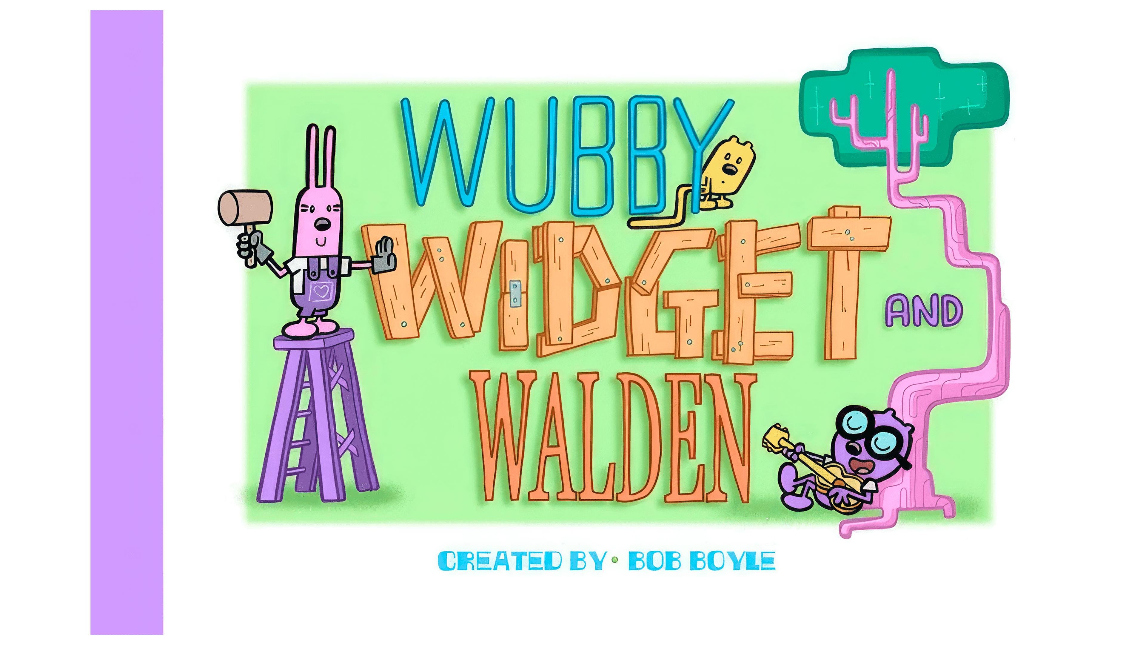
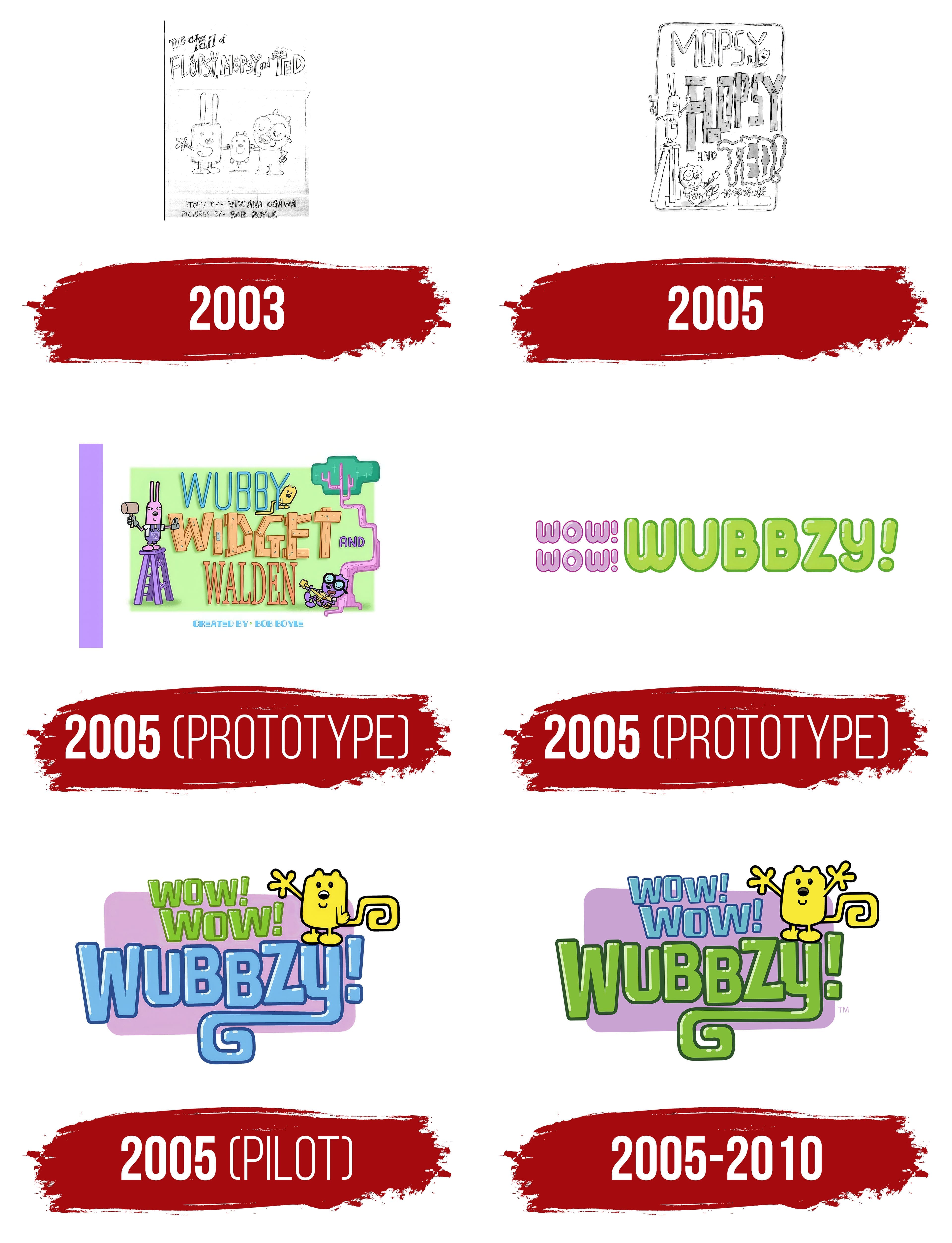
The first emblem of the upcoming series is closely tied to the book cover illustration, but the characters’ names have been changed. The rabbit, who previously carved his name from wooden boards, is now called WIDGET; the bear Ted became WALDEN; and the mouse transformed into WUBBY.
The green background adds a sense of coziness and softness, symbolizing the green grass of the magical town of Wuzzleburg. Bright pink trees and purple objects enhance the atmosphere of the fantasy world where the story takes place.
The positions of each character emphasize three main aspects that will be developed in the cartoon: play, learning, and creativity. Each character reflects these themes through pose, visually preparing the audience for the show’s upcoming adventures and educational elements.
2005 (Prototype)

In the new prototype, it was decided to focus on the main character, who was given a brighter, more memorable name: Wubbzy. This name sounds fun and energetic, like a wind-up toy, reflecting the character’s personality. The exclamations “Wow! Wow!” resemble the cheers of excited fans, supporting the hero and believing in his victories. The font used in the lettering is shiny and smooth, reminiscent of a baby rattle, adding a sense of lightness and playfulness to the image.
2005 (Pilot)
The logo for the pilot episodes featured an image of the main character, giving the emblem a friendlier, more appealing appearance. On a purple background, symbolizing a TV screen, green “Wow! Wow!” text is displayed in two tiers, slightly slanted, adding a sense of movement. Next to the last letter of the name Wubbzy stands the character himself, waving cheerfully. Special attention is given to his long tail, a key distinguishing feature of the character. The letters of the name are styled in a shiny finish, with variations in size and height, while the blue outline adds clarity and completeness to the design. Interestingly, the glyph for the letter “Y” is modified to resemble Wubbzy’s tail, creating balance and enhancing the logo’s visual effect.
2005 – 2010
The “Wow! Wow! Wubbzy!” logo reflects the character’s cheerful, energetic nature. Bright, contrasting colors green for the name “Wubbzy” and blue for the exclamations “Wow! Wow!” create a fun atmosphere. These color choices are intentional: Green symbolizes liveliness and activity, perfectly fitting the main character’s personality. The blue color of the exclamations highlights the lightness and spontaneity of his reactions to the world around him.
Wubbzy’s figure in the emblem, with raised hands as if greeting everyone, conveys his friendliness and eagerness to interact with others. This gesture reflects his restless nature, always in motion, always ready for new adventures. Wubbzy’s curly tail on the logo adds a playful touch, emphasizing the character’s uniqueness and casual style.
The font is rounded, making it visually soft and appealing to children. Each letter is slightly smoothed, with rounded corners, evoking a sense of safety and kindness, which is perfect for a young audience. Combined with the bright purple background, the font creates a feeling of lightness and fun.