 Getlink Logo PNG
The Channel Tunnel connects the United Kingdom and continental Europe, facilitating the movement of passengers and freight. Rail service runs under the strait, reducing travel time and simplifying logistics. The Getlink logo represents a company that manages the tunnel infrastructure and organizes train traffic between the two countries.
Getlink was founded on August 13, 1986, as Groupe Eurotunnel. It was established under an agreement between France and the United Kingdom to build a railway tunnel under the English Channel. The project was initially estimated at £ 2.6 billion. Over time, the cost rose to 9.5 billion due to stricter safety standards and technical changes.
Construction began in 1988. The tunnels were officially connected on December 1, 1990. The official opening was held on May 6, 1994, with Queen Elizabeth II and François Mitterrand in attendance. The tunnel became one of the largest engineering projects of the 20th century.
Since 1994, Eurostar and Le Shuttle have operated regular services. The high debt load of about 8 billion pounds led to losses. In 1997, large-scale restructuring began. In 2007, the company reported its first profit.
In 2009, Groupe Eurotunnel acquired Veolia Cargo and First GBRf. These acquisitions enabled the creation of the freight division Europorte. In 2012, the company launched the MyFerryLink ferry service. It was later discontinued due to antitrust issues.
In November 2017, the company changed its name to Getlink. In 2020, its shares were delisted from the London Stock Exchange and remained listed on Euronext Paris.
After Brexit, Getlink adapted its infrastructure to meet new border requirements. Terminals in Coquelles were expanded. In 2022, the ElecLink project began operation. It is a 1000-megawatt underwater interconnector linking the power systems of the United Kingdom and France.
In 2024, Getlink acquired the British company ChannelPorts.
In 2025, it completed deals with Associated Shipping Agencies and Boulogne International Maritime Services. These steps strengthened the company’s position in customs services. Getlink is developing digitalization, implementing artificial intelligence, and supporting the new Entry/Exit System border control project.
Meaning and History
What is Getlink?
A French company based in Paris, Getlink operates the Channel Tunnel, the only rail link between the United Kingdom and Europe. The structure is 51 kilometers long, with 39 kilometers running underwater. Revenue comes from passenger and freight shuttles between Folkestone and Sangatte, Eurostar services, and freight operations through its subsidiary Europorte.
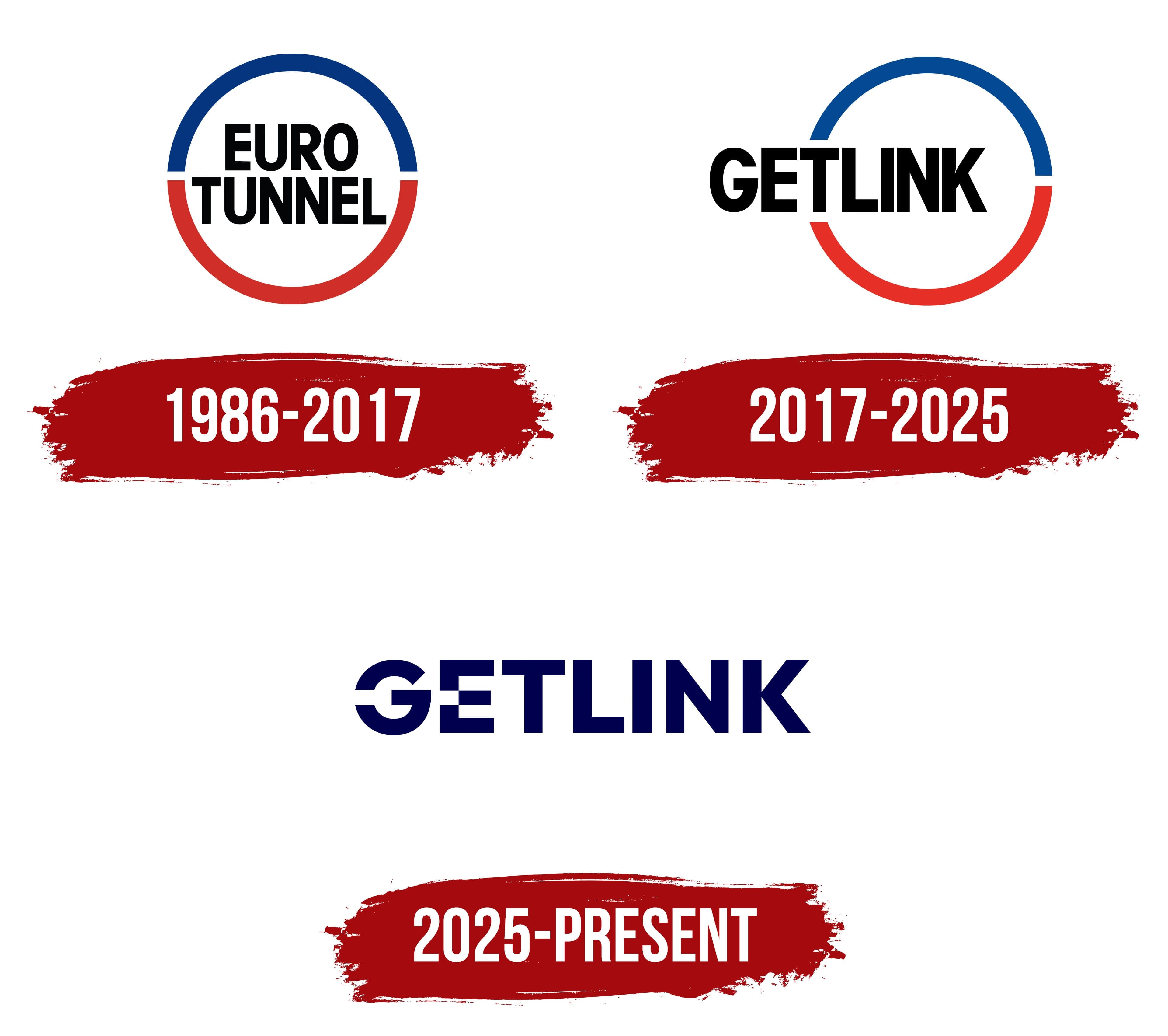
1986 – 2017
A 2-color ring emblem represented Eurotunnel during project preparation, tunnel construction, and the launch of rail service beneath the English Channel. The logo was introduced on May 19, 1986, for the combined France-Manche and The Channel Tunnel Group Limited structure. Its introduction coincided with the creation of the legal and organizational foundation for the French-British project connecting the 2 countries through an underwater tunnel.
François Mitterrand and Margaret Thatcher announced the France-Manche / Channel Tunnel Group consortium as the winner of the competition on January 20, 1986. France and the United Kingdom signed the Treaty of Canterbury on February 12. The concession agreement dated March 14 assigned the financing, construction, and operation of a permanent transportation link across the English Channel to the 2 companies. Eurotunnel group companies were created on August 13, along with a construction contract with TransManche Link.
Eurotunnel combined the words Euro and tunnel. Euro identified the project’s European and cross-border scale, while tunnel described its primary purpose. The name reflected the group’s responsibility for building and operating a rail route between France and the United Kingdom. After the tunnel opened in 1994, the name remained in corporate and operating use on both sides of the Channel.
The logo featured a ring with 2 openings along the horizontal axis. The upper arc was blue, while the lower one was red. The outline surrounded the name and resembled a closed route or tunnel passage. The color division distinguished the 2 sections while retaining one overall form. Blue and red remained Eurotunnel’s primary colors for several decades.
EURO TUNNEL appeared inside the ring across 2 lines. EURO stood above TUNNEL. The text used black uppercase letters in a narrow heavy sans-serif typeface. The condensed style allowed the longer lower word to fit within the circle. The letters occupied most of the emblem, giving the name and colored outline equal roles. Side openings and the 2 differently colored arcs completed the composition.
The ring emblem remained in use during construction and at the 1990 meeting of the French and British tunneling teams beneath the English Channel. After the opening ceremony on May 6, 1994, the logo continued to represent the group. Freight shuttles, Eurostar trains, and passenger shuttles began operating in 1994. The registration of Groupe Eurotunnel SA in 2005 and the 2007 financial restructuring changed the group’s legal structure while preserving the Eurotunnel name.
Different logo versions changed the arc thickness, spacing, and word placement. The primary structure retained the blue upper arc, red lower arc, and black EURO TUNNEL wordmark.
2017 – 2025
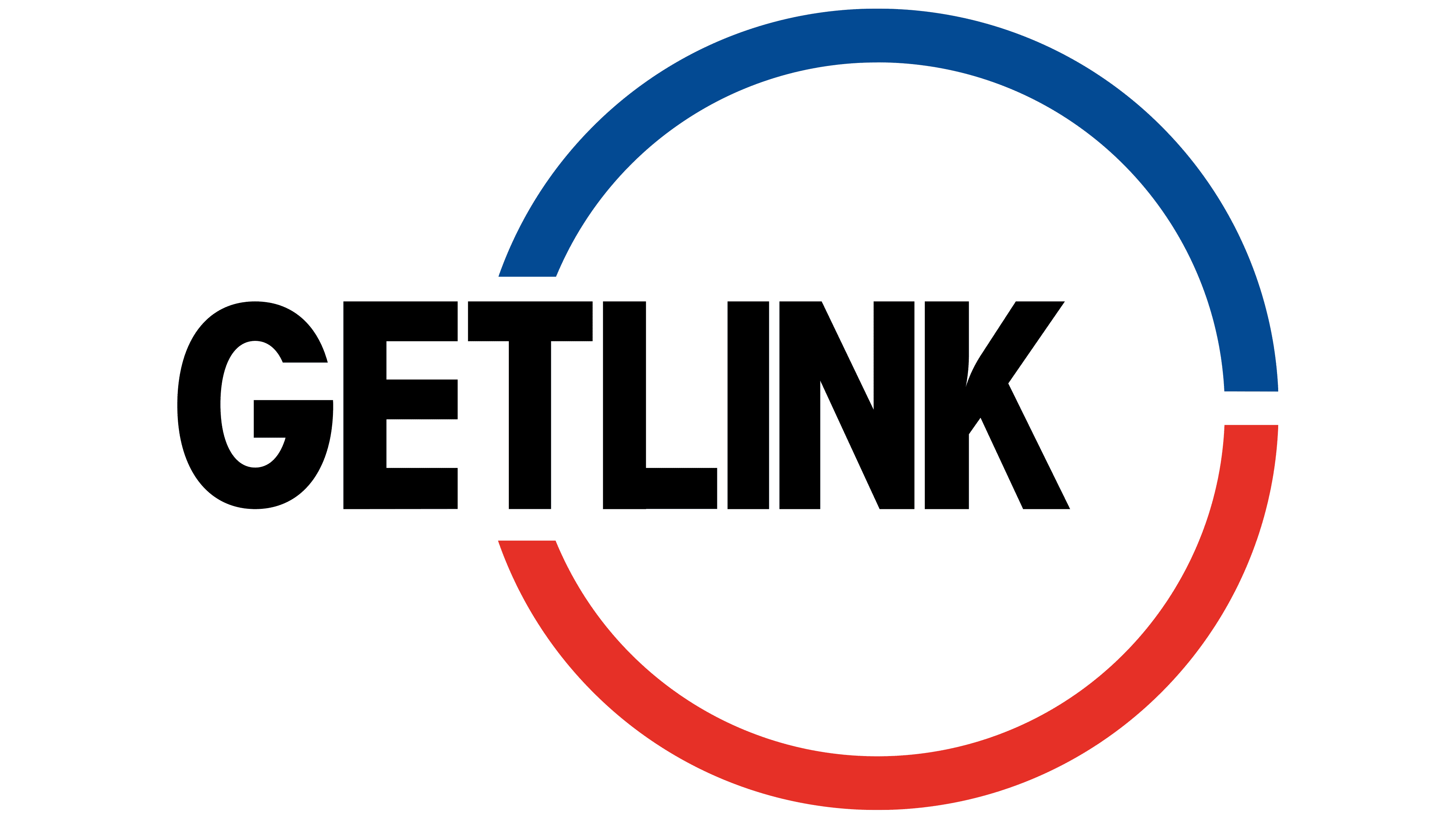
By 2017, the Eurotunnel group operated in several infrastructure sectors. It managed the Channel Tunnel, the Europorte rail operator, and the ElecLink electrical interconnector project. Eurotunnel described one asset, while the company’s activities covered a much broader range. The group’s expansion drove the renaming, but it retained the familiar ring to preserve continuity with its previous identity.
Groupe Eurotunnel became Getlink on November 20, 2017. Chairman and CEO Jacques Gounon described the renaming as the beginning of a new era in mobility infrastructure. Getlink communicated ideas of connection and exchange. Link represented connection, while Get retained the group’s GET stock market code.
The corporate and operating levels received different names following the change. Getlink became the parent group uniting several infrastructure businesses. Eurotunnel became the division responsible for the tunnel and transportation across the English Channel. During the presentation, Getlink was described as a group containing Eurotunnel and other operations.
The red-and-blue ring remained the foundation of the updated logo. GETLINK appeared inside the circle on one line, replacing the 2-line EURO TUNNEL name. The blue arc passed above the word, while the red arc curved below it. The opening on the right appeared near the final letters. On the left, the beginning of the word overlapped part of the outline. The intersection between the text and ring retained an association with a tunnel and an enclosed transportation route.
GETLINK used black uppercase letters in a heavy condensed sans-serif typeface. Broad verticals, tight spacing, and dense strokes allowed the new name to fit within the established circular layout. The wordmark occupied the horizontal axis and carried the primary meaning. The red and blue arcs preserved Eurotunnel’s familiar color foundation, while the new name represented the group’s expanded structure.
2025 – today
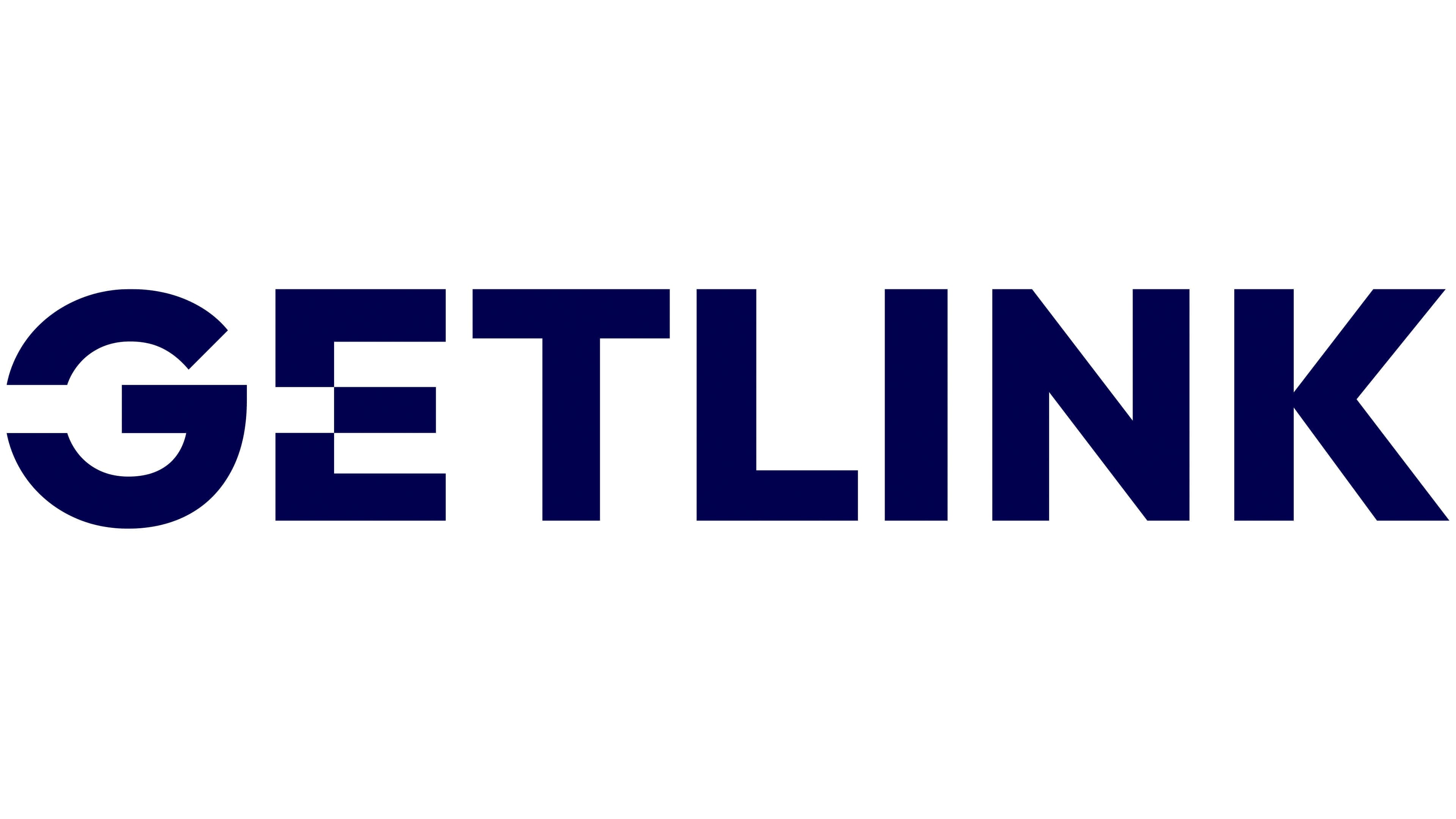
After 8 years of using Eurotunnel’s visual heritage, Getlink adopted a new identity. The company introduced the update on June 27, 2025, and revised the relationship between the corporate brand and its divisions. The changes affected Getlink, Eurotunnel, Europorte, ElecLink, and Getlink Customs Services. A shared system united passenger and freight transportation, electrical infrastructure, and border services.
The project centered on 3 concepts from the company’s presentation. Speed referred to fast service, fluidity represented uninterrupted processes, and connection described links among people, territories, and infrastructure. A shared typographic foundation identified the divisions as part of the group. Separate color codes distinguished the operations. Eurotunnel, Europorte, ElecLink, and Getlink Customs Services retained their established roles within the updated architecture.
The Getlink corporate logo became a single dark blue wordmark. The red-and-blue ring from the 2017 version gave way to a standalone typographic identity. Its connection with the former Eurotunnel emblem became less direct. The tunnel operator received a separate position within the structure. At the same time, the parent brand adopted an image that covers the group’s full range of operations.
GETLINK appears in heavy uppercase sans-serif letters. Straight lines, broad characters, and dense strokes create a large horizontal wordmark. Its primary custom features appear in the “G” and “E.” An opening interrupts the left side of the “G,” while a cut appears at the middle level of the “E” vertical. The paired openings unite the first 2 letters through one device and give the wordmark a distinctive form.
The corporate version uses dark blue. Red remains part of the color system for individual group operations. Divisions received separate shades within the shared typographic foundation. Getlink Communications Director Anne-Sophie de Faucigny connected the update with the development of complementary operations, group growth, innovation, and decarbonization.