 Taylor Morrison Logo PNG
Residential construction involves designing homes, building neighborhoods, and preparing homes for occupancy. Developers create spaces designed for everyday life and long-term use. The Taylor Morrison logo represents a company that builds homes and develops real estate in the United States.
Taylor Morrison was formed through the merger of two construction companies with different origins. Morrison Homes began operations in the United States in 1905 and specialized in residential construction. The British company Taylor Woodrow was founded in 1921 by Frank Taylor. It became a major international developer and entered the U.S. market in the 1950s.
In July 2007, the two companies merged to create Taylor Morrison. In 2011, after the 2008–2009 financial crisis, a consortium of investors led by TPG Capital and Oaktree Capital Management took control. The new owners restructured the company and prepared it for an IPO.
In 2013, the company listed its shares on the New York Stock Exchange. It was the largest homebuilding IPO at the time. In 2012, the company acquired Texas-based builder Darling Homes, strengthening its position in Dallas and Houston. In 2018, it bought AV Homes for $ 963 million and expanded its presence in Florida, Arizona, and North Carolina.
In 2019, the company completed its largest acquisition. It purchased William Lyon Homes for $2.4 billion. This made Taylor Morrison one of the five largest homebuilders in the United States. The company gained access to the Washington, Oregon, and Nevada markets and strengthened its position in the Southwest.
Since 2016, Taylor Morrison has been named America’s Most Trusted Home Builder. In 2021, the company entered the Fortune 500 list for the first time.
Taylor Morrison has built more than 100,000 homes, completed six major acquisitions, and strengthened its presence in key U.S. markets. The company’s headquarters is located in Scottsdale, Arizona.
Meaning and History
What is Taylor Morrison?
It is one of the leading developers in the United States, based in Scottsdale, Arizona. The company specializes in building and selling low-rise homes, townhouses, and high-end residential complexes. The organization manages the full operations cycle, from land acquisition and design to selling finished properties and providing mortgage support. The company builds under the Taylor Morrison, Darling Homes, and William Lyon Homes brands.
2007 – 2013
The emblem of people pulling a rope came to Taylor Morrison from Taylor Woodrow when the combined company was formed in 2007. After the merger of British groups Taylor Woodrow and George Wimpey, the company combined its U.S. operations, Taylor Woodrow and Morrison Homes, under the Taylor Morrison name. The company built homes and residential communities in the United States. Its name kept the surnames of two homebuilding businesses, while its logo preserved an image from one of their histories.
The Morrison name traces back to Morrison Homes, founded in Seattle in 1905 by C. G. Morrison. The other half comes from Frank Taylor, who built his first two houses in Blackpool, England, in 1921 at age 16. His uncle, Jack Woodrow, helped him start the business and lent his surname to Taylor Woodrow. When the U.S. operations were combined, the company retained Taylor and Morrison from the earlier names.
The rope has its own history. The cover of the first issue of Taylor Woodrow’s employee publication in 1935 featured a photograph of three men in a tug-of-war. Roughly two decades later, the photograph became the basis for the corporate emblem. The number of participants increased to four, and the scene became a symbol of collective effort. At Taylor Morrison, that connection to teamwork continued through corporate principles of collaboration and mutual respect.
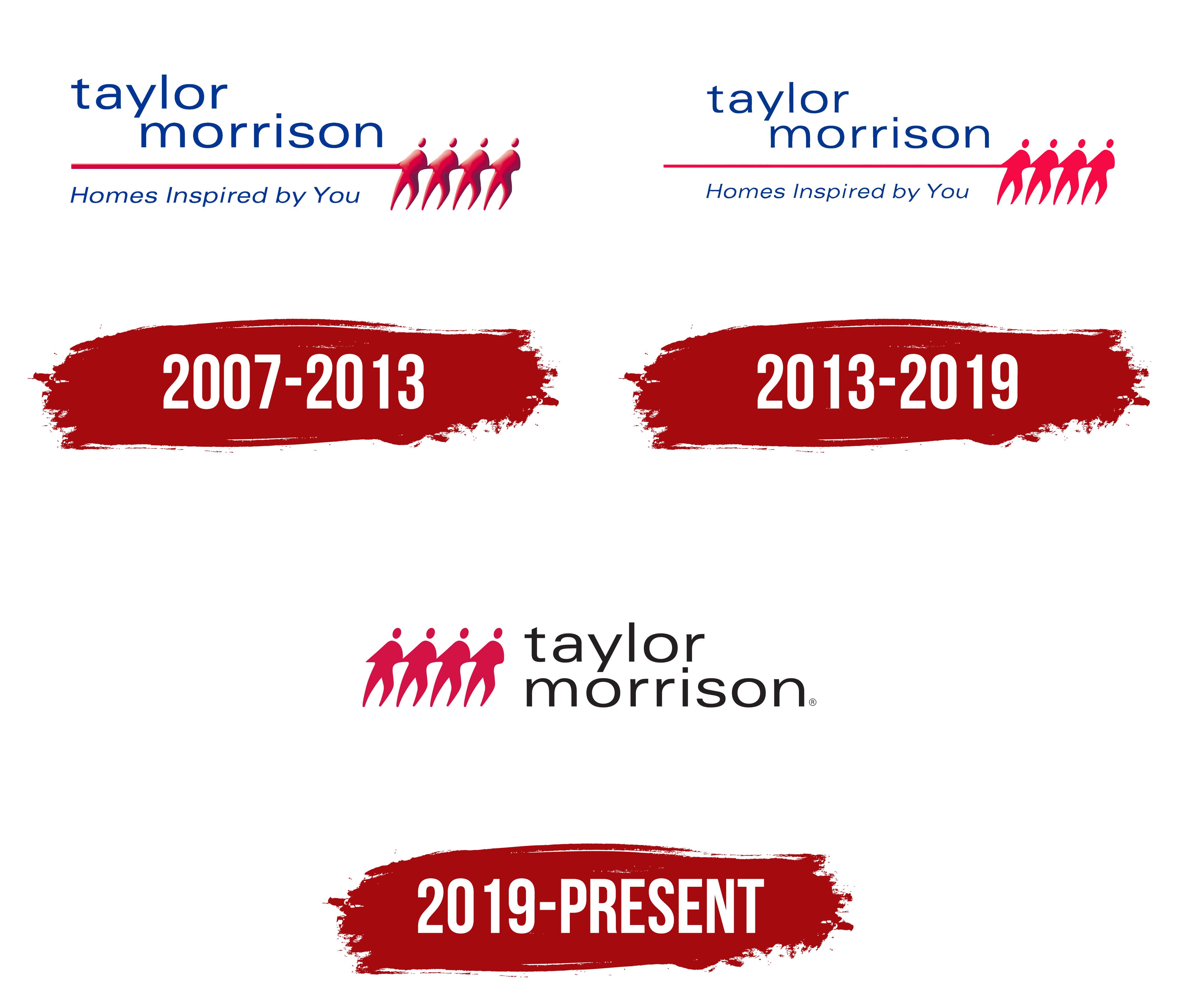
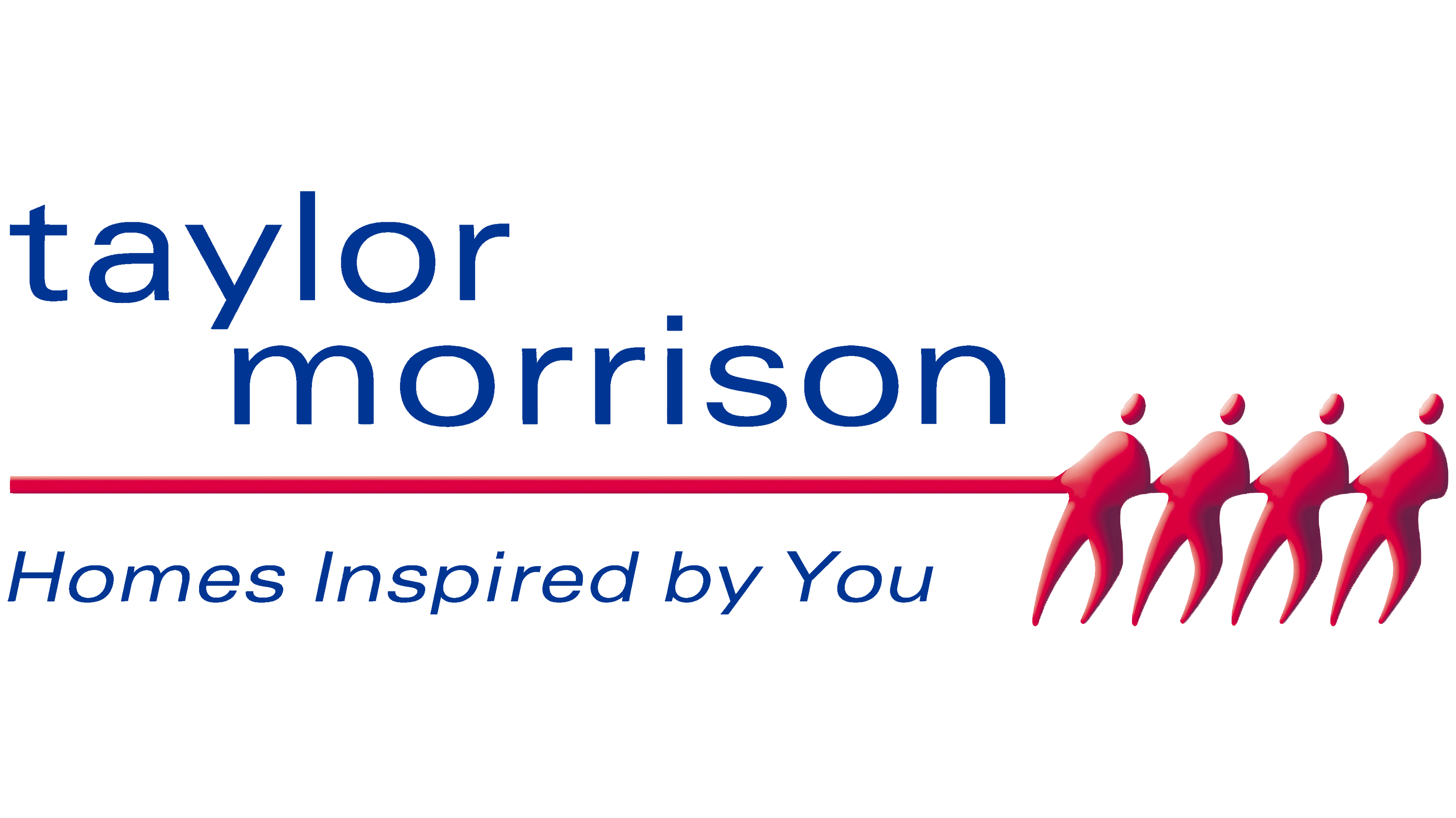
In the early logo, blue lowercase “taylor” and “morrison” appeared on two levels. The upper word began on the left, while the lower word was offset to the right. The upright sans-serif lettering resembled Frutiger or Myriad. A thin red rope extended beneath “morrison,” ending in four figures on the right. Their bodies leaned in the same direction, their arms connected, and their outstretched legs conveyed exertion. Small oval heads were separated from their bodies. Shades ranging from bright red to dark burgundy, along with highlights and shaded areas, gave the silhouettes depth. A separate blue “Homes Inspired by You” line appeared beneath the rope. Smaller, thinner italic lettering distinguished the slogan from the name. The phrase spoke to prospective residents’ ideas about their future homes.
2013 – 2019
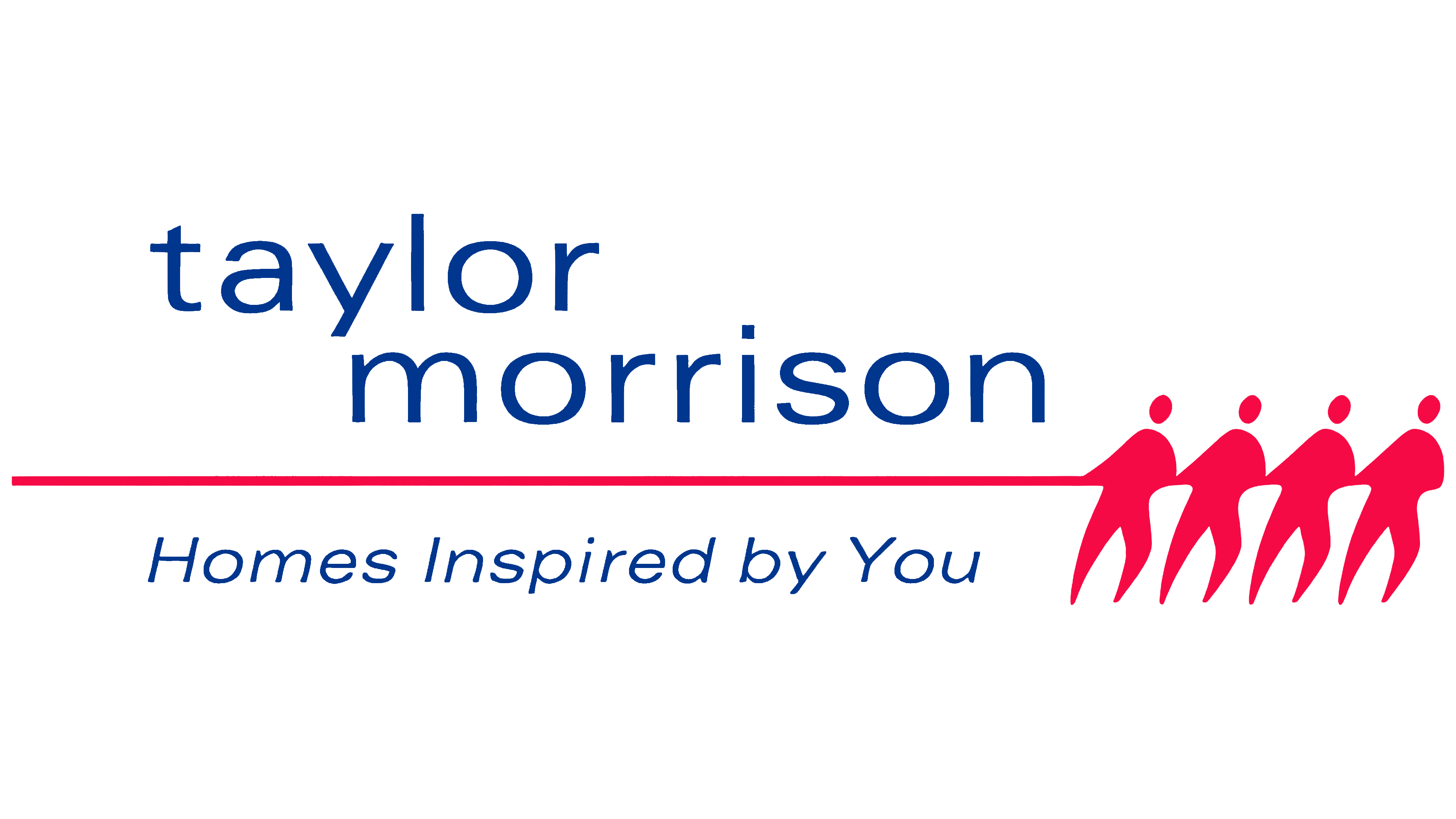
In the next version, Taylor Morrison simplified the figures at the right end of the rope. Burgundy-red shades, highlights, and shadows disappeared. The line and all four participants received a uniform, bright reddish-pink fill. The figures retained their positions, leaning bodies, and outstretched legs. The rope still ran beneath the name and led to the group on the right.
The blue name remained on two lines, although the letter strokes became slightly thinner. The tagline stayed beneath the red line. The changes focused on the figures and the rope’s color, preserving the logo’s layout.
2019 – today
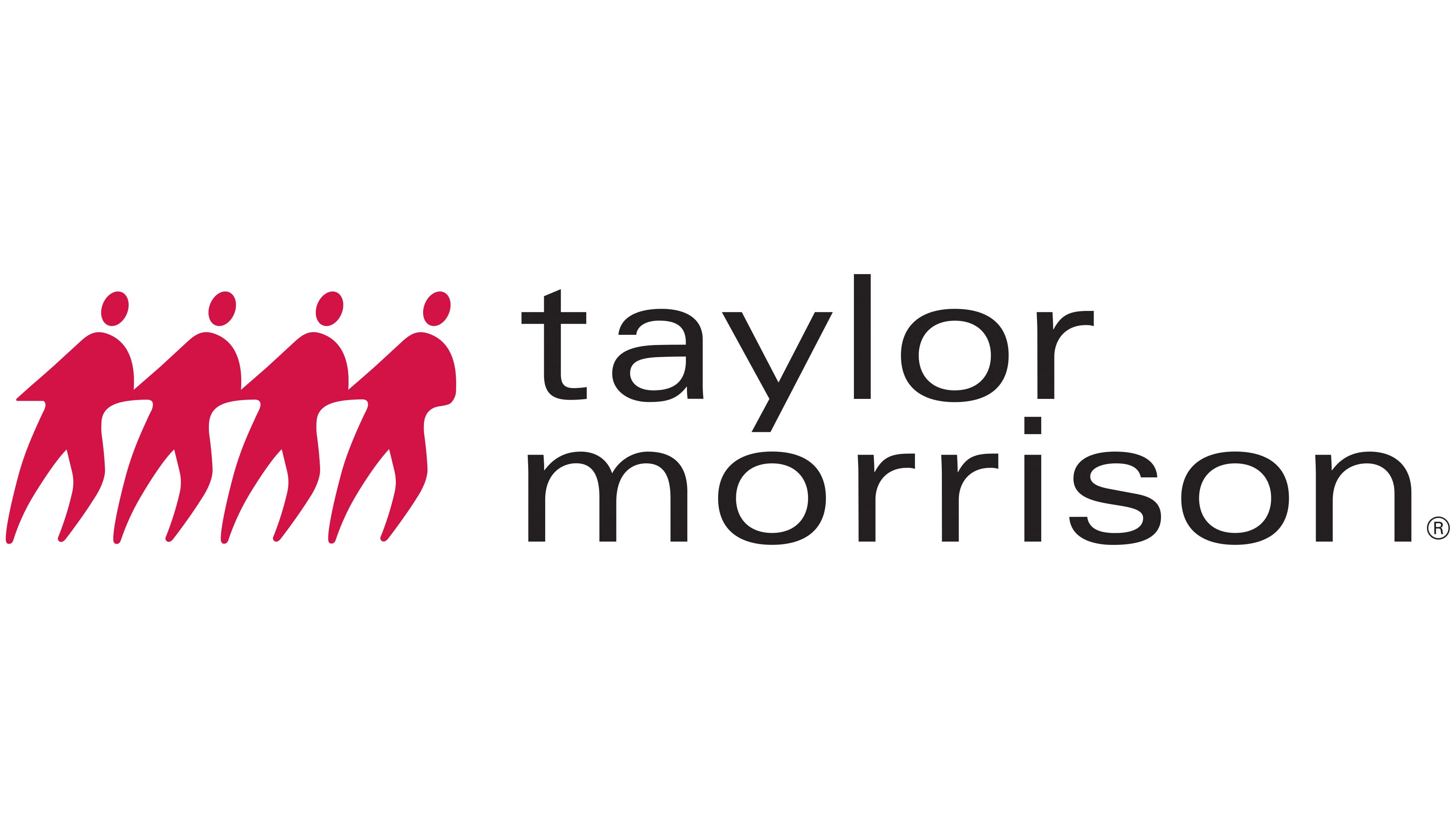
As Taylor Morrison grew and prepared for major corporate changes, including the acquisition of William Lyon Homes, the brand underwent a digital update. The logo adopted a more compact arrangement. The four red figures moved to the left of the name, while the long rope and “Homes Inspired by You” line were removed. Two adjacent sections, the group of people and the company name, replaced the underlined wordmark.
The silhouettes retained their forward lean and outstretched legs but became simpler. They have rounded, featureless heads, a uniform crimson-red fill, and outlines that touch. To the right, “taylor” and “morrison” appear on two lines sharing the same left edge. Both words use black lowercase sans-serif letters. The thin strokes are consistently thick, and the typeface resembles Avenir or Gotham. The lettering replaced the earlier blue while retaining the two-line arrangement.
By 2021, the company’s trademark application included the four-figure combination and the two-line name.