 Grupo Nutresa Logo PNG
Everyday food products include coffee, sweets, cookies, and ready-to-eat items that are part of the daily diet. Producing and distributing these goods involves working with recipes, packaging, and international shipments. The Grupo Nutresa logo represents a Latin American company that manufactures food products and manages a wide range of brands across various categories.
Grupo Nutresa began operations on April 12, 1920, in Medellín as Compañía Nacional de Chocolates Cruz Roja. The company united local producers and became a leader in the confectionery market. In 1933, it became a shareholder of Fábrica de Galletas Noel. During that period, it began producing Dux cookies and chocolate under the Corona and Diana brands.
In the 1960s, the company began diversifying. The brands Sello Rojo and Colcafé appeared, and Jet chocolate became a cultural symbol of the country. During the same years, the “Natural History” album was created. It became part of Colombia’s educational program.
By the 1980s, the company had become the holding company Inversiones Nacional de Chocolates S.A. It invested in chocolate, coffee, and pasta production. In the 1990s, the company acquired Rica Rondo, strengthening its position in the meat industry. It later acquired Nestlé’s Costa Rican assets and created Grupo Nacional de Chocolates S.A.
In 2011, the holding company adopted a new name: Grupo Nutresa S.A. The company entered international markets and acquired the Pops chain in Central America, Tresmontes Lucchetti in Chile, and the coffee brand Cameron’s Coffee in the United States. Later, Nutresa purchased Helados Bon in the Dominican Republic and the El Corral Group in Colombia.
By 2020, the group operated forty-six manufacturing facilities in nine countries. The product range included meat delicacies, chocolate, coffee, cookies, and ice cream.
In the second quarter of 2025, sales reached 5.16 trillion Colombian pesos, equivalent to 1.23 billion dollars. Growth was 34.8 percent. In the third quarter, revenue increased to 5.27 trillion pesos. The EBITDA margin rose to 16 percent. This reinforced Grupo Nutresa’s position as one of Latin America’s largest food conglomerates.
Meaning and History
What is Grupo Nutresa?
A major food group from Colombia that includes eight divisions: meat products, cookies, chocolate, coffee, retail, ice cream, pasta, and the company Tresmontes Lucchetti in Chile. It was founded as the chocolate factory Cruz Roja and, over time, became a holding company with a market capitalization of about $6 billion. It owns the country’s largest coffee brand, and its subsidiary Colcafé supplies coffee to Starbucks. Tresmontes Lucchetti leads the cold beverage category.
1920 – 2006

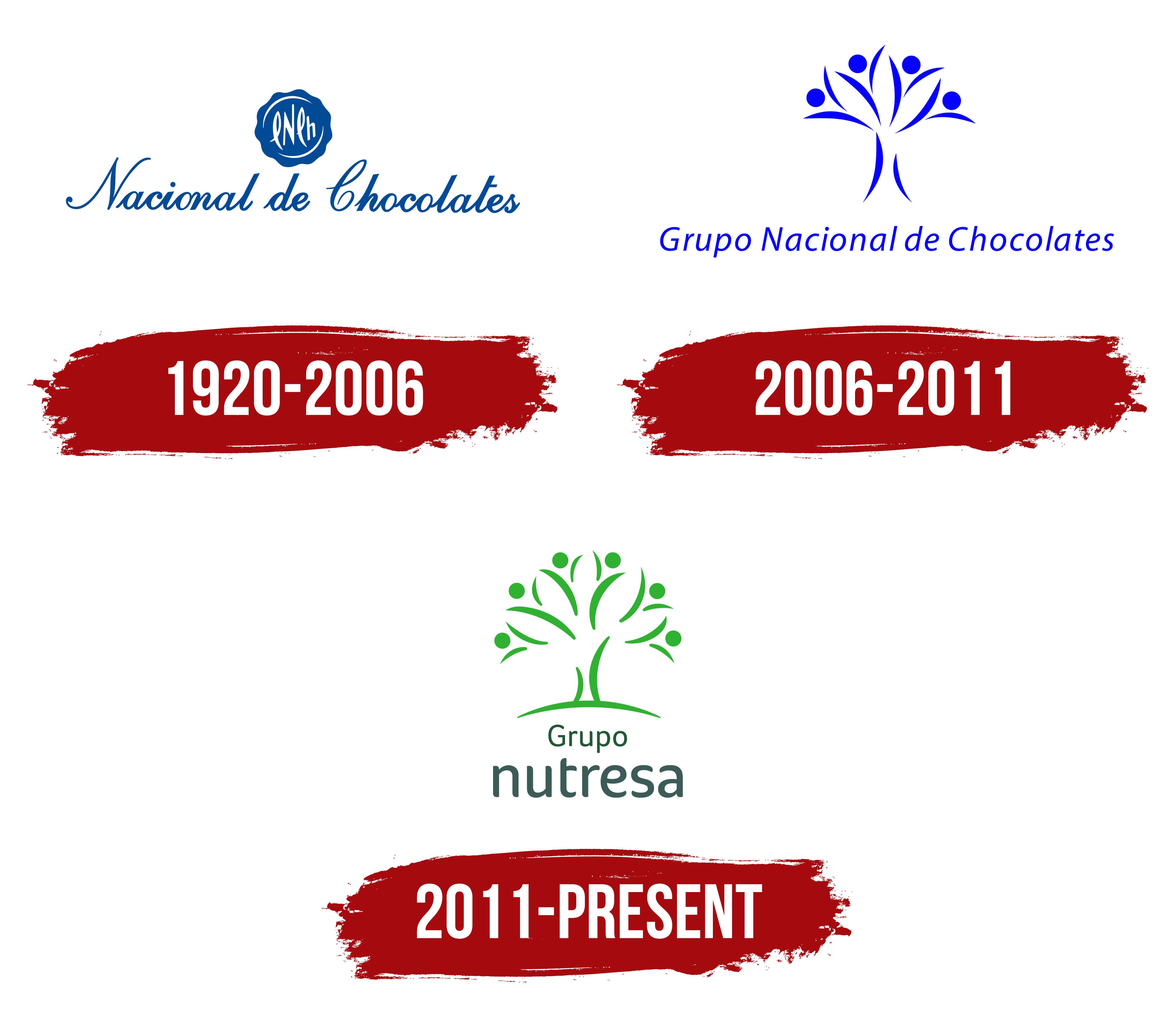
A blue seal containing the letters “CNCh” represented Compañía Nacional de Chocolates’ chocolate business for many years. Former Grupo Nutresa President Carlos Enrique Piedrahita discussed it in Bitácora de una multilatina, a book written with Mauricio Reina and Amira Abultaif. The authors described the emblem as a traditional blue seal bearing the CNCh initials. They linked it to the company’s early history and former full name.
The company began on April 12, 1920. Several small chocolate manufacturers in Medellín combined to form Compañía Nacional de Chocolates Cruz Roja. The company later shortened its name to Compañía Nacional de Chocolates S.A. The company acquired a stake in Fábrica de Galletas Noel in 1933 and later began producing coffee and pasta. The new categories expanded the business and created the foundation for a future food group.
The logo had a vertical structure. A circular blue medallion with a wavy outer edge appeared above the name. The uneven border resembled a wax seal. Inside was a white handwritten CNCh monogram made from uppercase “C,” “N,” and “C” letters followed by a lowercase “h.” The elongated characters were tightly connected. White arcs near the top and bottom filled open space inside the circle.
Nacional de Chocolates appeared below the medallion in blue. The “N” and “C” were uppercase, while the other letters were lowercase. The calligraphic style featured tall loops, thin connecting lines, and long finishing strokes. The name extended horizontally, while the seal appeared above its center. The company name occupied most of the logo, and the monogram served as its compact version.
The parent company Inversiones Nacional de Chocolates S.A. was created in 2003. It became Grupo Nacional de Chocolates S.A. in March 2006. By then, the group operated in meat products, cookies, coffee, ice cream, pasta, and chocolate. The blue CNCh seal preserved the connection with Compañía Nacional de Chocolates and represented the history of the original chocolate business. The group name already covered several areas of the food industry.
2006 – 2011
The former CNCh seal represented the chocolate business, while the parent company’s portfolio had expanded to 6 food categories. The company had acquired the Zenú meat business, Noel cookies, and confectionery assets. An emblem associated with Compañía Nacional de Chocolates placed the primary emphasis on chocolate production. After adopting Grupo Nacional de Chocolates, the group needed a new image to represent all its businesses.
A blue tree became the logo’s foundation. The form emerged during the group’s restructuring after it consolidated several food operations. The branches corresponded with chocolate, coffee, meat products, cookies, ice cream, and pasta. The generalized plant figure united different industries within one silhouette and represented the group’s structure.
Two flowing curves formed the lower section of the tree. They spread from the base, creating a divided trunk. Curved forms resembling branches or petals appeared above. The lines extended in different directions, creating an open crown. Soft curves joined into one vertical figure.
Four people with raised arms appeared inside the tree. Curved forms represented bodies and arms, while small blue circles formed the heads. Combining the tree with human silhouettes connected the different business areas with Grupo Nacional de Chocolates employees. The crown represented the portfolio, while the figures introduced the people working within the group.
The full Grupo Nacional de Chocolates name appeared beneath the tree. Thin sans-serif letters had a slight rightward slant. The long horizontal wordmark balanced the tree’s tall vertical form. The entire logo appeared in bright blue. It continued the Nacional de Chocolates identity, where blue had been used for the CNCh seal and calligraphic name.
2011 – today
The naming process for the updated group began with 63 options developed by branding company Marqas. Management wanted a short word connected with food or nutrition and easy to pronounce in different countries. The holding company’s president added a 64th candidate, Nutresa. The group adopted the name after acquiring the Mexican company Nutresa S.A. de C.V. in 2009 and already held rights to it in several markets.
Consumer research in Colombia, Mexico, Peru, and Central American countries ranked Nutresa first among the proposed names. The corporate book connects it with the word “nutrition.” The short form suited the holding company’s international plans and represented its entire food portfolio.
By 2010, Grupo Nacional de Chocolates no longer reflected the actual business structure. Chocolate had become one category alongside meat products, cookies, coffee, ice cream, pasta, and other operations. Shareholders approved the Grupo Nutresa S.A. name on March 31, 2011. Marqas conducted the research and developed the new brand, while Sancho BBDO later handled the advertising campaign.
The logo retained the tree that had previously represented the entire group. Green replaced blue, connecting the image to food and the agricultural origins of its ingredients. As the business expanded, it added more branches. A flowing horizontal curve representing the ground appeared at the bottom. A divided trunk rose from it and transitioned into a system of curved lines.
The crown consisted of 12 curves resembling leaves or raised arms. Circular heads above the paired forms created 6 human figures. The people extended in different directions from a shared trunk, representing the combination of numerous companies within the group. The tree connected the food business with the origins of its raw materials. At the same time, the figures represented the holding company’s employees.
The name appeared beneath the tree across 2 lines. A small Grupo with an uppercase “G” occupied the upper line. The larger lowercase Nutresa appeared below in a dense sans-serif typeface. Grupo used thin green lettering, while Nutresa appeared in a dark green-gray shade. The size difference gave Nutresa the primary role and shortened the former lengthy corporate signature.
Beginning in 2011, the emblem appeared on the group’s products as a corporate seal. The company expanded the program to the front of packages in 2013. The logo connected the parent group with Noel, Zenú, Colcafé, Crem Helado, and other portfolio brands. Their individual names remained on the products.