 Idemitsu Logo PNG
Fuel and motor oils power engines and equipment in transportation and industry under a range of conditions. The quality of these products affects machinery service life and operational stability. The Idemitsu logo represents a company that produces fuel, lubricants, and petrochemical products for the automotive and industrial sectors.
Sazo Idemitsu founded Idemitsu on June 20, 1911, in Moji. The company, Idemitsu Shokai, distributed railway lubricants. In 1938, it acquired the tanker Nisshomaru and a share in an oil refinery. From that moment, it began its own oil production and refining activities.
In 1940, the company Idemitsu Kosan Co., Ltd. was established. In 1952, the Apollo Gasoline brand emerged, becoming a symbol of the company’s technological renewal. In 1953, Idemitsu purchased Iranian oil, bypassing the British embargo.
In 1956, construction of the first refinery began. In 1961, Apollo Service Co. was established to manage the service station network. In 1962, the world’s largest tanker, Nissho Maru III, was launched. In 1967, the world’s first direct desulfurization unit began operating at the Chiba plant.
In the 1970s, Idemitsu entered global markets and opened offices in the United States, London, Beirut, Tehran, and Singapore. By 1981, the company owned ten tankers with a capacity of over 200,000 tons. In the 1980s, the company began oil and coal production in various countries.
In 1992, the company opened a lubricant production plant in the United States. In 1996, all company facilities received ISO 9001 and ISO 9002 certifications. By 1998, the company added ISO 14001. During this period, the company began developing geothermal energy in Takigami.
Since 2001, the company has invested in solid-state battery technologies and developed related areas in future energy. In the 2010s, Idemitsu focused on producing specialized lubricants and strengthening its position in Asia.
On April 1, 2019, the merger with Showa Shell Sekiyu K.K. was completed. As a result, the company formed a large fuel network under the Apollo Station brand. From 2020 to 2022, the company restructured and developed digital systems and renewable energy initiatives.
In 2023, the company introduced a series of motor oils, IFG and IFD, developed over many years of research. In 2024, the company continued its collaboration with Toyota in developing solid-state batteries. It also expanded its presence in Asia and Central Asia.
Idemitsu has transformed into a diversified energy company. It combines traditional oil operations with the development of technologies for electric vehicles and renewable energy sources.
Meaning and History
What is Idemitsu?
A Japanese oil corporation founded by Sazo Idemitsu as a supplier of lubricants for railways. The second largest oil refiner in the country after Eneos Holdings, it operates the Apollostation gas station network and has revenue exceeding 9 trillion yen. It is known for delivering oil from Iran aboard the tanker Nissho Maru despite the embargo. The main activities include oil refining, petrochemicals, energy, and resource extraction. Seven refineries account for most of the other income, and chemical plants produce ethylene and benzene. The company develops technologies for LEDs, batteries, and renewable energy, and extracts oil, coal, and gas in various countries. Toyota and Lexus plants use its products.
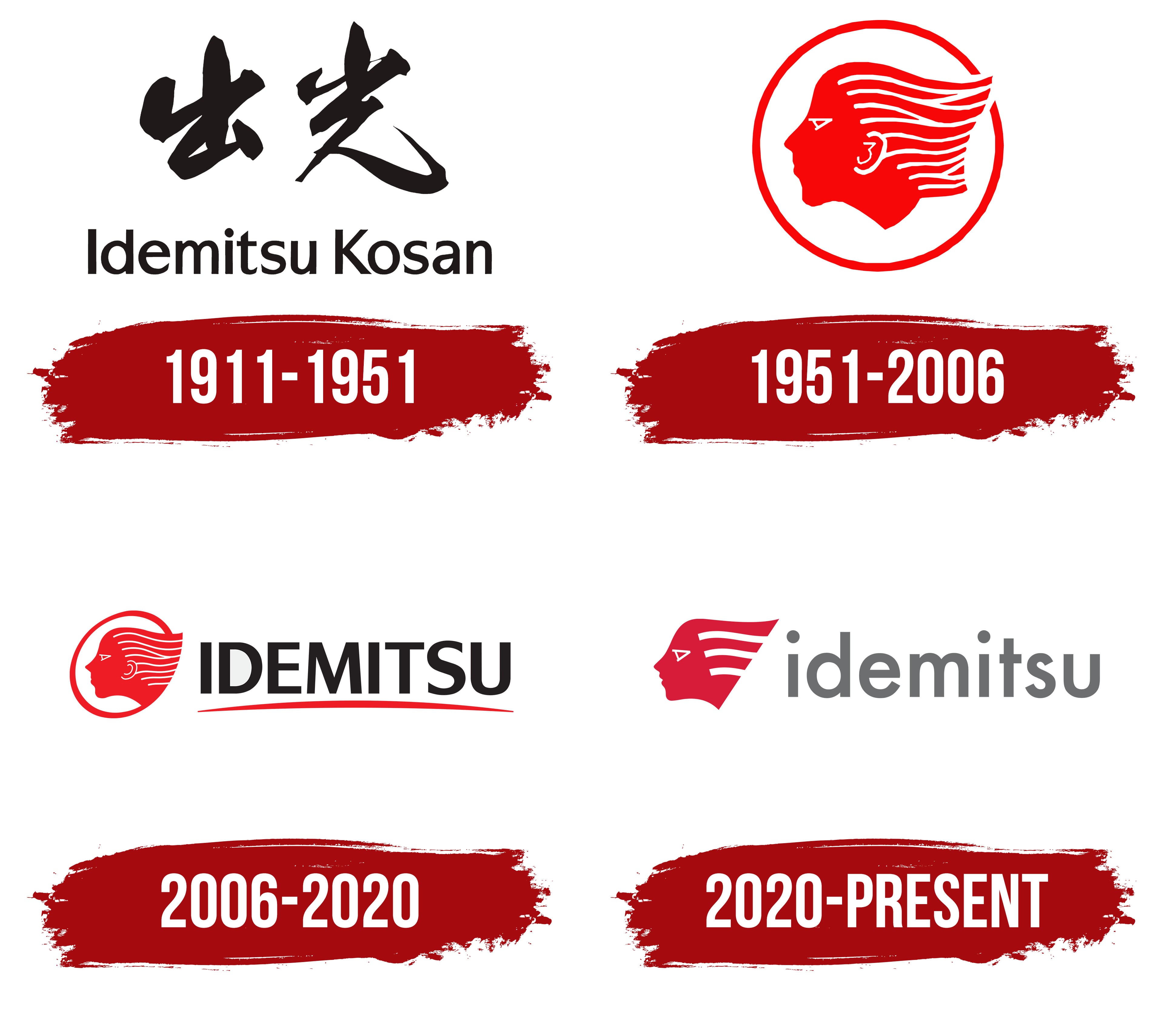
1911 – 1951
Idemitsu began on June 20, 1911, when Sazo Idemitsu founded Idemitsu Shokai in Moji. The company sold petroleum products and received the entrepreneur’s surname. The 2 characters 出光 represented the founder’s family name and served as the company’s shortened Japanese name.
The early identity used the calligraphic inscription 出光 rendered in ink. The characters had free contours, varying stroke thicknesses, and visible brushwork. The style maintained a connection with traditional Japanese writing and distinguished the name from uniform printed letters.
The logo consisted of 2 lines. Large muted black 出光 characters occupied the upper section. Line thickness varied throughout the strokes. The lower line contained the Latin name Idemitsu Kosan and explained the company name for international audiences.
In Idemitsu Kosan, the “I” and “K” were uppercase, while the other letters were lowercase. The name used a sans-serif typeface with straight lines, consistent stroke thickness, and restrained proportions. A shared color united the calligraphy and Latin signature in one composition.
The combined version dates from 1940. Idemitsu Kosan Co., Ltd. was established in that year. The 出光 calligraphy originated with the Idemitsu Shokai brand from 1911, while the lower line represented the corporate name introduced in 1940. Idemitsu Kosan merged with Idemitsu Shokai in 1947.
1951 – 2006

Idemitsu introduced a red profile of Apollo called the Apollo mark in 1951. The image came from classical mythology and was associated with the sun. In the company’s explanation, Apollo represented energy, ambitious goals, and future development.
The head appears in profile, facing left. A closed red ring surrounds the portrait. The facial outline includes a triangular eye, ear, nose, lips, and chin. Detailed rendering gave the image the features of a mythological figure.
The hair consists of numerous long horizontal lines. They begin near the head and extend toward the right edge of the circle, occupying most of its interior. Alternating bands form Apollo’s hairstyle and connect the portrait with the circular frame. Red unites the face, hair, and outer outline.
The Apollo mark appeared as Idemitsu expanded its fuel business. The company began producing Apollo Gasoline in 1952. After the product launch, Apollo’s profile appeared on fuel materials and gas stations. Red remained part of Idemitsu’s identity for decades.
2006 – 2020

In 2006, the Apollo mark was combined with the Idemitsu Kosan corporate name. Apollo’s profile occupied the left side of the horizontal logo, while the large IDEMITSU wordmark appeared on the right. A curved red line matching the emblem ran beneath the name.
The portrait retained its established foundation but received a simpler design. The number of bands in the hair was reduced, while the facial features became more geometric. Thin lines formed the nose and lips, a small triangle represented the eye, and the ear resembled a spiral. The head continued facing left.
The hair consisted of parallel wavy lines arranged horizontally. Their right ends crossed the frame and extended outside it. The circular outline became an oval that partially surrounded the head. On the right, the frame transitioned into an arrow-like extension.
IDEMITSU appeared in black uppercase letters. A bold upright sans-serif typeface gave all characters equal height and large dimensions. The company name became the primary part of the composition beside the Apollo mark.
The red stroke beneath the name began as a thin line on the left, widened near the center, and narrowed on the right. Its color matched Apollo’s profile and the oval frame. The line passed beneath IDEMITSU and connected the name with the emblem.
2020 – today
The merger of Idemitsu Kosan and Showa Shell Sekiyu created a shared corporate brand. Integration was completed in 2019 after Idemitsu acquired a stake in Showa Shell Sekiyu. Idemitsu introduced the new logo on June 19, 2020, and implementation began in July.
Apollo remained central to Idemitsu’s identity. The image originated with the sun god from Greco-Roman mythology. The company associated the Apollo icon with its principle of People-Centered Management, which placed people at the foundation of corporate management.
Apollo’s profile received a simplified geometric treatment while still facing left. An open head silhouette replaced the circular frame. The ear became a solid red area. The triangular eye, resembling a slanted letter “A,” carried over from previous versions. The elongated outline formed a wedge with a pointed end.
Three broad wavy bands replaced the numerous thin hairlines. They point to the right and pass through the rear section of the head. Within the red profile, the bands appear as white openings and divide the silhouette into several levels. The reduction in detail prepared the Apollo icon for different sizes, including corporate materials and apollostation signs.
The lowercase word idemitsu appears to the right of the profile. Gray rounded sans-serif letters replaced the black uppercase IDEMITSU wordmark. The new proportions aligned the name with the compact Apollo icon. Open space beneath the name replaced the former red stroke.
The company uses Emotional Red for the profile and gray for idemitsu. The corporate logo combines the Apollo icon with the lowercase wordmark. A separate profile version appears in the Apollostation network identity.