 Worley Logo PNG
Designing and maintaining industrial facilities involves working with factories, terminals, and power plants, where every system must be calculated and implemented with high precision. Such projects require engineering expertise, process coordination, and support at every stage. The Worley logo represents a company that provides engineering services for the energy, mining, and industrial sectors, including facility design, construction, and maintenance.
Worley was founded in 1971 in Sydney. Engineers John Grill, Steve Wholohan, and Eric Moses established it. The company was originally named Wholohan Grill & Partners. The organization specialized in designing facilities for Australia’s mining and energy industries. At that time, coal, iron ore, and gas production were expanding.
In 1987, the firm merged with the American company Worley Engineering, based in Houston. This created Worley Group with international operations. In 2002, the company held an IPO on the Australian Stock Exchange. After that, the company made a series of acquisitions, including Canadian AMEC Engineering and British Earth Tech.
In the 2010s, the company expanded its consulting and design services. Acquisitions included Aquenta Consulting and other firms. Following the collapse in oil prices in 2014–2016, Worley restructured and optimized its operations.
In 2018, the company acquired Jacobs Engineering’s ECR division for $3.3 billion. This nearly doubled its operations and made Worley one of the largest players in the global engineering industry.
Since 2019, the company has focused on the energy transition. It focuses mainly on renewable energy, hydrogen, and decarbonization. In 2021, Worley received contracts for green hydrogen and offshore wind projects. In 2022, orders in the oil and gas sector increased amid rising prices.
In 2023, the company implemented digital design technologies and artificial intelligence tools. In 2024, Worley won contracts to build ammonia and methanol production plants.
The company operates in more than 50 countries. It employs about 50,000 people and provides engineering and project management services across the energy, chemicals, infrastructure, and mining sectors.
Meaning and History
What is Worley?
An international engineering company headquartered in Sydney. It delivers the full project lifecycle, from design to decommissioning. The company employs more than 53,000 people working in energy, chemicals, mining, and infrastructure. It develops areas of renewable energy, hydrogen technologies, and environmental solutions. It provides engineering, procurement, construction management, digital transformation, automation, and asset management services. Partners include Shell, BP, Rio Tinto, BHP, Chevron, ExxonMobil, NVIDIA, and Dell Technologies.
2019 – 2023

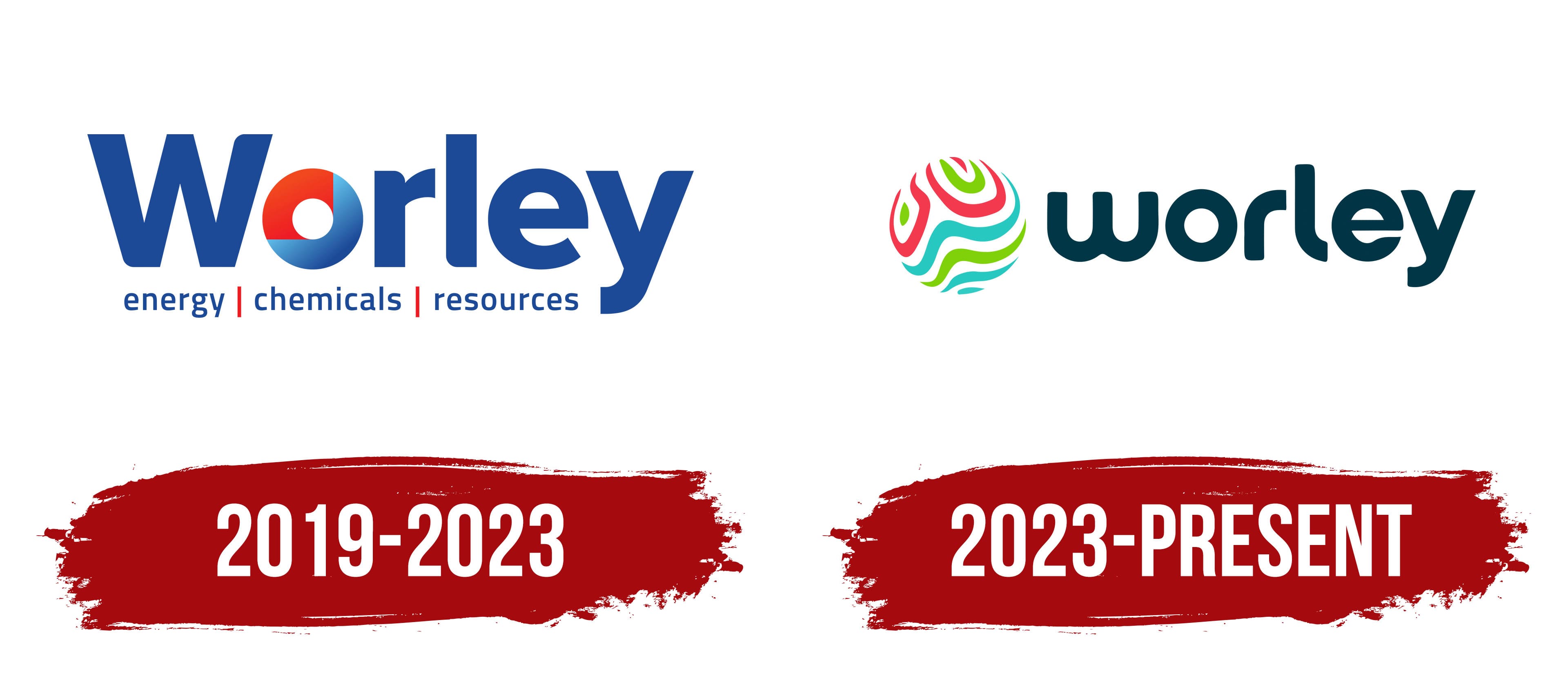
In October 2019, the company returned to the shorter Worley name following a major acquisition and an update to its corporate identity. It discontinued the WorleyParsons name, which had been used since 2002. The new logo featured a short wordmark, a colored circle replacing the letter “o,” and a lower line identifying the company’s main business areas.
The business began in Sydney in 1971. Engineer John Grill founded a small consulting company called Smith de Kantzow Wholohan Grill, which worked on industrial projects in Australia. The original name consisted of the last names of the founders and partners. Worley later became the primary name, taken from the last name of one of the company’s early executives. The WorleyParsons brand appeared following the 2002 merger with Parsons E&C Australia and combined the names of the two engineering companies.
The next stage began after the acquisition of Jacobs Engineering’s Energy, Chemicals and Resources division. Management shortened the group’s name in October 2019. The return to the historic name marked recognition and business expansion. The new identity combined the former name with the colors and typography of the acquired Jacobs ECR division. The line below the wordmark identified the company’s work in energy, chemicals, and natural resources.
The logo is based on a name with an uppercase “W” followed by lowercase letters. The blue sans-serif typeface has uniform stroke widths and rounded contours. It resembles Avenir Next or Museo Sans Rounded. The wordmark appears unified, while the main color accent replaces the letter “o.”
A circle divided into several colored sections replaces the standard letter. A red segment appears in the upper left. The remaining area transitions from light blue to a saturated blue. An arc and vertical and horizontal lines separate the sections. The circle forms part of the word while serving as a separate emblem.
The words energy, chemicals, and resources appear beneath the name. They use a thin blue sans-serif typeface. Short red vertical lines separate the three business areas. The lower line is smaller than the main wordmark and explains the group’s business profile following the 2019 transaction.
2023 – today
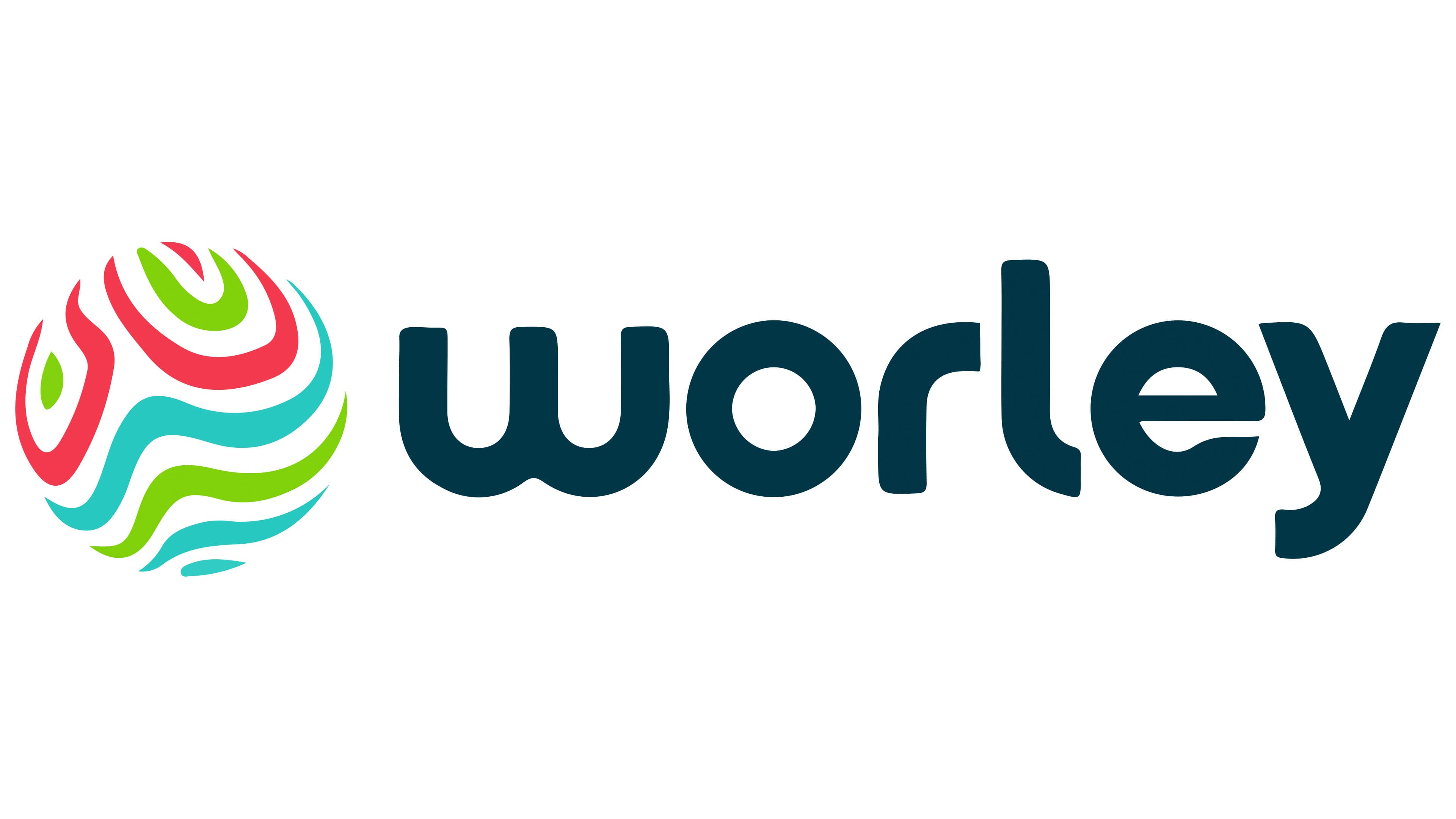
Worley introduced an updated identity on November 27, 2023. A system featuring rounded typography and a multicolored emblem replaced the previous dark blue wordmark. The redesign appeared with the platform “Delivering a more sustainable world.” The company connected the changes with its work on complex energy projects and the modernization of industrial infrastructure.
AFFINITY developed the project. The agency sought to represent the company’s modern business profile and show the connection between engineering and changes in the energy sector. A circular emblem and a softer treatment of the name replaced the former identity.
A globe-like circle appears on the left. Curved stripes run through its interior, forming a layered image. Their contours suggest the Earth’s surface, natural flows, and a map. White spaces separate the colored sections, making the inner structure visible.
Turquoise, lime green, and red stripes alternate within the circle. Green and turquoise occupy most of the area, while red creates bright accents. The lines are arranged freely and asymmetrically. The new color scheme differs from the previous identity, which used dark blue.
The lowercase word worley appears on the right. The sans-serif typeface consists of rounded forms with uniform stroke widths and resembles fonts from the VAG Rounded family. The wordmark uses a dark blue-green shade connected to the turquoise sections of the circle.
The logo uses a horizontal layout, with the circle on the left and the name on the right. In the 2019 version, the colored figure appeared within the word and replaced the letter “o.” After the update, the figure moved to a separate position, and the name became a single continuous wordmark. The energy, chemicals, and resources descriptor was discontinued, giving the logo a compact format for digital platforms, documents, signs, and other applications.