 Ingersoll Rand Logo PNG
Compressors, pumps, and pneumatic tools in industry operate under constant stress and harsh conditions. Such equipment is used in manufacturing, mining, and service workshops, where process continuity depends on its performance. The Ingersoll Rand logo represents a company that designs and manufactures industrial equipment for compressed air, fluid delivery, and equipment maintenance.
Ingersoll Rand traces its history to 1871, when Simon Ingersoll founded the Ingersoll Rock Drill Company in New York, which produced pneumatic drills. In 1905, it merged with the Rand Drill Company to become Ingersoll-Rand. The company specializes in producing compressors and industrial and construction tools.
At the beginning of the 20th century, the company developed a series of air compressors and pumps. They were used in the mining industry and in infrastructure construction. During World War II, Ingersoll-Rand supplied equipment to the U.S. Army. After the war, the company expanded its product line by adding industrial systems and bearings.
In the 1980s, the company entered the climate control business and acquired Trane for $ 900 million. In the 1990s, the portfolio included Club Car and Hussmann. In 2007, the company acquired Trane again. The deal was valued at $ 10.1 billion. After that, it became a leader in the HVAC market.
In 2013, the company sold its security systems division and began restructuring. In 2020, the company spun off its industrial segment into an independent company under the historic name Ingersoll Rand. The climate segment renamed itself Trane Technologies.
In the same year, Ingersoll Rand merged with Gardner Denver. The deal amounted to about $ 15 billion. From 2021 to 2023, the company acquired several industrial equipment manufacturers, including ILC Dover.
The company produces compressors, pumps, blowers, and vacuum systems. It serves clients in the industrial, energy, and healthcare sectors and remains a leading global supplier of industrial solutions.
Meaning and History
What is Ingersoll Rand?
An American industrial corporation formed after the merger of two engineering equipment manufacturers, it traces its history to a company that built drilling machines for aqueducts and tunnels under the Hudson River. Today, it is a leading producer of compressor systems, vacuum units, pumps, pneumatic tools, and lifting mechanisms in North America. It manages more than forty brands, including Gardner Denver, CompAir, Nash, Milton Roy, and ARO. After acquiring ILC Dover, the corporation entered the aerospace and pharmaceutical materials markets. About 21,000 employees work at facilities worldwide, serving the oil and gas, chemical, metallurgical, food, and energy industries.
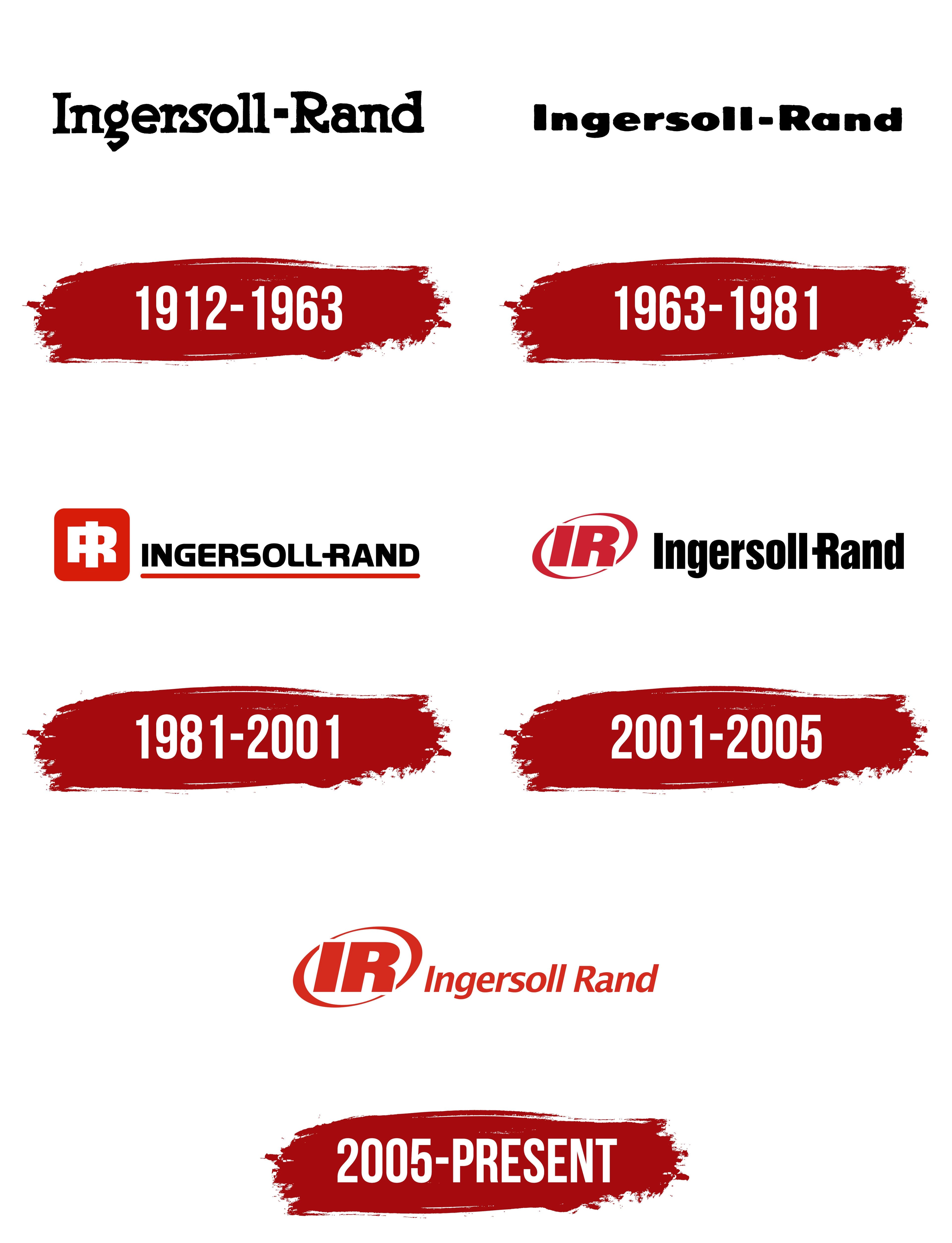
1912 – 1963

The company’s history began in 1871. Simon Ingersoll established Ingersoll Rock Drill Company after developing a steam-powered drilling machine. Rand Drill Company, associated with the Rand brothers, operated in the same industrial sector. Both businesses manufactured drilling equipment.
Ingersoll’s company merged with Sergeant Drill Company in 1888 and became Ingersoll-Sergeant Drill Company. Ingersoll-Sergeant and Rand Drill formed Ingersoll-Rand Company in 1905. The new name combined the Ingersoll and Rand surnames.
The early logo centered on the full Ingersoll-Rand name. The 2 surnames appeared on one line and communicated the history of the industrial merger. A short hyphen joined the founders’ names and divided the wordmark into equal sections.
The name used heavy dark slab-serif letters. Uppercase “I” and “R” letters marked the beginnings of the surnames, while the other characters were lowercase. A black hyphen occupied a small space between the 2 words with equal margins on both sides.
The letters had dense forms and traces of hand-cut construction. Large serifs increased the weight of the wordmark, while variations in the contours resembled early industrial typography. The heavy style corresponded with the company’s production of drilling equipment.
The spelling appeared shortly after Ingersoll-Rand Company was formed in 1905. Several versions were used during the first half of the 20th century. Letter proportions and typographic details changed, while the name, uppercase “I” and “R,” and hyphen remained.
1963 – 1981

Ingersoll-Rand updated its wordmark in 1963. The full name, based on the Ingersoll and Rand surnames, remained the foundation. Black and the hyphen continued in use. The redesign affected the letterforms, stroke thickness, and spacing.
The letters became shorter and received thicker lines. Spacing decreased, creating a dense horizontal wordmark. The hyphen continued to divide Ingersoll and Rand, preserving the structure of 2 family names.
The typeface received a heavy sans-serif style. Rounded contours replaced the prominent serifs of the previous version, while the counters became smaller. Uppercase “I” and “R” letters marked the beginning of each surname, with the remaining characters in lowercase. The combination of short height and thick lines gave the wordmark a substantial form.
The logo represented Ingersoll-Rand during the expansion of its industrial production. The company manufactured compressors, pumps, tools, drilling rigs, and equipment for various industries. The dense black name appeared on different types of machinery and represented the manufacturer’s corporate identity.
1981 – 2001

Large industrial equipment and small parts required different identification formats. The full Ingersoll-Rand name worked on documents and broad surfaces. At the same time, machinery housings, tools, and components needed a shorter mark. In 1981, the company introduced an IR monogram and made red the foundation of its new identity.
A scarlet square with rounded corners appeared on the left. Inside were intertwined white “I” and “R” letters. The vertical bar of the “I” passed through the heavy “R” and joined both characters into a compact figure. White openings preserved the monogram’s form at small sizes and allowed it to appear on equipment.
The black INGERSOLL-RAND name appeared on the right. Heavy uppercase letters used a sans-serif style. The hyphen continued to divide the two family names. The “R” in RAND received an additional horizontal line, creating a cross-shaped form.
A thin red line ran beneath the name. It began under the opening “I” and ended near the “D,” matching the monogram block. The full name appeared in corporate materials and on large applications. The intertwined IR served as a short mark for machines, tools, and components.
2001 – 2005

DMCD developed a new Ingersoll Rand logo in 2000. An oval frame replaced the square monogram block from 1981. The IR letters and red color remained, while IngersollRand became one word. The Ingersoll and Rand surnames continued recalling the 2 businesses that formed the company.
The monogram appeared on the left. The uppercase “I” and “R” used a heavy sans-serif style with a slight rightward slant. Both were red and joined into a compact group. The monogram could appear independently from the full corporate signature.
Two red arcs with thickened ends surrounded IR. One appeared above the letters, while the other curved beneath them. Both arcs left openings on their ends. The arcs created an elongated oval with open edges and gave the logo horizontal proportions.
The black IngersollRand wordmark appeared on the right in Helvetica Inserat. Uppercase “I” and “R” letters marked the beginnings of the surnames, while the remaining characters were lowercase. Heavy sans-serif lettering and tight spacing united the two names on one line. The “R” retained the additional crossbar from the previous version.
2005 – today
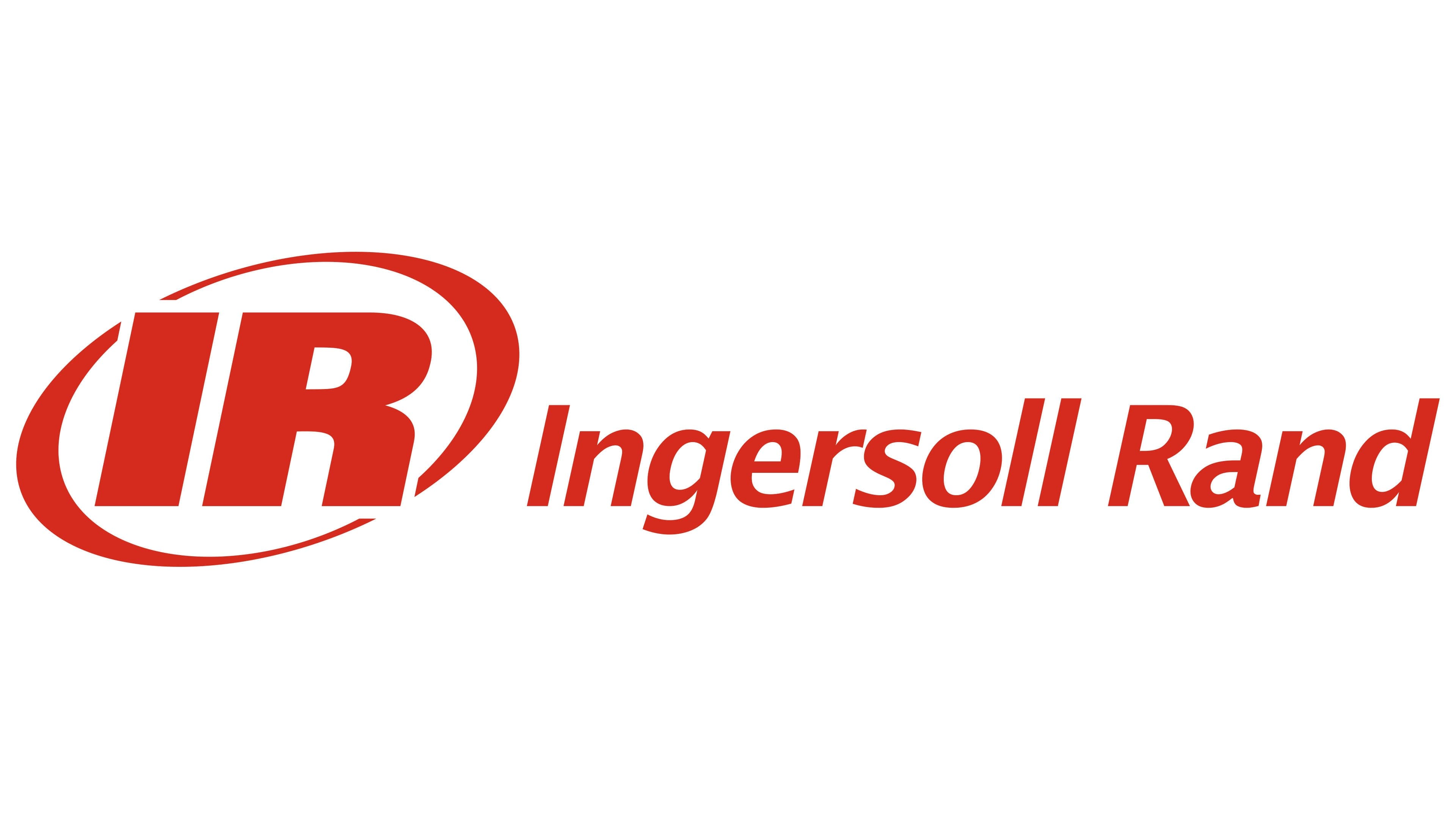
By the mid-2000s, the Ingersoll Rand portfolio included more than 200 brands. The company appointed Siegel+Gale to unite them. The agency developed the shared brand platform “Inspiring Progress” and connected the numerous divisions with it. Red became the primary corporate color, while the oval IR monogram remained the lead element.
The emblem was based on the initials of the historical name. The “I” appeared on the left, with the heavy “R” on the right. The two letters joined into a compact design. An elongated oval crossed the monogram diagonally. The outline and letters used a light red shade. A white version with the same proportions appeared against dark surfaces.
The red Ingersoll Rand name appeared on the right. A space separated the 2 surnames. Uppercase “I” and “R” letters marked their beginnings, while the other characters were lowercase. The wordmark used Lucida Sans Demi Italic with sans-serif forms and a rightward slant. The strokes became thinner, the contours softened, and a simpler form replaced the extended crossbar of the “R.”
Ingersoll-Rand plc combined with Gardner Denver on February 29, 2020. Following the transaction, the new company became Ingersoll Rand Inc. The climate business became Trane Technologies. Ingersoll Rand Inc. continued using the red IR monogram and the Ingersoll Rand wordmark.