


 Jacksonville Jumbo Shrimp Logo PNG
The Jacksonville Jumbo Shrimp logo reflects the baseball club’s regional identity. Its graphic design emphasizes the team’s originality and emotional appeal, with an orientation toward entertainment and fan engagement.
Professional baseball in Jacksonville began in 1904 with the Jacksonville Jays of the South Atlantic League. During the following decades, local clubs used several names, including the Tarpons, Roses, Scouts, and Indians. In 1953, the Jacksonville Braves featured young Hank Aaron, whose season came during the gradual racial integration of professional baseball in the American South.
The team became the Jacksonville Suns in 1962 and won the International League championship in 1968 before the franchise briefly moved to Norfolk. Baseball returned in 1970, when the Suns entered the Double-A Southern League. In the 1980s, the club played as the Jacksonville Expos under an affiliation with the Montreal Expos. Future MLB pitcher Randy Johnson was among the prospects developed in Jacksonville.
A later partnership with the Miami Marlins produced three Southern League championships. In 2016, owner Ken Babby replaced the Suns’ name with Jacksonville Jumbo Shrimp, referring to the coastal region’s shrimping industry. The unusual identity brought national media coverage and increased merchandise sales outside the local market.
In 2021, Jacksonville moved to Triple-A, becoming Florida’s only club at that level. Devin Smeltzer later threw the first no-hitter of the franchise’s modern era, adding another milestone to a baseball history extending across changing names, leagues, owners, and affiliations. The promotion kept the club’s established role in Florida’s player-development network.
Meaning and History
What is Jacksonville Jumbo Shrimp?
It is a Triple-A baseball team from Jacksonville, Florida, competing in the International League as an affiliate of the Miami Marlins. The team previously played as the Jacksonville Suns, later renaming itself after the popular local seafood dish, jumbo shrimp. Its home stadium is on the St. Johns River waterfront. The club is renowned for its creative game promotions, which feature regional seafood dishes and local craft beer.
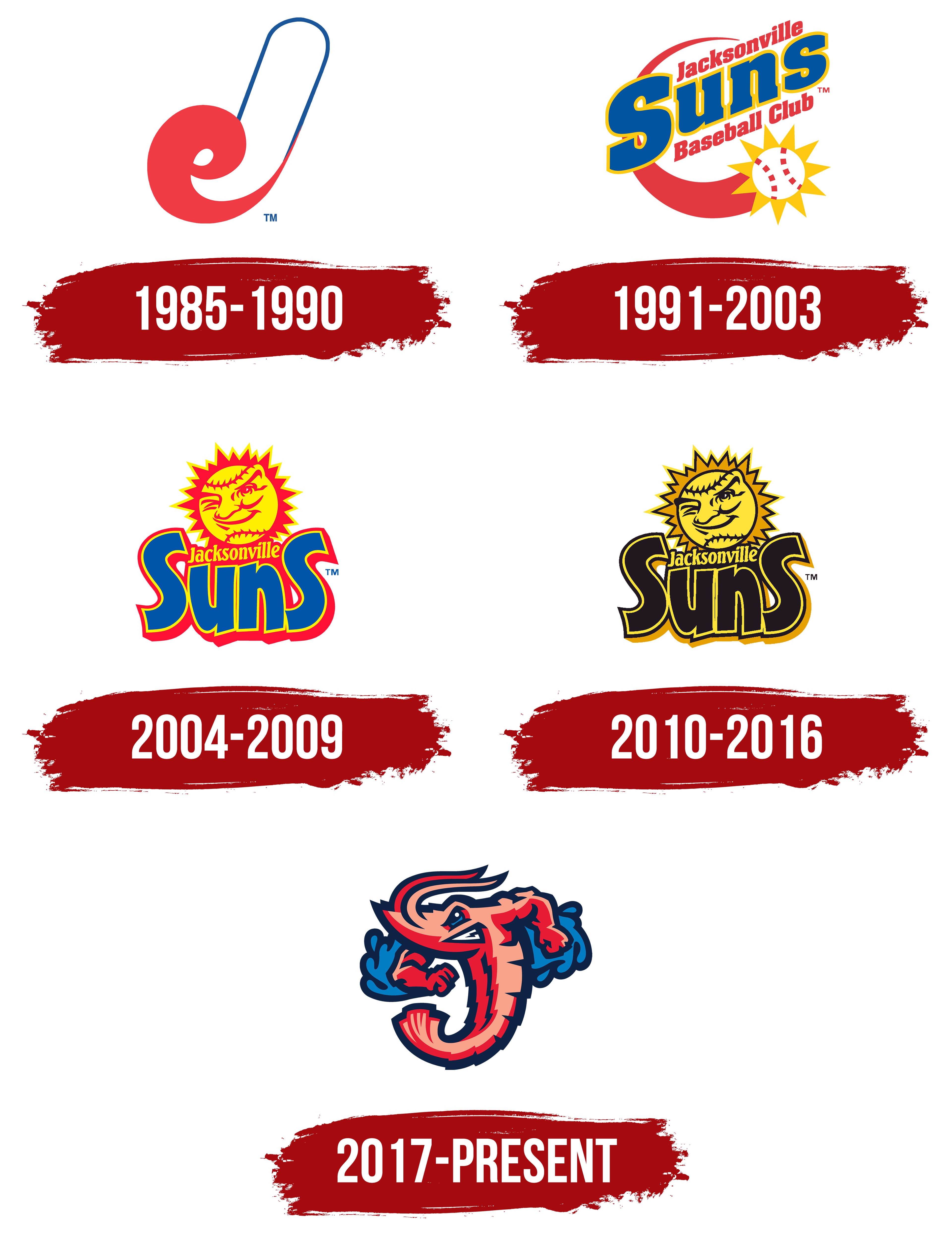
1985 – 1990

The Jacksonville Expos logo from the team’s tenure as the AA affiliate of the Montreal Expos reflects the club’s kinship with the parent franchise. After the team was renamed from the Jacksonville Suns to the Jacksonville Expos, it became necessary to create a mark whose visual concept would reflect the main team’s corporate identity.
The design placed its main emphasis on stylizing the letter symbols, combining the initials of the team name with those of its parent club. The elements “J” and “e” are visually merged into a single form, where the red “e” is organically integrated into the curves of the larger “J.” This solution is similar to the approach previously used in the Montreal Expos identity. In this way, the designers achieved unity and visual resemblance, emphasizing the team’s status as part of a larger organization.
The color scheme repeats the original Montreal Expos shades: dark blue, red, and white, highlighting visual continuity between the clubs and symbolizing the team’s belonging to a unified system.
The letters were created as individual glyph drawings, specifically designed for the logo, enhancing the perception of the team brand’s uniqueness and individuality.
1991 – 2003
.
During this period, the Jacksonville Suns baseball club used a logo presented to the public after the partnership with the Montreal Expos ended. The team’s name, which returned to the historic “Suns,” was reflected in the logo design through a visual metaphor of the sun integrated with the baseball theme.
The logo reflects the symbolism of the team’s name by depicting a stylized sun, with a baseball at its center, surrounded by sun rays. The lower part of the composition is complemented by a red semicircular element resembling an orbital line or the visual perception of the solar disk on the horizon.
A central role is given to the text block, presented in three lines with a clear perceptual hierarchy. The main word “Suns” is depicted in large, diagonally oriented blue letters outlined in a bright yellow shade. The supporting inscriptions, “Jacksonville” and “Baseball Club,” placed above and below, are executed in a smaller, italic, red font, emphasizing the focus on the main name.
The central word uses large, rounded glyphs with a massive character and decorative thickening of the contour lines. The letters have minor stylistic detailing, giving them solidity and visual stability. The additional inscriptions “Jacksonville” and “Baseball Club” are presented in italics, with a dynamic slant and restrained lines, creating a balanced contrast with the logo’s main word.
2004 – 2009

The opening of the new Baseball Grounds of Jacksonville stadium in 2004 led to a large-scale rebranding of the Jacksonville Suns, accompanied by a radical update of the team’s visual identity.
The core of the composition was a stylized sun figure, designed as a face with distinct baseball features, highlighted by a mischievous wink. Metaphorically, this image reflected the sports club’s playful, spirited character, visually linking the team’s identity to the atmosphere of baseball games.
The logo’s palette was built from shades of red, yellow, and blue. Yellow is associated with the solar theme and emphasizes the team’s name. At the same time, red and blue complement the image, strengthening the emotional perception and sense of dynamism.
The logo’s typography centers on the word “Suns,” rendered with decorative glyphs of rounded, massive forms, enclosed by an outline border. The word construction uses a variation in letter sizes: the outer characters are rendered in a larger scale. In contrast, the two central letters are smaller, allowing the word “Jacksonville” to be placed in a neat italic font between the end characters. This method of integrating the inscriptions creates a balanced composition, enhancing the perception of the club’s full name.
2010 – 2016

The introduction of an updated Jacksonville Suns logo was accompanied by a change in the color palette to enhance visual contrast and solidify the club’s image. The previous red and blue accents gave way to stricter tones of black, gold, and yellow, which enhanced the perception of the sun as anthropomorphic, while retaining its characteristic mischievous wink.
The appearance of the sun remained the same: a round shape with jagged rays, a face stylized as a baseball. However, the transition to a monochrome, golden palette highlighted status and confidence, bringing the brand’s perception closer to classic sports traditions.
The typographic part of the emblem remained unchanged: the characteristic contrasting font with shadows and outlines remained intact. The inscription “Jacksonville,” placed between the outer letters of the team’s name, was preserved in its original form, demonstrating design continuity and recognition of the compositional structure.
The new logo was introduced as part of a broader concept to update the club’s image. Corresponding changes in player uniforms accompanied it. The previous red-and-blue game attire gave way to uniforms dominated by black and gold, visually complementing the new stage in the team’s brand development.
2017 – today
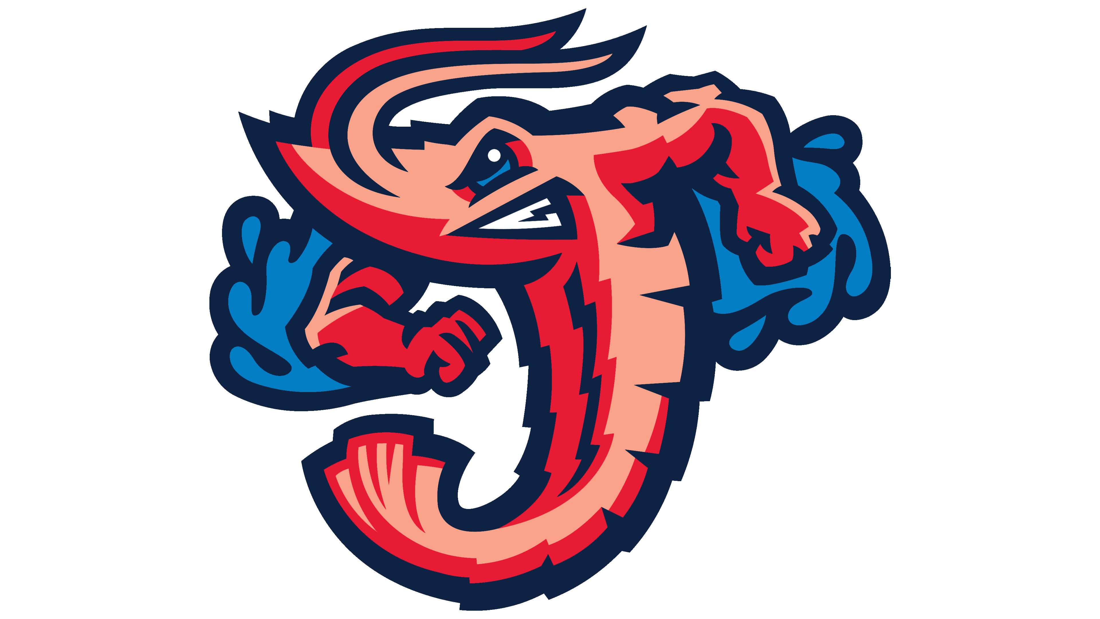
The ironic name Jacksonville Jumbo Shrimp, introduced in November 2016, required a radical rethinking of the team’s previous image. The studio Brandiose, specializing in eccentric and memorable Minor League Baseball brands, was brought in to create the new identity. The designers’ task was to visualize the deliberately contradictory combination “Jumbo Shrimp,” an oxymoron that unites the concepts of large and small, as well as strength and weakness. This became the foundation of the new club identity.
The key figure of the logo is a shrimp stylized as the letter “J,” serving as the city of Jacksonville’s letter symbol. It is depicted in an unusually combative, tense pose, with bent arms and clenched fists. The character’s personality contradicts the soft, defenseless perception of a shrimp as a sea creature, creating a powerful, emotionally contrasting image.
The palette is based on bright marine shades, including saturated gradients of red, pink, and blue, emphasizing the mascot’s natural origin and Jacksonville’s regional identity, known in the US as “The River City.” The figure is complemented by stylized waves, reflecting the city’s inseparable connection with water and reinforcing the image’s authenticity.
The club’s management explained that the primary objective of the new design was to alter the team’s perception, engage fans more actively, and increase the club’s commercial potential. Through the unusual and humorous perception of the image, Jacksonville Jumbo Shrimp managed to broaden the brand’s popularity, increasing merchandise sales and recognition beyond its region.
