 Kering Logo PNG
Gucci, Saint Laurent, Balenciaga, and Bottega Veneta are part of a single group that manages the development and commercial operations of these fashion houses. This work includes brand management, collection strategy, resource allocation, and international market expansion. The Kering logo belongs to a French holding company that brings together luxury brands and coordinates their global activities.
Kering traces its origins to 1963. That year, François Pinault founded a timber business in Brittany. Over time, the business expanded to include producing and distributing building materials. In 1988, Pinault created the holding company Pinault SA. It included retail and trading businesses such as CFAO and Conforama.
In the 1990s, the company entered luxury retail. It first acquired a stake in the Printemps department stores. Later, it purchased the Gucci Group for about $ 3 billion. The 1999 acquisition of Gucci became a turning point in the holding’s development. After that, the focus shifted to the high fashion segment. In the following years, the group added the brands Yves Saint Laurent, Bottega Veneta, Balenciaga, Alexander McQueen, and Brioni.
In 2005, François-Henri Pinault took control of the company. In 2007, it acquired a controlling stake in Puma. In 2013, the organization rebranded as Kering.
In the 2010s, Kering strengthened its position in the fashion industry. Under creative director Alessandro Michele, Gucci became the main growth driver. By 2018, sales reached approximately 8 billion euros. In 2021, the holding invested in developing digital channels and online platforms.
In 2022, Gucci’s growth slowed. Alessandro Michele left his position as creative director. Sabato De Sarno replaced him. The new designer’s first collection, presented in 2023, received mixed reviews. In 2024, Gucci’s sales declined by about 20 percent. Kering’s stock price fell 40 percent from its peak.
The company remains a leading player in the global luxury market. Its portfolio includes the brands Gucci, Saint Laurent, Bottega Veneta, Balenciaga, Alexander McQueen, and Brioni. The Pinault family retains control of Kering through the Artémis holding.
Meaning and History
What is Kering?
An international luxury holding company that manages the brands Gucci, Saint Laurent, Bottega Veneta, Balenciaga, Alexander McQueen, Brioni, Pomellato, Boucheron, and others. It specializes in premium clothing, footwear, and jewelry, and has discontinued its perfume division. The network includes more than 1,500 boutiques in 40 countries.
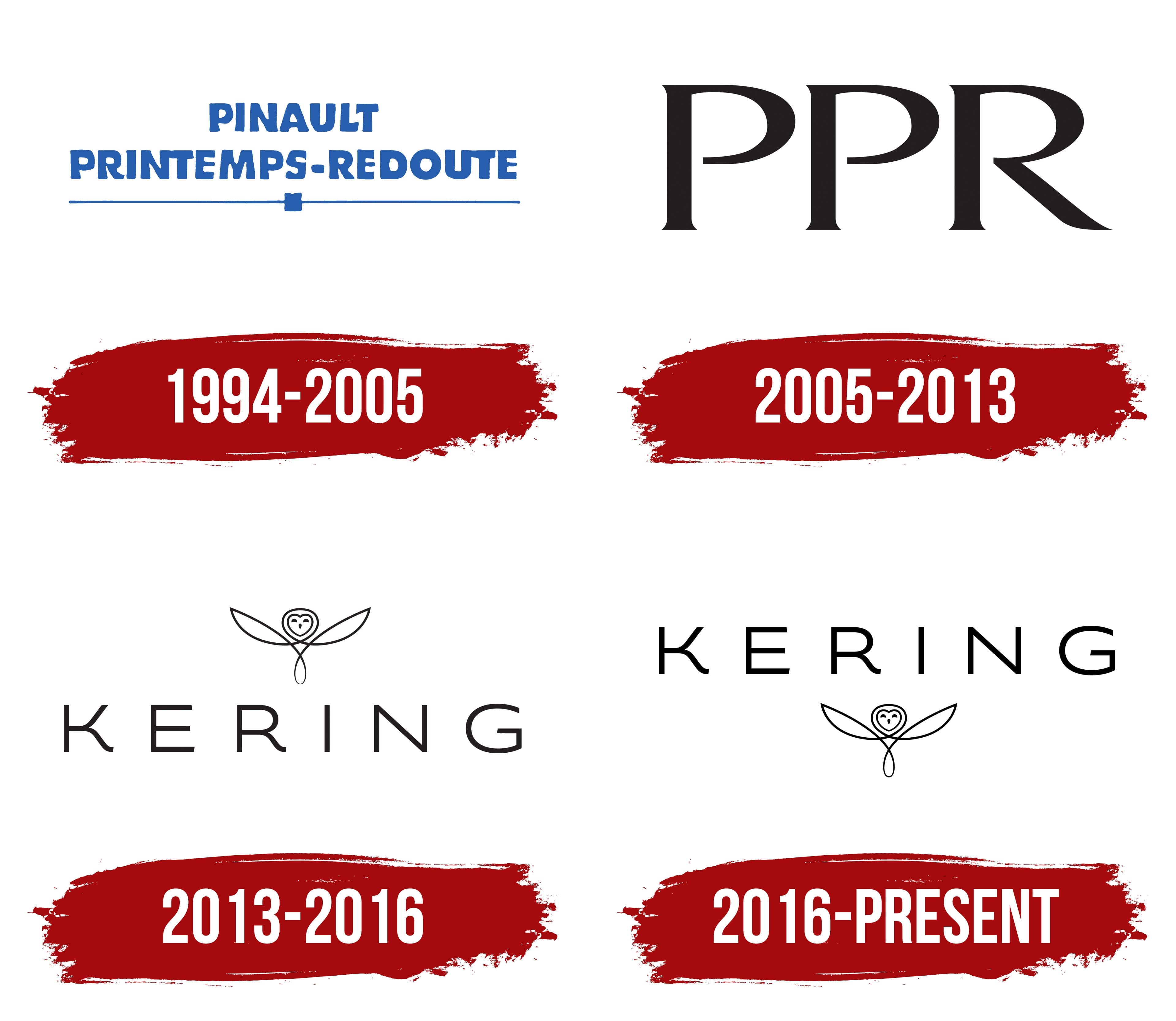
1994 – 2005
Before adopting the Kering name, the group was known as Pinault-Printemps-Redoute. The company’s history began in Rennes in 1962, when 26-year-old François Pinault established a timber trading business. Pinault Group was listed on the Paris Stock Exchange in 1988 and began expanding its retail operations. After acquiring Printemps and an interest in La Redoute, the group adopted a new name in 1994. It combined François Pinault’s last name with the names of two major retail holdings.
The logo consisted of two lines. “PINAULT” appeared on top, with “PRINTEMPS-REDOUTE” below it. All three words were written in bright blue uppercase letters. The large characters had a heavy decorative style, solid fills, and softly irregular outlines. The two-line arrangement reduced the overall width and allowed the long corporate name to fit into a compact format.
A thin blue line ran beneath the lettering. A small square in the same color divided the line into two sections at the center. The line formed the logo’s lower boundary and balanced the large lines of text. The composition relied on typography, blue coloring, and the sequential arrangement of the three parts of the corporate name.
The business structure began changing in the early 2000s. The group shifted its focus from distribution to luxury houses. The transition was accompanied by investments in Gucci Group and continued portfolio expansion. Pinault-Printemps-Redoute remained the corporate name during this period, so the blue logo continued to appear in the group’s materials.
2005 – 2013
In 2005, the long Pinault-Printemps-Redoute name was replaced by the abbreviation “PPR.” It consisted of the first letters of Pinault, Printemps, and Redoute. The thin line and square from the previous logo were removed, leaving a composition built around a single black wordmark.
The renaming accompanied another restructuring of the business. François-Henri Pinault became head of the group in the same year. By then, the company owned nearly all of Gucci Group and was reducing its presence in traditional retail. The abbreviated name suited the revised structure and brought the holdings together under one corporate identity.
The logo featured the uppercase letters “P,” “P,” and “R” in a single horizontal line. The large, black serif characters were slightly elongated. Thick strokes were combined with thin connecting lines. Serifs finished the vertical and curved sections of the letters. Both “P” characters had the same form, followed by an “R” with a diagonal leg.
An open white background surrounded the abbreviation, which served as both the company name and its emblem. PPR represented the parent group in communications with investors, partners, and portfolio companies. The short wordmark remained in use as the business continued its transition toward the luxury sector.
2013 – 2016
By 2013, PPR’s business portfolio had changed considerably. Printemps had been sold in 2006, La Redoute was being prepared for sale, and luxury and lifestyle brands had become the group’s primary holdings. François-Henri Pinault introduced the Kering name and its updated identity on March 22, 2013. The legal name change took effect on June 18.
The name Kering brought together several associations. The Breton word “ker” means “home” or “place of residence” and refers to the Pinault family’s roots. Kering is also phonetically similar to the English word “caring.” The group connected the pronunciation with care for its brands, employees, partners, and the environment. The “-ing” ending gave the name an international form.
The project included the name, logo, corporate identity, and the slogan “Empowering Imagination.” Dragon Rouge handled the brand positioning and slogan. Havas Lifestyle developed the name, emblem, and overall identity. TBWA\Corporate supported the launch campaign. Reza Bassiri, creative director at Euro RSCG C&O (later known as Havas Worldwide Paris), created the owl. Typographer Julien Denez developed the lettering.
The emblem depicted an owl with outstretched wings. Thin black lines formed a symmetrical silhouette with long pointed tips. The head had a heart-shaped outline containing two rounded eyes and a small triangular beak. Beneath the head, intersecting lines formed a loop. The illustration used fine strokes and white negative space.
The company associated the owl with wisdom and protection. The bird represented the parent group guiding and supporting its fashion houses. Its symmetry conveyed cooperation among the divisions, while the face shape continued the theme of care embedded in Kering’s pronunciation.
The word “KERING” appeared below the owl. The thin geometric letters were uppercase, sans serif, and widely spaced. The identity used black and white. Launch materials associated black with the nighttime world and white with open space for ideas. Under the Kering name, the group represented Gucci, Bottega Veneta, Saint Laurent, Balenciaga, and other luxury houses.
2016 – today
In the 2016 version, the Kering name moved to the top, and the owl was placed below it. The vertical arrangement appears in a trademark registration claiming priority from November 7, 2016. The new order changed the viewing sequence, placing the group’s name before its corporate emblem.
“KERING” retained its uppercase letters, thin strokes, and wide spacing. The word extended horizontally and became wider than the owl. The bird was reduced in size relative to the lettering, making the lower portion of the logo more compact.
The owl retained the structure introduced in 2013. A heart-shaped outline formed the head, with symmetrical wings extending to both sides. Thin lines crossed beneath the face and created an enclosed lower section. Despite the smaller dimensions, the original proportions and primary details remained intact.
The vertical logo accompanied Kering’s continued concentration on the luxury sector. The owl represented the parent group, while the fashion houses in its portfolio retained their individual logos. The corporate mark identified the Kering level while preserving the separate identities of Gucci, Bottega Veneta, Saint Laurent, Balenciaga, and other brands.
In 2023, the group marked 10 years since adopting the Kering name. For the anniversary project, the company returned to the owl image introduced during the 2013 renaming.