


 Kone Corporation Logo PNG
Movement within buildings relies on elevators, escalators, and automatic doors, which facilitate the flow of people between levels. These systems operate in residential complexes, office centers, and transportation hubs, where precise coordination and stable operation of mechanisms are essential. The Kone Corporation logo represents a company that develops, installs, and maintains equipment for vertical and horizontal movement within buildings.
Engineer Harald Herlin founded Kone Corporation in 1910 in Helsinki. In its early years, the company supplied electric motors and industrial equipment. In 1918, Kone installed its first elevator in a hotel in the center of the Finnish capital. After that, the firm focused on elevators.
In the early 1920s, the company began producing elevators. In 1924, escalator production began. The first one was installed in the Stockmann department store and operated for several decades. After World War II, active growth began. In the 1950s, Kone entered the Scandinavian markets. In 1967, the company opened a factory in Sweden.
The company expanded further by acquiring foreign enterprises. In 1975, Kone acquired the American Armor Elevator. In 1979, it added the Australian Westinghouse Elevator. In the 1980s, the company made deals in the United Kingdom and Germany.
In 1994, the company purchased Montgomery Elevator for $ 245 million, strengthening its position in the United States. In 1996, the company introduced the MonoSpace, the first machine-room-less elevator.
In the 2000s, the company expanded its operations in North America and Asia. During this period, it acquired the Canadian company Partek and the Indian company Express Lifts. In 2013, Kone introduced UltraRope, a line of carbon-fiber ropes designed for ultra-high-rise buildings.
The European Union did not approve an attempt to acquire Thyssenkrupp Elevator in 2016. In 2020, the company moved its headquarters to Espoo. Today, it operates in 60 countries and services more than one million elevators and escalators worldwide.
Meaning and History
What is Kone Corporation?
A Finnish engineering company and one of the leaders in the production of elevators, escalators, and automatic doors. It operates in more than one hundred countries, providing design, installation, maintenance, and modernization services. Its main innovation is the MonoSpace elevator, which has no machine room and features EcoDisc electric motors that reduce energy consumption. The product range includes models for various building types, with capacities up to 5 tons and speeds up to 3 meters per second. The company collaborates with Toshiba Elevator and Building Systems and manages the Chinese enterprise GiantKONE, which installs about 15,000 systems per year.
1910 – 1948
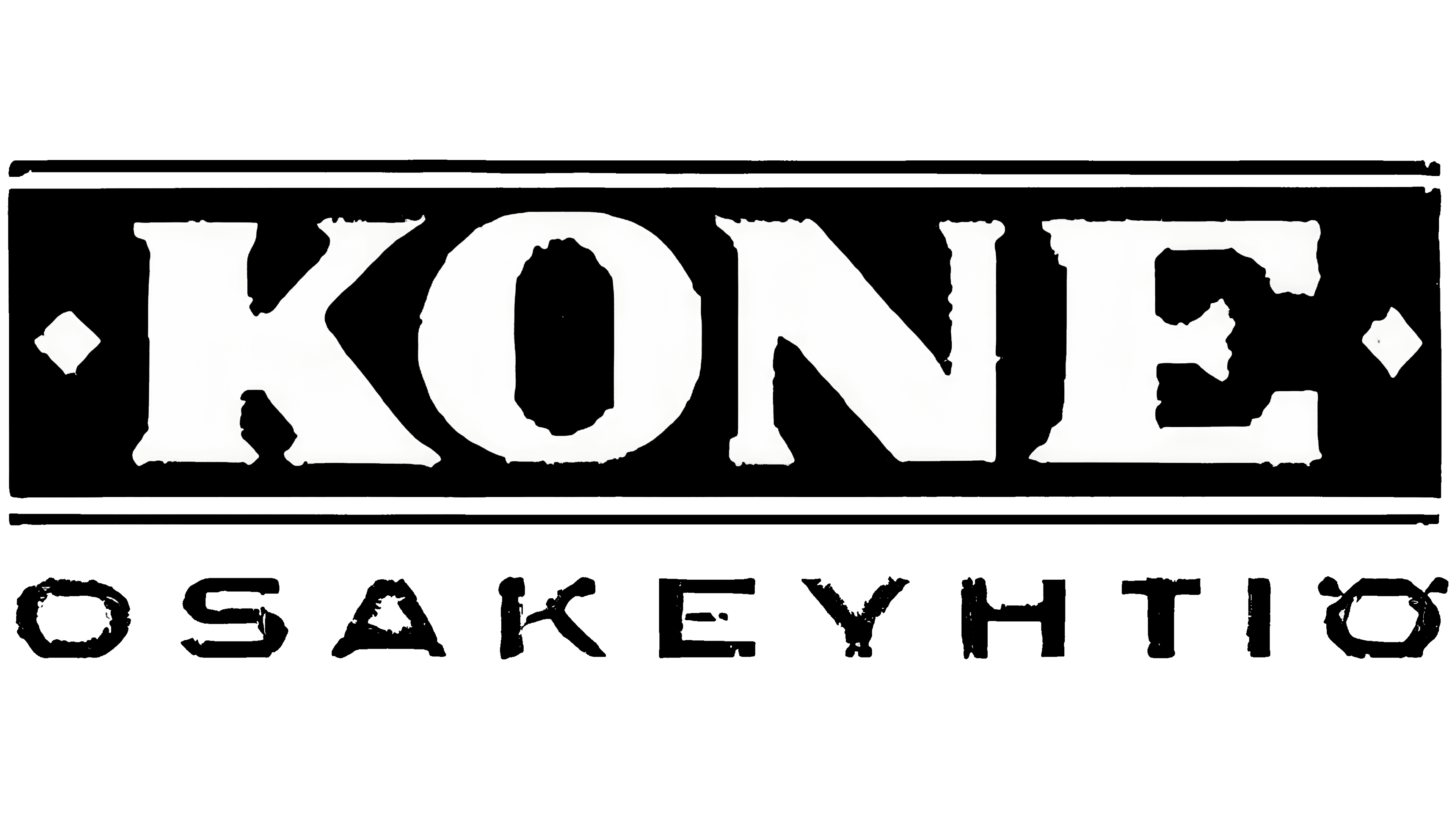
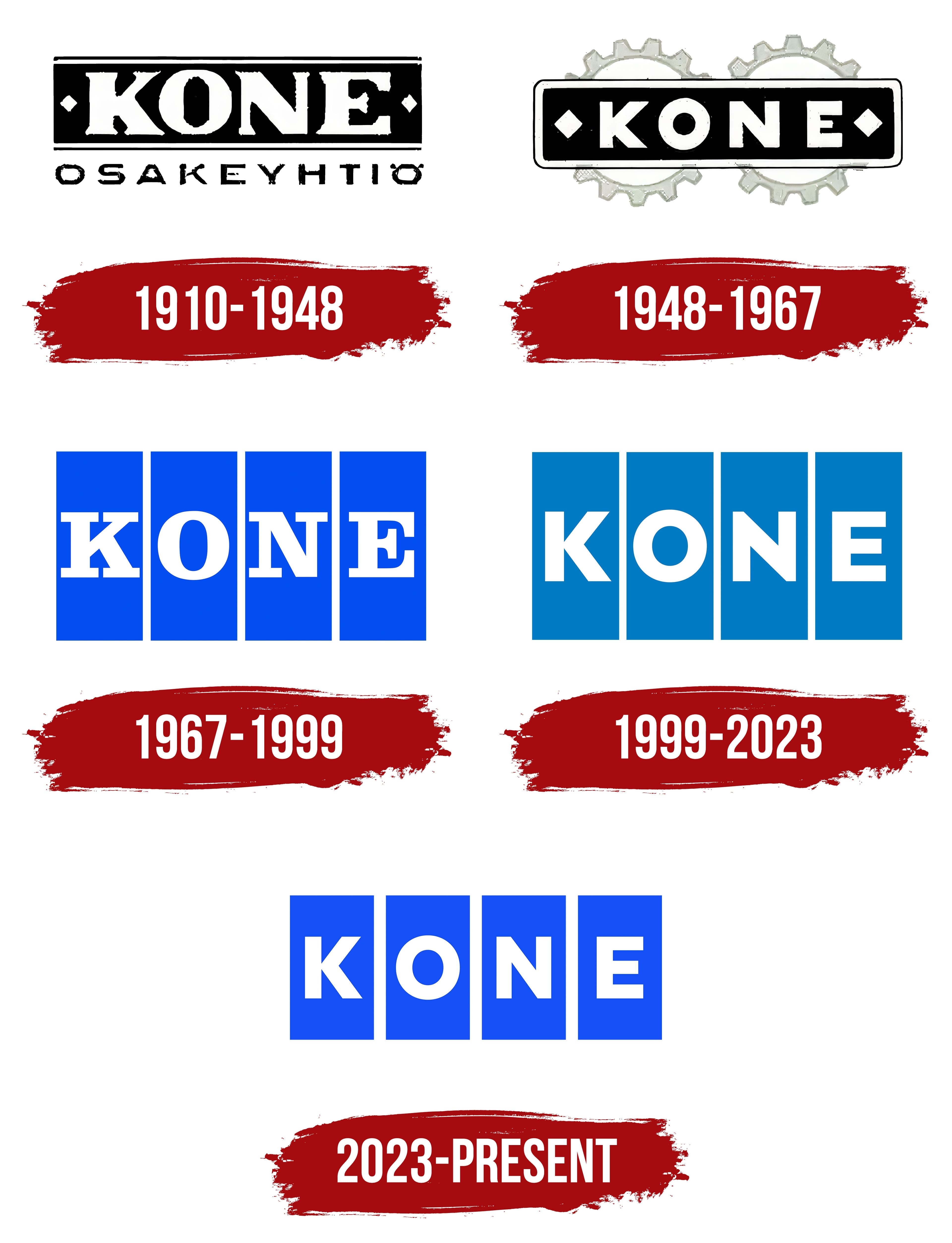
The first KONE emblem appeared in 1910 after the Tarmo workshop was registered under a new name. The word “OSAKEYHTIÖ,” meaning “joint-stock company” in Finnish, appeared beneath the large KONE inscription. The logo combined the company’s trade name with a description of its legal structure.
The composition had two levels. An elongated black panel containing the white word “KONE” occupied the upper section. The large uppercase letters featured heavy strokes and substantial slab serifs associated with Egyptian-style typefaces. The dense wordmark filled nearly the entire dark field. Two small diamond-shaped figures appeared near the edges, separating the name from the panel’s boundaries.
A separate line containing “OSAKEYHTIÖ” appeared below in narrow black letters. Its lighter style distinguished the KONE brand name from the company’s legal-status description. White letters against a black background, paired with the thin lower line, formed a compact two-level composition.
The company was established in Helsinki on October 27, 1910. The Tarmo workshop had operated since 1908. After its registration under the KONE name, it repaired and sold used Strömberg electric motors. The business also imported elevators made by the Swedish company Graham Brothers. The Finnish word “kone” means “machine” or “mechanism,” matching the company’s engineering focus.
Elevators assembled from KONE-produced components began appearing in the Helsinki area in 1918. Harald Herlin joined the company later. He bought it from Strömberg in 1924, became chairman of the board, and became the principal owner.
1948 – 1967
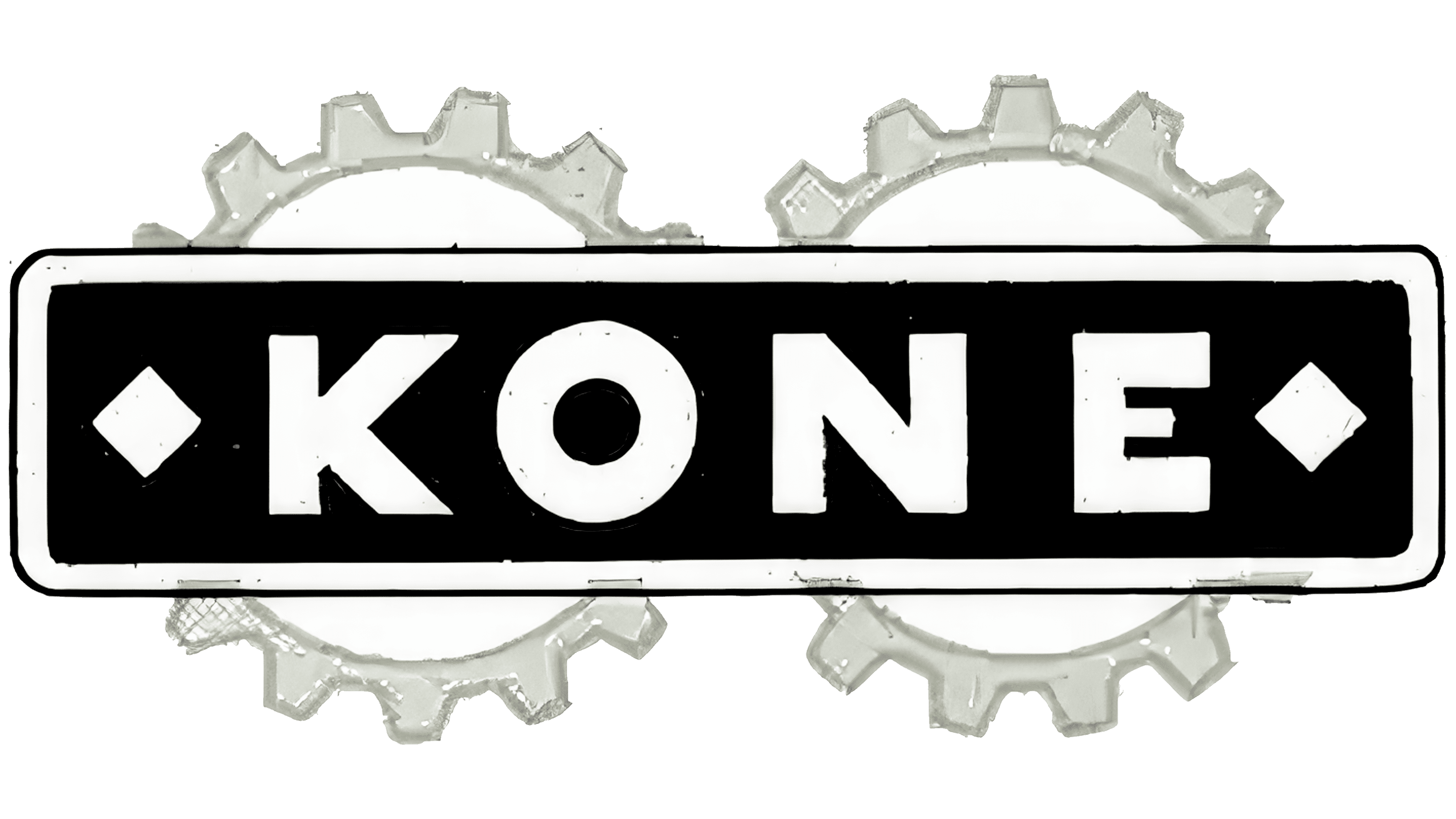
Two cogwheels appeared in the KONE emblem in 1948. By then, the company’s production program included elevators, industrial cranes, and lifting equipment. According to KONE materials, the mechanical components reflected the growth of its engineering operations. The company name retained the primary position, while the gears added an image associated with industrial manufacturing. The update coincided with postwar production growth and equipment deliveries made under Finland’s reparations obligations to the Soviet Union.
An elongated black plaque with rounded corners formed the logo’s base. A thin light border followed the outer edge. The large white word “KONE” occupied the foreground. Small diamond-shaped figures appeared to the left of the “K” and to the right of the “E.” They carried over from the previous version, connecting the updated identity with the company’s early emblem.
The name treatment became simpler. Heavy geometric sans-serif letters replaced the decorative serifs. Stroke width remained nearly uniform throughout. The four characters formed a dense horizontal line and occupied most of the black field. The white wordmark stood apart from the dark background and remained the composition’s dominant element.
Two large, equal-sized cogwheels appeared behind the plaque. Their translucent gray silhouettes were partially covered by the main block and resembled a machine’s background mechanism. The upper teeth extended above the plaque, while the lower teeth projected below it, increasing the logo’s height. The panel covered the central parts of the wheels and left open space around the letters. The arrangement connected the KONE name with industrial equipment and allowed one emblem to represent several manufacturing divisions.
1967 – 1999
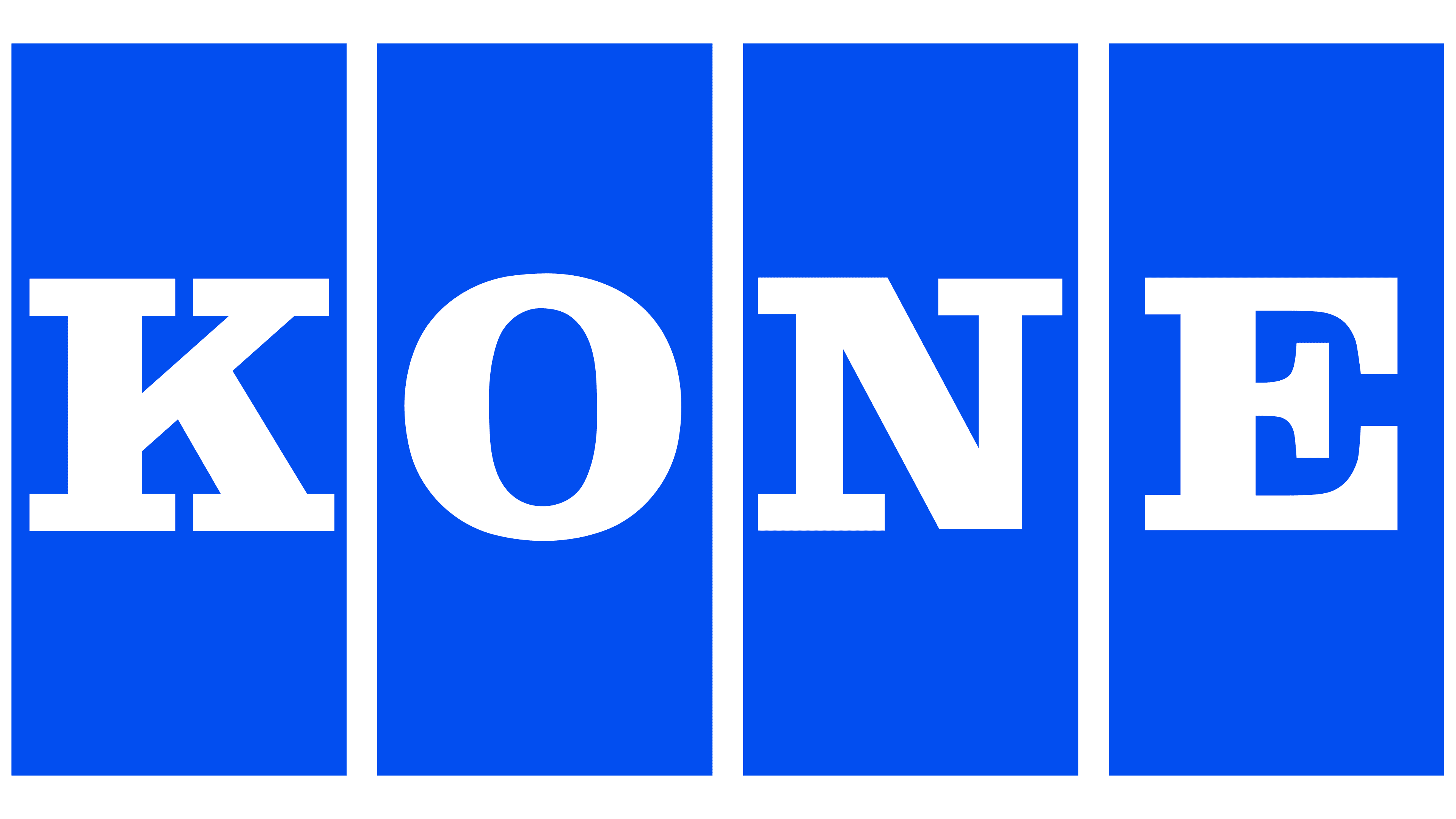
Four blue modules replaced the gear emblem in 1967. KONE was preparing to expand beyond Finland and needed a unified corporate mark for international markets. The compact, modular composition suited elevators, industrial equipment, factories, and other production facilities.
The KONE name was divided among four equal vertical modules in bright blue. Each contained one white uppercase letter, “K,” “O,” “N,” or “E.” Narrow white gaps separated the blue fields. At the same time, their equal dimensions preserved the wordmark’s unity. The earlier emblem’s external border, gears, side diamonds, and decorative details were removed in favor of a more compact system.
The letters had a serif structure with heavy slab terminals. Their forms resembled Clarendon and other Slab Serif typefaces. The white characters occupied most of the blue fields and formed a horizontal line. Each module contained one letter, while equal heights and consistent spacing brought the four sections together as the word KONE.
KONE materials associate the upright modules with elevator cars and shafts. Their tall proportions resemble the facades of multistory buildings equipped with the company’s lifting systems. Blue and white referred to the Finnish flag and the company’s country of origin. The name established corporate ownership, while the modular structure reflected KONE’s engineering business.
The update accompanied the company’s growth during the 1960s. KONE opened a new elevator factory in Hyvinkää. Its 1968 acquisition of ASEA’s elevator business made the company one of Northern Europe’s leading elevator manufacturers. The four-block system remained in use for many years. It became the foundation for later versions of the corporate identity.
1999 – 2023
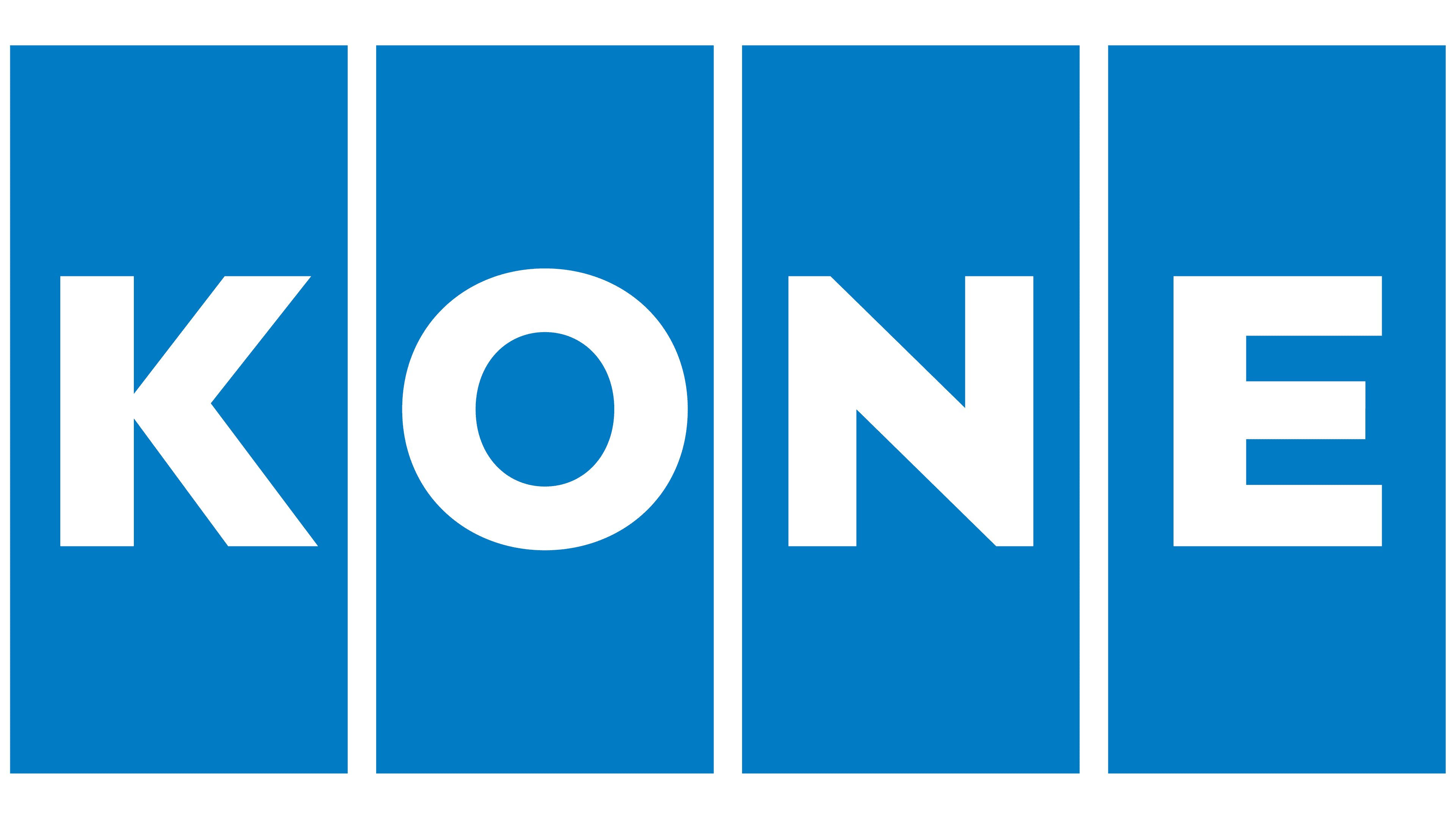
By the end of the 20th century, KONE operated in numerous national markets. It acquired Westinghouse’s European elevator business in 1974 and added the American company Montgomery Elevator in 1994. KONE expanded across Asia at the same time and combined its elevator and escalator operations into an international business. The company’s growth led to an updated corporate signature that retained the modular structure introduced in 1967.
The 1999 redesign changed the color and letterforms. Four equal vertical blocks continued the established structure, while a lighter blue replaced the previous bright blue. Narrow white gaps remained between the modules. White letters “K,” “O,” “N,” and “E” appeared inside them. The name remained divided into four equal sections forming a horizontal line.
The primary changes affected the letters inside the blue fields. Narrow sans-serif characters replaced the heavy slab-serif forms. The letters became lighter, and the round “O” received a simpler geometric construction. Consistent stroke width and similar proportions gave the wordmark a uniform appearance. The type resembled Helvetica Bold and Franklin Gothic. The comparison refers only to the visible forms because the original information does not identify the exact typeface.
KONE’s corporate materials presented the updated lettering as contemporary typography for an international business. The four vertical fields, blue-and-white combination, and established letter sequence maintained continuity with the 1967 version. The lighter blue and sans-serif typography accompanied a new period of development following the group’s expansion across Europe, North America, and Asia.
2023 – today
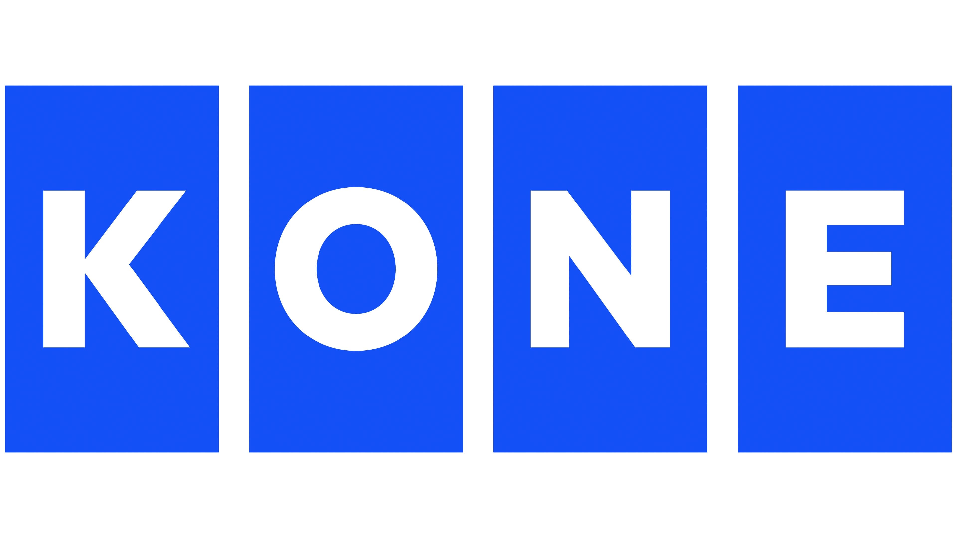
KONE updated its logo in 2023 while preserving the four-part structure. Changes affected the proportions, color, and positioning of the letters. The company introduced the version as part of a global rebranding program developed for digital channels, modular interfaces, and a flexible identity system. It was KONE’s most extensive brand transformation in approximately 20 years.
The group’s restructuring in the early 2000s left the previous mark in use. KONE acquired Partek in 2002 and established a major cargo-handling division. That part of the business later became the independent company Cargotec. The elevator and escalator operations retained the KONE Corporation name, along with the 1999 logo featuring four blue blocks.
KONE and the international consulting company Manyone developed the rebranding. The agency conducted research and workshops with employees from several countries. The team prepared the brand positioning, overall identity system, and guidelines for digital applications. KONE Global Head of Brand Experience Annika Payne led the project on the company’s side. KONE Corporation holds the legal and public authorship of the logo.
The composition retained four vertical blocks containing the letters “K,” “O,” “N,” and “E.” A vivid, saturated blue replaced the lighter shade used since 1999. The fields became smaller, and the white letters occupied less space within the modules. Manyone adjusted the letter proportions and spacing between the sections. The identity was limited to the KONE name and four blue blocks.
The historic structure introduced in 1967 remained part of the new system. Revised dimensions adapted the logo for screens, digital interfaces, and physical applications. Manyone incorporated it into a global brand system centered on urban life and the theme “People Flow.” The phrase refers to KONE’s work with elevators and escalators.
Danish studio Unmute developed the audio identity in collaboration with Manyone. The team created a sonic logo and a set of musical components for different brand touchpoints. Three ideas formed the basis of the audio system. They were “sense of life,” “sense of flow,” and “sense of trust.”