


 Kyrie Irving Logo PNG
The Kyrie Irving logo is truly impressive and aesthetically appealing, though it is quite complex in design. It is perfectly drawn from a geometric perspective, making you want to examine it repeatedly. Every detail is executed with precision, giving the logo a high level of presentability. It fully matches the name Kyrie Andrew Irving, a renowned basketball player with an outstanding reputation in the sports world. He has achieved victories and success through difficult trials and a challenging journey.
At first glance, the logo may appear to be a hieroglyph or symbol consisting of just one letter. However, upon closer inspection, new aspects of this identity emerge. It quickly becomes clear that two letters are visible on the white background, not just one, and each is presented in a unique and unconventional form. These letters gradually reveal themselves, giving the logo layers and adding depth to its visual perception.
Kyrie Irving’s signature brand began in 2011, when the Cleveland Cavaliers selected him with the first pick in the NBA draft. In the same year, he signed his first contract with Nike. During his early seasons, Irving wore several basketball models without a personal line, while his rising profile and on-court results strengthened the case for a signature release.
The Kyrie 1 debuted in December 2014 with a low profile, strong traction and firm foot support. Kyrie 2 followed in 2015 with a rounded sole designed for sharp cuts. The 2016 version improved cushioning and lockdown, while the 2017 model gained wider use among professional players and casual buyers. Later releases kept the focus on quick changes of direction and court grip.
Limited editions referenced Irving’s interests, including Friends and SpongeBob SquarePants. In 2018, the line introduced Air Zoom Turbo for added responsiveness. Kyrie 6 arrived in 2019 with improved support, cushioning and third-eye references. The 2020 model used a new traction pattern, and Kyrie Infinity debuted in 2021 with added comfort and foot support.
The range later expanded into T-shirts, shorts, socks and accessories. At the same time, marketing continued to use Irving’s playing style and public image. By 2023, it had become one of the company’s most recognised basketball collections. Statements made by Irving in late 2022 ended the partnership, and development of a new model was suspended.
Meaning and History
What is Kyrie Irving?
This is an NBA superstar, a point guard known for his ability to finish at the rim with thrilling drives that break through defenses. With his signature crossover and knack for making game-winning shots, he has become a fan favorite and a nightmare for opponents. Off the court, he is known for his enigmatic and outspoken personality and interest in intellectual pursuits. His collaboration with Nike resulted in a popular collection of signature sneakers that combined fashion with cutting-edge technology, reflecting his unique style of play.
Before 2014

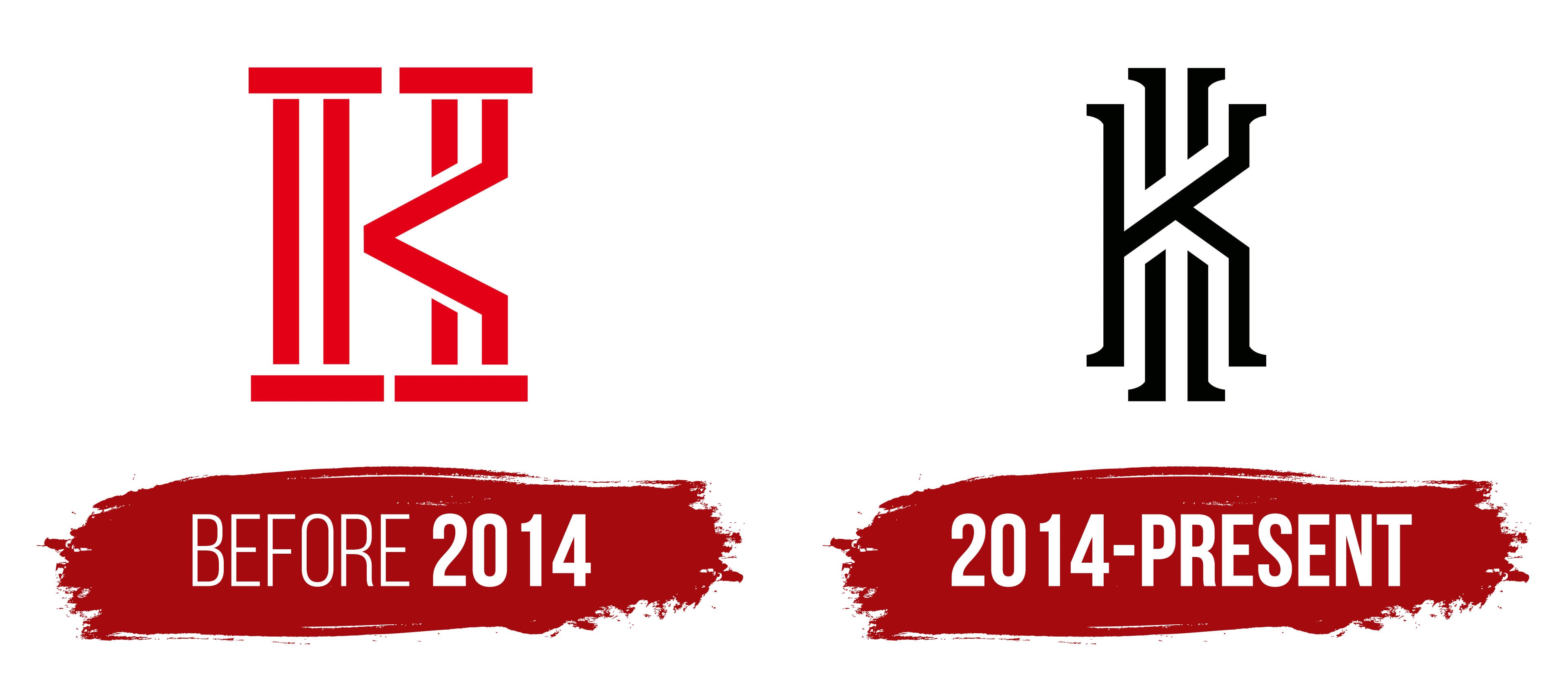
Initially, basketball players had an emblem that represented their unique style. Still, with each new success in his career, the likelihood of collaborations with well-known sports apparel and footwear brands grew. Therefore, it was only natural that, during his partnership with Kyrie, Nike developed a new signature logo for him. This logo, created in collaboration with Nike, became an enhanced version of the original emblem, reflecting Kyrie’s athletic achievements and personal identity.
However, the charm of the first identity cannot go unnoticed; despite its simplicity, it had a powerful visual impact. The foundation of this emblem was the capital letter “K,” which stood out prominently against the white background. Its unique depiction remained highly legible, yet the multilayered design made the emblem complex for the untrained eye. Many saw elements of an English hieroglyph in this unusually shaped letter, while some tried to decipher the lines’ meanings and connections. The logo was undeniably memorable and consistently attracted public attention.
Massive lines and arrows harmoniously united in the single letter “K” created a stately and majestic composition. The emblem’s scale was emphasized by its structure of more than ten vertical and horizontal strokes, forming a unified whole.
2014 – today
In 2014, designers developed a unique identity for Kyrie Andrew Irving at Nike’s request. As before, the foundation of the new logo remained the letter “K,” but it is now combined with the letter “I” in a unified graphic union. The main goal of creating this emblem was to make it easily recognizable and original while strengthening its connection to the famous basketball player’s name and the branded footwear released under it.
The letters in the logo combine beauty and precision, creating harmony between form and content. The color palette was changed to a classic one: a black background and white letters create a Yin-and-Yang effect, symbolizing the balance of opposites. The letter “K” dominates in the foreground, while “I” recedes into the background. However, upon closer examination, it becomes clear that both letters form a unified whole. This dynamic gives the symbol a unique brightness and individuality. At the same time, the letter “K” remains an independent element that exists on its own, while the letter “I” is perceived as being constructed from separate parts.
The logo also evokes associations with ancient English hieroglyphs, enhancing its uniqueness. Thus, the individuality of the original logo naturally transitioned into its new incarnation, maintaining a connection to the past while acquiring a more modern, original appearance.