


 Liverpool Victoria Logo PNG
The Liverpool Victoria logo embodies reliability and stability, which is especially important in the financial services sector. The emblem’s symbolic imagery emphasizes the importance of a trusting relationship between the insurance company and its clients, whose interests it protects.
Liverpool Victoria began in 1843, when a group of businessmen created the Liverpool Independent Legal Victoria Burial Society. Based in a small office on Stanley Street, it offered working-class families a way to cover funeral costs. During the 1850s, the society added savings plans and life insurance, broadening its customer base and financial activity.
Geographic expansion followed in 1889 with offices beyond Liverpool and Manchester. By the early 20th century, the organization had become one of Britain’s largest mutual insurers. It moved into a new Liverpool headquarters in 1914. Through the 1920s and 1930s, it added accident cover and pension products, while continuing operations during both world wars.
After 1945, the company modernized its systems, adopted new technology, and expanded its nationwide agency network. The 1996 acquisition of Frizzell Group strengthened its general insurance business. In 2001, Liverpool Victoria shortened its public name to LV=, and the purchase of motor insurer Tomorrow followed in 2007.
A proposed £530 million sale to Bain Capital was announced in December 2020, threatening the company’s mutual status. Members rejected the offer in December 2021, and chairman Alan Cook resigned. During 2022 and 2023, LV= reviewed its strategy, invested in automation and customer support, appointed new leadership, expanded pension and financial products, and continued charitable and community projects while remaining an independent mutual insurer.
Meaning and History
What is Liverpool Victoria?
This well-known insurance company in the United Kingdom started as a small burial society and later grew into a significant player in the financial services sector. This mutual company is owned by its members, not shareholders. It offers various insurance products, including investment and pension plans, as well as home, car, pet, and travel insurance. The company has earned a reputation for its competitive pricing, extensive coverage, and active community support through various partnership programs and charitable initiatives.
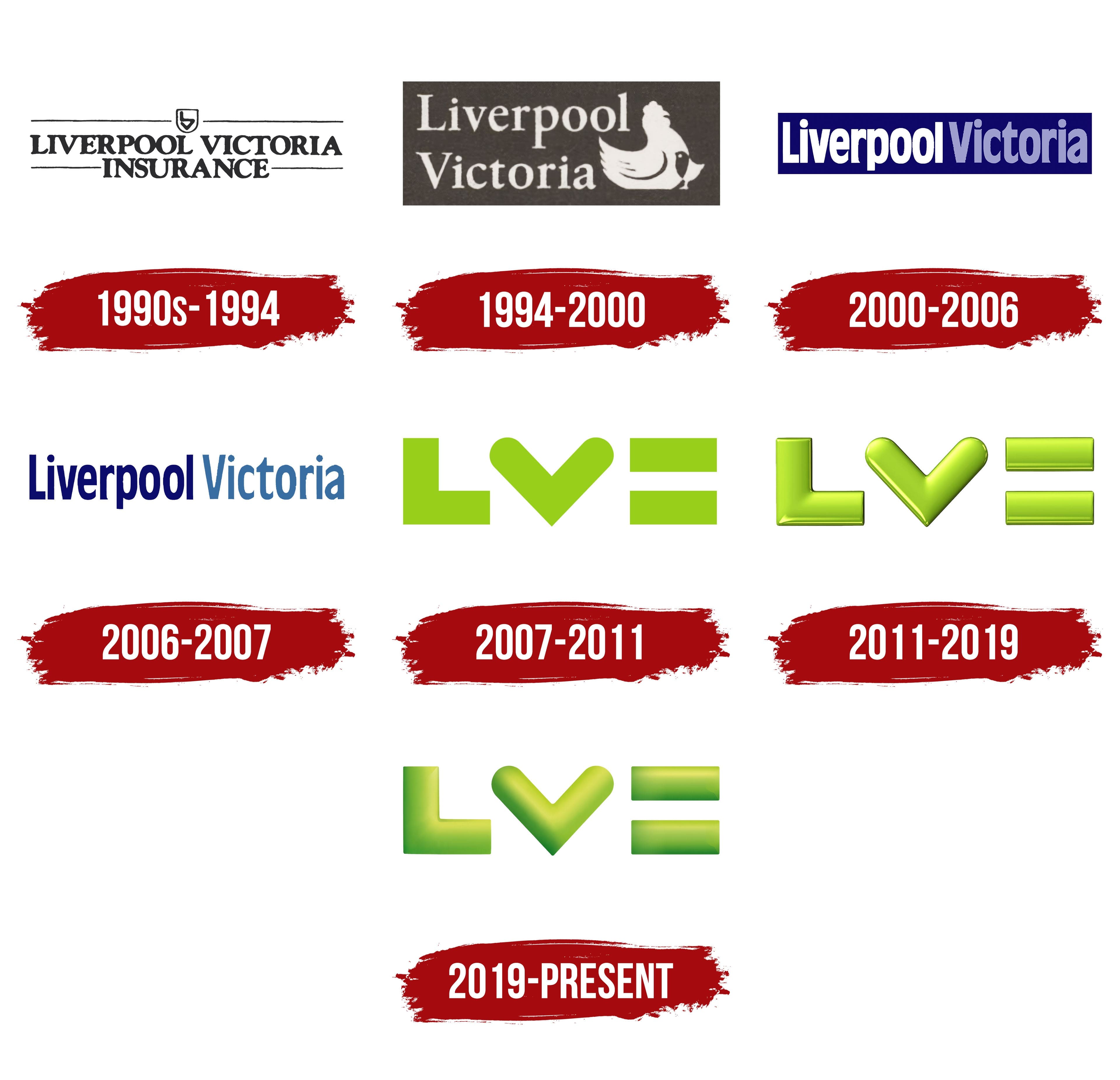
1990s – 1994
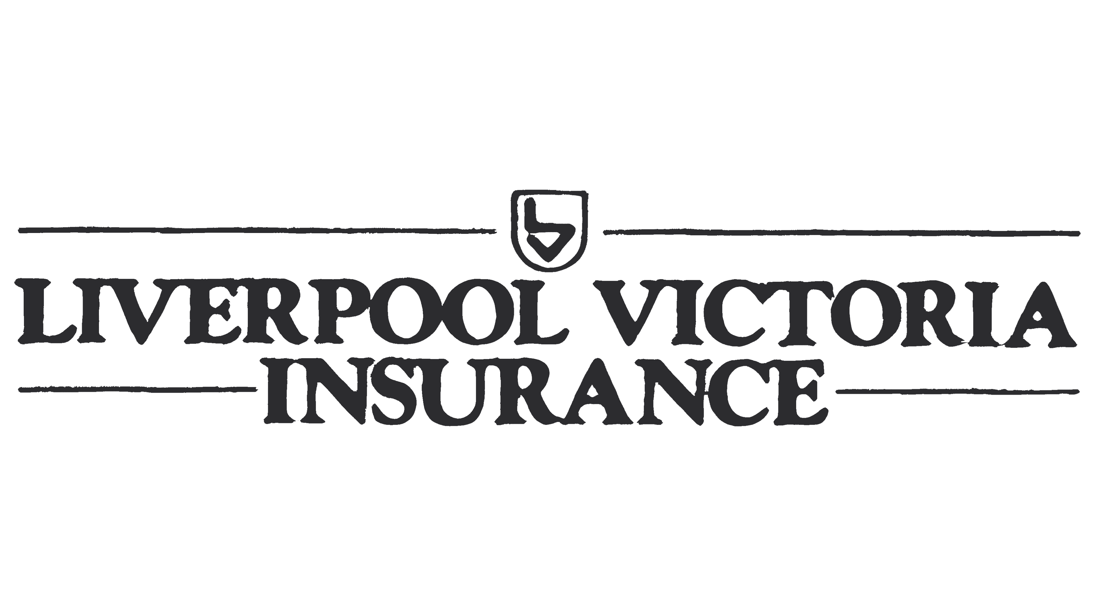
This is the simplest and most minimalist Liverpool Victoria logo, as it was created before the insurance company decided to “play up” to clients to gain their favor. It features the brand name in black, written in a single line with very narrow letter spacing. The font looks contradictory, appearing strict due to the capital glyphs while seeming soft because of the rounded corners. The long serifs add a sense of dynamism that emphasizes the company’s drive to act.
The word “INSURANCE,” positioned at the bottom and centered, uses a similar font. It serves an informational purpose, indicating the organization’s field of activity to attract new clients. Both parts of the inscription are surrounded by thin horizontal lines, creating a sense of symmetry and order. Although the frame lacks fragments, it still gives the logo a more official and solid appearance. Four stripes visually highlight the company name, emphasizing its importance.
The upper lines draw attention to the emblem depicted between them. It consists of a small quadrangular shield with a rounded base and a monogram formed from “L” and “V.” The letters connect, resembling an inverted flag. This design element represents the brand’s rich history, as monograms often symbolize high social status. The shield, in turn, evokes associations with protection and safety, aligning with the insurance company’s goals.
The logo combines only two colors: black and white. This strict combination reflects how seriously Liverpool Victoria approaches customer service. The monochrome palette unites the stripes, monogram, and inscription, creating a sense of unity.
1994 – 2000
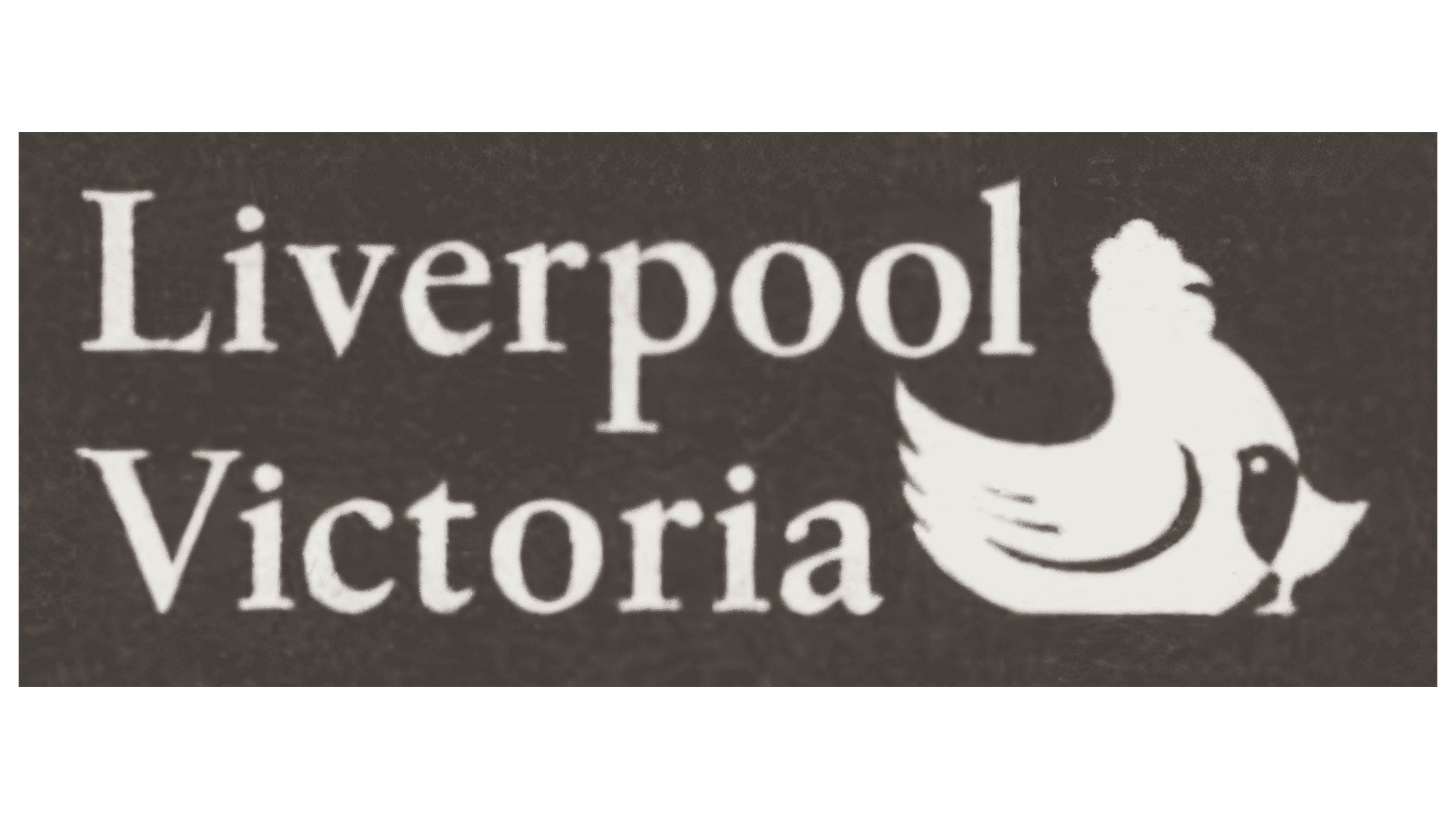
This insurance company’s logo might seem strange, as it doesn’t associate with financial services. The image of a hen with a chick would be more fitting for a farm products brand or a restaurant chain. However, the designers chose differently, depicting a caring hen right next to the “Liverpool Victoria” inscription.
The organization’s name is now split into two lines and left-aligned to leave space for the unusual illustration. The new font resembles the previous one: it still has serifs, and the strokes vary in thickness. The main change is the case of the letters: all letters, except the initial “L” and “V,” are now lowercase. The serifs have taken on a more precise, angular shape, automatically inspiring confidence in the company’s services. The relatively wide spacing between the glyphs makes the inscription clear and easy to read.
The image of the hen and chick is the most unusual part of the Liverpool Victoria logo. But there is a reason for it. The designers used such an original symbol to evoke a sense of security. Here, the insurance company is compared to a caring hen, under whose wing the chick, representing a client in need of help, wants to hide. The two silhouettes, large and small, symbolize safety, reliability, and care.
Although the image is not directly associated with financial services, it helps the brand establish an emotional connection with consumers, as the hen and chick are a metaphor for family values. The logo’s colors, however, do not evoke kindness and mutual support; the dark gray tones create a serious atmosphere, hinting at Liverpool Victoria’s professionalism.
2000 – 2006
This company logo looks entirely different from the previous ones because it is bright and colorful. There is no hen or chick, only a single-line inscription inside a long dark blue rectangle. However, the chosen style can’t be called minimalist, as the wordmark is in a decorative font, roughly similar to Prenton RP UltraCond Medium by BluHead Studio. It has several unusual features:
- Closed apertures, most noticeable in “e” and “a.”
- A triangular protrusion at the bottom of the “r,” mirroring the shape of a similar protrusion at the top.
- A small indentation at the end of the “i,” where the round dot fits perfectly.
- Vertical cuts at the edges of “e,” “r,” “c,” “t,” and “a.”
This font features many sharp, straight angles, conveying the company’s dynamic nature and its continuously expanding range of services. The glyphs are elongated vertically, making the “o” look like ovals and the “c” resemble half-ovals. This geometric shape gives the inscription an aristocratic elegance, highlighting the uniqueness of Liverpool Victoria. The very narrow letter spacing reduces readability, creating a sense of unity and support.
The large rectangular base symbolizes reliability and stability, reminding customers that the insurance company cares about their well-being. Its dark blue color inspires confidence and is associated with constancy and loyalty. The text is light: white for the first word and light blue for the second. Both colors symbolize purity, safety, stability, and calm.
2006 – 2007
This logo was created in 2006 and was used briefly before the company was renamed LV=. Unlike the previous version, it no longer has a rectangular base; the inscription is now set against a plain white background. The first word was recolored to dark blue, while the second took on a pale turquoise shade. The new color scheme emphasizes the insurance company’s authority, aiming to appear solid in its clients’ eyes.
The font also changed, though it remained generally recognizable. The designers made the lines thinner, allowing the apertures to widen slightly. The letter spacing was increased, which improved the inscription’s readability. The dot above the “i” no longer rests in a semicircular indentation; it is raised higher.
This did not affect the overall style: the glyphs remain vertically elongated, and most have sharp-cut edges. The “r” still features a small triangular protrusion at the bottom, giving the letter a somewhat “predatory” appearance. All these angular elements highlight Liverpool Victoria’s ambition to remain a market leader in insurance by expanding its service range through acquisitions.
2007 – 2011
If the old logos looked slightly aggressive due to their sharp edges, this version, by contrast, suggests thoughts of love and pacifism. In 2007, the company radically changed its image and rebranded as LV=. Its new name closely resembles the stylized word “LOVE,” with a missing “O” and an equal sign in place of an “E.” This was an unexpected choice for an insurance firm that had previously emphasized its seriousness.
The brand’s emblem now features the “LV=” inscription, where each glyph has a unique geometric shape.
- “L” looks like a perfectly right angle, giving a sense of stability.
- “V” also has a 90-degree angle but points downward, like a diamond. The upper ends of the letter are rounded, making the “V” resemble a heart.
- ” =” consists of two horizontal rectangles and does not look like a standard equals sign.
Interestingly, all inscription elements have the same length and are approximately equal in width. This symmetry creates a visual balance missing in previous Liverpool Victoria logos.
The designers used “LV=” to make the reference to “LOVE” obvious. They turned the letter “V” into a heart-like shape and enlarged the equals sign, styling it like an uppercase “E.” But =” can be interpreted differently, too: as a symbol of stability. This original emblem helps the insurance company connect emotionally with clients and attract young people who appreciate unconventional solutions.
Although hearts are usually associated with red, they are not used in the logo. All three glyphs are colored in a pleasant light green shade, evoking thoughts of nature and spring. It is a color of well-being, life, renewal, and growth. It appears calming and subconsciously builds trust in Liverpool, Victoria, as a reliable partner in financial matters.
2011 – 2019
Brand managers concluded that the standard two-dimensional look of the LV= emblem was too simple. They challenged the trend toward minimalism to emphasize the company’s reluctance to follow standards. Since the encoded “LOVE” inscription fits perfectly with this concept, it was decided to keep it. Only the style of the glyphs changed: flat lines gained an attractive volume.
Designers added a glossy shine to the symbols, using a green gradient with a smooth transition from dark to light shades. The colors became vivid and bright, as if sunlight truly fell on the logo. This palette evokes positive emotions, making the insurance company associated with positivity and joy. This precisely reflects the name LV=, which symbolizes love.
Thin light lines were added to the edges, giving the symbols a three-dimensional look. The outer and inner corners were slightly rounded, so the stylized heart fit seamlessly into the composition. While the shape of the glyphs creates a sense of softness, the texture suggests the opposite: the glossy shine resembles cold metal. Thin black outlines drawn on the right side convey a sense of stability.
This contrasting combination reflects the essence of Liverpool Victoria: the company strives to protect clients, provide them with comfort, and maintain a firm stance on insurance matters. The emblem shows the organization’s reliability and stability, and the green color, a symbol of balance, reinforces these associations.
2019 – today
The company kept the old concept, as the “LV=” inscription is associated with the word “LOVE,” helping to establish an emotional connection with clients. Although the designers did not change the size or shape of the glyphs, the logo now looks entirely different. It no longer has the glossy texture that once drew attention to the brand name.
The shine and expressiveness disappeared along with the bright palette, light highlights, and black outlines. Only the recognizable letters remain, complemented by the mathematical equals sign. The enticing gloss was replaced by a restrained matte texture, making the emblem’s elements appear not metallic-hard but flexible. This sense of flexibility highlights the insurance company’s ability to adapt to any client. To create this impression, the designers slightly adjusted the inscription:
- They used muted tones, lacking vibrancy and brightness.
- They shifted the gradient, concentrating the darker shades closer to the bottom (for “L,” at the bottom-left).
- They achieved a three-dimensional look through long, lightened sections.
Visually, the new logo appears more voluminous and smooth than the previous one. This is especially noticeable in the soft edges. The gentle gradient creates a matte surface effect associated with calmness, comfort, purity, and minimalism. The pale green shades give the brand name a natural appearance with no hint of aggression.