 Unipol Logo PNG
Insurance and financial services include auto and home insurance, savings plans, and retirement products. These tools support everyday life and help manage risk and finances. The Unipol logo is associated with an Italian group that provides insurance and financial services to private clients and businesses.
Unipol’s history began in 1963 in Bologna. A group of cooperatives associated with the League of Cooperatives established Compagnia Assicuratrice Unipol. Initially, the organization focused on property insurance. Since 1969, it has entered the life insurance market. In the 1970s, the trade unions CGIL, CISL, and UIL joined the company’s capital. By the mid-1980s, the company ranked among Italy’s ten largest insurance groups and became the first cooperative organization to have its shares traded on the stock exchange.
In the 1990s, Unipol expanded its business areas. In 1995, it founded UniSalute, a company specializing in health insurance. In 1996, it established Linear, which offered phone-based car insurance.
A major transformation began in 2012, when Unipol acquired control of Premafin and Fondiaria-SAI. After regulatory approvals, the merger was completed on January 6, 2014. As a result, UnipolSai Assicurazioni was created, becoming Italy’s second-largest insurance organization.
The group continued to expand in the banking sector and partnered with BPER Banca. It operates in asset management and real estate. The main shareholder remains the cooperative Coop Alleanza 3.0, which owns 22 percent of the capital.
The company became a key participant in a deal in which BPER offered 4.3 billion euros to acquire Banca Popolare di Sondrio. It achieved a net profit of 743 million euros, up 17.6 percent from the previous year. Insurance premiums reached 9.2 billion euros.
Meaning and History
What is Unipol?
An Italian financial holding company from Bologna, Unipol grew out of a mutual insurance society and ranks among the country’s largest. It includes Italy’s second-largest insurance company and operates in insurance, banking, real estate, and other activities. Annual insurance premiums reach 11.3 billion euros, 3.7 billion of which come from life insurance. A 22 percent controlling stake is owned by Coop Alleanza 3.0. The main operations are in Italy, with a subsidiary in Serbia.
1963 – 2000
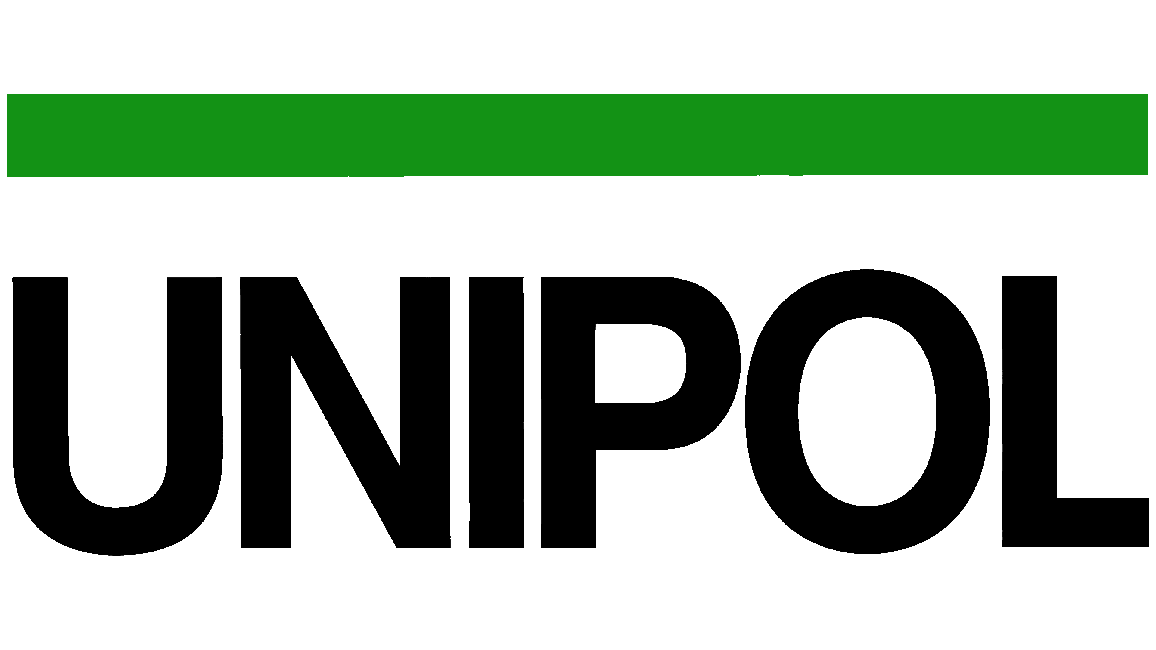
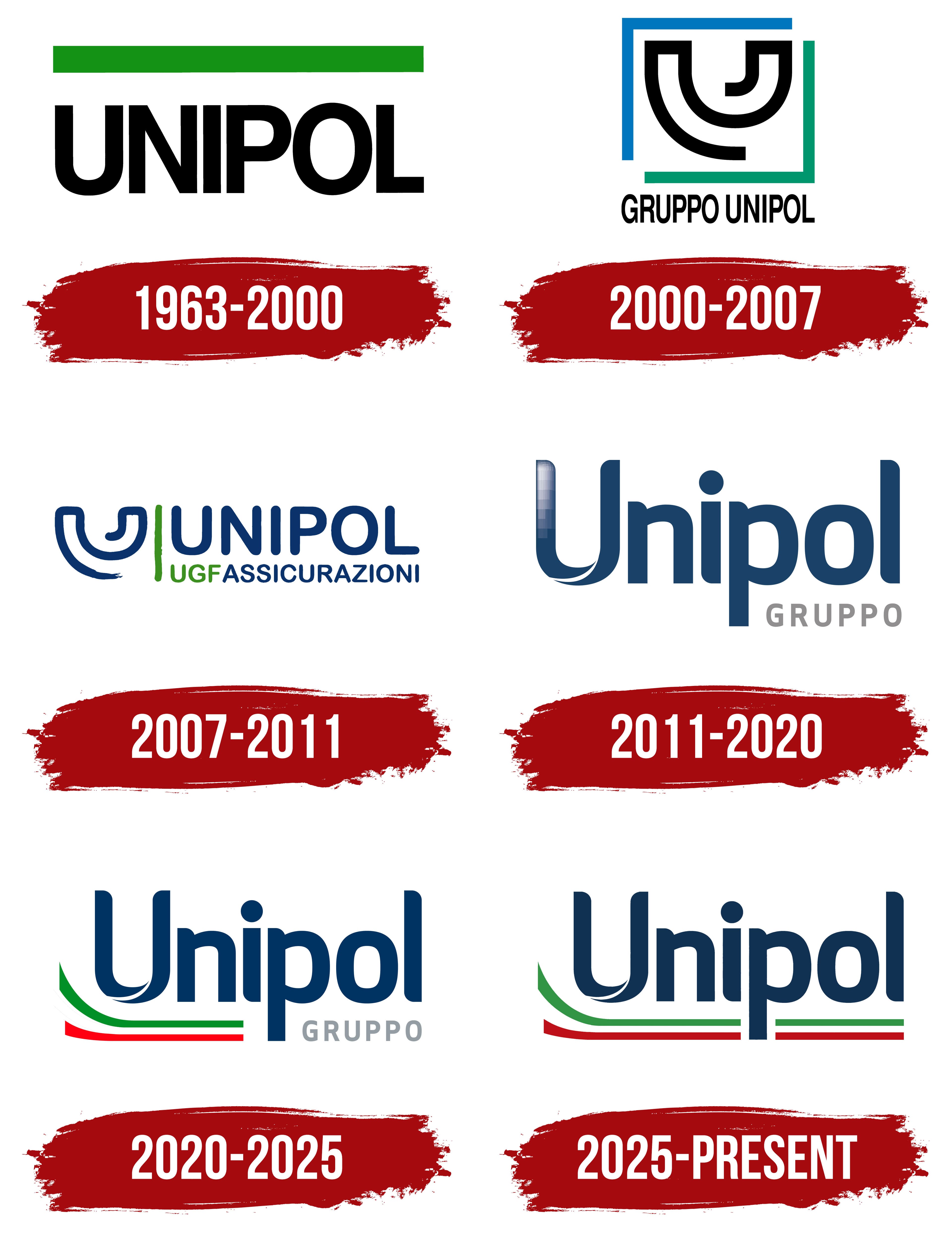
In Unipol’s 1990 wordmark, a broad green band replaced the separate globe image. The lettering and rectangle formed a compact design, preserving green as a connection to the earlier identity. Behind the company’s short name was a history that began in Turin in 1961 at Lancia’s initiative. Unipol came from “Unica Polizza,” meaning “single policy,” and was linked to motor vehicle liability insurance.
In 1962, cooperative organizations from Bologna and Emilia acquired the company. A year later, it moved its registered office to Bologna. Unipol dates its modern group history to this cooperative period. The early emblem featured a “U” with a globe inside. Beside it, UNIPOL appeared in Aldo Novarese’s Eurostile typeface. In 1989, the group created a separate symbol. It retained the “U” and globe motif and added a green segment.
The 1990 version focused on the name. Black UNIPOL lettering used Helvetica capitals with tight spacing and thick, uniform strokes. A thick green rectangle ran above the word, parallel to the lettering and extending across almost its full width. In this arrangement, the lettering and band emphasized the full name, replacing the earlier “U” and globe combination.
2000 – 2007

In Gruppo Unipol’s 2000 update, gaps at the emblem’s corners represented the group’s openness to other business areas and society. The two-color frame distinguished the businesses. Green referred to the insurance company, while blue accompanied Unipol Banca. A blue rectangular outline ran along the left and top, with green along the right and bottom. The corner ends remained open where the colors met.
Inside the frame was a black geometric “U.” Two thick curved bands formed nested shapes, with the smaller one following the larger’s curve. Without any text inside, the emblem maintained its connection to Unipol through the name’s initial letter. Small black sans-serif GRUPPO UNIPOL capitals appeared beneath the square symbol. Straight strokes and slightly elongated proportions gave the lettering a look reminiscent of narrow versions of Helvetica or Univers Condensed.
2007 – 2011
The creation of the Unipol Gruppo Finanziario holding company, abbreviated as UGF, in 2007 prompted an identity review. The existing “U” emblem remained, with softened contours, while orange from the Aurora insurance business joined the color system. In 2009, the insurance divisions updated their identities. The Unipol Assicurazioni logo placed the holding company’s abbreviation beside ASSICURAZIONI.
The design centered on two lines of lettering. Dark blue UNIPOL appeared at the top in sans-serif capitals with proportions resembling Avenir. The lower line was smaller, with green UGF beside blue ASSICURAZIONI. Two nested blue arcs forming a “U” sat to the left of the text. A green vertical line separated the emblem from the name and repeated UGF’s color. Rounded letter terminals and slightly irregular curves gave this version a softer look than the earlier, stricter geometry.
2011 – 2020
In 2011, the group returned to the Unipol name customers already knew. It commissioned Turin agency InTesta to redesign its logo system. It removed the separate emblem and replaced it with a capital “U” at the start of the name. Lowercase sans-serif letters followed, with even contours resembling Avenir, Myriad, and Nunito. The large “U” retained its symbolic role within the word.
The lower curves of the initial letter resembled two overlapping ribbons separated by a narrow light-colored gap. A gradient highlight with pale rectangular sections ran along the left vertical stroke. The group associated the converging lines of the “U” with an embrace, protection, and closeness to customers. Gray GRUPPO capitals appeared beneath the right end of the dark blue Unipol wordmark. The brand guidelines specified Pantone 302 C for blue and Pantone 430 C for gray.
The shared lettering connected the divisions’ identities, while colors distinguished their business areas. Dark blue identified the group, red represented insurance, and light blue marked banking. Linear and UniSalute received green. After consolidating its insurance businesses in 2014, InTesta created the UnipolSai logo using the same system. The initial “S” in Sai had ribbon-like curves, while red maintained the connection to insurance. In 2017, a solid fill replaced the highlight on the “U,” leaving the light-colored gap between its lower arcs.
2020 – 2025
During the COVID-19 pandemic, Unipol added the Italian flag’s colors to its corporate logo. InTesta, part of Armando Testa Group, developed the Tricolour Edition in 2020. Roberto Gresti was listed among the creative team members. The tricolor expressed solidarity with Italy and the company’s connection to the national community.
The dark blue Unipol name and gray GRUPPO lettering remained. The main wordmark paired a capital “U” with lowercase sans-serif letters in a style resembling Avenir, Myriad, and Nunito. An arched opening within the lower curve of the “U” divided it into two sections.
A ribbon beneath the name formed the new part of the design. Near the “U,” its bands curved upward, then extended to the right and ended in a straight cut. Green ran along the top and red along the bottom, with a white gap between them. The lines were interrupted around the “p.” The ribbon turned the logo’s lower edge into a horizontal underline, retaining the familiar Unipol lettering while adding Italy’s colors.
2025 – today
The 2025 merger of Unipol Gruppo and UnipolSai Assicurazioni created Unipol Assicurazioni. The logo reflected the name change. GRUPPO disappeared, and the tricolor ribbon stretched across Unipol’s full width.
The dark blue lettering retained its earlier structure, with a capital “U” followed by lowercase letters. The white opening remained within the curve of the “U.” The Italian flag’s colors now run beneath the entire word. The extended ribbon connects the combined insurance company’s identity to its country of origin.