


 Madagascar Logo PNG
The Madagascar logo is cheerful, representing a well-known animated franchise that appeals to children and adults. It playfully conveys adventure, humor, lightness, and the joy of the rich flora and fauna brought to life by the magic of professional animators.
Madagascar began in 2005 with an animated feature developed by directors Eric Darnell and Tom McGrath at DreamWorks Animation. The project had taken shape in the early 2000s, with research into animal behavior and the setting. Released on May 27, it followed zoo animals pushed from New York into the wild and earned over $532 million worldwide. Video games based on the film appeared the same year, extending the property beyond cinemas.
Madagascar: Escape 2 Africa arrived in 2008 and earned over $603 million. The Penguins of Madagascar television series also began that year and ran until 2015, winning several awards, including an Emmy. Merry Madagascar followed in 2009, while Madagascar 3: Europe’s Most Wanted reached cinemas in 2012 and earned nearly $746 million, the highest total in the main trilogy.
The feature spin-off Penguins of Madagascar opened in 2014 and earned over $373 million. A separate King Julien prequel series later debuted on Netflix in 2017 and continued until 2020. A short production titled Madagascar: A Little Wild appeared in 2018, and the mobile game Madagascar: Mad Pursuit followed in 2019.
In 2020, a penguin-focused streaming film was announced for Peacock. Reports of a possible revival of the main film series circulated in 2021 without an official confirmation. By 2023, the franchise still included three main films, a theatrical spin-off, television series, shorts, and games, while discussions about further projects continued.
Meaning and History
What is Madagascar?
This animated cartoon has won the hearts of viewers around the world with its lively characters and fun adventures. The show follows a group of animals from Central Park who embark on impromptu trips that take them far from their home in New York City. The main characters are Gloria the hippo, Melman the giraffe, Marty the zebra, and Alex the lion. Their vivid personalities create comical and often chaotic situations. Clever dialogue, slapstick, and themes of friendship and self-discovery make the cartoon truly memorable. The franchise has expanded to include short films, TV shows, video games, and theme parks. The expansive universe with notable characters like the crafty penguins and King Julien has brought musical numbers and pop culture references, and attracted a wide audience to the animation industry.
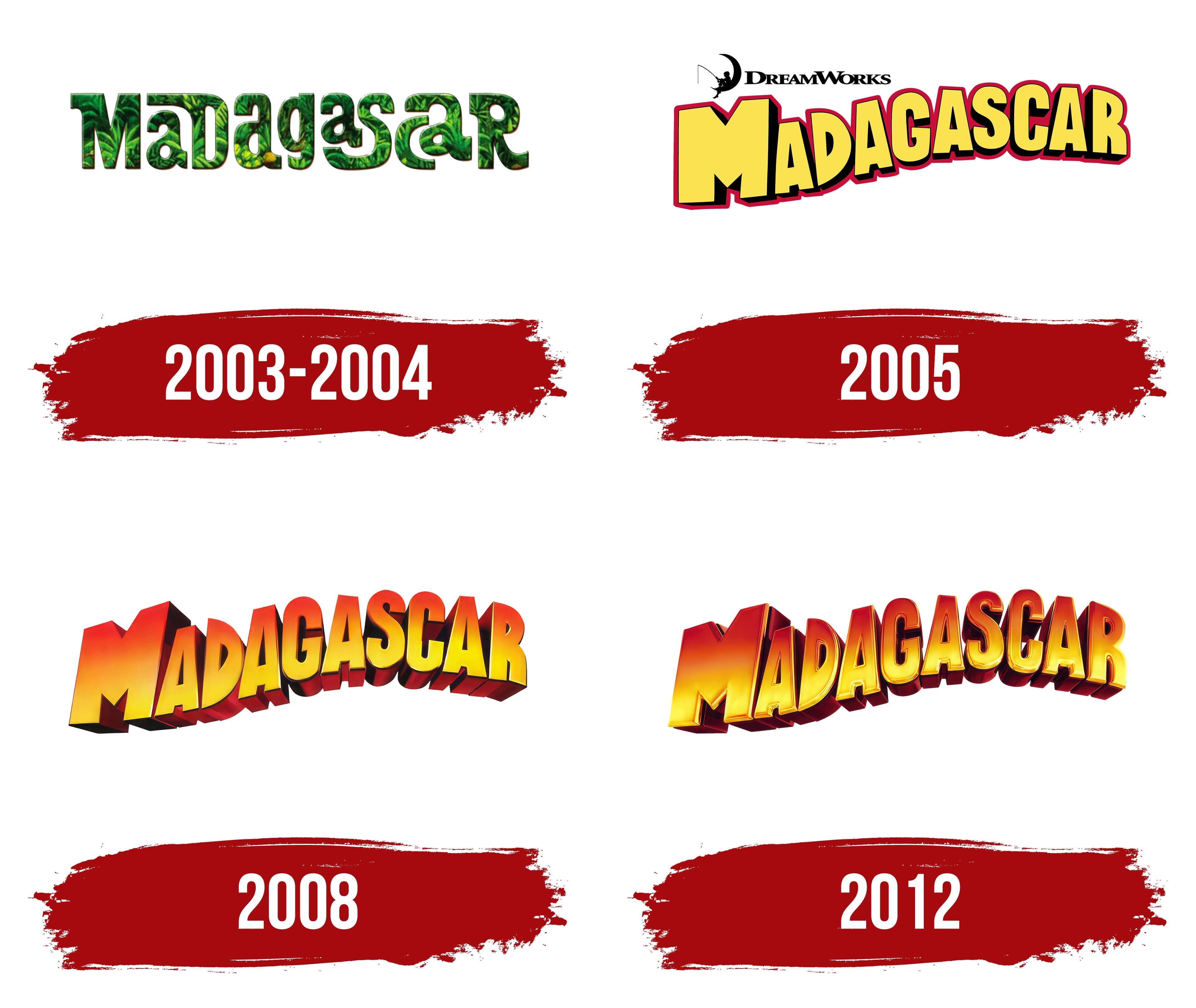
2003 – 2004
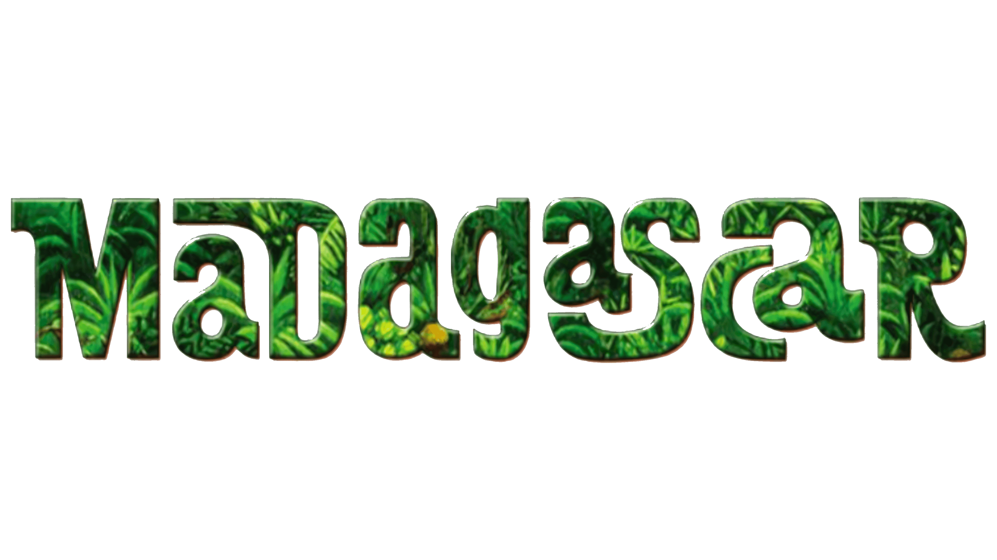
Before the official release of the animated film about restless animals, the project had a temporary logo that spectacularly captured the world in which the main events took place. Its concept was connected to the jungle, the characters’ natural habitat. Untouched wild forests served as the prototype for Madagascar’s visual identity, adorning the emblem with the freshness of greenery and breathing the free-spirited nature of its anthropomorphic inhabitants into it.
The structure of the logo is playful, resembling a puzzle or Tetris, where each miniature detail is part of a larger, cohesive, harmonious, and mysterious picture. Because of this, the letters are not uniform in size:
- The smallest are the first and third “a” and the “c.”
- The largest are “M,” “D,” and “R.”
- The widest are “S” and the fourth “a.”
- The most unusual is the “D,” with a stroke extending to the left.
Moreover, the glyphs are in different cases: some are uppercase, others are lowercase. “a” appears most frequently among the lowercase, while the rest are mainly uppercase. This makes the inscription feel like a fun game where one must piece together all the elements to form a coherent word. In this case, it has already been assembled; it’s just a matter of recognizing and reading it correctly. The inscription is well “camouflaged,” as the green color effectively masks natural objects.
The impression of the text element is positive: it reveals the jungle’s multilayered nature, where each level has its own life, reflecting local biodiversity. The letters seem to echo the calls of tropical birds and the rustle of dense foliage. Overall, the colorful and mysterious design appeals to children in the animated world. The variety of shapes and colors, along with the playful font, hints at the entertaining and humorous nature of the full-length animated film.
Despite the complex structure and varied forms, the glyphs complement each other well, creating a harmonious picture of the wild jungle. Their smooth curves and soft lines blend perfectly with precise angles and straight edges. This contrast maintains the perfect balance, as harmony is organized chaos. Similarly, the seemingly chaotic letters form a unified inscription in this case. They are the foundation of Madagascar’s emblem. Although it was just a prototype, it played an important role in the film’s visual identity, helping to choose the appropriate style.
2005
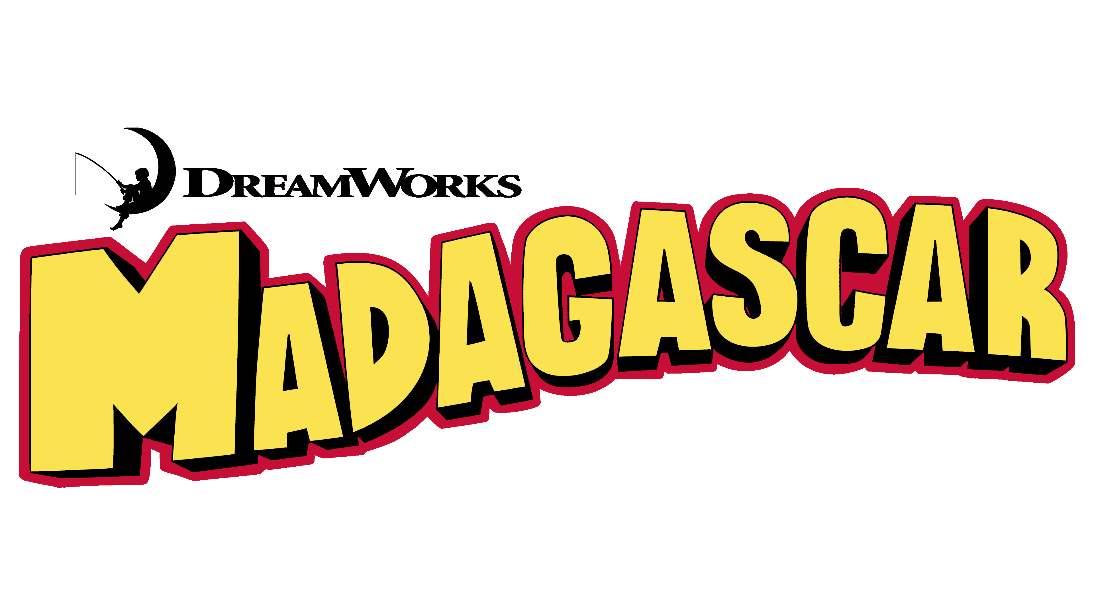
The new animated film required a new Madagascar logo because, as a franchise, each animated movie must have its own face. Yet, parallels between the emblems must also remain so that viewers can immediately understand that the new release is thematically and plot-wise connected to the previous one. The designers considered this and proposed a similar logo style with a personal interpretation. What did they come up with?
As a result of meticulous work, a massive emblem was created, in which text once again dominates. There is some graphic content, but it is minimal and serves as a designation of the film’s creator. It features the traditional DreamWorks studio sign: a small fisherman sitting on a crescent moon, holding a fishing rod. The boy watches it closely, afraid to miss the next catch, and viewers are interested in the company’s creations. Next to him, the studio’s name is indicated in a single word. All elements are colored black so that the studio’s name and symbol remain in the background while the main focus is on the film’s emblem.
By the way, black is actively used in the Madagascar logo: it appears in the main part, adding depth to the glyphs. The sides of the letters and the internal spaces are darkened to create the illusion of three-dimensionality. Thanks to this effect, it feels as if the name emerges from the red background, though the red color, in this case, serves only as a border for the inscription.
The block style does not make the letters strict; on the contrary, they look funny and childlike, which was exactly what the designers intended, as the logo is for an animated film. The chosen font is large, massive, uppercase, and grotesque. The first glyph is the widest of all: it resembles the MTV logo. Both “M” s are so similar that they share matching side shadows and the lower part of the central notch (angle). The other letters are much smaller than the first but are also uppercase.
A wavy horizontal line adds playfulness to the text: the second part of the name is much higher than the first, creating the impression of gentle swaying, like on waves. Combined with the yellow color of the symbols and the red border around them, this creates a joyful mood, as if the emotions from watching the animated film lift viewers into the sky or plunge them deep into the sea. The impression is generally very positive, vividly conveyed in the Madagascar emblem.
2008
In the logo of this period, text dominates, so there’s nothing else besides it. It is the primary element because it represents the title of the animated film, appears in the credits, and is displayed on posters. It is the heart of the visual identity, as it represents the main setting of the animated film:m a tropical island modestly nestled off the southern coast of Africa. This version is characterized by:
- Wavy shape (the curved line rises upward, hinting at an optimistic and joyful conclusion to events);
- Massiveness (due to the large letters, the inscription looks huge, wide, and long);
- Blocky glyphs (the font is in uppercase, making all symbols very tall);
- Three-dimensionality (the letters gain depth from shadows, creating an impression that they are raised above the background);
- Cut-off tops (particularly, all “A” s have a flat edge instead of a point).
There remains a similarity between the “M” letters in the word “Madagascar” and those in the MTV logo. They are nearly identical: equally geometric, wide, extra-bold, and blocky, with similar massive legs and triangular indentations. The border around the title has disappeared, but a patterned bottom with red half-shadows has been added, giving the text an even greater three-dimensional effect.
The logo now features a gradient that was not present before. The upper part of the line is colored like the morning dawn, while the lower part resembles the noonday sun. This combination reflects the tropical setting in which the characters’ adventures unfold and suggests that the events are thrilling, emotionally intense, and heated. The color beautifully resonates with the film’s content and subtly supports its concept.
2012
At first glance, this version may seem identical to the previous Madagascar logo, but it’s not. The differences don’t affect the animated film’s style, structure, or idea. The changes mainly focus on the text’s readability, ensuring it’s visible on any device, from home projectors to personal smartphones.
The emblem’s composition remains the same, with a wavy horizontal inscription. Designers added more realism, making it seem like the massive three-dimensional letters, connected into a single ribbon, are floating in the air. This impression is reinforced by the detailed rendering of the lower part of the glyphs, where the distinctive border of each symbol is visible, showing either rounded edges or smooth platforms.
The wave-like shape of the text makes the logo genuinely childlike, adding energy, playfulness, and dynamism that bring the static sign to life. The wide and long ribbon of large letters also resembles a classic toy train, considered one of childhood’s delightful symbols. As a result, the visual identity sets a positive tone and creates anticipation for an enjoyable viewing experience.
The letters now have a decorative edge that increases the openings and clarifies the inscription, making the glyphs stand out much more. Despite the narrow spacing between characters, they don’t blend into a single entity and aren’t lost beneath the red-yellow gradient, which not only remains but has become more vivid. By the way, the saturated colors convey a high level of excitement in the animated film, set the stage for an emotional experience, and indicate the warm regions where the main events occur.