


 Nick at Nite Logo PNG
The Nick at Nite logo is concise and modern, reflecting the network’s core message and giving viewers access to high-quality, accessible content. Even after years, the channel remains committed to showing interesting and popular films to a wide audience. The nighttime block’s emblem symbolizes that Nickelodeon shows and films continue to air at night, offering the opportunity to enjoy programs at any time of day. This logo effectively emphasizes the versatility and round-the-clock availability of entertainment for viewers of all ages.
Nick at Nite began on July 1, 1985, when Nickelodeon used its nighttime hours for classic television rather than children’s programming. The block first relied on black-and-white sitcoms from the 1950s and 1960s, including The Donna Reed Show and Mister Ed, reaching adults with nostalgia and younger viewers curious about older TV.
By the late 1980s and early 1990s, the schedule expanded with series from the 1960s and 1970s, including The Bob Newhart Show and The Mary Tyler Moore Show. The brand also developed interstitial segments and specials, giving the block a separate tone inside cable television. In 1996, TV Land launched as a related outlet for older programs, allowing Nick at Nite to focus on more recent sitcoms.
In the late 1990s and early 2000s, the lineup shifted toward shows from the 1980s and 1990s, including The Fresh Prince of Bel-Air and Full House. In 2004, the start time moved from 8 p.m. to 9 p.m., leaving more evening space for the children’s schedule. In 2006, Fatherhood became the block’s first original series, while George Lopez joined the lineup in 2009 and became one of its strongest acquisitions.
During the 2010s, the schedule added Friends, That ’70s Show, Instant Mom, The Goldbergs, Mom, and Young Sheldon. Instant Mom premiered in 2014 and ran for three seasons, while the 30th anniversary in 2015 brought marathons tied to TV history. By 2023, Nick at Nite remained active as a late-evening comedy brand built around older hits and newer syndicated sitcoms.
Meaning and History
What is Nick at Nite?
This special television block transforms Nickelodeon’s daytime kids’ programming into a nostalgic space for an adult audience. When evening comes, the channel comes alive with various popular sitcoms and family shows from different decades. This evening block has become a pop culture icon, offering younger generations a chance to discover classic series while allowing adults to relive their favorite moments. Its appeal lies in its ability to bring together audiences of different ages, creating a shared viewing experience for the whole family. It often sparks conversations about the “good old days” of television, allowing parents and children to share memories and discuss classic shows. The block has gained popularity in the late-night TV market with carefully curated comedies and dramas.
1984 (Pre-launch)
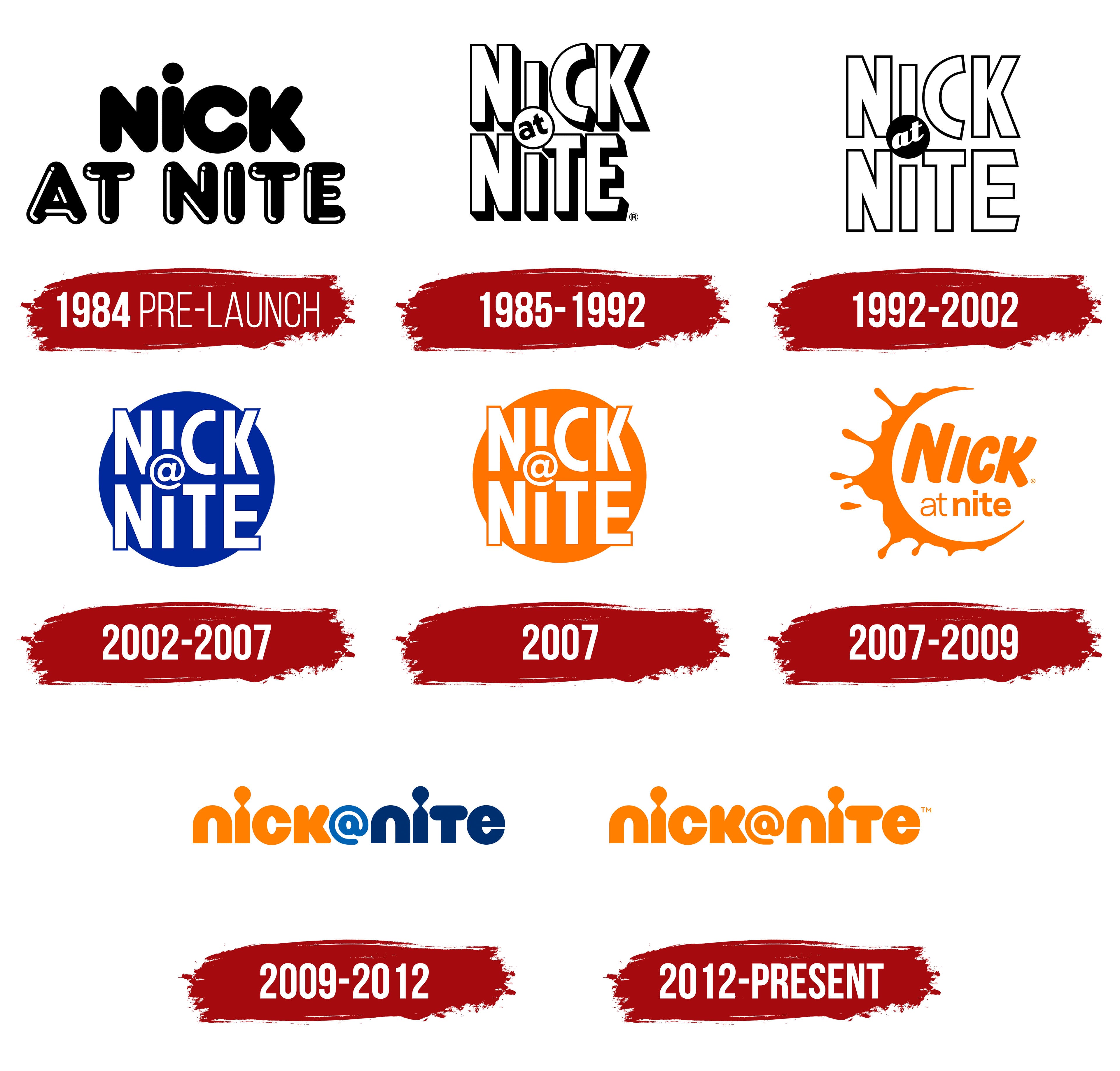
The emblem for the Nick at Nite nighttime programming block was created with a focus on simplicity and brightness. The name “Nickelodeon at Night” was coined by programmer Debbie Beece. The upper part of the logo features the channel’s shortened name, written in flat black letters. These characters resemble the original emblem of the parent channel but differ in their softer, more rounded shapes, adding a sense of ease and highlighting the programming’s entertaining, positive-emotion-filled nature and kind-hearted characters.
The lower inscription “at Nite” is rendered in 3D and shines with light reflections, symbolizing that the channel at night is full of exciting shows. The light from the screen, reflected in the letters, illuminates the dark hours, turning the night into an exciting adventure.
1985 – 1992
The company chose a lighter, more modern design to release the nighttime block. The name is presented in 3D white letters with black edges, adding depth and visual appeal to the logo. The capital letters with sharp glyphs emphasize the scale of the project and confidence in its long-term popularity. These changes are directly connected to the decision to position nighttime programming as “shows for the older generation,” which initially featured classic sitcoms.
The main feature of the logo became the dot over the “i,” which transformed into a round ball and shifted down for the word “Nick,” enclosing the preposition “at.” This element was inspired by the “pinball” logo designed for the channel, but rarely used. The design update was handled by studios that previously collaborated with Nickelodeon: Frederator Studios and Corey McPherson Nash, adding uniqueness and professionalism to the emblem.
1992 – 2002
The logo was slightly updated when transitioning to a full schedule of programs and modern series. The volume was removed, leaving flat white letters with a neat black outline and a black ball-shaped dot with a white preposition inside. This simplified design eliminated the former monumentality, giving the emblem a more stylish, friendlier look.
The contrast of black and white symbolizes the alternation of day and night, highlighting that at night, viewers were offered series and shows that disappeared from the screens during the day. This approach reflected a new programming strategy adapted for the evening format.
2002 – 2007
The logo gained a more expressive look thanks to the significant enlargement of the ball, which now resembles the Moon gently illuminating the night sky. A deep, dark blue background represents this calm nighttime atmosphere. The white inscription with an elegant blue outline is in the foreground. It is adorned with the modern “@” symbol instead of the usual “at,” giving the emblem a youthful and relevant character.
This design creates a feeling of coziness and calm, perfectly suited for evening entertainment shows. Soft, rounded lines and rich colors emphasize the inviting and relaxing atmosphere of nighttime viewing.
2007
The 2007 logo retained key elements but adopted a bright orange color, evoking associations with Nickelodeon’s main brand. This color strengthens the connection to the parent channel, conveying energy, activity, and freshness, which is perfect for the block’s evening and nighttime programming. The orange color symbolizes that the channel’s nighttime broadcasts are as lively and engaging as the daytime ones.
The central element of the visual mark remains the name “Nick@Nite,” where the “@” symbol, as before, plays a significant role, emphasizing the digital era and interactivity. This symbol reminds viewers that the nighttime block stays on top of trends and is ready to offer something new and exciting for evening viewing.
The logo’s font is bold and simple, creating a sense of confidence and accessibility. It is easily understood by people of all ages while maintaining the brand’s friendliness. The letters are placed closely together, emphasizing the unity of the content and the harmony of the different shows and movies the block offers for family viewing in the evening.
The round background highlights the image’s completeness and unity as if framing all the shows and programs into one package, promising quality and entertainment for nighttime viewing.
2007 – 2009
The new logo transformation brought Nick at Nite even closer to the visual style of its parent company. The white circle, symbolizing the Moon, received a bright and distinct orange crescent outline, designed in the style of the famous “splash,” a brand’s signature element. This detail makes the logo more dynamic and lively while maintaining its association with nighttime programming. The font of the word “Nick” was adapted to match the parent channel’s overall style, adding modernity and reinforcing unity with Nickelodeon’s visual identity.
2009 – 2012
Expanding broadcasting into the evening hours strengthened the connection between the block and daytime programming, reflected in the logo. The new design uses two main parts of the text: orange, symbolizing daytime, and blue, representing night. This color transition emphasizes the continuity of the channel’s broadcasts. The emblem’s overall look mirrors the main network’s rebranding, showcasing a modern style. The name is written with smooth, minimalist lines, and the dot over the “i” merges with the letter, creating a keyhole effect that symbolizes the amazing world of cinema opening up to viewers. Additionally, the “@” symbol is used in the logo, adding dynamism and modernity to the design.
2012 – today
The Nick@Nite logo reflects its connection to the main Nickelodeon brand through the signature orange color. This shade symbolizes energy, fun, and creativity, qualities associated with Nickelodeon and its programming for many years. The emblem visually conveys friendliness and ease, highlighting the channel’s focus on family entertainment and lighthearted shows.
The key element of the logo is the text itself, designed with a rounded, smooth font that avoids sharp edges, making it simple and easy to understand. This font is ideal for a brand aimed at viewers of all ages, creating an association with accessibility and clarity.
Particular attention is drawn to the “@” symbol, which is integral to the name. This element is highlighted and playfully incorporated into the design: its spiral shape livens and dynamizes the composition while also hinting at the modernization and renewal of old television traditions in the digital age.
Additionally, the unique shape of the letter “i” stands out, with its upper part resembling an hourglass. This feature is intentional, as it symbolizes the passage of time and reflects the evening programming block aimed at viewers looking to relax after a long day.
The Nick@Nite emblem carefully maintains a visual link to Nickelodeon while emphasizing the channel’s evening focus, offering family-friendly programming for unwinding and watching favorite shows together.