


 Nicktoons Logo PNG
The Nicktoons logo resembles a vibrant children’s character enthusiastically inviting a young audience to watch. The bright details and bold colors highlight the channel’s focus on kids and promise them an exciting time filled with entertaining and educational shows and cartoons. This logo conveys energy and joy, evoking associations with fun adventures and engaging content awaiting viewers on the channel.
Nicktoons began on May 1, 2002, when Nickelodeon launched Nicktoons TV in the United States as a separate cable channel focused on animated series. The early schedule relied on the company’s archive, with Rugrats, Doug, and Ren & Stimpy airing alongside newer programs such as SpongeBob SquarePants and The Fairly OddParents. The format gave viewers access to animation throughout the day and returned many older shows to regular television rotation.
In 2003, expanded distribution through additional cable operators helped the channel reach a wider audience. A major change followed in 2005, when the channel became Nicktoons Network and began moving from a library-based service toward a channel with its own original productions. In 2006, Kappa Mikey became its first original series, blending Japanese and Western animation styles. In 2007, Edgar & Ellen and Making Fiends added darker and more experimental material to the lineup.
The channel received a brand update in 2009, followed by international growth in 2010 with launches in the United Kingdom and Ireland. In 2013, NFL Rush Zone brought sports animation to the channel through a project made with the National Football League. In 2015, Harvey Beaks and Pig Goat Banana Cricket joined the schedule, while Slam!, made with the NBA, expanded the sports-based direction in 2017.
From 2018 to 2023, Nicktoons focused on digital access, interactive features, mobile and web platforms, social media activity, online games, contests, streaming, crossovers, and regional versions for new markets. Middlemost Post and The Patrick Star Show arrived in 2021. Later projects included short-form animation, localized content, virtual reality, and augmented reality experiences based on popular animated shows.
Meaning and History
What is Nicktoons?
It is a well-known television network and brand owned by Nickelodeon. It specializes in animated programs for children and teens. The company is known for various unique animated shows, sometimes called “Nicktoons,” that have influenced pop culture for generations. The network offers a place for fantasy and inventive animated stories, showcasing a mix of recent and vintage Nickelodeon animated programs. The brand has had a major impact on children’s animation, creating several enduring characters and franchises that spread into books, movies, and other media.
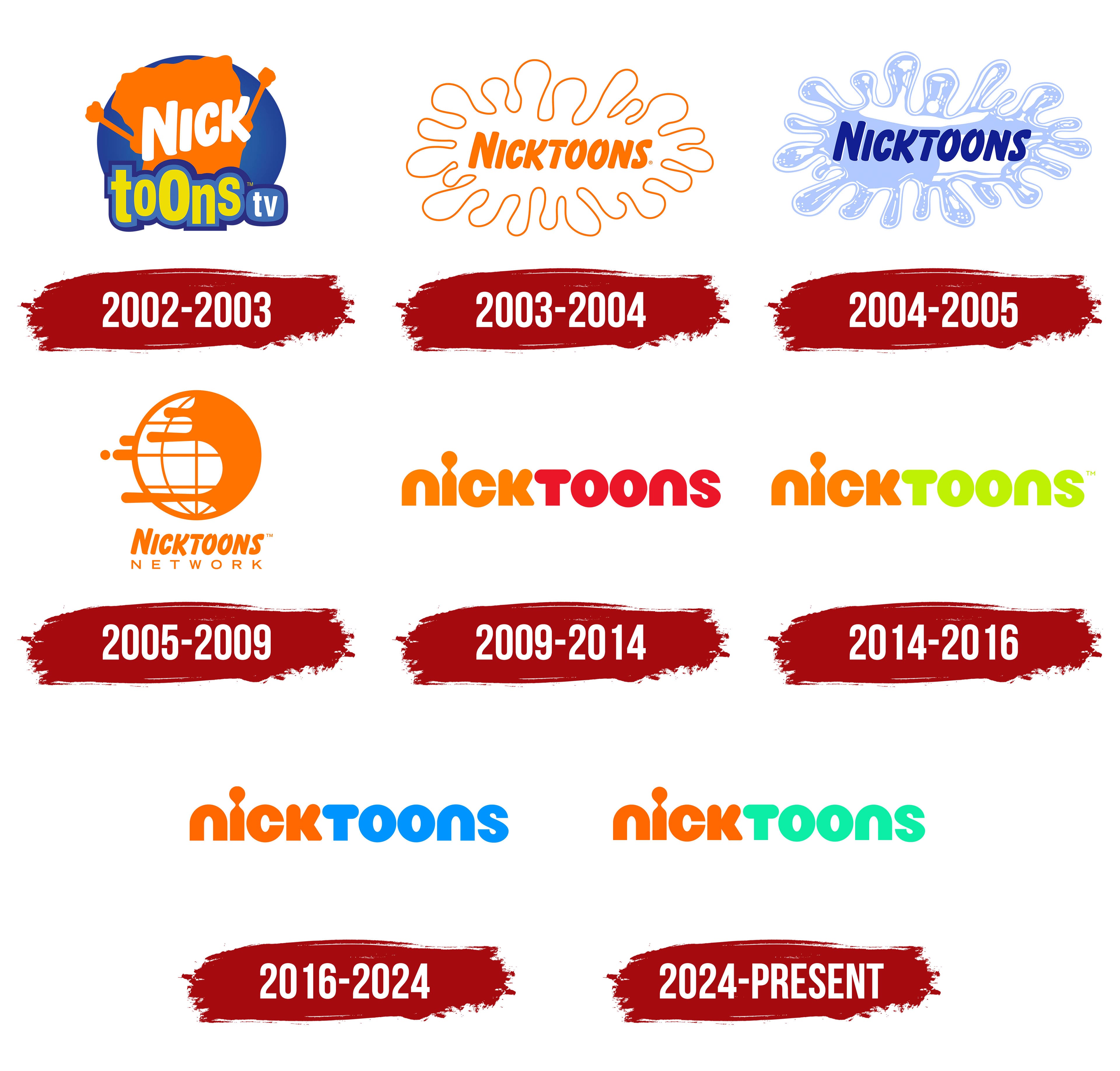
2002 – 2003
The channel’s first logo was a blue circle symbolizing an old television screen. This visual choice emphasized the channel’s retro direction, which aired classic Nickelodeon cartoons. The emblem transported viewers to the past, creating a sense of nostalgia.
In the center of the circle, SpongeBob SquarePants, a well-known character, is depicted with his arms raised. His face is not visible, and large white letters spelling “Nick” are placed over his figure, referencing the main Nickelodeon channel. This name likely connects to one of Nickelodeon Animation’s earliest shows, Nick.
At the bottom of the logo, the word “toons” is placed on a light blue background with a dark blue border. The letters appear to bounce, symbolizing the joy and fun children experience while watching their favorite cartoons.
2003 – 2004
The emblem as a splat appeared a year after the channel’s name was changed to the single word “Nicktoons.” The logo seems to convey the feeling that the word jumped from above and splattered liquid, symbolizing children’s joy at jumping in puddles and finding happiness in them. The bright orange hue of the logo enhances this impression, associating it with energy and fun.
The image echoed a similar Nickelodeon logo, using a splat but with a fill. This emphasized continuity and the connection between the channels, maintaining brand recognition and capturing the audience’s attention with its playfulness and brightness.
2004 – 2005
In 2004, the emblem underwent significant changes, giving it new volume and making it brighter and more dynamic. One of the key features of the updated logo was the change in color scheme: orange was replaced with blue, giving the emblem a fresh, modern look. This color choice is also associated with water and coolness, highlighted by adding water reflections, creating an effect of realism and depth.
The logo’s shape retained its recognizable “explosive” silhouette, resembling a liquid splash, symbolizing energy, fun, and dynamism. These associations are important for children and teenagers seeking bright, memorable experiences.
The channel’s name kept its original font, but the text color changed to blue. This shade of blue emphasizes freshness and calmness, contrasting with the logo’s active background.
2005 – 2009
In 2005, the channel was renamed Nicktoons Network, reflecting the transition to digital broadcasting and the expansion of its audience. The new logo, featuring a globe, symbolized the channel’s global reach. The visual element, in which the globe appears to collide with a splat spreading across its surface, demonstrates movement and the channel’s broadcast across a large part of the planet. This approach highlights that the brand is actively growing and moving forward, reaching more viewers worldwide.
The orange color of the logo is associated with dynamism, energy, and youth, aligning perfectly with the channel’s spirit, which focuses on a young audience and children’s shows. Below the globe image is a two-tiered inscription. The word “Nicktoons” is rendered in bold, a brand characteristic that makes it easily recognizable and emphasizes the channel’s identity. The word “Network” is written in thin, wide, and straight capital letters, symbolizing stability and seriousness in the approach to broadcasting.
The width of the inscription underscores the theme of global audience reach and helps create an association with the channel’s significant influence and strong presence in the world of animation. The logo symbolizes active growth, content distribution, and the channel’s aspiration to become a leader in the digital broadcasting of children’s shows.
2009 – 2014

In 2009, Nicktoons underwent a major rebranding, coinciding with the addition of popular animated series such as Teenage Mutant Ninja Turtles and Winx Club. The new logo represented a television network focused on school-age children aged 6 to 11. This visual brand mark became the foundation for all subsequent channel emblems.
The new emblem uses a font similar to the Nickelodeon logo, emphasizing continuity and connection with the parent brand. Most of the letters in the logo consist of smooth curves, as if drawn by a bouncing spring or a brush, giving it a playful, dynamic feel. The dot above the “i” merges with the main glyph, resembling a schematic figure of a person or a matchstick, adding an element of surprise and creativity to the overall design. Considering the channel’s previous symbols, this element could also resemble a drop of paint, symbolizing the creativity and artistry inherent in all the channel’s projects.
The emblem’s color scheme is well thought out, and the name is divided into two parts. The first part, “Nick,” is done in orange, highlighting the connection with the main brand. The second part, “toons,” is colored in a rich red, symbolizing energy and drawing attention. This emphasizes that the channel is a vibrant extension of Nickelodeon, offering modern, engaging shows.
The emblem expresses friendliness and underscores the channel’s focus on a youthful audience, hinting at the exciting content that awaits viewers on screen.
2014 – 2016
In 2014, the Nicktoons channel updated its logo, changing the color of the second part of the name to a bright, neon green to highlight the release of the new series “Sanjay and Craig.” This move symbolized the channel’s intention to draw the young audience’s attention to new projects while maintaining a memorable style.
The new color in the logo contrasts with the traditional orange color of the first part, “Nick,” which remained unchanged and continues to be associated with the main brand. The neon green emphasizes freshness, energy, and playfulness, aligning with the spirit of the new content and the expectations of the target audience, children and teenagers.
2016 – 2024
The latest changes to the emblem reflected the channel’s evolution and desire to remain relevant to its audience. In the new version of the visual mark, the bright neon green color of the word “toons” was replaced with blue, making the logo more balanced and visually appealing. This blue color added freshness and symbolized reliability and stability.
The “Nick” part also changed: its orange color became more saturated, enhancing contrast and giving the logo more brightness and energy. This color scheme became more universal and appealing to both boys and girls, highlighting the channel’s diverse content.
2024 – today
For the release of the comedy film “The Nicktoons Movie,” the color of the second part of the name, “toons,” was changed to bright green. This bold move symbolized the renewal of the visual style, emphasizing fresh ideas and a new video format featuring all the animated characters beloved by viewers over the years.
The green color in the logo is associated with energy, growth, and novelty, perfectly aligning with the spirit of the new project. As before, the orange part, “Nick,” symbolizes a connection to the main brand, emphasizing the channel’s continuity and recognition.