The Panhard logo symbolizes the company’s historical heritage, which made it an innovator in the automotive industry. Traditional elements of the emblem reflect the brand’s rich past, while the strict geometric shapes emphasize technological achievements and embody the pursuit of excellence.
Panhard: Brand overview
In 1887, René Panhard and Émile Levassor sparked a revolution in Paris, founding a company and embarking on a journey that would leave an indelible mark on automotive history.
By 1891, they had crafted their first automobile, driven by a Daimler engine. This pioneering creation roared to life in 1894 during the inaugural Paris to Rouen automobile race, capturing imaginations and setting the stage for future innovations.
In 1895, the company introduced the groundbreaking Panhard system, a front-engine, rear-wheel drive layout that would become the blueprint for automotive design.
Entering the 20th century, the company emerged as France’s largest automobile manufacturer by 1900, a testament to its ingenuity and craftsmanship. In 1910, the company expanded its horizons, venturing into the production of trucks and military vehicles, cementing its versatile engineering prowess.
Throughout the 1920s, the company continued to push boundaries, pioneering four-wheel brakes and independent suspension systems. The 1930s saw a shift towards luxury vehicles, further solidifying the company’s reputation for excellence and quality.
René Panhard’s passing in 1936 brought his son Jean into leadership, steering the company through turbulent times. From 1939 to 1945, during World War II, the company pivoted to producing military equipment before returning to civilian automobile production post-war.
1954, the company introduced the Dyna Z, which featured an innovative aluminum body. The sporty Panhard 24 followed in 1955, showcasing the company’s flair for design and performance.
A shift occurred in 1965 when Citroën acquired a controlling stake in the company. This acquisition led to the cessation of passenger car production by 1967, marking the end of an era.
From 1968 to 2004, the company, now Panhard General Defense, focused solely on military vehicle production. In 2005, the company became part of the Auverland group, continuing its legacy in defense.
Renault Trucks Defense acquired the company in 2012, and by 2018, the brand was fully integrated into Arquus, a division of the Volvo Group, ensuring its legacy endures.
Meaning and History
What is Panhard?
It is a French manufacturer known for producing many vehicles, including cars and military equipment. The company was one of the first and most innovative automobile manufacturers, significantly contributing to automotive engineering and design. Civilian vehicles have been recognized for their advanced technology and unique designs, while military vehicles have been prized for their durability and performance in various defense applications.
1887 – 1891
The Panhard company emerged in the late 19th century when circular logos were in vogue. Many car manufacturers favored them for practical reasons: such emblems displayed better on metal or enamel plates and were easier to install on various surfaces, such as the steering wheel.
The circular shape embodies continuity, completeness, and perfection. It is a symbolic choice for a brand that wanted to emphasize its stability and reliability. Additionally, this logo reflects longstanding heraldic traditions: with a round heraldic shield, the company showcased its connection to European culture.
The circle also resembles a wheel, directly indicating Panhard’s field of activity. Its closed form suggests dynamism associated with fast-moving cars. Multiple concentric circles make the emblem look like a seal—a symbol of formality, authenticity, and authority.
At the center is a monogram of intertwined “P” and “L” letters, as the company was originally named Panhard & Levassor after its founders. The elegant design gives the logo a unique and recognizable look. In the 19th century, prestigious organizations often used monograms to denote status and exclusivity. This letter symbol highlights the high quality of the brand’s cars.
The sharp serifs and semicircular protrusions at the ends of the “P” and “L” play an important role in the logo’s emotional perception. They create a sense of tradition and respectability, demonstrate attention to detail, and symbolize Panhard’s care for every aspect.
The monogram is surrounded by a white ring that separates it from the full company name. The inscription is arched and ends with dots for visual balance. The bold font with rectangular serifs gives the words a strict and classic look, emphasizing the automaker’s solidity.
The logo’s color scheme reflects the brand’s values and aspirations. White symbolizes purity and honesty; yellow represents innovation and optimism, and black represents reliability and prestige. Together, they create a contrast that captures the attention of potential Panhard customers.
1891 – 1907
The logo with the side “S” letters was used for the S-series cars, where “S” stood for either low-slung chassis (surbaissées) or, according to another version, valveless engine (sans soupapes). The designers positioned these letters on either side of a large red circle, which appears three-dimensional due to the gradient.
The shiny texture emphasizes the sophistication of the emblem adorning luxury cars, adding depth and dynamism. The rich red color is associated with energy, passion, and speed. It symbolizes a love for driving and reflects the power and agility of the vehicles, helping the brand establish an emotional connection with customers.
The red gradient highlights the company’s strength and confidence, showcasing its leading position. Combined with gold and black elements, it evokes a sense of prestige, luxury, and exclusivity characteristic of Panhard’s products.
As before, the badge’s center is a monogram of intertwined “PL,” representing the full name Panhard & Levassor. Now, with a fine gold outline, the letters appear more refined. The same outline is present on the two side “S” letters, which extend beyond the circle and are connected to it by short horizontal lines. The designers placed them so that the two “S” resemble a car’s headlights, with the logo’s central part associated with the grille.
1907 – 1953
The company continued to use a circular logo to emphasize its longevity and connection to tradition. This shape creates a visually complete look, ensuring perfect symmetry. The strict classic design evokes a sense of reliability and professionalism.
The focus remains on the monogram of the intertwined letters “P” and “L.” This refers to the name Panhard & Levassor, which is not explicitly mentioned. The designers did not include any text in the emblem, keeping it light and dynamic. The “P” and “L” have decorative serifs on the ends, giving them a traditional style and making the monogram more expressive. Despite their different heights, the letters are perfectly balanced and appear stable.
The association with a wheel is even more apparent in the new logo, as the gray circle framed by a golden outline creates a sense of speed. Its visual mobility reflects the brand’s connection to the automotive industry. The circle, resembling a heraldic shield, underscores the company’s long history, dating back to the late 19th century.
The color palette also influences Panhard’s perception.
- The monogram’s black color is associated with strength, elegance, and authority, demonstrating seriousness and professionalism.
- The dark gold border around the logo attracts attention, symbolizing energy, optimism, and innovation. It creates a striking contrast with the black “PL” letters.
- The gray background evokes a sense of calm and confidence, making the other elements more noticeable.
Thus, the emblem and its colors fully align with the ideas at the core of the automotive brand.
1945 – 1967
In 1945, the company completely changed its concept, removing “Levassor” from its name and shifting to producing lightweight cars with aluminum bodies. Consequently, it adopted a new logo reflecting this evolution. Unlike previous versions, it no longer featured the iconic monogram, as the “PL” letters lost their meaning after the brand was renamed.
The circular shape of the emblem was also abandoned, replaced by a single “PANHARD” inscription. The black word occupies one line and is set in an empty white space, perfectly reflecting the concept of lightness. The bold diagonal strokes do not weigh down the logo because other elements balance them:
- Thin lines of the letters create a sense of airiness;
- Quirky V-shaped bars in both “A”s demonstrate the brand’s uniqueness;
- The semicircular parts of the “P,” “R,” and “D” add dynamism to the inscription.
The wordmark is rendered in an italicized font associated with speed and energy. The contrasting thickness of the strokes also creates an illusion of movement, accurately conveying the essence of the automotive company. The black color underscores Panhard’s confidence, seriousness, and solidity.
1953 – 1967
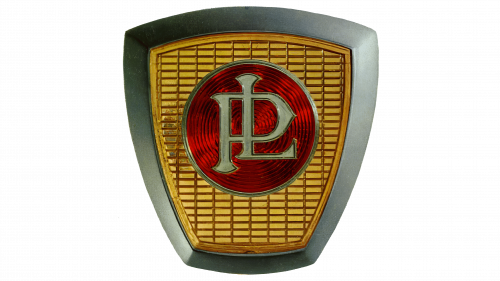
The quadrangular logo adorned passenger cars until 1967, when the brand fully transitioned to armored vehicles. Despite removing “Levassor” from its name, the “PL” monogram continued to be used as a tribute to Panhard’s long history. It symbolizes the extensive journey the company undertook before adopting its modern form.
The monogram looks almost the same as in the original emblem. The capital letters “P” and “L” intertwine harmoniously, forming a timeless symbol inside a red circle. Elegant serifs and pointed ends give the logo a traditional appearance, reflecting its rich heritage.
A large quadrangular shield shaped like an inverted trapezoid represents a stylized car grille. This is indicated by the pattern of numerous rectangular cells filling almost the entire internal space. The most interesting aspect of this Panhard logo is the combination of different textures.
- The central part consists of numerous red concentric circles. The alternating light and shaded areas make them appear ribbed.
- The small rectangles forming the grid shine brightly in the light, which, combined with the gold color, evokes wealth and luxury. The separating stripes have a convex shape, making the design three-dimensional.
- A wide frame with a silver gradient imitates the texture of the metal. Thanks to the dark outlines, the monogram appears three-dimensional.
2005 – 2018
Panhard changed its logo in 2005 when it became part of Auverland and focused on producing military trucks. The designers revived the old wordmark with the distinctive V-shaped bars on the “A.” They completely updated the font, achieving greater lightness and improving the readability of the inscription.
The letters now have fewer bold strokes, and those remaining are adorned with thin parallel lines. This gives the emblem an airy feel and fills it with inner energy, reflecting the vehicles’ dynamism. Instead of italics, a straight font is used, making the word appear clear and understandable despite the many small details.
The black inscription is underlined by a long khaki stripe that curves on the left to surround the silhouette of a deer standing on its hind legs. The line symbolizes determination, activity, and prospect. The depicted animal reflects Panhard’s pride in its machinery, symbolizing strength and great speed. The color scheme is also deliberately chosen. The designers combined white, black, and khaki to highlight the company’s focus on military trucks.

