


 Piggly Wiggly Logo PNG
The Piggly Wiggly logo evokes associations with a cute, neat pig, which serves as the store chain’s mascot. The emblem highlights the abundance and variety of food, creating a light and fun atmosphere perfect for family shopping. This friendly pig image symbolizes care for customers and their needs, giving visitors a sense of comfort and enjoyment in the shopping process.
The mascot’s face clearly expresses understanding and support for those who love delicious food and appreciate quality products. This image plays an important role in creating a positive mood, helping to associate every shopping trip with the joy and warmth of family meals. The logo builds an emotional connection with customers, making the shopping experience more pleasant and memorable.
Piggly Wiggly began in 1916, when Clarence Saunders opened a self-service grocery store in Memphis, Tennessee. Customers could take products directly from shelves instead of giving shopping lists to clerks. The store introduced organized aisles, individual price tags, checkout counters, and shopping carts, helping define the modern supermarket format.
Saunders expanded through franchising, and by 1922 the chain had 1,200 stores in 29 states and traded on the New York Stock Exchange. In 1923, an attempt to regain control from short-selling investors ended in bankruptcy and cost him the company. Even so, the network continued growing and counted more than 2,660 stores by 1932.
During the 1940s and 1950s, Piggly Wiggly adopted refrigerated displays and private-label products. Industry consolidation followed in the 1960s and 1970s. Stronger competition from national chains in the 1980s pushed many stores toward smaller rural communities. Shoppers Value Foods acquired the business in 1989 and increased its presence in the southeastern United States.
C&S Wholesale Grocers bought its largest Carolinas operator in 2003, while a major division was sold to Fresh Brands Inc. in 2014. By 2020, Piggly Wiggly remained an independently owned franchise network concentrated in the South and Midwest. Stores expanded online ordering and delivery in 2021 and 2022, while local operators continued adjusting their assortments to regional demand in 2023.
Meaning and History
What is Piggly Wiggly?
This is an American grocery chain with an unusual name, which has become a recognizable landmark in communities across the Midwest and the South. Regular customers affectionately call this store “The Pig” because it was the first to introduce self-service, radically changing how people shop for groceries. The stores are known for their cozy atmosphere and focus on local goods, often offering regional delicacies alongside well-known brands. The chain’s mascot, Mister Pig, adds a special charm to the shopping experience. The chain has successfully withstood competition from major retailers. Thanks to its franchise model, store owners can customize their product offerings to suit local community preferences, helping maintain the store’s popularity and significance in these towns’ lives.
1916 – 1949
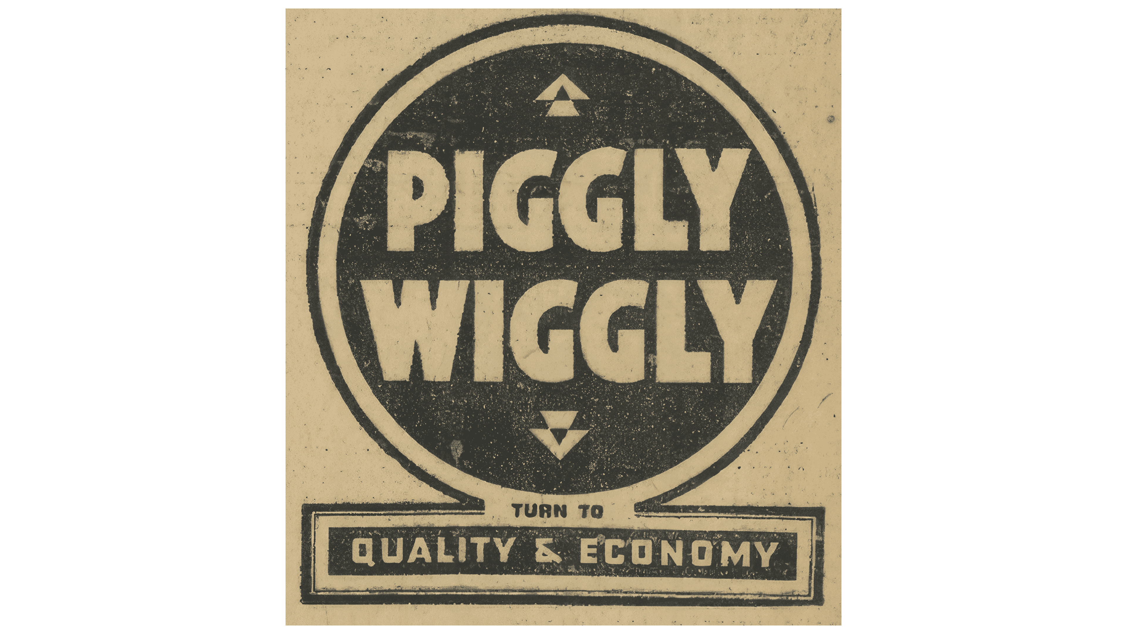
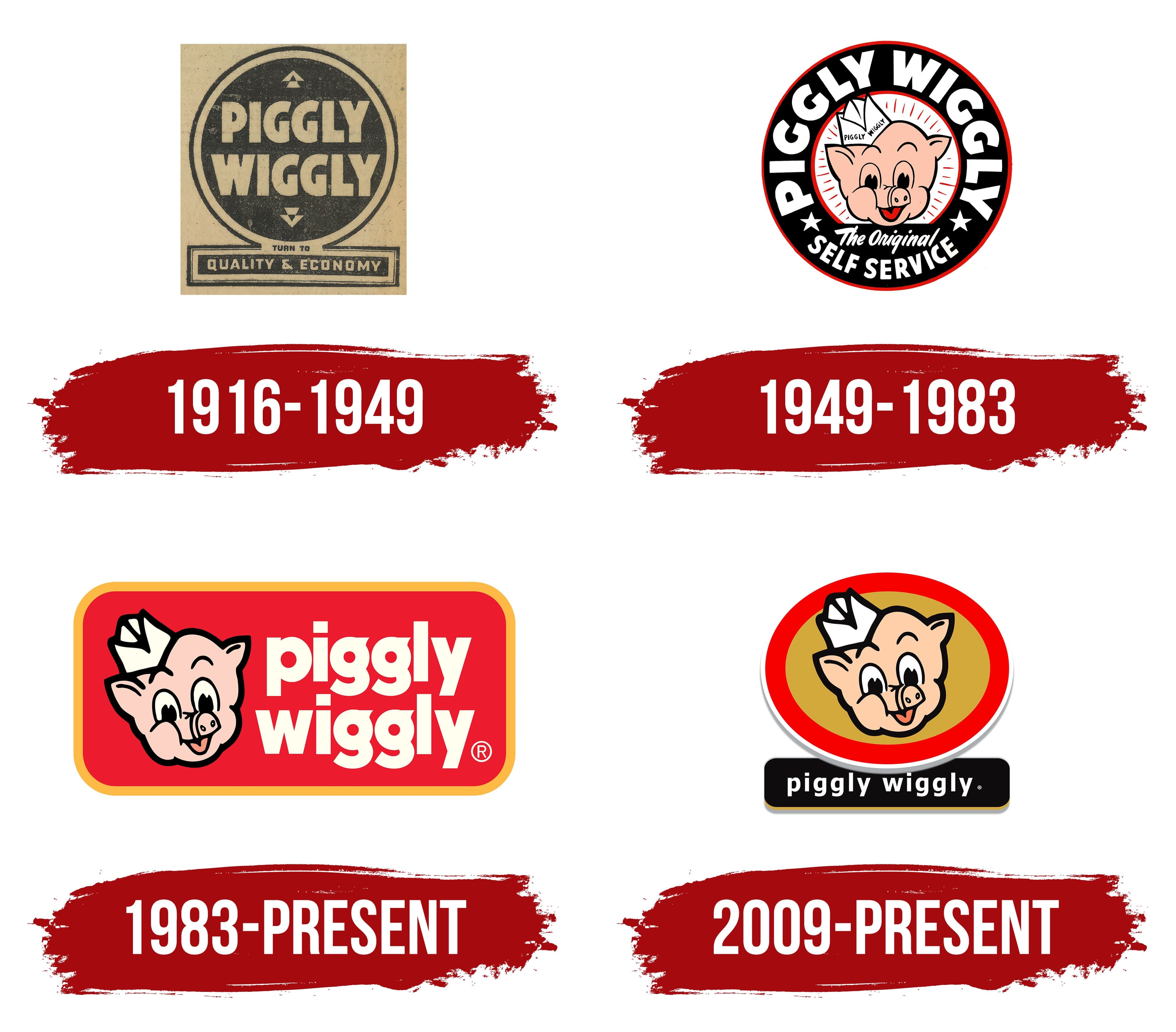
The first store emblem was designed as a black circle, resembling a road sign. This was symbolic, as supermarkets introduced a new approach to movement within the store. The name and arrows pointing in opposite directions marking the entrance and exit were added to the black surface to complete the image. This approach helped optimize customer flow inside the store.
Cash registers were moved closer to the exit to avoid crowding at the entrance and eliminate a sense of congestion. This solution allowed customers to move through the aisles in an orderly manner, picking up the necessary items from start to finish. The sign also emphasized the connection to traffic symbols, drawing attention to the introduction of new checkout lanes to improve transaction flow.
A rectangle with inscriptions highlighting the key benefits of the new store format- speed and savings- was added to the bottom of the circle. Piggly Wiggly offered customers the option to choose their items, significantly speeding up service and lowering prices, as the store no longer needed additional staff to assist in the aisles.
The black-and-white colors of the logo were associated with chalkboards, where product prices were written in chalk, adding another element of simplicity and accessibility. How the brand name originated remains a mystery. One of the main theories is that the founder once saw piglets trying to escape by crawling under a fence and decided to name the store after this, as it aimed to bypass traditional retail rules. Saunders likely associated customers with piglets, so he refused to reveal the name’s true meaning during his lifetime to avoid offending anyone.
1949 – 1983
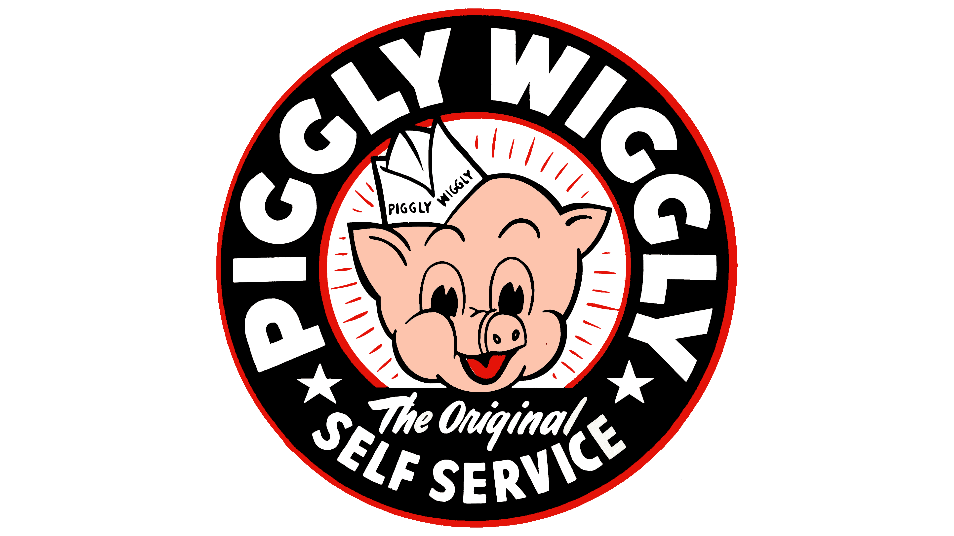
After the war, the stores adopted a brighter and more stylish logo. At the center of the emblem, which retained its circular shape, was a cheerful, smiling pig’s face wearing a paper cap resembling a grocer’s uniform. This detail emphasized the connection to the grocery business and evoked a sense of friendly service.
The pig’s radiance symbolized cleanliness and profit, key elements of the Piggly Wiggly store image. These stores paid Great attention to cleanliness, and the self-service system contributed to customer savings, making shopping more enjoyable and affordable.
The logo was encircled by a thick black border with the brand name written around it, highlighting its uniqueness. At the bottom of the visual sign was the phrase “the original self-service store,” underscoring Piggly Wiggly’s role as a pioneer in this retail system. Founder Clarence Saunders’ idea to implement self-service quickly gained popularity and was adopted by other chains. To maintain its status as the originator, the logo specifically emphasized the brand’s uniqueness. Saunders also granted franchises the use of his system, yet the original store remained a popular destination for shoppers eager to visit, a source of innovations like shopping carts.
1983 – today
After Malone & Hyde acquired the brand, the logo was modified to emphasize the network’s new values and focus. A red price tag was chosen as the background, evoking associations with discounts, savings, and good deals, thereby enhancing the store’s appeal to customers seeking bargains.
The pig’s face is on the left side of this background, the brand’s symbol, which remains unchanged, reinforcing continuity and recognition. On the right, the brand name is displayed in two levels in white font, making it easy to read and remember. The use of white, combined with the red background, symbolizes renewal and the guarantee of fresh products, which is important for customers seeking quality and nutritious items.
The orange border around the logo adds warmth and friendliness, emphasizing the chain’s focus on customer comfort and convenience. This color also reflects the brand’s commitment to creating a pleasant atmosphere, making the shopping experience affordable and enjoyable for visitors, and strengthening their emotional connection to the store.
2009 – today
The new owners, C & S Wholesale Grocers, combined the original mascot with the first logo, restoring the Piggly Wiggly logo to its historical roots. The emblem is designed as a circular road sign, symbolizing movement within the stores and the brand’s evolution over the decades.
The central element of the visual sign remains the recognizable Piggly Wiggly mascot. With its kind smile, this character instantly evokes associations with friendliness and accessibility, which align perfectly with the brand’s focus in the retail sector. The pig wears a chef’s hat, highlighting the connection between food and the kitchen, making the visual emblem vibrant and memorable for shoppers.
The lower part of the sign is styled as a black rectangular plaque with the white text “piggly wiggly.” This element recalls the chalkboards used in grocery stores to display prices and promotions. This retro touch adds a hint of nostalgia to the emblem and emphasizes the connection to its history.
The red circle on a gold background gives the logo a dynamic, cohesive appearance while maintaining its recognizability. The color palette also evokes warmth and comfort, helping generate positive emotions among consumers.
This overall style reflects simplicity and clarity, making Piggly Wiggly a supermarket that remains a part of everyday life for many families, as it has been for decades.