 Kingfisher Logo PNG
Home repair and renovation require materials, tools, and home goods that are purchased at specialty stores. These chains offer a range of products for building and renovating spaces. The Kingfisher logo is associated with a company that operates retail chains for home goods and repair supplies, including DIY stores in various countries.
The company was founded in 1982 as Paternoster Stores Ltd. It was created to acquire the British chain Woolworths. After the deal was completed in 1983, the organization was renamed Woolworth Holdings plc and already owned the B&Q chain, specializing in home improvement products. In the following years, the group expanded by acquiring pharmacy and retail chains, including Superdrug, Ultimate, and Tip Top Drugstores.
In 1989, the company changed its name to Kingfisher plc and began diversifying and expanding into European markets. By 1998, Kingfisher had merged B&Q with France’s Castorama, creating the largest European DIY retail network. In 1999, the company acquired Screwfix Direct. A year later, it began expanding into China.
After 2001, Kingfisher spun off Woolworths and Superdrug into separate companies. By 2002, it had gained full control of Castorama. In the 2010s, the group strengthened its international presence and restructured management. In 2014, leadership passed to Véronique Laury. She launched the ONE Kingfisher program to integrate businesses.
Since 2019, Thierry Garnier has led the company. Under his leadership, Kingfisher has focused on developing e-commerce and launching the Powered by Kingfisher program, which includes proprietary brands and the Screwfix Sprint service.
In 2024–2025, the company continued to expand its marketplaces in the United Kingdom, France, and Poland. B&Q strengthened its presence in the Irish and UK markets.
The company reported profit growth and announced plans to complete its share buyback program by March 2026.
Meaning and History
What is Kingfisher?
One of the largest European home improvement and DIY retail chains operates about 1,900 stores under the B&Q and Screwfix brands in the United Kingdom and Ireland, as well as in France, Poland, Spain, Portugal, and Romania, and through its joint venture, Koçtaş, in Turkey. The company expanded through acquisitions and focused on the DIY market, having exited the pharmacy and electronics sectors. The product range includes building materials, furniture, plumbing, garden equipment, and interior solutions.
1983 – 1989
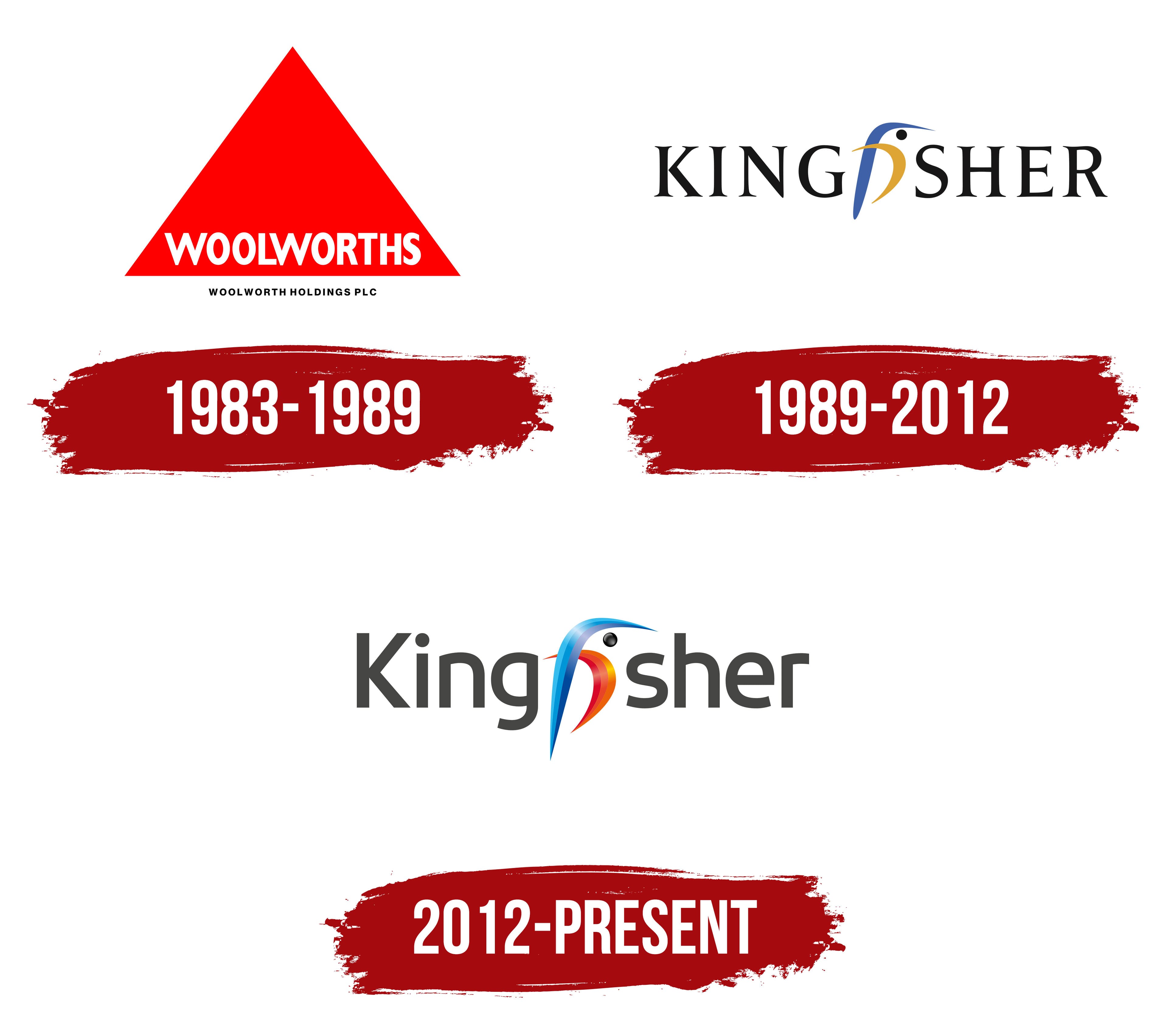
From 1983 to 1989, the Woolworths name formed the basis of Woolworth Holdings plc’s identity. A red triangular emblem connected the holding company with its best-known retail business. The branding reflected the group’s position after acquiring the British operations of F. W. Woolworth, including Woolworths stores and the B&Q chain.
In 1982, a group of investors led by Charterhouse Japhet established Paternoster Stores plc to complete the acquisition. The company became Woolworth Holdings plc on November 12, 1982. Comet and Superdrug later joined its portfolio. As the group expanded, the Woolworths name represented only one part of its operations. The holding company became Kingfisher plc on March 17, 1989.
The logo featured a large red equilateral triangle pointing upward. Its base extended across the full width of the composition, while the sides met at the top center. The white word “WOOLWORTHS” appeared along the lower edge. Its uppercase letters had a dense sans-serif style similar to Helvetica Bold and Univers Extra Bold. The wide “W” made the line look heavy.
The full name “WOOLWORTH HOLDINGS PLC” appeared below the triangle. Its black uppercase letters were smaller, separating the group’s legal name from the retail chain’s name. The difference in scale reflected Woolworths’ leading role in the holding company’s public identity as B&Q grew and Comet and Superdrug joined the portfolio.
1989 – 2012
Woolworth Holdings plc became Kingfisher plc in December 1989, and a kingfisher bird appeared in the group’s identity. The former name was associated primarily with the Woolworths chain. It did not adequately represent a holding company that owned B&Q, Comet, and Superdrug. In his study of corporate branding, John Balmer presented Kingfisher as an example of a company shifting from one retail division’s name to a shared identity across several businesses. The new name united the various chains while allowing them to retain their established brands.
The English word “kingfisher” refers to the bird of the same name. The name came from an episode in the life of group executive Geoffrey Mulcahy. A 1999 article in The Guardian traced the name to Mulcahy’s former Scout patrol. Wolff Olins developed the identity. Design Week later included Kingfisher among the agency’s successful corporate renaming and identity projects.
The logo centered on the black word “KINGFISHER,” set in uppercase serif letters. Their forms resembled Trajan and Adobe Garamond. The original information does not identify the exact typeface. A stylized bird replaced the letters “FI” between “KING” and “SHER.” Integrating the kingfisher into the word helped clarify the name’s meaning.
The bird consisted of three elements. A curved blue stroke represented the upper part of the head or wing and extended into a long beak. A lower golden-orange curve resembled the body or a raised wing. A small black dot formed the eye and connected the colorful bird with the dark lettering. Placing the illustration within the word preserved the inscription’s unified shape.
Kingfisher expanded across Europe during the following years. B&Q and Castorama began integrating in 1998. The group acquired Screwfix in 1999 and purchased the remaining interest in Castorama in 2002. Woolworths and Superdrug separated from the holding company in 2001. The electrical retail businesses later became part of Kesa Electricals. After divesting those operations, Kingfisher focused on home improvement retail, while the Kingfisher image remained part of its corporate identity.
2012 – today
In 2012, Kingfisher replaced the heavy typography of its 1989 logo with a softer sans-serif typeface. The kingfisher gained richer colors and a nearly complete silhouette. By then, the group operated internationally in the home improvement industry. Its corporate identity united businesses in several countries while allowing them to retain their individual retail names.
The international consulting firm Wolff Olins participated in the brand update. Designer Sarah Lewis’s materials identify 2012 as the year the logo was launched. Working through Conran Design Group, she developed Kingfisher’s annual report. Her assignment involved carrying the company’s updated identity into the Annual Report and giving the publication a contemporary appearance. Lewis created the report layout and several corporate video concepts.
The name “Kingfisher” appears in dark gray sans-serif letters. It begins with a capital “K,” followed by lowercase characters. The lettering is softer and lighter than the all-uppercase wordmark introduced in 1989. Its proportions resemble Segoe UI and Myriad Pro SemiBold.
A kingfisher replaces the letters “fi” between the “g” and “s.” Its outline resembles a lowercase “f,” preserving a connection to the name’s spelling. The 1989 version depicted a compact bird’s head, while the updated image shows an almost complete silhouette. A blue area forms the head, back, and elongated lower section. The upright curve continues into a pointed beak facing right. A gradient ranging from light blue to dark blue gives the image depth.
Red and orange sections form the bird’s lower body. The curved shape resembles a breast or wing, while its pointed edge continues the line of the upper area. A small black circle forms the eye. The blue, red, and orange sections create a unified figure within the gray wordmark and illustrate the meaning of the English name Kingfisher.
Kingfisher plc continues to use the 2012 logo. B&Q, Castorama, Brico Dépôt, Screwfix, TradePoint, and Koçtaş retain their individual retail brands. The kingfisher represents the entire group of home improvement chains.