


 Poland Spring Logo PNG
The Poland Spring logo is not just a beautiful symbol of natural riches. The identity focuses on contemporary issues and offers the right solutions. The producer positions the purchase of quality bottled water as an inexhaustible source of health. The company has always focused on the quality of its products and continues to uphold its commitments to consumers.
According to the brand, drinking clean, ecological water means caring for your health today to avoid a range of diseases in the future. Responsible recycling practices demonstrate care for the planet’s future.
The motifs of the modern logo accurately reflect traditions: the founding date, the brand name, and the environmentally friendly green color scheme. The identity has no excesses, and none are needed. Just three elements clearly and thoroughly convey the essence and content.
Poland Spring began in 1845, when Hiram Ricker bought land in Poland, Maine, and found a natural spring on the property. In 1859, he started selling the water in small quantities to travelers and local visitors. A year later, the Ricker family opened Poland Spring House. This hotel linked water to resort culture, clean air, and the period’s health-focused travel habits.
The brand gained wider attention in the 1870s. Its water received recognition at the 1876 Philadelphia Centennial Exposition, helping demand grow beyond Maine. In 1883, Poland Spring began selling bottled water outside the hotel in glass bottles. By the early 1900s, it was supplied to hotels and restaurants in New York and other major cities, and a bottling plant built in 1907 expanded production.
Ownership changes shaped the modern business. In 1969, the company was acquired by Perrier Group, which helped develop distribution and production. During the 1980s, plastic bottles made the product easier to sell through supermarkets, convenience stores, and offices. In 1992, Nestlé acquired the parent water business, placing Poland Spring within a larger beverage network.
From the 2000s onward, the brand added flavored waters, updated packaging, and faced legal and environmental disputes over water sourcing and marketing claims. In 2021, One Rock Capital Partners and Metropoulos & Co. bought the North American water division, forming BlueTriton Brands. Later activities included Poland Spring Origin, recycled-plastic bottles, aluminum packaging tests, Maine-source campaigns, and direct online sales.
Meaning and History
What is Poland Spring?
It is a bottled water brand produced by BlueTriton Brands. The water is extracted from natural springs in Maine. Known for its crisp, refreshing taste, the brand offers a variety of bottled water, including still and sparkling, in a range of sizes to meet different needs. It uses recyclable packaging and participates in water conservation activities. The brand is widely available in supermarkets, stores, and online retailers, making it a popular choice for those looking for high-quality natural spring water.
1845 – 2003
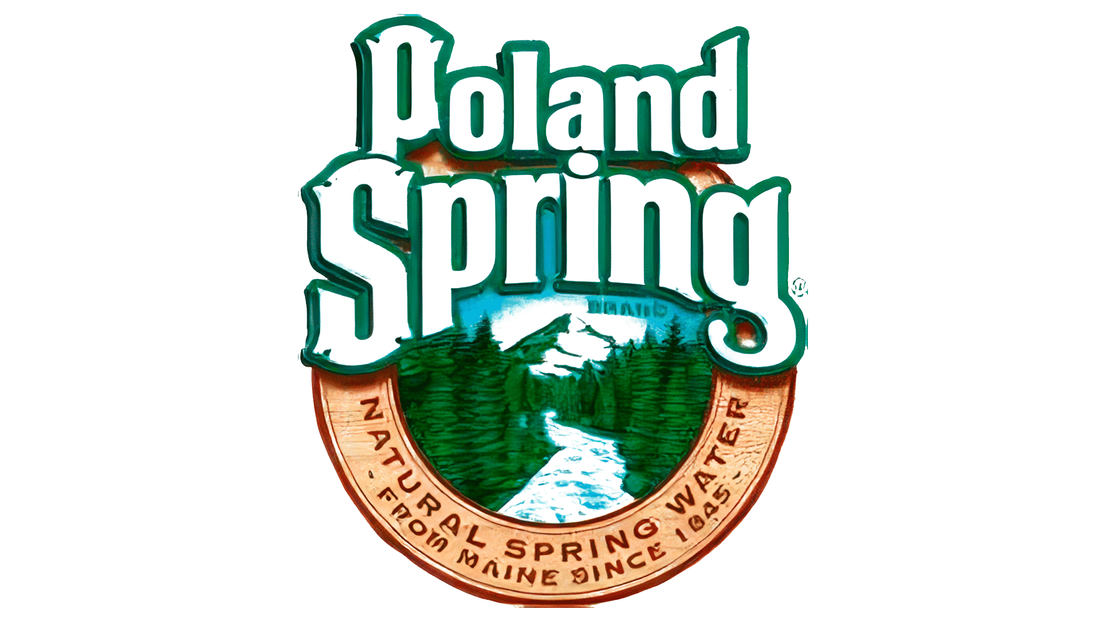
The brand’s first logo clearly and effectively announced itself. The colorful depiction of mountains emphasized the product’s eco-friendliness. Pure water from Maine has always been perceived as a source of strength, health, and energy due to its quality, characteristics, and composition. The natural landscape, featuring the region’s mountains, created a clear, logical perception of the symbol. The realistic color palette evoked a desire to visit the mountains and try the refreshing water. At first glance, the mountains appear as the background, but they are the logo’s informational foundation and central element.
The logo’s three-dimensional lettering served an informative function. The font was clear, and the letters were elegant, arranged in two rows along a curved axis. They had precise outlines and a green border, with white letters. There was harmony between the words, the illustration, and the informational block at the bottom.
The circle played a key role, focusing attention on each element. The mountain river symbolized purity and movement, adding dynamism to the logo.
2003 – 2015
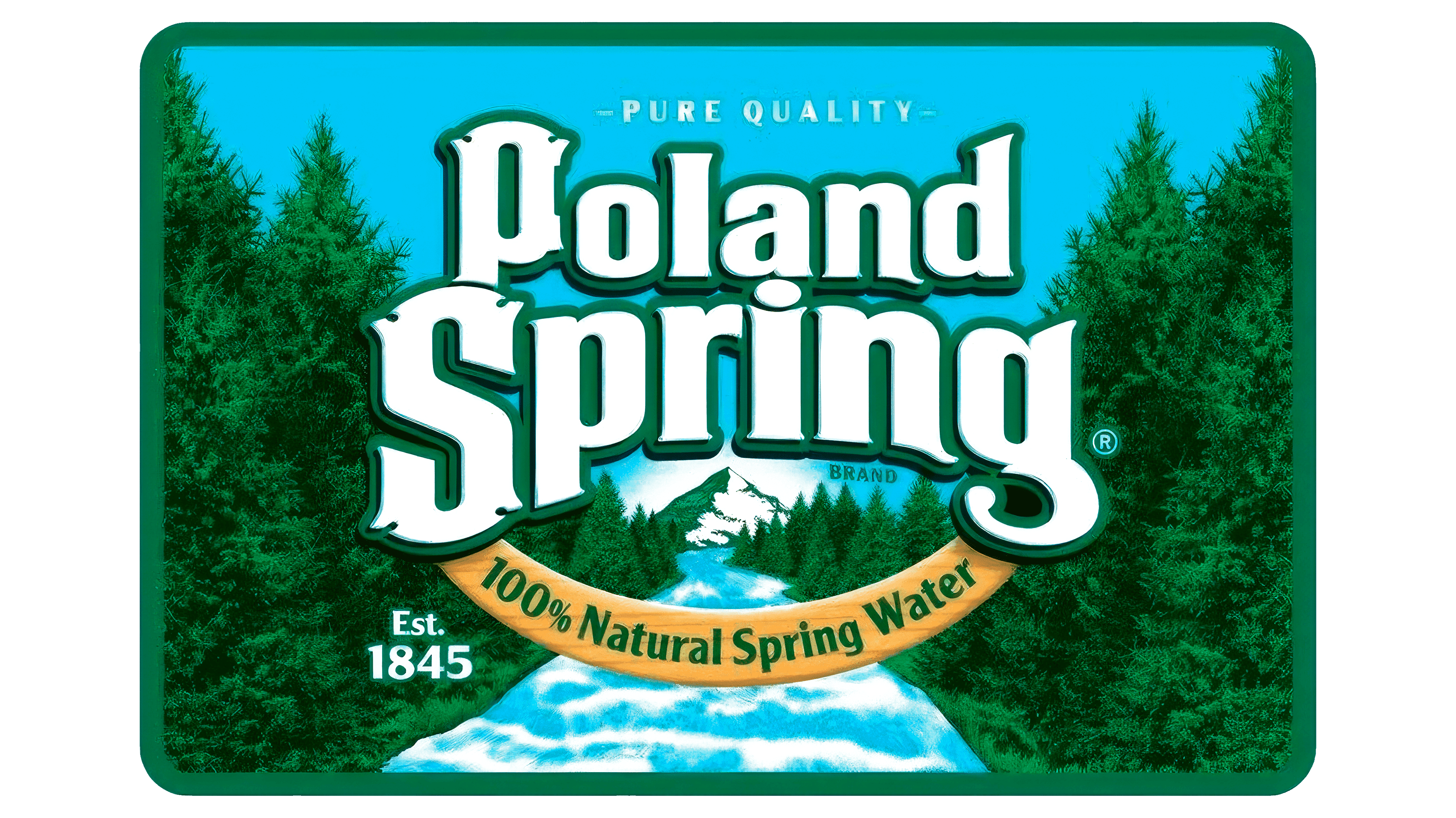
In the new period, the logo’s geometry changed to include a square. Elements familiar to consumers remain, but they have undergone several transformations, maintaining a high visual perception of the logo.
A green frame outline highlights the main elements. Those choosing bottled water are drawn to the center of the logo. There, a mountain river is realistically depicted, symbolizing the flow of life. The gentle blue color of the water is associated with purity, emphasizing quality. The percentage on the logo highlights the water’s superiority over any other.
The brand name is written in a large white font, which gives it a presentable look. In this identity, numerical values enhance the brand’s authority in the eyes of the target audience.
The trees on the logo can be discussed at length. They are part of a beautiful scene and indicate the company’s environmental responsibility. Nestlé has repeatedly participated in actions to protect nature, as reflected in the logo design.
2016 – 2019
In 2016, the logo was simplified: all visual and multifaceted effects, such as rivers, sky, and trees, were removed. Information clutter was minimized. The new identity reflects the concise text, a minimal color palette, and the essence alone.
The brand’s founding date is displayed at the top of the logo. The phrase “Poland Spring” occupies the central position. At the bottom, a phrase informs consumers that they are holding environmentally clean and tasty water.
To retain attention, designers used a rectangular geometric frame. It is done in a natural beige color, associated with a tree trunk, though figuratively, without any detailing.
2019 – today
In 2019, the simplest logo in terms of graphic shapes and text additions was created. It is minimalist and conveys the company’s authority. Many already trust the manufacturer and know the high quality of its products, so detailed information is not required. Clarity, understandability, and simplicity come to the forefront.
The brand name Poland Spring is presented in dynamic graphics. The large font is arranged in a semicircle, with the text centered within the circle for quick brand recognition. The founding date is at the bottom, testifying to stability, confidence, and reliability. The designers deemed it unnecessary to mention quality, as this information is already well-known.
The green color scheme continually evokes nature and eco-friendliness. The logo demonstrates an impressive balance of dynamism and harmony.