


 Nestle Pure Life Logo PNG
The Nestlé Pure Life logo symbolizes the highest quality of products. This unified emblem was created for people who focus on their health. The producer offers high-quality bottled water and provides customers with the best-tasting alternatives. The company actively participates in programs and initiatives aimed at preserving natural resources. As a result, the brand’s products became well-known in Europe, America, Asia, and Africa at an early stage of their development. The modern logo perfectly reflects all aspects of the company’s work.
Nestle Pure Life began in 1998 as a global bottled water brand launched first in Pakistan, where demand for safe drinking water was high, and trust in tap water was limited. The product was positioned as an affordable filtered water option, not as a luxury brand, which helped it reach a broad group of consumers from the start.
After early growth in Pakistan, Pure Life entered Brazil in 2000 and then expanded across South America, Africa, and Asia. In 2002, it reached North America, including the United States, where the bottled water market was already competitive. From 2003 to 2005, the brand expanded into several European countries, including France, Italy, and the United Kingdom, with marketing tailored to local habits and expectations.
In 2008, Pure Life underwent a global rebrand that unified its packaging and messaging across markets. By 2010, it had become the world’s leading bottled water brand by sales volume. In 2011 and 2012, lighter plastic bottles were introduced to reduce material use and transport impact. In 2015, Pure Life Splash added lightly sparkling water with natural fruit flavors as an alternative to sweet soft drinks.
From 2017 to 2020, the brand invested in recycled plastic bottles and broader packaging changes. Pure Life+ appeared in 2019 with added minerals in selected countries. In 2021, the North American water business, including Pure Life in the United States and Canada, was sold to One Rock Capital Partners and Metropoulos & Co. Outside North America, the brand continued with larger reusable containers, functional water, hydration campaigns, and social programs linked to access to clean drinking water.
Meaning and History
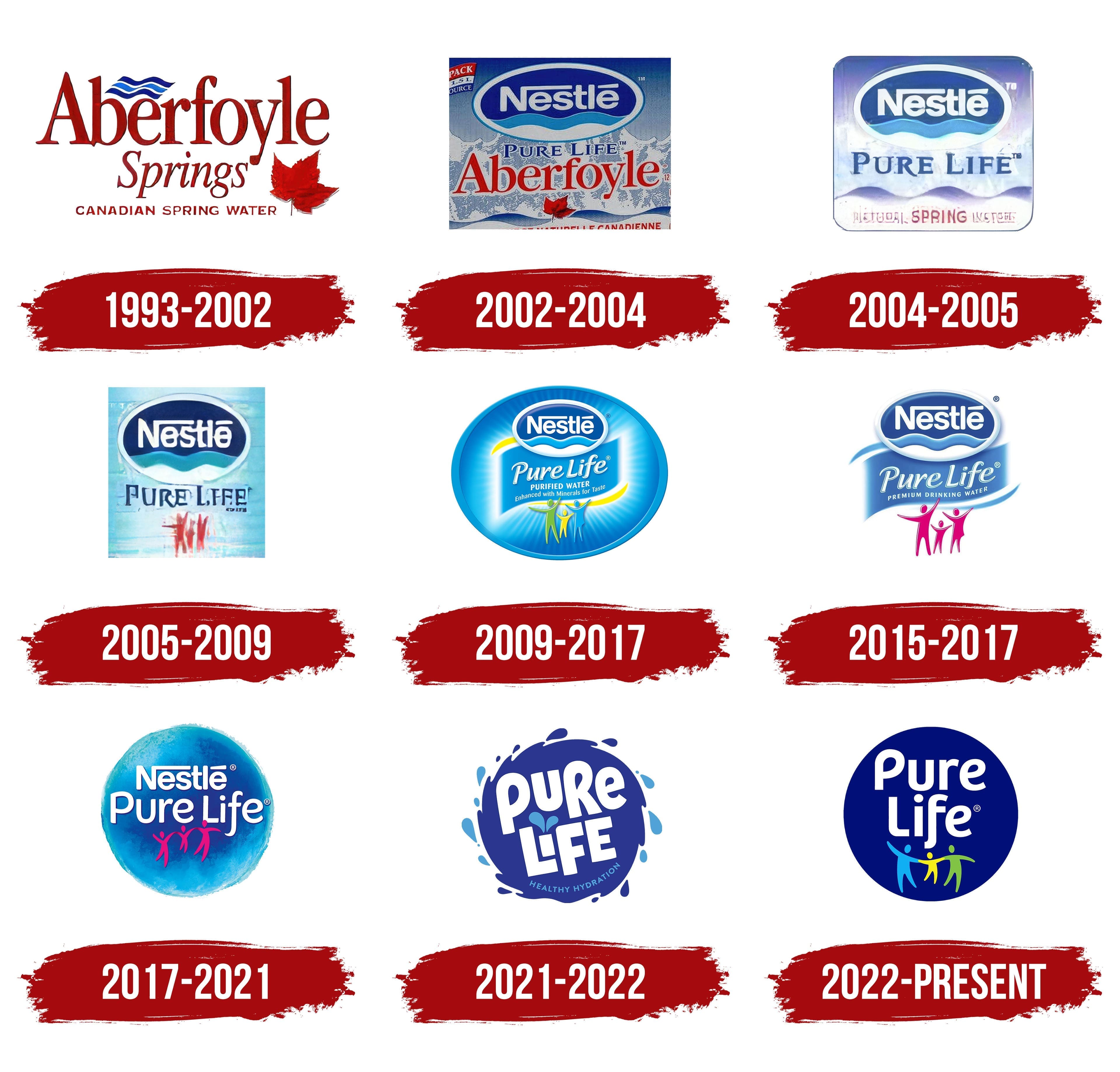
Overall, Nestlé Pure Life consistently ranks among the best in its products and activities. The success is justified: customers highly appreciate the water’s taste, naturalness, and health benefits. Those who try the water enriched with minerals and beneficial components for the first time become its regular admirers. Thus, the brand’s identity is always perceived as informative, and the modern logo is vivid proof of this.
What is Nestlé Pure Life?
It is a bottled water brand produced by Nestlé Waters, a division of the global food and beverage company Nestlé. The brand produces purified water enriched with minerals for flavor. The brand comes in bottles of different sizes, making them convenient for a range of occasions, from single servings to large bottles for the whole family. It emphasizes quality and sustainability, aiming to reduce its environmental impact by using recyclable packaging. The brand is widely available in supermarkets, convenience stores, and online retailers, making it a popular choice for hydration.
1993 – 2002
The brand entered the American market in 1993 with its unique signature logo. The producer created not just an element of recognizability for its product but also emphasized the brand’s patriotism, the high quality of the water, and its distinctive taste, all in one presentational logo. Designers combined various informational blocks into a single logo, developing a complex identity through meaning, content, and contrasts.
The logo of this period was recognizable and attracted attention in different countries. The logo’s brightness depends directly on the color choices used in the identity. In this case, there is an interesting harmony that only professionals could achieve.
The first point of attention is the text element “Aberfoyle Springs.” It proclaims information about the brand, which was not yet popular. The red color is associated with thirst, passion, and love. Therefore, from a strategic perspective, the water was meant to become desirable for the buyer. The large red letters and the smaller, offset second word are so bright that they are unforgettable. The font and style of the words are different: the first word captures attention, and the second serves as a complement.
Another text element on the logo indicates the product’s territorial origin. This inscription is also in red, but it is secondary. Smaller letters and a concise font with a classic inclination create a harmonious impression. All three text elements look different but appear effective and beautiful.
Additionally, the logo has two symbols that enhance its positive perception. A red maple leaf reminds viewers of Canada, serving as a clue for those interested in the product’s authenticity and quality. A small wave symbol indicates the purity of the water. The lines of the three waves vary in shades. To separate the elements of the unified design, color contrast is used, reminiscent of freshness, coolness, and pleasure. The background of the logo is perfectly white and non-textured.
2002 – 2004
A new logo was presented in the American and international markets for nearly two years. It was entirely different in type and format, just like the new series of refreshing water.
This time, the word “Aberfoyle” moved to the lower part of the logo, and the word “Springs” disappeared entirely. Instead, there was text content in the form of a prominent “Nestlé” inscription enclosed in a frame.
The new logo was not developed using standard solutions. Although the 1993 logo served as the basis, all elements underwent a radical transformation.
The predominant colors, light blue and blue, emphasize the purity and quality of the water. Potential customers should examine each element to understand what product is in front of them and who the manufacturer is.
The “Nestlé” inscription, set in a separate element, is combined with a wave design, evoking associations with a reliable producer providing pure water to its customers. A white frame creates a sense of volume, focusing on the key aspect. The phrase “Pure Life” is placed at the center of the logo, but does not attract the main attention. The word “Aberfoyle” is written in huge red letters. This nine-letter element was meant to be noticed almost simultaneously with “Nestlé” and the maple leaf.
The logo’s background is uneven and creative. Instead of a classic approach, a combination of the sea and the mountains is used to highlight the water’s values.
2004 – 2005
The updated logo also emphasized freshness and purity. The identity focuses on transparency and eco-friendliness, and the soft blue emphasizes the product’s environmental qualities. The content concept remains the same, but the symbolism and details of the logo have significantly changed. White now symbolizes gentleness and appears more frequently than before.
The company’s name is in large, wide letters in a light tone, making it easy to read. The placement of the letters “Nestlé” makes the product easy to find on store shelves. Waves in the middle of the oval remain in the background, reflecting the main idea and message: naturally pure and beneficial water replenishes energy. Mountain and water elements also serve as the background, spreading across the logo.
The phrase “Pure Life” now occupies the central position. The letters are aligned horizontally, slightly elongated, and have sharp angles and serifs. The font has become more concise and restrained. At the bottom of the logo, the inscription “NATURAL SPRING WATER” represents the power of nature.
The color palette is gradient, transitioning from dark to light, creating a striking contrast reminiscent of the blue sky and the transparency of seas and oceans.
The logo stands out for its presentability and aesthetic beauty. It lasted no more than a year before significant changes followed.
2005 – 2009
In 2005, the company introduced a new identity: compositional elements, design, and graphics. Notably, elements and details that complicated the overall look were left behind. Accessibility of information became key, so colors and textual additions were chosen to accurately convey the product’s main benefits.
The emblem’s overall background is a soft blue, perceived as a natural shade of the sky and clear sources. All canons say blue is calming but dynamic and active, like an ocean wave. This interplay of background color remarkably emphasizes the symbolism’s scale.
A fairly large circle encompasses two main informational motifs. The company name, Nestlé, is written in white, indicating reliability and popularity. A single word inspires trust among customers. The contrasting image of waves in three shades symbolizes purity and freshness. The product’s eco-friendliness is an indisputable advantage of Nestlé water. A wide white oval frame highlights the main message: “Only quality water can bring health!”
The phrase “Pure Life” slightly shifts downward compared to the previous logo interpretation. The font and letter shape have been changed. They are elegant, aligned in a row, and spaced evenly apart. Each capital letter is written in a deep, rich blue color.
An innovation was the addition of three figures symbolizing a family. These figures, in a rich red color, are highly noticeable. The depiction of three figures of different sizes in motion conveys the value of traditions, representing dynamism.
2009 – 2017
Many believe that the logo created in 2009 is one of the designer’s most successful works. Perhaps that’s why it remained unchanged for six years.
The updated identity stands out for its kindness and friendliness towards customers, symbolizing care and attentiveness. The central focus is on figures of people holding hands, emphasizing family connections. Family and relatives are regarded with affection, which is why the dynamic figures in various tones evoke the warmest feelings. Everyone wants their loved ones to be healthy, and the company producing the purest water in the world offers to care for everyone. Sentimentality and dynamism are intertwined in one logo, creating an innovative identity solution.
The company remains true to its traditions, maintaining the presentation of its name but making it smoother and more concise. The company name is placed in a frame at the top of the emblem. The waves with gradient tones and the white semi-oval frame are long familiar to Nestlé’s target audience.
A new element, a wide blue background resembling a wave or a blue ribbon, enhances text readability. This background allows the product to be presented in a simple and understandable format.
The logo’s multi-layered nature deepens its perception. Dynamic figures of people, like a flag, hold the text block, raising it above their heads and offering it to the sky. This image conveys the idea that pure water is invaluable.
2015 – 2017
In the next interpretation, the logo became more restrained. The colorful human silhouette figures are now detailed and colored in a soft pink hue. This adds simplicity to the logo but reduces its dynamism. Conservatism and restraint prevail.
The placement of text elements remains the same, but the number of letters has been reduced. The focus is now on the product being part of the premium segment, expressed in three words: “the best-tasting water.”
Interestingly, for the first time across all periods, the background, which previously existed alongside the company name, extends beyond the contours. This design movement emphasizes freedom, the power of nature, and purity.
2017 – 2021
In 2017, new criteria for presenting information on logos were applied. Designers used new techniques to visualize motifs in the identity, making the logo’s transformation a logical and expected phenomenon. The perfection and precision of the letter lines are presentational. The logo forms a logical sequence: see, think, remember the taste of the water, and buy the product. The logo also conveys absolute happiness, with cheerful, friendly pink human figures.
The word “Nestlé” is consistently displayed across all products, reinforcing trust in the company’s products. The “Pure Life” inscription has become slightly more minimalist while maintaining its significance.
2021 – 2022
If a logo can be described as cheerful, energetic, and dynamic, then the new identity format for pure and delicious water fits this description. The logo has become more whimsical while maintaining maximum informativeness. Now, the circle has transformed into a water droplet, which, while stationary, rotates on its axis. The primary colors blue and white form its color scheme. Human figures are no longer used in the identity during this period.
2022 – today
Modern identity increasingly strives for simplicity and accessibility to information. Through the elements and text on the logo, the brand positions itself as the customer’s best friend, perhaps even as an attentive parent who prioritizes health.
Amid global issues and rising rates of kidney and other organ diseases, the brand is responsible for providing the highest-quality water. The eco-friendliness of the purest water today is very high, and this does not go unnoticed by customers from various countries. Nestlé water is among the most popular, and its logo, with three elements and only two main colors, plus three additional ones, is among the most recognizable.
The familiar blue background has greater depth in the new format. The white inscription in the center of the blue circle is visible. The three-colored human figures evoke associations of family happiness.