


 Polygon Logo PNG
The Polygon logo symbolizes the desire to explore all aspects of the gaming industry. The platform offers in-depth analysis of events, from reviews of new games to discussions of trends, bringing together journalists, critics, and developers. It has become a space where games are viewed as both entertainment and cultural phenomena.
Polygon was founded in 2012 during the expansion of Vox Media and officially launched on October 24, 2012. The project grew from The Verge Gaming, a gaming blog within Vox Media’s technology publication The Verge. Co-founders Christopher Grant, Justin McElroy, and Russ Pitts built the site around news reporting, detailed analysis, developer interviews, reviews, and studies of gaming culture.
From its launch, Polygon relied on interactive features, infographics, and video. In 2013, coverage expanded to Gamescom, E3, and Tokyo Game Show, along with independent games and developers. The site hired established journalists and critics, strengthening its role within gaming media.
In 2014, Polygon opened a YouTube channel featuring comedy shows, documentaries on game development, and video reviews. By 2015, its editorial scope included representation, the social impact of games, and related cultural debates. Podcasts and regular Twitch broadcasts followed in 2016. During 2017 and 2018, reporting widened to virtual reality, augmented reality, consoles, PC technology, social media, streaming services, long-form articles, and interactive projects.
In 2019, Polygon increased coverage of esports and streaming culture. During 2020 and 2021, virtual showcases and online events replaced many physical conferences. In 2022, new video series examined video game history and game design. By 2023, the publication continued covering games, media, technology, and industry change worldwide.
Meaning and History
What is Polygon?
This online resource dedicated to games and entertainment has become a key source of news, reviews, and analysis on video games. It stands out from competitors for its in-depth reporting and unique editorial style, combining professional journalism with a passion for gaming. The platform offers a wide range of content, from news summaries and game reviews to long-form articles and video series, catering to casual gamers and dedicated enthusiasts. The authors often address broader cultural and social aspects, highlighting how video games influence modern society and interact with other forms of art and media.
2012 – 2024
In 2012, the Polygon website launched, initially positioning itself as a gaming blog. However, within a short period, the portal significantly expanded its scope and became a multi-topic resource, offering diverse materials on video games and related culture. This gaming portal is closely tied to and owned by Vox Media.
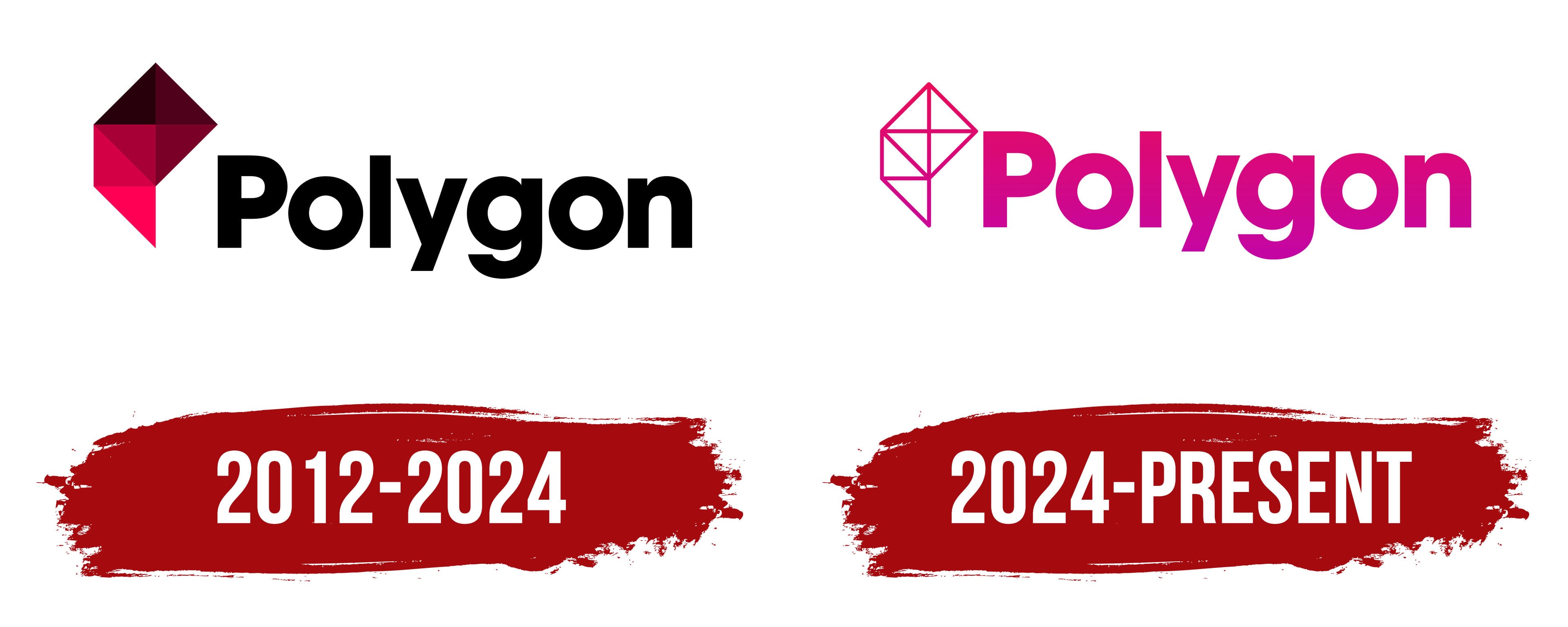
Simultaneously with the website launch, the first Polygon logo was introduced, which is important in strengthening brand recognition. The logo was minimalistic but impressively beautiful and stylish. It featured a single symbol and one word, which looked concise yet elegant. The geometric figure on the logo was drawn using a carefully selected color palette, creating a sense of depth through shading and highlights on the lines. This 3D effect added dynamism to the logo, which was particularly important for a gaming website where speed and motion are key.
The logo’s text element was rendered in black, using a bold font. The first letter, “P,” was capitalized and stood out due to its large size, while the remaining letters were elegant and noticeable but less emphasized. The emblem lasted about 12 years until a rebranding brought an updated version of the identity.
2024 – today
The updated logo retained many features of its original prototype but reflected the changes on the website, which had become a hub for information about video games; the logo needed to reflect that shift. It is an elegant interplay of shapes and lines, reflecting the spirit of modern media. At its center is the title, rendered in a bold font with clean contours. The letters appear carved from a single block, conveying simplicity and confidence. The sans-serif typeface emphasizes its technological and versatile character.
To the left of the text is a graphic element that resembles animated geometry. Seven triangles smoothly connect to form a unified figure, creating a visual rhythm. This shape evokes associations with a structure where all parts are interconnected, symbolizing unity and multifacetedness. A gradient from soft pink to deep burgundy gives a sense of motion, resembling waves of color gliding across a surface.
The name embodies the complexity and richness of form. The polygonal figure in the logo represents the platform’s multilayered ideas and approaches. This graphic solution balances simplicity and intricacy, harmoniously aligning the visual style with the brand’s concept.
The overall design conveys dynamism and modernity while retaining a touch of formality. The emblem combines minimalism with richness, creating a unique identity for the platform.