


![]() Repretel Logo PNG
Repretel Logo PNG
The vibrant Repretel logo has become an integral part of Costa Rican television identity. Its colors symbolize energy and dynamism, while the serious typography conveys a professional approach to work. Designers struck a balance between tradition and modernity in the emblem to express the company’s evolution over the years.
Repretel was formed in Costa Rica in 1993 by Remigio Ángel González, a Mexican media businessman born on June 14, 1944. Known in Latin American media circles as “El Fantasma” for his public silence, he worked in the early 1980s as a Televisa sales representative. In 1981, with Televisa-backed financing, he bought Guatemala’s Canal 3 and Canal 7, a model later used in Costa Rica.
Representaciones Televisivas S.A. entered the Costa Rican market by leasing Canal 9 and Canal 6, then known as Telecentro. Canal 6 had been founded on September 12, 1965, with Costa Rican and Panamanian investors and support from NBC. It had used Televisa programming, competed with Teletica, and launched NotiSeis in 1976. Repretel bought Canal 6 outright in 2007.
In 1995, the group added Canal 11, whose history began with Televictoria in 1969, the first Central American station to adopt color broadcasting. By 1996, Canal 11 was under Repretel control. In 2000, after the Canal 9 lease expired, the company moved its signal to Canal 4, which it had acquired from TV Azteca after the Mexican group’s regional plans weakened.
Repretel later bought Canal 2 in 2012 and renamed it CDR 2. Its radio arm, Central de Radios Repretel, operated stations such as Radio Monumental and Radio Reloj. In 2008, González grouped his Latin American assets under Albavisión, named after his wife Alba Elvira Lorenzana. By 2018, the group controlled 35 TV channels, 114 radio stations, and two publishing businesses in 11 countries, with Repretel as a key Costa Rican asset.
Meaning and History
![]()
The name Repretel is formed from the phrase “REPREsentaciones TELevisivas.” The abbreviated version is used in logos and is often presented in blue, taken from the Costa Rican flag. This is a tribute to the home country and a display of patriotism, connecting the media company with its audience.
Of course, there have been many other bright colors in Repretel’s emblems because it loves gradients. Even the visual symbols of its owned TV channels once shimmered with all the shades of the rainbow. In 2007, the company switched to flat design to convey a serious approach to broadcasting and evoke professionalism and trust.
What is Repretel?
Repretel is the short name for Representaciones Televisivas S. A., a media company that owns Costa Rican channels 2, 11, 6, and 4, as well as several radio stations. Broadcasting is exclusively in Spanish and covers the entire territory of Costa Rica. The company was founded in 1993 and is now based in San José. It is owned by the Latin American media network Albavisión, which is owned by Remigio Ángel González.
1993 – 2007
![]()
The logo features the large dark blue word “REPRETEL,” beneath which is a small inscription, “Un mundo de entretenimiento,” the media company’s slogan. The upper line is in bold italics with rounded serifs, while the lower one is in even, thin, and grotesque. Adjacent are three circles with the emblems of Costa Rican channels belonging to Repretel.
- The lower circle features the Canal 4 icon, a red number “4” that appears three-dimensional due to its gradient black-and-white outline. The number four is inside an ellipse formed by two rainbow-colored arcs. This bright portal leads to a world of children’s programs and movies. This logo was created in 2000 when Repretel bought the channel from TV Azteca and remained in use until 2007.
- The middle circle contains the number “6”, the emblem of Canal 6 from 1999 to 2004. The six looks like a compact disc, with the left part not rounded but stretched upward. Both ends of the bending strip are painted turquoise. On one side, it smoothly transitions to yellow and orange; on the other, it transitions to blue and purple. Rainbow shades meet in the center, turning into a rich red.
- Inside the top circle is the Canal 11 logo, created in 1995 and used until 2004. In the center are two blue ones, superimposed and connected by three orange stripes. The left number is lighter than the right. The number appears three-dimensional due to the wide black contours. Next to it is a rainbow disk. It is enclosed in a ring of short gray strokes and complemented by a dark pink “CANAL” inscription.
The three circles are arranged one behind the other on a gray stripe, forming an ellipse. This hints that all three TV channels are interconnected: they are on a common orbit and “revolve” around Repretel. The logo was used from 2000 (from the time of Canal 4’s purchase) to 2004 (when Canal 6 and Canal 11 changed their visual symbol system).
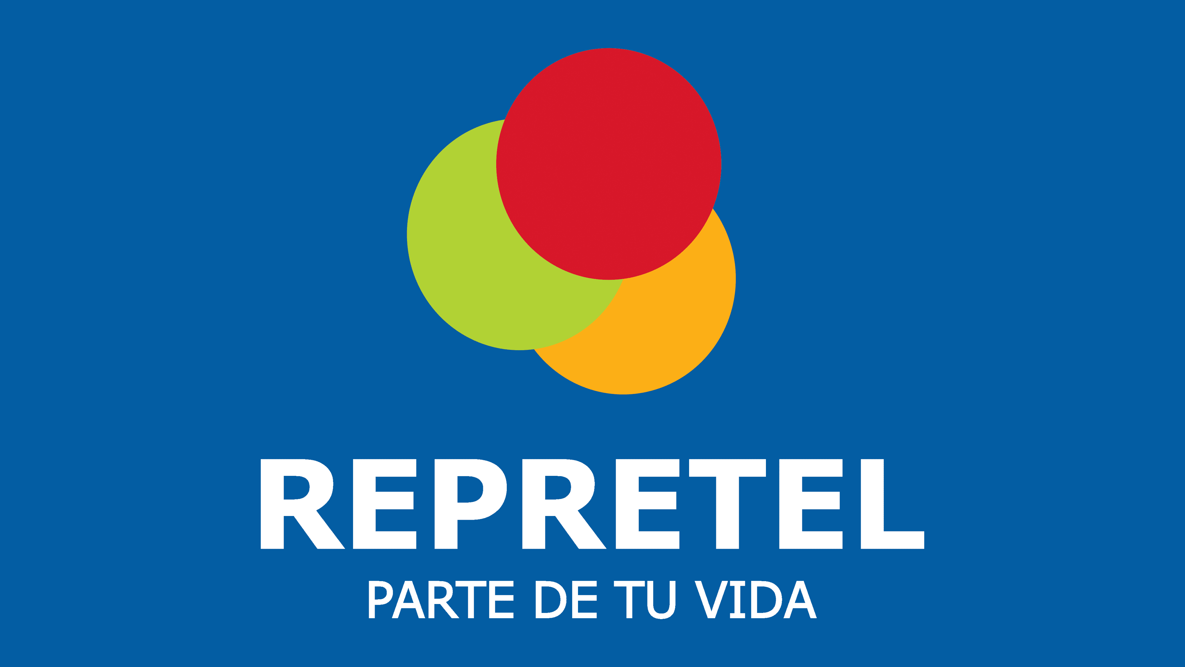
2007 – today
![]()
In 2007, the media company made its emblem minimalist and flat, eliminating the gradient. Now, its name is accompanied by a new slogan: “PARTE DE TU VIDA.” Both inscriptions are painted in light blue and executed in the same bold sans-serif font.
Above are three circles: red, green, and orange. They no longer represent TV channels, as Repretel now has four, not three, with CDR 2 joining in 2012. However, the geometric figures still symbolize a wide range of content from movies and talk shows to news and sports programs. This logo was created by the design studio Brandmaker.
Font and Colors
For both the company name and its slogan, the font Verdana is used. This humanist sans-serif was developed by Matthew Carter based on Tahoma and released in 1996. It was intended for Microsoft Corporation, so its main advantage is high legibility even on small screens.

The logo reflects the colors of the Costa Rican national flag: red and blue. These are complemented by orange and light green, conveying Repretel’s versatility and commitment to content diversity.