 Santander Chile Logo PNG
Financial services, including loans, credit cards, money transfers, and savings accounts, are integral to everyday life and business operations. These services are provided through a banking system that integrates local services with international resources. The Santander Chile logo represents a bank that operates as part of a global group and provides financial services to individual customers and businesses in Chile.
Banco Santander began operations in Chile on October 23, 1978. It was opened as a branch of the Spanish banking group. In the early years, growth was moderate. In 1982, the bank acquired the assets of the bankrupt Banco Español Chile. Under that name, the institution operated until October 1989, when it reverted to Banco Santander Chile.
The 1990s marked a period of growth. In 1993, the bank purchased Fincard, the country’s largest credit card operator. In 1995, Fincard merged with Financiera Fusa. On this basis, the Banefe division was created to focus on consumer lending.
In 1996, Banco Santander acquired a controlling stake in Banco Osorno y La Unión for $ 495 million. The merger created Chile’s largest private bank. Its assets reached 7.9 billion dollars. The headquarters were located on Bandera Street in Santiago.
By 2000, the group had strengthened its market position. During that period, Banco Santiago was acquired. After the merger was completed on August 1, 2002, a new combined institution emerged as Banco Santander Chile.
Later, the bank became a leading participant in the country’s financial sector. In 2023, management announced an investment plan totaling $800 million, scheduled through 2026. The funds are directed toward digital transformation, including the development of the Work Café project and the creation of the Campus Santander training center.
In the same year, the Más Lucas account was launched. It is the first fully digital, fee-free service that earns interest.
Banco Santander Chile remains the country’s largest bank. Its assets amount to about 68.2 trillion Chilean pesos. The bank serves 4.6 million clients and operates 237 branches. The institution holds an A2 rating from Moody’s and an A-minus rating from Standard & Poor’s.
Meaning and History
What is Santander Chile?
The largest private bank in Chile, headquartered in Santiago, is part of a Spanish financial group. It serves individual and corporate clients, universities, and government institutions. The network includes 377 branches and over one thousand ATMs. The main business areas include retail banking (loans, mortgages, cards, savings), small and medium business services (credit lines, financing), and corporate and investment banking (capital markets, project financing, investments). The bank also offers insurance, leasing, factoring, foreign exchange, and consulting.
1978 – 1982
The bank was named after Santander, a city in northern Spain, where it was founded in 1857. The Santander group kept its connection to the port city, while Chile identified its Chilean operation. Its local history began in 1978 with the establishment of Banco de Santander-Chile, which focused on foreign trade transactions. The bank’s founding document was dated October 23, 1978, and it received authorization to operate in January 1979.
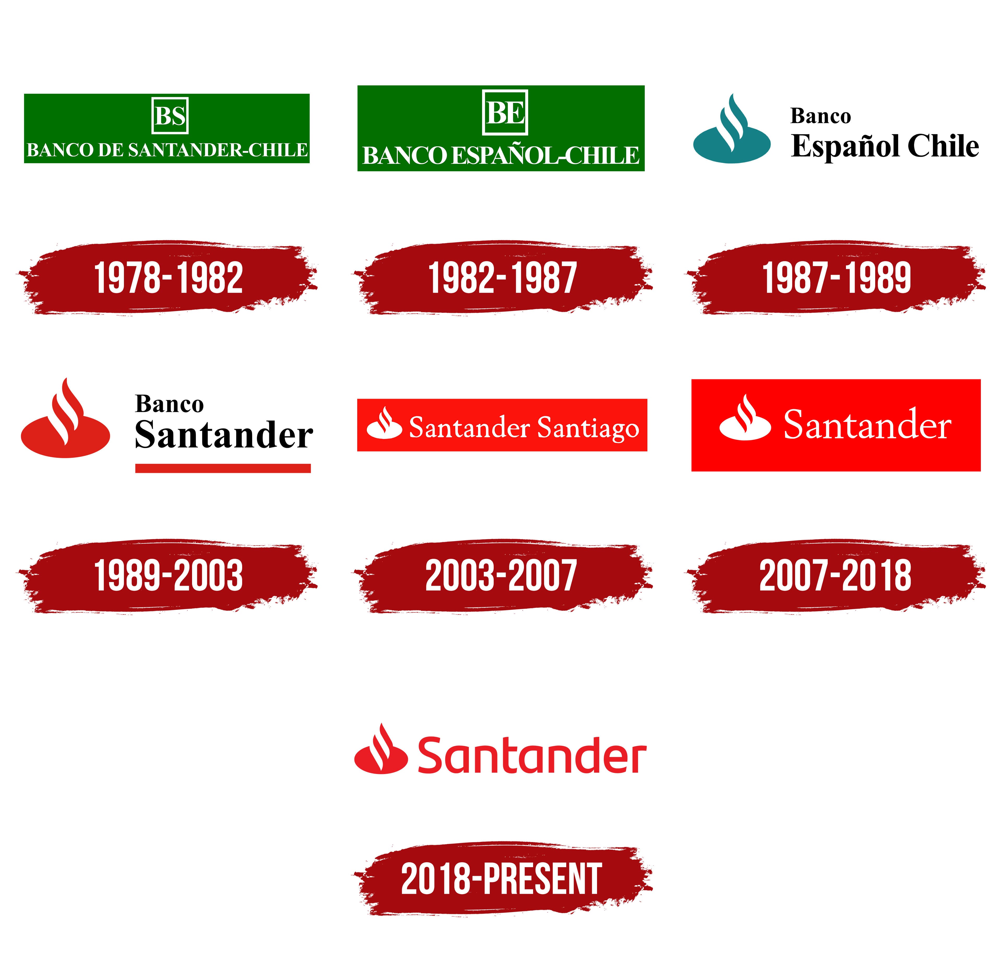
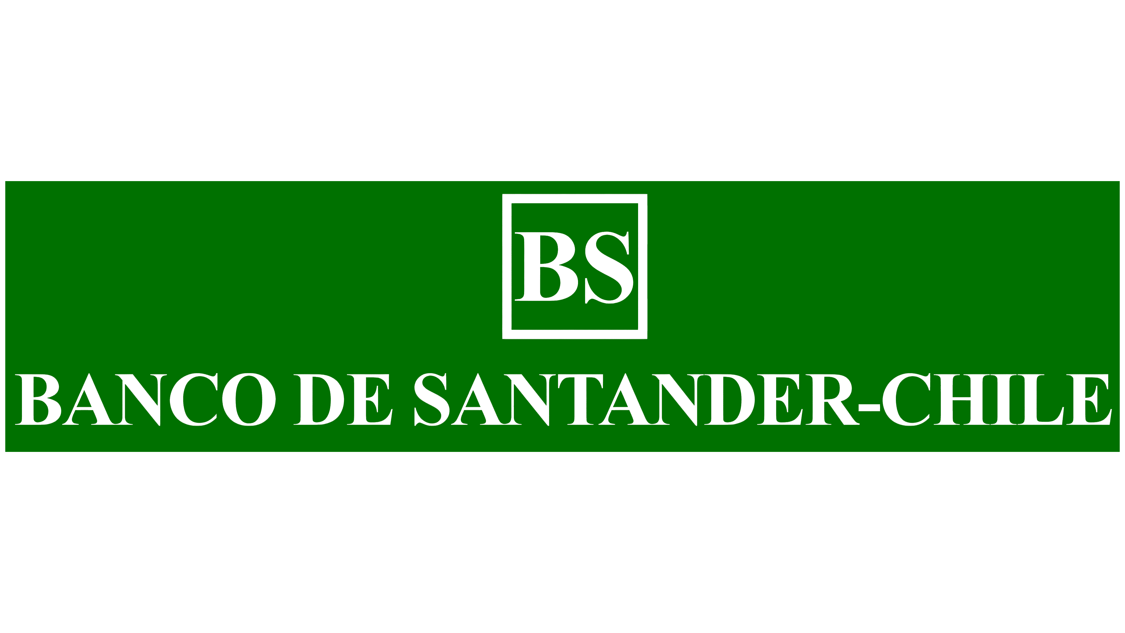
The original logo inherited the Spanish bank’s green color scheme. The name and monogram appeared inside an elongated horizontal rectangle. A small square with a thin white border sat at the upper center. Inside, closely spaced white capital letters “BS” formed the initials of Banco Santander. Serifs and tight spacing gave the monogram a compact shape.
Below the square, BANCO DE SANTANDER-CHILE stretched across the full width of the green field. The white capital letters echoed the monogram’s style, with serifs and straight vertical strokes. Their shapes resembled Times New Roman, Bodoni, or Didot. SANTANDER-CHILE occupied most of the line, joining the Spanish bank’s name with the country where it operated.
1982 – 1987
In 1982, Santander acquired the name Banco Español-Chile, meaning “Spanish Bank of Chile,” along with the bank’s assets and liabilities as it was liquidated. The Chilean operation used the name until 1989, then returned to Banco Santander. The logo’s wording changed with the name, while the design remained.
Inside the white-bordered square, “BE,” the initials of Banco Español, replaced “BS.” BANCO ESPAÑOL-CHILE replaced BANCO DE SANTANDER-CHILE on the lower line. A tilde appeared above the “Ñ” in ESPAÑOL.
The green rectangular field, the monogram above the name, and the white lettering remained unchanged. The logo retained its uppercase serif lettering after the name change.
1987 – 1989
Banco Español Chile adopted Santander’s flame emblem in Spain while keeping its existing name. The group adopted the symbol as part of its visual identity in 1986. Landor Associates developed the corporate identity, with Jerry Kuyper on the team. The bank associates the image with the discovery of fire and its role in human development. At the same time, the flame represents passion and a close connection to people.
In the Chilean logo, a dark teal symbol replaced the square monogram. A horizontal oval formed its base, with curved flames rising above it. Two gently curving vertical white lines divided the upper portion. The green rectangular background disappeared, leaving the emblem and name against an open white background.
To the right, Banco Español Chile appeared in black on two left-aligned lines. A smaller Banco sat above the larger Español Chile. The upright letters retained their serifs and resembled Times New Roman. A tilde appeared above the “ñ” in Español.
1989 – 2003
The return to the name Banco Santander-Chile in October 1989 changed the emblem’s color. The teal flame became bright red. Red entered Santander’s corporate identity in 1989 and remained in subsequent versions.
The symbol on the left had an oval base and two curved white shapes extending upward. The flowing curves within the red shape suggested flames. To the right, Banco Santander appeared in black on two lines. A smaller Banco sat above the larger Santander. The uppercase and lowercase letters were upright, with a serif typeface resembling Times New Roman or Georgia.
A red horizontal bar matching the emblem appeared below the name. Separate from the symbol, it extended across the full width of Santander. The bar was a flat rectangle, slightly shorter in height than the lowercase letters.
2003 – 2007
The merger of Banco Santander-Chile and Banco Santiago introduced a combined name into the bank’s logo. The banks merged in 2002. After their banking operations were integrated in 2003, the Santander Santiago brand was introduced. The name retained both banks’ names and their histories before the merger. Luis Bassat of Bassat Ogilvy designed the logo.
In the updated logo, Santander and Santiago appeared on a single line, giving the two names equal prominence. The separate underline and the word “Banco” were removed. White lettering sat to the right of the flame symbol on a bright red horizontal rectangle. The combined name extended the logo horizontally, while the shared background united the lettering and emblem.
The white symbol on the left retained two curved bands rising upward. At the bottom, the bands joined an oval resembling a bowl or the base of a vessel. Together, the curves and oval suggested flames or smoke rising above a bowl. The Santander Santiago lettering combined flowing contours with small serifs, resembling Garamond or Sabon. Both words began with an uppercase “S,” followed by lowercase letters. White united the name and flame against the red background.
2007 – 2018
The combined name Santander Santiago appeared in the logo after Banco Santander-Chile and Banco Santiago merged. The banks merged in 2002, completed integrating their operations in 2003, and began operating under a shared name. It preserved both organizations’ names and reflected their transition to a combined business. Luis Bassat of Bassat Ogilvy designed the logo.
Santander and Santiago appeared on a single line to the right of the flame emblem. The separate underline and the word “Banco” were removed. The white lettering and symbol sat on a bright red horizontal rectangle. The combined name filled most of the space, maintaining the logo’s elongated proportions. The shared background connected both parts of the name with the emblem.
The flame on the left consisted of two white curved bands extending upward. At the bottom, they joined a white oval resembling a bowl or vessel base. Their outlines suggested fire or smoke above a bowl. The Santander Santiago lettering had flowing contours and small serifs, resembling Garamond or Sabon. Both words began with an uppercase “S,” followed by lowercase letters. The lettering and flame were white against a shared red background.
2018 – today
Santander’s shift toward digital services and a friendlier approach to customer communication coincided with a 2018 logo update. The Chilean bank joined the group-wide rebranding, which rolled out across key markets at the same time. Group chair Ana Botín introduced the new identity at the shareholders’ meeting on March 23, 2018. Interbrand developed the design after gathering opinions from Santander employees and customers in several countries.
A white background replaced the red rectangle. The emblem and bank name appeared in the same shade of red, but brighter. On the left, the flame retained its horizontally elongated oval base and two curved shapes extending upward. White gaps separated the red areas, suggesting fire or rising smoke trails. The upper portion became more compact in relation to the oval. The designers used a geometric grid to coordinate the symbol’s angles and spacing.
Santander appeared to the right, beginning with an uppercase “S” followed by lowercase letters. Rounded contours and medium-weight vertical strokes replaced the earlier serifs. Hendrik Weber developed the humanist lettering with Monotype. Two details from the bank’s earlier lettering remained. The lowercase “a” retained its single-story form, and the “t” crossbar extended to one side. The overall lettering resembles typefaces like Avenir, though Santander created the letters specifically for the bank.
The name’s lettering became the starting point for a complete alphabet. It was built from Santander’s seven distinct letters: “S,” “a,” “n,” “t,” “d,” “e,” and “r.” The alphabet was intended for logos and division names to ensure a consistent design. The logo typeface came in two weights, Regular and Light. In April 2019, Santander introduced the Santander Font family, developed with Monotype as an extension of the bank’s lettering work.