


 SoBe Logo PNG
The SoBe logo symbolizes a commitment to Americans’ health. The brand carefully selects ingredients for its drinks, which quench thirst and provide pleasure. South Beach Beverage Company, owned by PepsiCo, has created products that appeal to various age groups and have no analogs.
Unique blends and additives have an amazing aroma and a rich, memorable taste. Exotic drinks initially attracted customers’ attention and then became their favorites. Today, they are made for the particularly health-conscious.
The brand’s identity emphasizes the naturalness and exoticism of its products. The emblem with two lizards symbolizes the unity and harmony of taste and composition. This combination includes traditional recipes and innovative components.
SoBe was founded in 1995 in Norwalk, Connecticut, by Tom Schwalm, Arline Sorensen, and John Bello. The name came from South Beach in Miami Beach, a reference to the nightlife, beach culture, and youth trends that shaped the brand’s early image. The company entered the alternative beverage market as U.S. consumers were shifting away from traditional sodas and toward teas, juices, and functional drinks.
Its first product was SoBe Black Tea 3G, made with black tea, Siberian ginseng, guarana, and ginseng. In 1996, the brand added lysine-enriched beverages, following interest in ingredients linked to health and daily energy. In 1997, the lizard appeared on bottles and became the brand’s main visual marker in stores.
By the late 1990s, SoBe had expanded into teas, juices, and energy drinks with unusual flavor mixes and added nutrients. In 2000, PepsiCo bought the company for $370 million, giving it access to a broader retail and distribution network. In 2002, SoBe Adrenaline Rush entered the energy drink category. In 2004, SoBe Love Bus Brew was released in collaboration with Aerosmith.
In 2008, SoBe Lifewater entered the low-calorie, flavored-water segment with added vitamins. During the 2010s, the company refreshed the bottle shape, updated the lizard image, and added new flavors. From 2020 to 2024, the line shifted toward tests of recycled and biodegradable packaging, probiotic and prebiotic formulas, energy drinks, herbal teas, and adaptogen-based products.
Meaning and History
What is the SoBe?
It is a beverage company founded in South Beach, Miami, and now owned by PepsiCo. The brand name SoBe comes from “South Beach.” The company specializes in soft drinks, including flavored waters, teas, and energy drinks. It is known for its exotic flavor combinations, often incorporating unique fruit blends and herbal ingredients. The brand’s distinctive marketing and colorful packaging reflect its South Beach roots, aiming to capture the essence of a healthy, active lifestyle. Following PepsiCo’s acquisition, products became widely available in supermarkets, convenience stores, and online retailers, reaching a broad consumer audience.
1996 – today
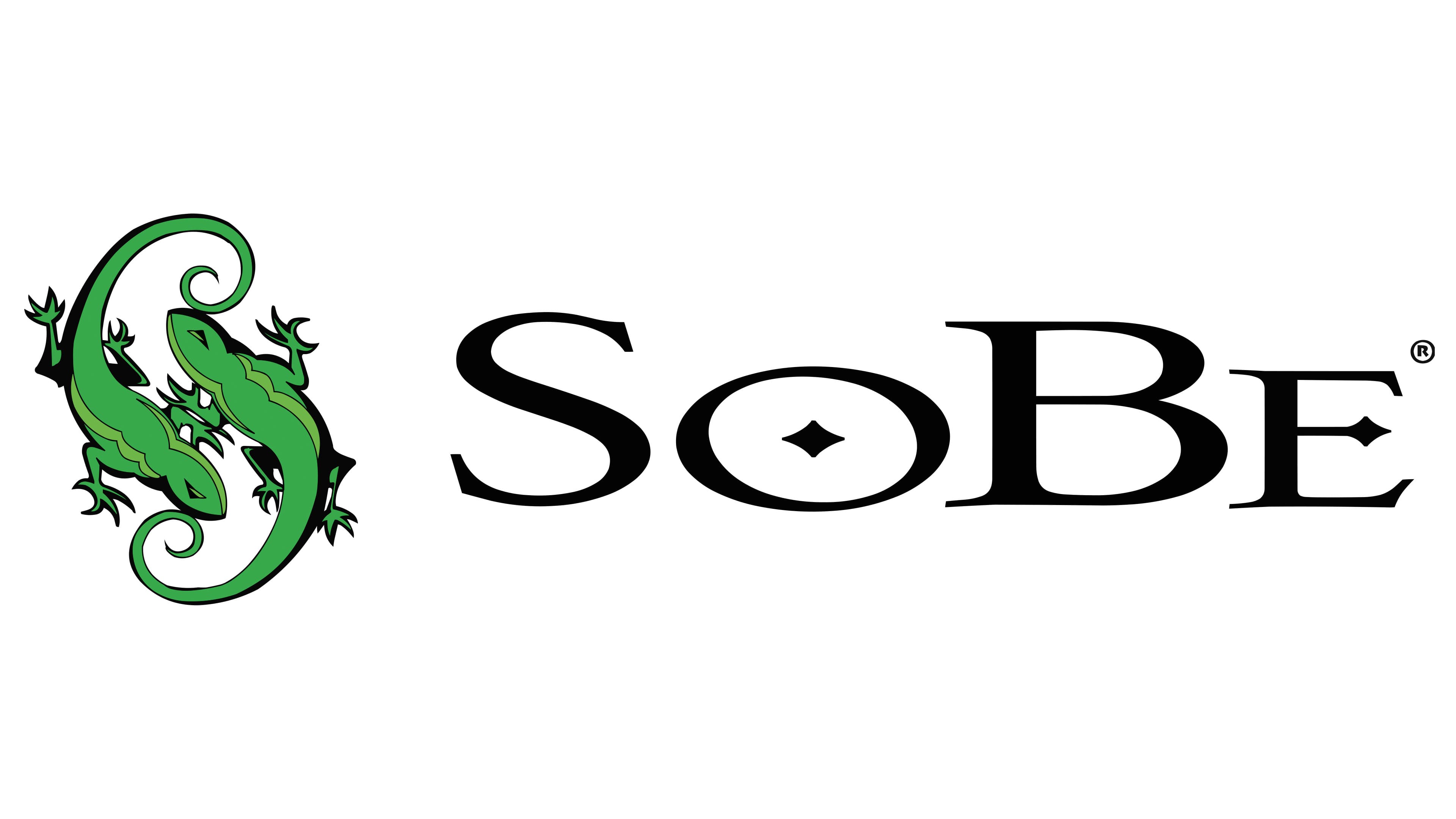
An interesting observation is the logo’s consistency since the brand’s inception. Compared to its competitors, this speaks to stability and confidence in the future. Updates and rebranding are often tied to advertising campaigns to boost consumer demand, but this case is different.
In 1996, the luxurious drinks were launched, and the logo was introduced. It attracted attention with two lizards, each shining brightly and positioned asymmetrically. They were a vivid, rich green and didn’t just stand out on the white background; they indicated that the brand’s products are natural and healthy. The lizards are depicted with great detail and realism, appearing in motion. They are not static; their dynamic nature is noticeable. Each line of their bodies is outlined in black, enhancing their visual appeal. The elegantly curled tails add playfulness and pleasure.
To the right of the lizards, the brand name “SoBe” is written in large letters on a horizontal line. The black color looks perfect against the snow-white background. The word has four letters, two of which are capitalized. The different letter sizes catch the eye and encourage reading the rounded font. Additional attention is drawn to the diamond in the center of the “O,” which also appears in the next vowel, forming part of the middle horizontal line of the “E.”
The logo is dynamic and modern, with a unique style and charm.