 StepStone Logo PNG
Job searching involves browsing job listings, submitting resumes, and interacting with employers through online platforms. These services aggregate job postings and help users navigate the job market. The StepStone logo is associated with a platform that publishes job listings and provides tools for job seekers and recruiters.
StepStone was founded in 1996 in Oslo as Jobshop. The company emerged as an online job-posting platform when the labor market still relied on print advertisements. In 1998, it began expanding across Scandinavia. In 2000, Jobshop changed its name to StepStone to reflect its focus on career advancement. That same year, the company merged with several European sites, including the British TopJobs and German StepStone Deutschland.
After the dot-com crash in 2001–2002, the company faced financial difficulties. In 2002, the media group Schibsted acquired it. The new owner invested in technology upgrades and the development of digital platforms. In 2007, the company entered Central and Eastern Europe and launched sites in Poland and the Czech Republic.
In 2009, Axel Springer acquired a stake from Schibsted. In 2015, it became StepStone’s sole owner, valuing the business at around €500 million. In 2016, the company acquired the British platform Totaljobs for about £ 200 million. In 2017, StepStone acquired Jobindex in Denmark as well as services in Belgium and the Netherlands.
In 2019, the company introduced the Talent Solutions platform. It combined recruitment and analytics tools. In 2021, the company went public on the Frankfurt Stock Exchange, raising 1.7 billion euros at a valuation of about 7 billion. After the listing, it invested in artificial intelligence technologies to improve job- and candidate-matching algorithms.
In 2022, StepStone acquired the Austrian platform “Karriere.at” for 100 million euros. In 2023, the company implemented video interviews and virtual job fairs. In 2024, it began expanding beyond Europe, entering markets in Southeast Asia and Latin America.
StepStone Group operates in more than 30 countries. The company works with tens of millions of job seekers and hundreds of thousands of employers. It remains one of Europe’s largest online job search platforms.
Meaning and History
What is StepStone?
One of Europe’s largest online job search and recruitment services, it is part of Axel Springer Media Group and operates in dozens of countries. The platform combines corporate recruiting, HR solutions sales, and integration with global human resource management systems. The service serves millions of users and uses artificial intelligence for data analysis and automated hiring. It helps employers manage staff through analytics and find professionals worldwide.
2000 – 2017
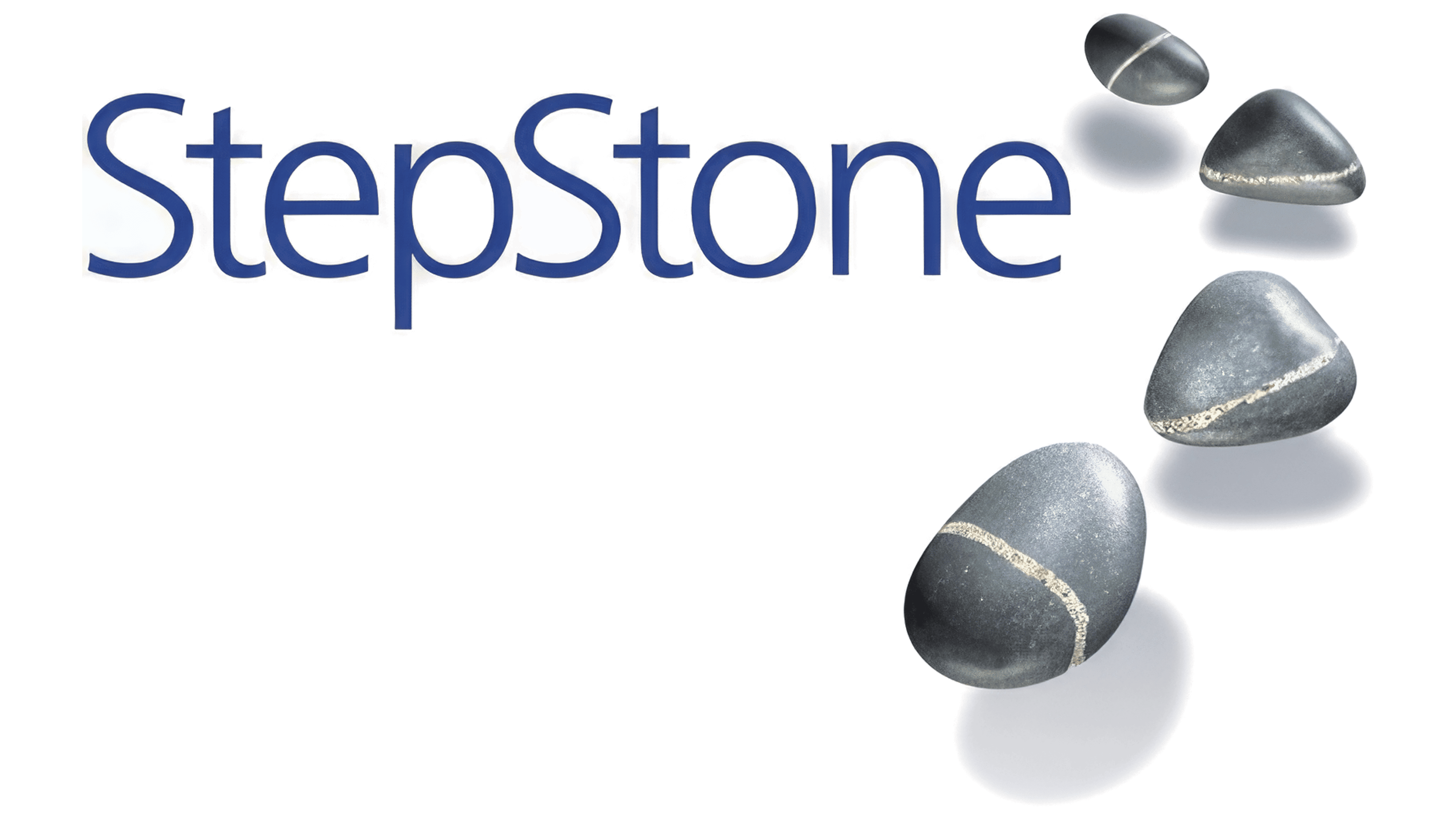
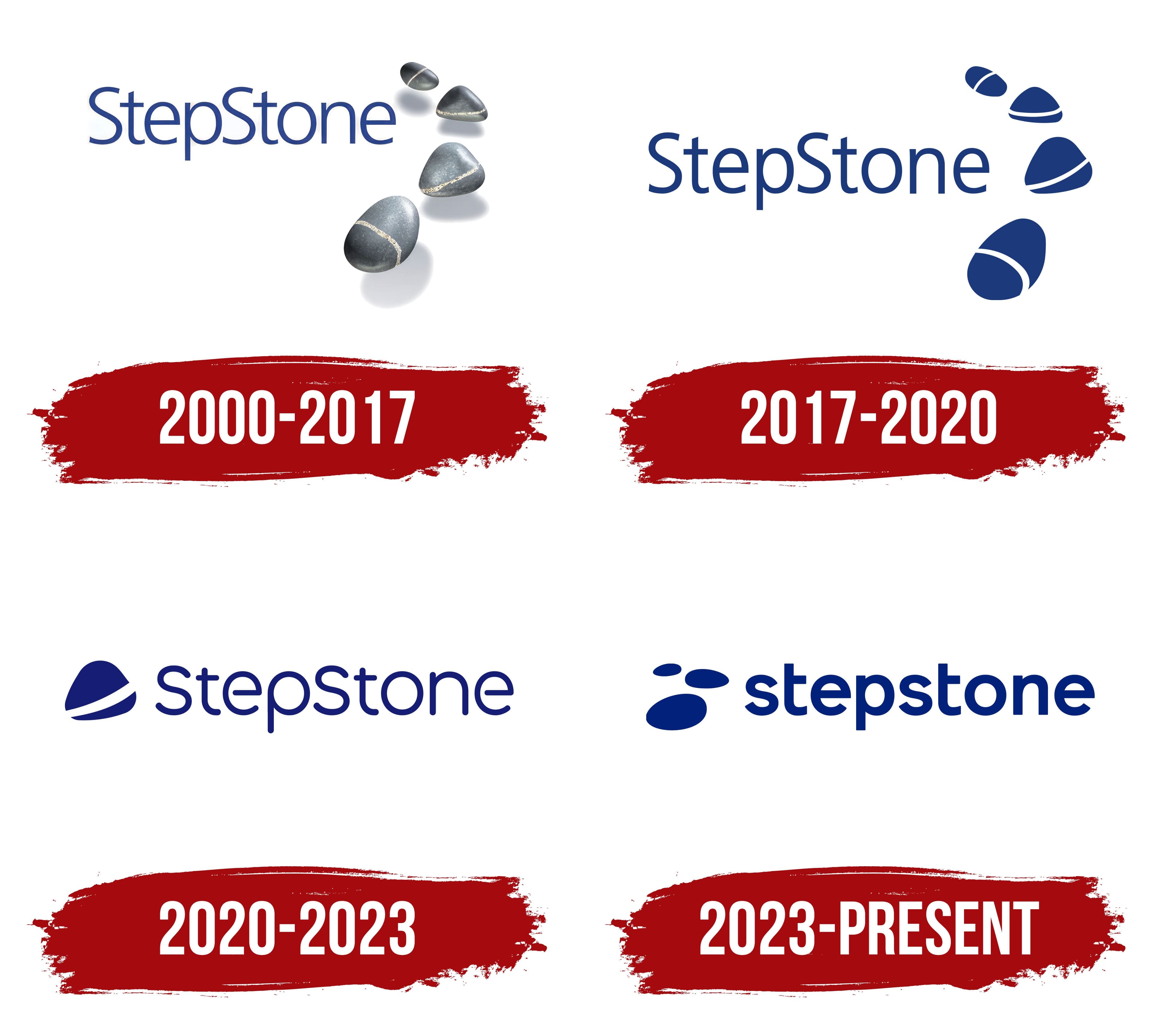
Before adopting the StepStone name, the Norwegian company operated as Jobshop.no. The job search service began operating in 1996. In 1999, as the business expanded and acquired the German platform Careernet.de, it adopted the Stepstone name. The name comes from the English expression “stepping stone,” referring both to a stone that helps someone cross to the next point and to a step toward a new achievement. The 2000 logo gave the name a literal interpretation.
Four stones appeared to the right of the StepStone lettering. They followed a curved path from a large stone at the bottom to a smaller one at the top, suggesting a route toward the next goal. The stones resembled smooth pebbles with natural irregularities. Gray with a bluish tint, pale veins, glossy highlights, and shadows beneath the stones gave them an almost photographic sense of depth.
By contrast, the name was understated. Thin dark blue sans-serif letters formed a single word, with a capital “S” at the beginning of each part. The lettering resembled Myriad or Frutiger Light. The typeface’s slender lines contrasted with the rounded stones and their varied shapes, and the name’s meaning connected them.
2017 – 2020
By 2010, StepStone used two logo versions with the same arrangement: the name and four stones to its right. Alongside the three-dimensional image was a flat version for stickers, fabric applications, and engraving. The primary version combined vector lettering with raster images of the stones. The additional version consisted entirely of vector outlines suitable for other reproduction methods.
In the simplified version, the stones lost their photographic texture, highlights, and shadows. Their rounded, pebble-like forms became dark blue, while the pale veins became curved white bands. The four shapes still followed an arc, from the small upper stone to the large lower one. The brand’s blue was specified as #0C2577.
The StepStone lettering remained on the left, with a capital “S” at the beginning of both parts of the word. The thin sans-serif letters had elongated proportions, consistent stroke widths, straight verticals, and smooth curves. The typeface resembled Frutiger or Myriad. By 2010, the tagline “your career. your life. your future.” had been removed from the logo. Both versions retained the brand name and stones.
2020 – 2023
In 2020, StepStone reduced the four-stone path to a single symbol and moved it to the left of the name. The blue silhouette resembled a polished, triangle-shaped pebble with rounded corners. A broad white arc crossed it diagonally. The stone and lettering now formed a single horizontal arrangement.
StepStone remained a single word, with a capital “S” at the beginning. The dark blue sans-serif letters gained softly rounded terminals and consistent stroke thickness. Thin lettering and larger interior openings gave the wordmark a light appearance. The typeface resembled Nunito or Quicksand.
2023 – today
Three stones returned to the Stepstone logo in a brand update launched on May 3, 2023. Research into perceptions of the company prompted the change. The earlier identity lacked recognition and differentiation from competitors, and it inconsistently communicated the idea of finding the right job for everyone. Stepstone developed the project with Amsterdam agency Dawn. Brand Marketing Director Diana Augustin led the work internally.
Three blue oval shapes replaced the stone path, appearing to the left of the name. The largest stone sits at the lower left, with the smallest above it and the medium-sized stone offset to the right between them. The white bands, texture, and shadows disappeared. The company associated the emblem with a path toward new opportunities, the right job, and a fulfilling life. Dark blue “stepstone” lettering appeared to the right in lowercase sans-serif letters. The strokes became substantial and uniform, with forms resembling Avenir or Rounded Sans. In regular writing, Stepstone replaced the earlier StepStone spelling, capitalizing only the initial letter.
Blue remained the primary color. Turquoise and coral were added to the identity, with a smooth gradient between them. The horizon and morning sky inspired the gradient, through which the company sought to convey freedom and optimism. Turquoise and coral serve as accents alongside the blue logo.