 Schibsted Logo PNG
Digital services include news platforms, classifieds sites, and online publications that provide information and help users complete everyday tasks. Such platforms combine media and services into a single ecosystem. The Schibsted logo is associated with a media group that manages news resources and digital platforms in Northern European countries.
Schibsted began operations in 1839 in Christiania (now Oslo). Christian Michael Schibsted founded the printing house Chr. Schibsteds Forlag. In 1860, he launched the newspaper Christiania Adresseblad, soon renamed Aftenposten. This publication became one of Norway’s leading newspapers. After the founder died in 1879, his son Amandus took over management. Under his leadership, the newspaper modernized and strengthened its position in the national market.
In 1966, the company acquired the newspaper Verdens Gang (VG). By 1981, it had become Norway’s most widely read publication. In 1988, Schibsted became a public limited company. In 1992, the company was listed on the Oslo Stock Exchange and began expanding in Scandinavia.
In 1996, the company purchased a 49.9 percent stake in the Swedish newspaper Aftonbladet. In 1998, it acquired a 73.6 percent stake in Svenska Dagbladet. These acquisitions made the company one of the region’s leading media groups. In the early 2000s, it launched FINN.no, Norway’s largest online classifieds platform. In 2003, it bought the Swedish website Blocket.se, laying the foundation for a large digital classifieds network.
In 2006, Schibsted entered the French market and acquired leboncoin.fr. This site became one of Europe’s largest online marketplaces. In the 2010s, the company expanded internationally into Spain, Italy, Morocco, and Brazil. In 2019, it spun off its foreign assets into an independent company, Adevinta. After that, Schibsted focused its operations on Scandinavia.
In 2024, the company split its business into two parts. The Tinius Trust took over the media division, Schibsted Media. The marketplace division was renamed Vend. On July 1, 2025, Schibsted Media completed the acquisition of Sweden’s TV4 Media and Finland’s MTV from Telia, strengthening its position in the television market.
Founded nearly two centuries ago, the company continues to play an important role in developing Scandinavian media and digital services.
Meaning and History
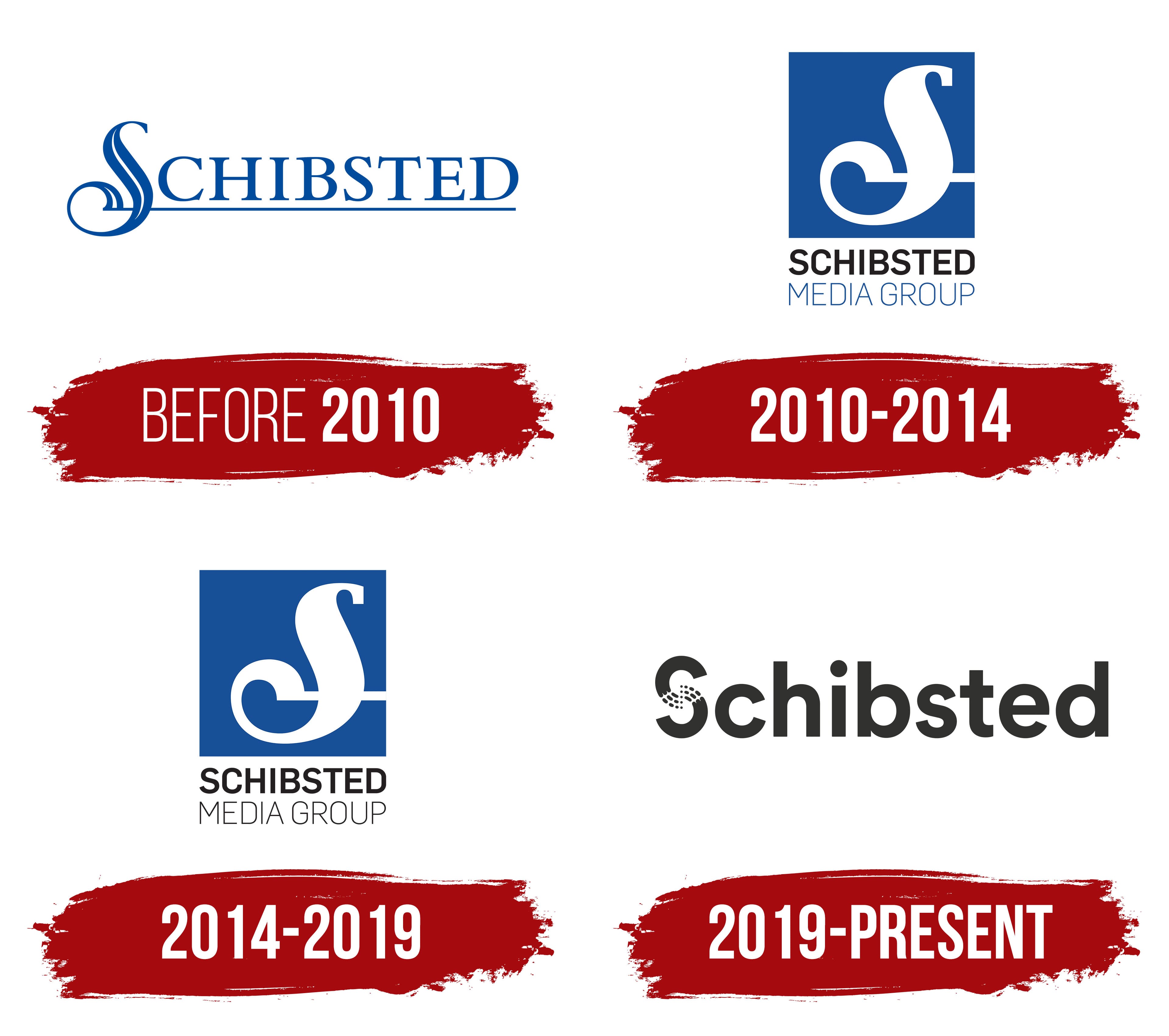
What is Schibsted?
Schibsted is the largest media group in Northern Europe, founded in Norway. Its portfolio includes leading newspapers, online portals, and classified services operating in more than twenty countries, including Aftenposten, Verdens Gang, Aftonbladet, Svenska Dagbladet, and Finn.no. The company manages national media in Norway, Sweden, Finland, France, Spain, Denmark, and the Baltic countries, as well as platforms Blocket.se, Leboncoin.fr, and Kufar.by. Beyond news, the group develops booking, dating, and weather services, as well as digital marketplaces in Europe, Brazil, and Morocco.
before 2010
In Schibsted’s early logo, the founder’s surname’s first letter took up almost as much space as the rest of the name. The blue “S” rises above the neighboring capitals and resembles a calligraphic initial. A thin white line cuts through its broad stroke, and its lower curve curls into a spiral. From the base of the “S,” a blue underline extends beneath SCHIBSTED to the final “D.” The remaining letters use an upright serif style. The decorative initial remains part of the word, joining the full company name.
The surname belonged to Christian Schibsted. In 1839, he began working in a printing business in Christiania (now Oslo) with printer Johan Jørgen Krohn. In 1843, Schibsted became the sole owner of the printing house. The printing and publishing business later grew into a media group bringing together Norwegian and Swedish media outlets.
2010 – 2014
On November 9, 2010, Schibsted introduced a logo with a separate emblem replacing the enlarged first letter in the name. The decorative “S” moved into a blue square and became white. Its lower curve still curls inward, while a horizontal stroke extends toward the square’s right edge, recalling the line beneath the earlier lettering. The thin cutout within the letter was removed, leaving a solid white silhouette.
The company name appears beneath the square in 2 lines. Large black SCHIBSTED lettering uses closely spaced sans-serif capitals with thick, even strokes. Below it, thin blue MEDIA GROUP lettering appears in elongated capitals. The English descriptor identifies the business as a media group. A stacked arrangement replaced the earlier elongated logo. The separate “S” occupied the upper section, with the name and descriptor below.
2014 – 2019
In the updated Schibsted logo, the 2 lines used different lettering weights. MEDIA GROUP changed from blue to black, matching SCHIBSTED. The upper line retained its heavy sans-serif capitals, while the lower line remained thinner. The English descriptor still identifies the company as a media group.
A blue square with a white decorative “S” sits above the words. Its curl and horizontal stroke preserved a connection to the early Schibsted lettering, when the enlarged initial was part of the name. The letter remained a separate emblem above the two-line name. The update changed the color of the lower line.
2019 – today
On September 11, 2019, Schibsted introduced a logo in which the group’s full name replaced the earlier square and MEDIA GROUP descriptor. Stockholm agency Bold developed the project. The group removed “Media” because it operated both media and other businesses. The company wanted to strengthen the Schibsted name and bring its subsidiary brands together under it.
The group redesigned the capital “S.” Its broad, rounded strokes break into dots and elongated particles through the middle. The remaining letters are lowercase and heavy, with soft corners and geometric sans-serif forms. The primary logo is black, with a white version for dark backgrounds. Blue remained part of the identity, while the main wordmark became black. The “S” also stands alone from the Schibsted name, and its internal pattern carries through the group’s branding. Bold founder and Creative Director Oskar Lübeck explained the shape as “The Unifying Force.” Separate parts come together, reflecting collaboration among the brands.
In 2022, Norwegian studio Bakken & Bæck adapted the identity for digital products. The logo’s overall form remained intact. The “S” within the name and its standalone version were refined for small-scale use. Bright blues, gradients, and rounded-form patterns entered the identity, extending the motif of dots and short strokes within the letter.
After the group split in 2024, the Tinius Trust-owned media business was temporarily named Schibsted Media. In 2025, it returned to the shorter Schibsted name, connecting it to the group’s newspaper heritage and journalism. The digital marketplace business became Vend.