


 Stutz Motor Company Logo PNG
The logo of Stutz Motor Company is distinguished by its luxury, although unfortunately, it is from the past. Its heyday ended in the mid-20th century, and attempts at revival have led nowhere. The refined and elegant emblem remains a vivid reminder of the luxury sports car Bearcat.
Stutz began in 1911, when engineer and businessman Harry C. Stutz founded Ideal Motor Car Company in Indianapolis, Indiana. He aimed to build an American performance car capable of competing with strong European brands. That same year, he created the Bearcat. This sports car entered the first Indianapolis 500 only five weeks after construction began.
The Bearcat finished eleventh, giving the new company valuable publicity and the slogan “The Car That Made Good in a Day.” In 1912, the business was renamed Stutz Motor Company, and the Bearcat became its first production model. It appealed to wealthy buyers and motorsport enthusiasts, while racing helped showcase the cars’ durability and speed.
During the 1910s, Stutz expanded into the premium automobile market. Harry Stutz sold his stake and left the company in 1919, but production continued under new leadership. In the 1920s, the firm introduced advanced models, including the Vertical Eight with an overhead-valve eight-cylinder engine. The 1927 Black Hawk became one of the brand’s best-known cars after setting several speed records.
The Great Depression damaged the luxury-car market, yet Stutz continued engineering work and introduced the DV32 in 1931 with a twin-cam engine. Falling sales forced the company to end production in 1935. The name returned in 1968, when James O’Donnell launched the Blackhawk on a Pontiac Grand Prix base. Buyers included Frank Sinatra and Elvis Presley, and limited-series cars remained in production until 1995.
Meaning and History
What is Stutz Motor Company?
The American luxury car manufacturer was known for creating cars with impressive performance. Harry C. Stutz founded the company in Indianapolis, Indiana, and it became famous for its fast and efficient Bearcat model. The cars, which competed with other luxury brands of the time, were often associated with wealth and status. Throughout its history, the corporation experienced changes in ownership and financial difficulties. Eventually, the company closed its doors, leaving a legacy as an innovative American automaker.
1911 – 1935

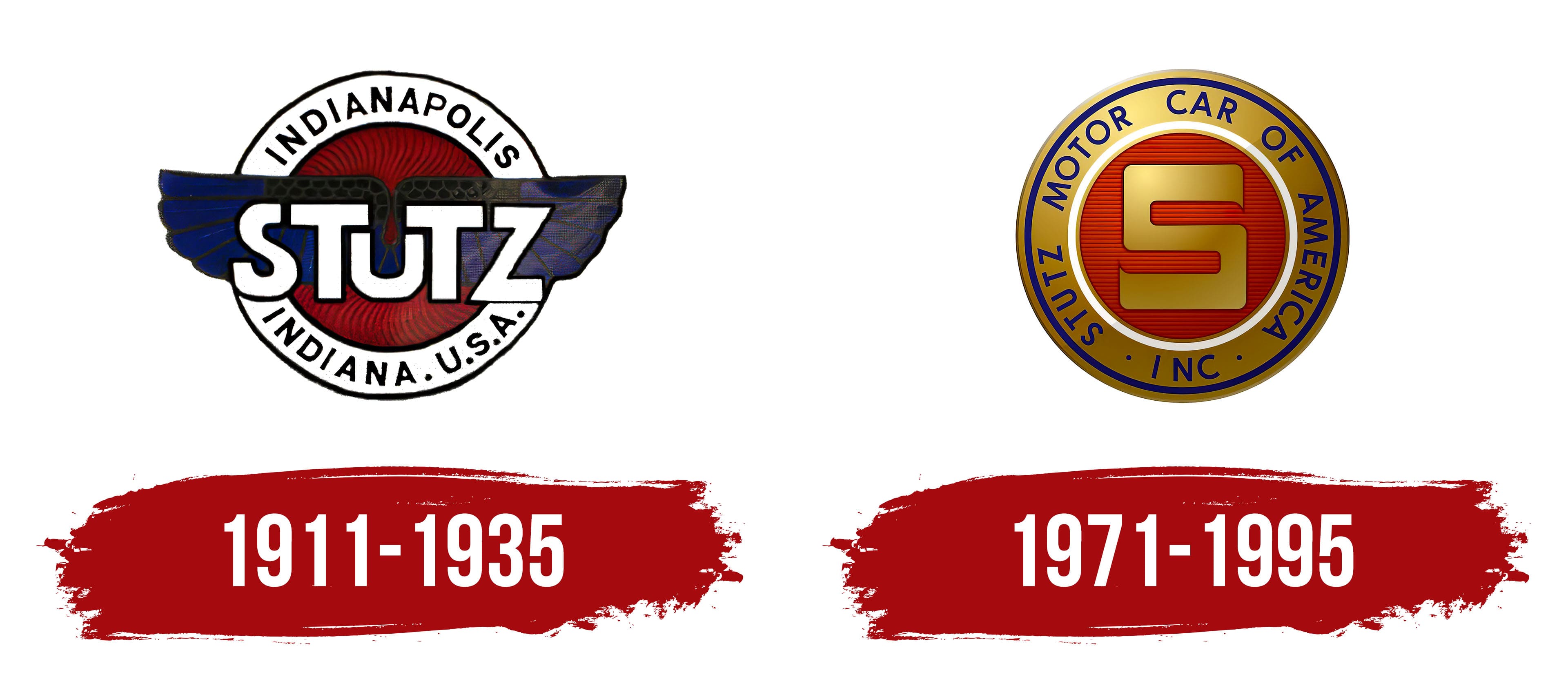
The circular emblem of Stutz Motor Company was unlike a classic roundel, as it incorporated a winged element into its design. The centerpiece was a dark red circle with fine black crosshatches. The hatches were so closely spaced that they resembled a rapidly spinning turbine.
A wide white ring ran along the edge of the logo. This border featured several semicircular inscriptions in a grotesque, thin, uppercase, smooth font. These inscriptions conveyed the company’s location and origins and highlighted the brand’s authenticity.
- The upper part contained the single word “Indianapolis.”
- The bottom featured the state and country name “Indiana. U.S.A.”
This demonstrates that the luxury sports car manufacturer took pride in its origins and sought to honor its birthplace by offering unique sports cars to consumers. This emblem served a strong marketing function, indicating to motorists where they could buy luxury sports cars.
The main focus was on the brand name, which occupied the middle line and was presented not as text but as a full graphic element. The letters were white, outlined in black, effectively standing out against the dark background. The design of this line was characterized by the designers’ effort to maintain symmetry, significantly reducing the size of the “U.” It was centered and appeared as a lowercase glyph surrounded by uppercase letters.
The font was extra-bold, geometric, slightly angular, and sans-serif, reflecting the company’s desire to quickly attract clients and intrigue them with its cars. The circle was overlaid with widely spread wings, a symbol of high speed, crucial for sports cars.
1971 – 1995
The emblem of Stutz Motor Company underwent a drastic change in content but retained its shape. It was still a circle, but now clearly resembled a heraldic roundel. It featured:
- An accentuated center with a key detail.
- A wide border strip with information.
- A narrow double-ring frame.
Each element had its own significance and distinct design. A red circle occupied the entire central part, with thin horizontal lines dividing it. Against this background stood a block “S.” It was large and gold, with a gradient and sharp ends, resembling the number 5.
A white ring separated it from the name, behind which was a wide band with circular inscriptions. Dark blue letters on a golden background looked very noble and presentable, emphasizing that this was a luxury sports car brand. The border was also blue and gold to emphasize the sports cars’ exclusivity, as these were vehicles whose revival attempts failed.