


 Tang Logo PNG
The Tang logo symbolizes the natural, eco-friendly, and beneficial qualities of the company’s products. The emblem reflects the richness of fruity flavors and emphasizes preserving vitamins in the ingredients, making Tang products appealing to health-conscious consumers.
Tang began in 1957, when General Foods chemist William A. Mitchell developed an orange-flavored powdered drink as a practical alternative to fresh orange juice. The product was created for easier storage, transport, and preparation, since fresh juice spoiled quickly and was harder to handle. Tang reached the U.S. market in 1959, but early sales remained weak because many buyers did not yet understand why they needed it.
The brand’s position changed in 1962, when NASA used Tang during the Mercury space program and John Glenn’s orbital flight. General Foods turned that connection into a major advertising theme, presenting the drink as part of the Space Age. Tang later stayed linked to the Gemini and Apollo missions, including the 1969 Moon landing, which helped strengthen its public image during the 1960s and 1970s.
The range expanded in the 1970s with grape, lemon, and grapefruit flavors. In the 1980s, Tang moved deeper into international markets, especially in developing countries where powdered drinks were seen as modern and convenient. Philip Morris Companies, later renamed Altria Group, acquired General Foods in 1985. In 1989, a breakfast-focused campaign repositioned the drink for morning use, while the 1990s added mango, passion fruit, and single-serve sachets.
After a 2000 reorganization, Tang became part of Kraft Foods and was promoted with added vitamins and minerals. Its 50th anniversary campaign followed in 2007. Later launches included fruit tea variants, Fruit Frenzy in 2013, probiotic drink mixes in 2015, social media campaigns in 2017, ready-to-drink formats in 2019, a lower-sugar orange formula in 2020, Natural in 2021, Energy Boost in 2022, and bottled and carton formats in 2023 under Mondelez International.
Meaning and History
What is Tang?
It is a brand of powdered drink mixes owned by Mondelez International. Originally developed as an alternative to orange juice, it has become known for its distinctive tart flavor and association with space travel. The product is a fruit-flavored powder mixed with water to produce a drink. While orange remains the most recognizable flavor, the brand has expanded its lineup to include a variety of fruit flavors to cater to different tastes and markets worldwide. The brand gained significant popularity when NASA astronauts used it on space missions, making it an important part of the company’s marketing strategy. It is renowned for its long shelf life, convenience, and affordability, making it a popular choice in many families. It is often advertised as a source of vitamin C and other nutrients. The brand is globally recognized and is particularly popular in many developing countries, where it is sometimes seen as an affordable alternative to fresh fruit juices.
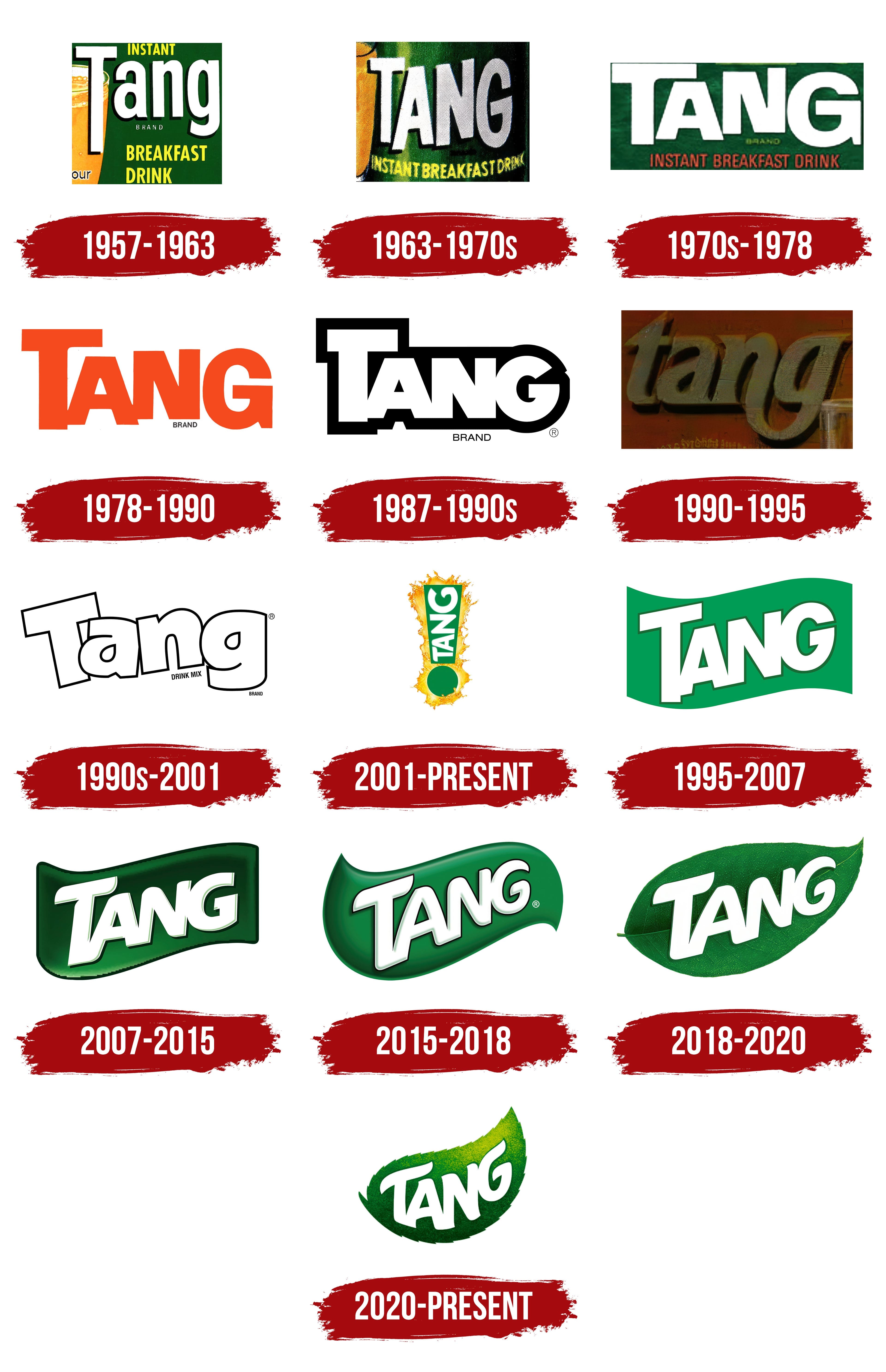
1957 – 1963
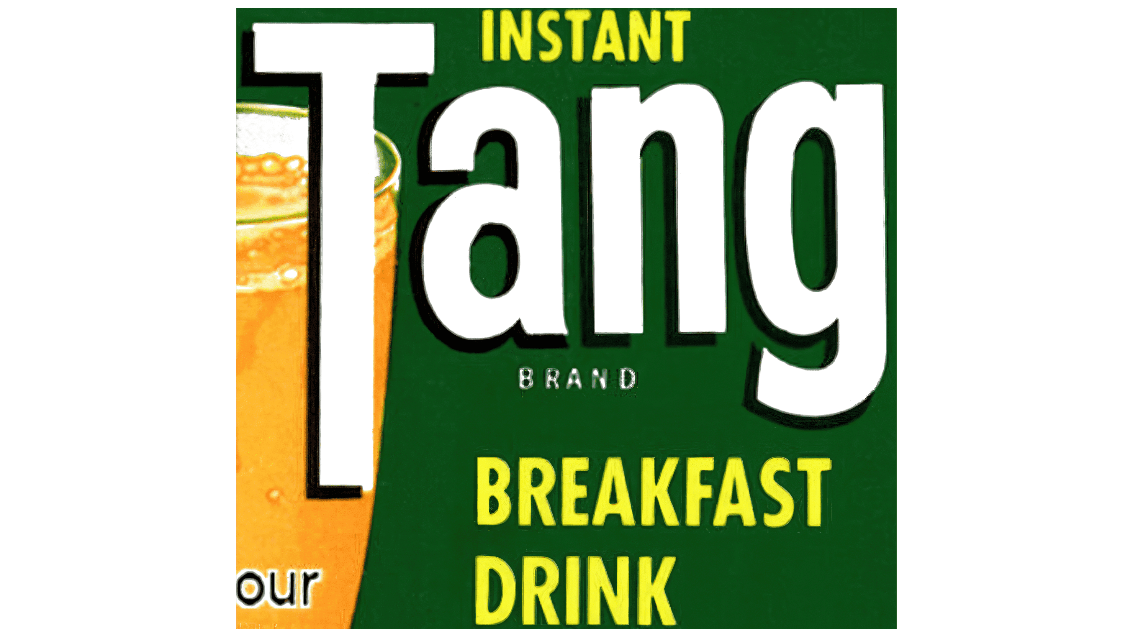
Tang was first introduced as a “breakfast drink,” as reflected in the emblem. The thin white letters of the name emphasize the product’s safety and low-calorie content. The especially elongated first letter, “T,” draws attention to maintaining a slim figure with regular mixed use.
To the left of the logo is an image of a glass filled with freshly made orange juice, which stimulates appetite and reinforces associations with morning freshness. The green background behind the name subconsciously evokes connections to nature, plants, and the product’s natural qualities, enhancing trust in its health benefits.
1963 – 1970s
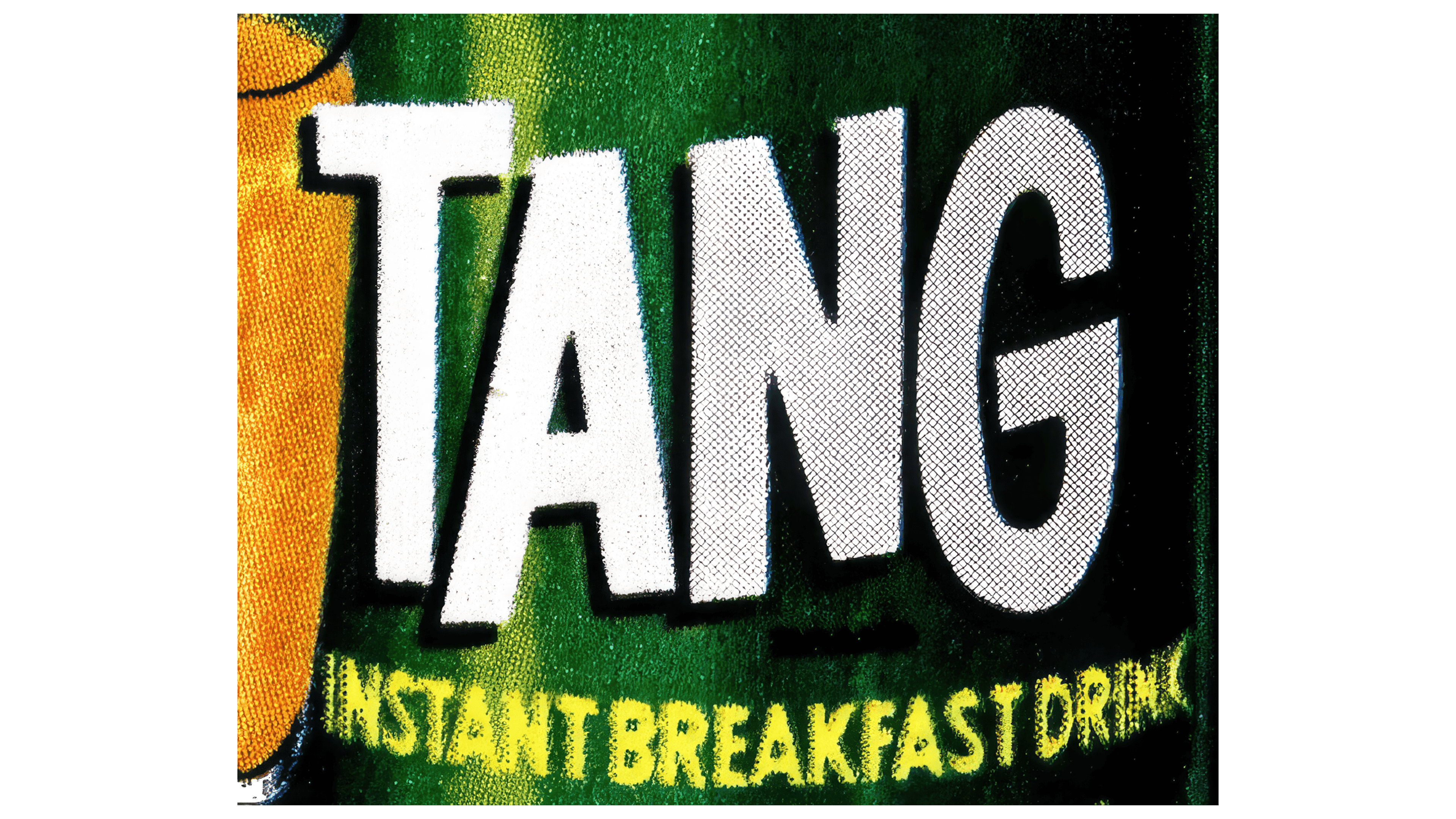
Ten years later, when NASA recognized and used the brand, the logo received an updated look: white capital letters that seemed to float against the background. The three-dimensional characters resembled bubbles in a glass, reinforcing associations with beverages and hinting at weightlessness in space. This effect also symbolized the brand’s rapid sales growth, as emphasized by the use of all caps in the text.
The yellow tagline “Instant Breakfast Drink,” rendered in the color of orange juice, directly indicated the contents of the package and strengthened associations with a ready-to-drink morning beverage.
1970s – 1978

The text in the logo maintained its weightless effect, creating the impression that it is suspended and floating in the air or water. However, the letters became wider, reflecting the company’s growing popularity and the expanding variety of drink flavors.
The letter “T” in the logo seems to embrace the “A” on one side, adding a sense of dynamism and unity. The varying thickness of the glyph and the smooth curve on the right resemble a dispenser on a container from which the ready-to-drink juice can be poured, emphasizing the product’s convenience and readiness for consumption.
1978 – 1990

In the new logo, the text’s font remained unchanged, but the color was switched to red. The name became the sole element of the logo, symbolizing the launch of a new concentrate and the introduction of a red-colored drink in the product line. This minimalist approach also highlights the brand’s global reach, emphasizing its recognizability and influence in the international market.
1987 – 1990s
The new black-and-white logo was significantly different from previous versions. Although the font and style of the text were preserved, the letters became white, surrounded by a wide black background that traced the contours of the word. This high-contrast design drew attention and was ideal for any packaging. The white characters emphasized the benefits and safety of the ingredients. The emblem appeared like a portal to a world of freshness and light, creating associations with the product’s cleanliness and quality.
1990 – 1995

The new Tang emblem featured lowercase letters in gold, which formed the foundation of the design. The golden color symbolized the brand’s achievements and the product’s value inside the packages, while also reflecting the orange, the first fruit used in powder production. The glyphs of the letters “g” and “n” were connected at the bottom, creating a visual association with drinking straws. This design element linked the logo to the liquid form of the final product and resembled the curve of a smile, emphasizing the brand’s friendliness and approachability.
1990s – 2001

After Kraft and General Foods merged, the brand identities were revised. White letters with a thin black outline made the emblem visually light and almost subtle. With its “stumbling” letters, the logo took on a childlike softness and lightness, creating a sense of gentleness and friendliness. The company aimed to shift the focus to the benefits of the ingredients, emphasizing the products’ naturalness and safety.
1995 – 2007
In 1995, the global push for sustainability and natural products set a new direction for the company’s future emblems. The green background, designed as a waving banner, emphasized the natural flavors of the brand’s powders. The white lettering adopted more precise and even glyphs, giving the logo a sense of solidity. The slight upward tilt of the text symbolized the brand’s growth and development. The green outline reinforced the connection to nature, highlighting the product’s eco-friendliness and natural qualities.
2001 – today
In 2001, the brand introduced an entirely new concept. A green exclamation mark, as a powerful statement, became the central element, literally “striking” the drink. Tang waves splashed outward artistically, creating the effect of a flavor explosion. This design conveyed the message: only Tang, with no compromises. The brand name was placed vertically within the upper part of the exclamation mark, adding uniqueness to the logo. The logo exuded energy and dynamism, positioning Tang to concentrate on sports and active lifestyles.
2007 – 2015

The dark green wave with a sharp outline made the emblem appear striking. The name’s bold, three-dimensional white letters immediately draw attention inside the wave. The company reduced the sugar content in the drink by 50%, and the new logo highlights this important step towards naturalness and health benefits. The emblem embodies the updated approach to the product, emphasizing its improved qualities and the commitment to a healthier formula.
2015 – 2018
The company’s logo has seemingly unfolded, symbolizing the ambition to conquer new countries and continents under its new owner, Mondelēz International. Now, the consumer sees a three-dimensional inscription from a slight angle, adding a sense of dynamism and depth to the logo. The background ends are curved and tapered on both sides, giving the image a resemblance to a toothpaste trail. This creates the impression that the concentrate has been squeezed from a tube and is ready to be mixed, highlighting the product’s readiness for use and emphasizing its practicality and convenience.
2018 – 2020

The brand name was placed on a natural orange leaf, giving the new emblem a fresh and natural appearance. This emblem captured the brand’s spirit by incorporating elements of its historical past, highlighting the company’s extensive experience. The combination of history and modernity symbolized the brand’s resilience and growth. The realistic depiction of greenery emphasized its natural, beneficial composition, underscoring the company’s commitment to quality and natural ingredients.
2020 – today
The modern Tang logo is dynamic and vibrant. The main symbol is a stylized leaf that visually merges with the brand name, creating a cohesive and harmonious composition. The leaf represents the product’s natural ingredients, emphasizing its connection to nature and its natural qualities.
Interestingly, in this logo, the leaf’s edges are no longer smooth but jagged, creating an abstract image not tied to any specific tree or plant. This accentuates the product’s universality and eco-friendliness, making it appealing to a wide audience. The leaf, as if illuminated by sunlight, evokes a sense of freshness and purity, associated with natural ingredients that travel directly from nature to the consumer.
The “Tang” lettering is in white, contrasting well with the leaf’s green and yellow hues. This contrast enhances the emblem’s visibility, making it more noticeable and easier to remember. The letters in the name have soft curves and smooth lines, suggesting a friendly, dynamic character. They seem to “fit” into the leaf, highlighting the unity of nature and the product.
The leaf gently descending to the bottom of the glass adds depth to the logo and symbolizes the process of preparing the drink, which dissolves easily in water while retaining all the freshness and rich fruit flavor. This visual technique emphasizes the product’s ease and simplicity of use.