


 Tanqueray Logo PNG
The Tanqueray logo shows that the manufacturer has kept the gin recipe secret. Nobody knows the exact composition. This saves the brand from fakes. The emblem assures buyers of the drink’s authentic, unique taste, rooted in the 18th century.
Meaning and History
It all started with the priest’s son, Charles Tanqueray, who in 1830 set up in London the distillation of the purest spirit drink with a mild, balanced taste. Before founding his own company, he worked with his brother at the Curries distillery, where he mastered the intricacies of distilling. When the distillery was established, Charles had several recipes and a proprietary technology for purifying alcohol. Moreover, he was the first to abandon sugar and introduced a system of continuous distillation (in 1832).
This allowed the entrepreneur to break into the market and quickly take a leading position. The brothers opened Edward & Charles Tanqueray & Co to retail gin eight years later. In 1868, Charles Tanqueray died, and his son, Charles Waugh Tanqueray, took over the business. To survive in a highly competitive environment, he signed an agreement with Gordon, forming the Tanqueray Gordon & Company union at the end of the 19th century. Under it, Gordon distributed its products in the British market, and Tanqueray’s in the American market. This helped explain its popularity in the US.
In 1941, the factory building in the Bloomsbury area of London was destroyed during an air attack. Not a stone of the enterprise remained; only the Old Tom alembic survived, and it became legendary. The company later moved it to Cameron Bridge (Scotland), where it settled. It still works, helping produce the purest alcohol through multiple distillations. According to 2016 data, Tanqueray gin was the most in-demand in the world, with about 3 million 9-liter cases sold.
To avoid fakes, increase popularity, and gain recognition, the company developed a unique bottle design in 1948: round, tapering downward, with a protruding rib at the top. The branded containers are painted light green and are shaped like hydrants that once pumped water to the London distillery. Another source claims that the container’s original design replicates the appearance of a 1920s shaker used for mixing alcoholic cocktails.
What is Tanqueray?
Tanqueray is a British-Scottish premium gin with an ABV of 40-47.3%. It is produced in Scotland, where the company relocated after World War II. Charles Tanqueray opened it in 1830 in London. Now, the world’s most famous gin brand belongs to Diageo Corporation.
Old

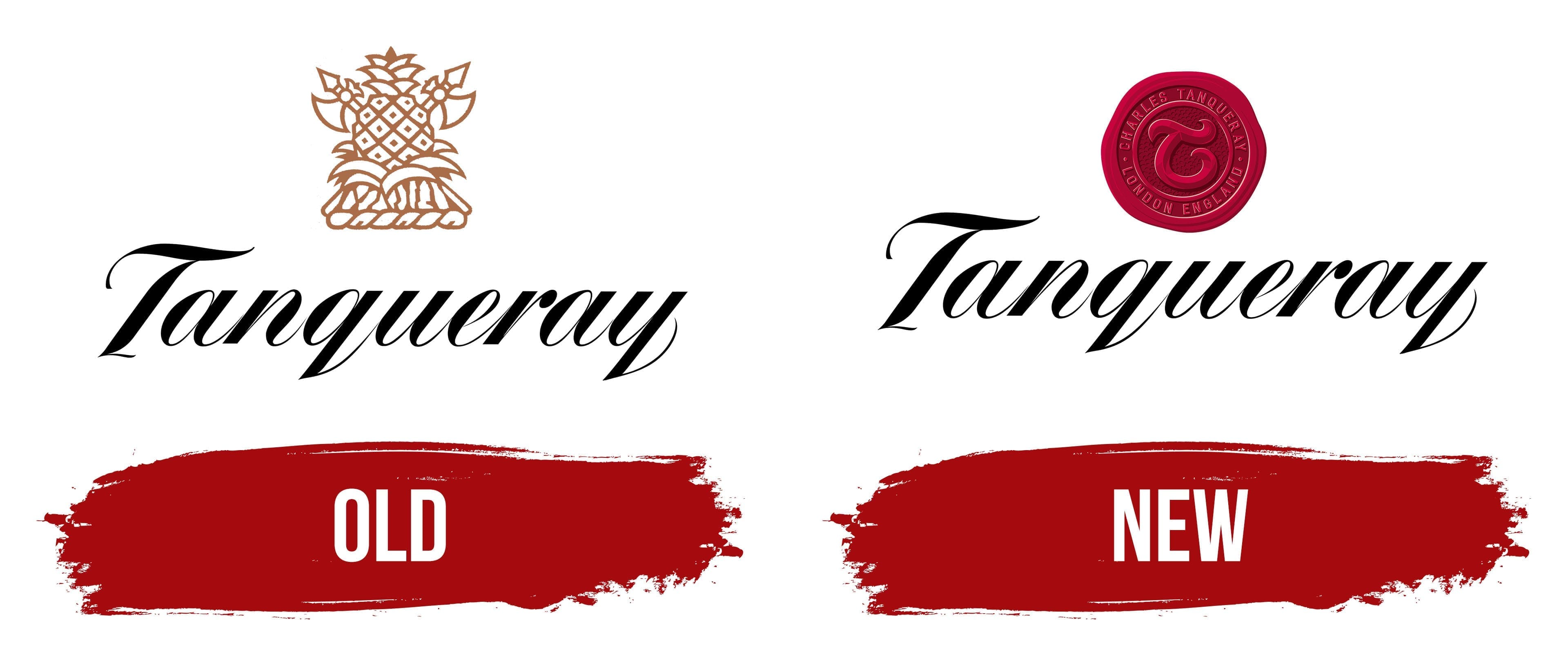
The alcoholbrand’sdoldest logo includes its name. It is in italic handwritten text. The inscription is calligraphic and semi-connected, with gaps between “T” and “a” and between “r” and “a.” Thin lines connect the remaining signs. They start in the lower zone for “q” and “y” and go up. The name is written in bold white letters on a black background.
Above is the coat of arms of the Tanqueray dynasty, with a pineapple; behind it, the blades of two axes and two spades are visible. These symbols are important to the family: the tropical fruit represents a tribute to Victorian luxury, hospitality, and cordiality, and the edged weapons testify to the dynasty’s participation in the Third Crusade.
New
The modern logo is the quintessence of British chic and the company’s historical heritage. It features a dark red wax seal – the personal mark of the brand’s founder and gin developer. In the center is Tanqueray Sr.’s signature: a curly “T” with three scrolls. It is surrounded by inscriptions indicating the founder’s full name and surname, as well as the place where the plant appeared.
This design conveys the timelessness of a premium drink, as if it were just tested and approved by its creator. At the bottom is the word “Tanqueray,” carried over from the previous visual identity. The only difference is the color. In the old logo, the inscription is white; in the current one, it is black.
Font and Colors
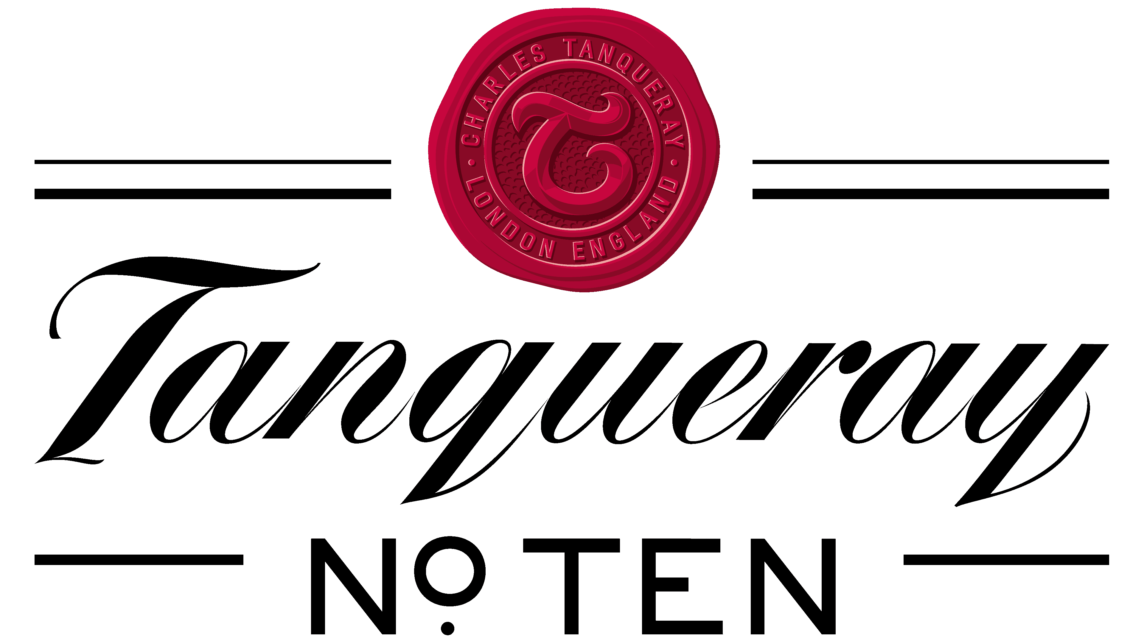
The Tanqueray brand works very hard to maintain a high level of distillation in its dry gin; therefore, it emphasizes its connection to its roots. This trend is reflected in all identity elements: the unique green glass bottle, the logo with the founder’s seal, and the name, which she tries not to change. She succeeds because her product is made according to an old recipe of the highest standard; therefore, the visual elements match the premium content.
For the logo, an individual typeface was developed to emulate handwritten text. The letters are lowercase (except the first), italic, smooth, with smooth lines and harmonious transitions. The Tanqueray brand’s base colors are red and green, and the seal bearing the founder’s personal signature and the bottle are painted in these colors. Black, white, and gold complement them.