 Telecom Argentina Logo PNG
Communication and the internet support everyday tasks, from calls and messages to streaming video and online work. Data transmission and service access are provided through a network spanning cities and regions. The Telecom Argentina logo represents a company that provides mobile communications, internet, and digital services to residential and business customers.
Telecom Argentina was created on November 8, 1990, following the privatization of the state-owned company ENTel. As a result of the reform, private investors received 60 percent of ENTel’s assets. The new entity received a concession to provide services in the country’s northern regions, including parts of Buenos Aires.
In 1993, the company began offering mobile services in the capital region under the Miniphone brand. In 1995, it launched its own Personal brand for the country’s northern region. By 1998, mobile subscribers had reached 490,000, accounting for 64 percent of the national market.
By 1999, Telecom Argentina served 3.2 million telephone lines, all fully converted to digital technology. During the same period, the company expanded its license portfolio into southern regions and strengthened its position in the mobile market.
After the 2002 economic crisis, Telecom Argentina faced financial difficulties. By 2003, the company had completed its debt restructuring and changed its ownership structure after France Telecom withdrew.
In 2016, the Fintech fund acquired a controlling stake. In 2017, it announced a merger with Cablevisión. The merger was completed in January 2018, forming the country’s largest convergent services operator and combining mobile and fixed telephony, internet, and television.
In December 2024, the board of directors approved a corporate reorganization that included the subsidiaries NYSSA and AVC. The process took effect on January 1, 2025.
Telecom Argentina announced it would acquire Telefónica’s operations in the country. The deal amounted to $ 1.245 billion. The company acquired nearly all of Telefónica Móviles Argentina’s shares, but the government suspended the transaction. Authorities cited the risk of excessive market concentration and potential dominance in key communications segments.
Meaning and History
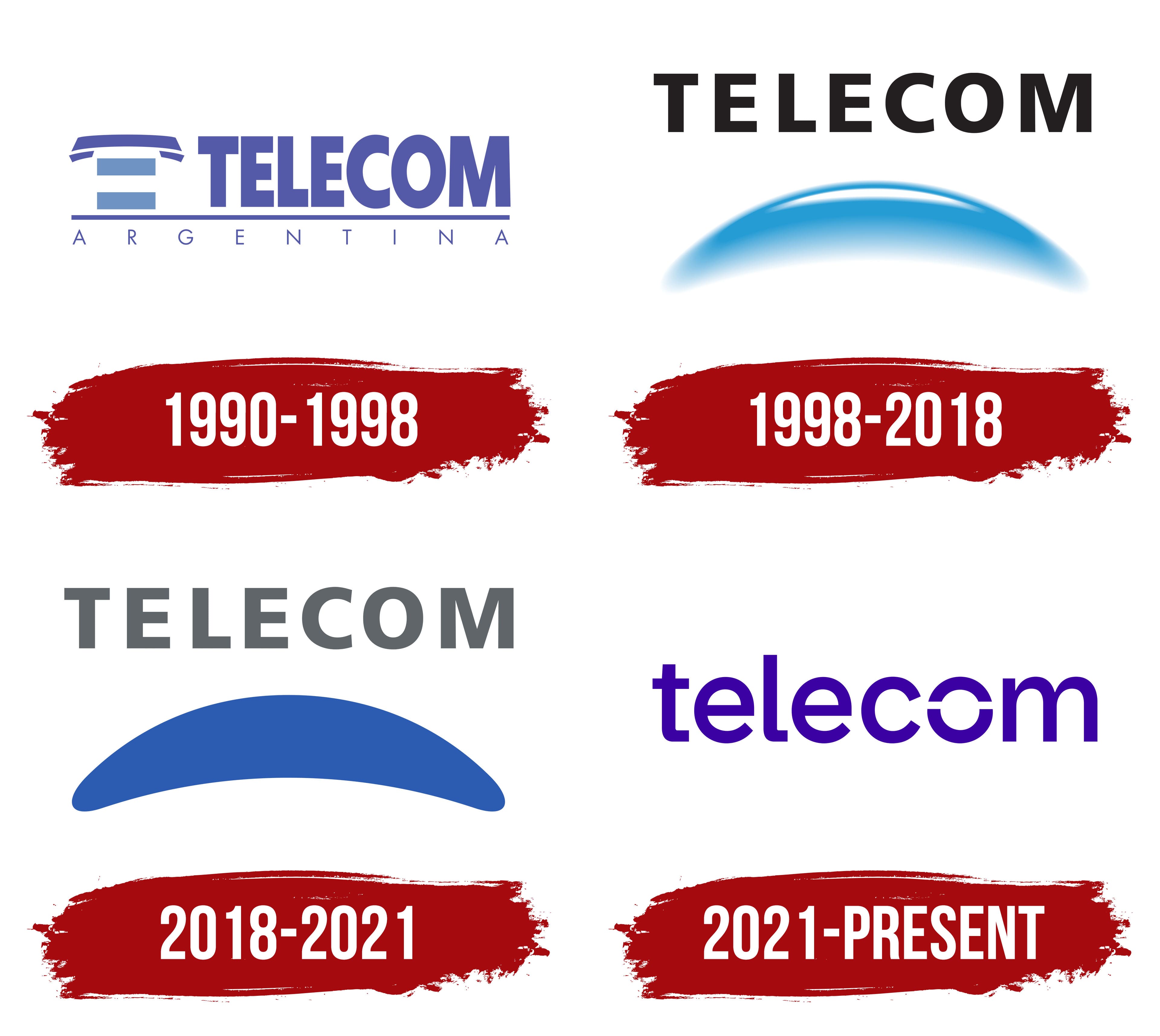
What is Telecom Argentina?
It is Argentina’s largest telecommunications operator, offering a full range of communication services for individual and corporate clients. The company provides fixed and mobile telephony, broadband internet, digital television, cloud solutions, and data transmission services. Its infrastructure includes an extensive network of mobile towers under the Personal brand and a nationwide fiber-optic network.
1990 – 1998
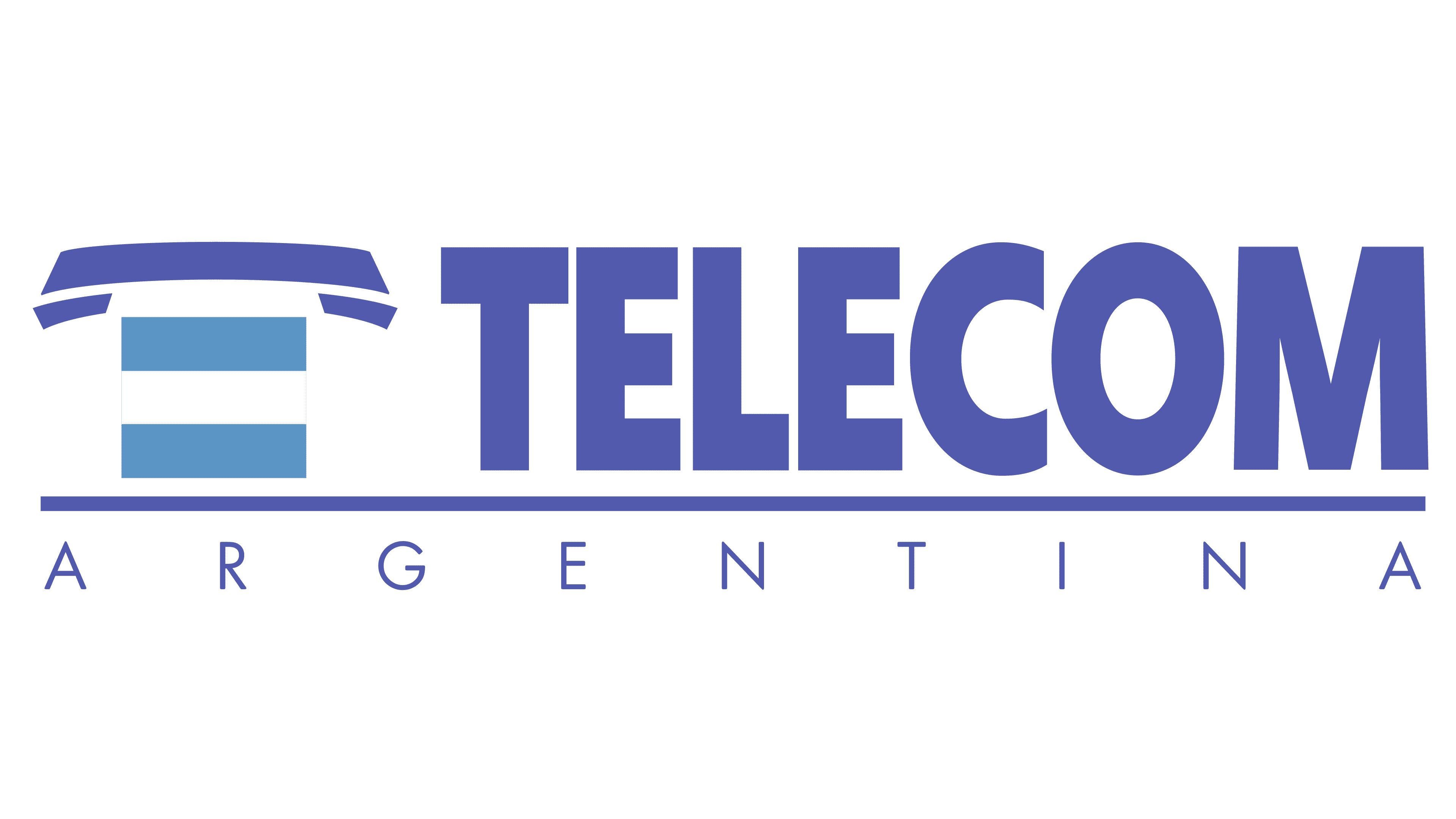
Telecom Argentina’s first logo appeared in 1990, when the state-owned telephone company ENTel’s network was divided into two regions following privatization. The new operator took responsibility for northern Argentina. Its name combined an abbreviation of “telecommunications” with the country’s name. It kept the name as the business expanded into data transmission and digital services. The version used until 1998 conveyed both the company’s business and its national identity.
A horizontal telephone handset with angled ends appeared at the upper left. Beneath it was a rectangular shape with two light blue bands separated by a white band. Their arrangement repeated the Argentine flag’s colors. Together with the handset, the shape formed a stylized “T.” To the right, large TELECOM lettering appeared in the same dark violet-blue as the handset. The sans-serif capitals had thick, even strokes and tight spacing. The lettering resembled Eurostile Bold or Microgramma.
A thin horizontal line in the same dark shade separated the upper row from ARGENTINA below. The lower name used smaller capitals with thin strokes and wide spacing. Within this two-level arrangement, the large TELECOM identified the operator, while the lower line specified the country.
1998 – 2018

Telecom’s preparations for competition in the telecommunications market included reviewing its identity. The company wanted to present itself as a provider of a range of communications services, rather than solely as a telephone operator. Chaves-Pibernat began work on the identity in 1996. Under Rubén Fontana’s direction, FontanaDiseño developed the logo and visual identity. At the same time, Hugo Kogan y Asociados applied the brand to infrastructure. The update was introduced on February 18, 1998.
A broad light blue arc beneath TELECOM replaced the telephone handset. Its rounded ends were thicker, and its middle rose upward, suggesting a sphere’s convex curve. A highlight followed the upper edge, while the saturated blue along the lower portion faded softly into the light background. Gradual changes in shade and shadow gave the form depth. Black TELECOM lettering appeared above the arc in heavy sans-serif capitals. The straight strokes were consistently thick, with generous interior openings. The lettering resembled Helvetica Bold or Arial Black.
The designers linked the arc to Earth’s atmosphere and the way communications bring people closer. Light blue maintained continuity with the previous identity and referred to Argentina’s national colors. The slogan introduced with the logo, “Un mundo más próximo,” meaning “A closer world,” expressed the same idea of reducing distances.
2018 – 2021
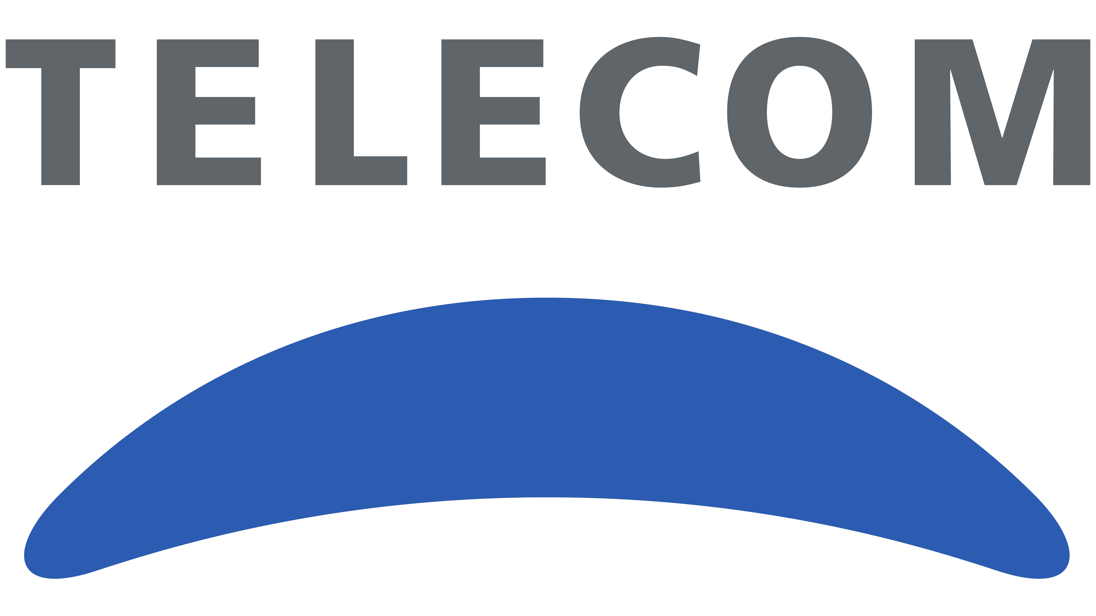
Telecom later adopted a flat version of the logo, retaining the name above the arc. The blue shape lost its gradients and white highlight. A uniform bright blue fill replaced its earlier depth. The arc still rose in the middle, its thickened ends remained rounded, and its lower edge took on a smooth concave curve.
The TELECOM lettering also changed. Black became gray, while the uppercase sans-serif style stayed the same. The strokes were consistently thick, and all the letters shared the same height. The lettering resembled Helvetica Bold or Montserrat SemiBold.
2021 – today
Work on a shared identity for Telecom, Personal, and Flow began in October 2020. The company needed a family of three recognizable brands with shared design principles and distinct roles. The project coincided with a shift from separate fixed-line and mobile services to a unified digital environment for customers. BMC, Don, and Alegría worked on the brand system. Alegría led visual development under creative director Luigi Guidotti.
The new logos were introduced on October 4, 2021. Personal became the brand for home and mobile connectivity, Flow covered entertainment, and Telecom served as the corporate brand and the name for services offered to businesses and government organizations. Related typography helped connect the three names. Fernanda Cozzi and Isaías Loaiza developed the custom Pulso typeface for the project, with Alegría and Javier Reboursin providing art direction for the type design.
For the first time, Telecom’s name appeared entirely in lowercase. A single “telecom” line in saturated blue-violet, close to ultramarine, replaced the gray lettering and blue arc. The upright sans-serif letters have rounded contours and uniform stroke thickness. The lettering resembles Circular Std or Avenir Next Rounded. The previous standalone symbol disappeared from beneath the word, with its curves carried into the “o.” Two curved sections leave horizontal gaps slightly above the middle, forming an open ring. This reference to the earlier emblem became part of the name itself, maintaining Telecom’s connection to Personal and Flow’s shared identity.