 Rightmove Logo PNG
Searching for real estate involves viewing listings, comparing properties, and communicating with sellers or landlords through online platforms. Such services bring the housing market together and simplify the selection process. The Rightmove logo is associated with a British platform that lists properties for sale and rent and helps users find suitable options.
Rightmove was founded in May 2000 by four major real estate agencies. Countrywide, Connells, Halifax, and Royal & Sun Alliance participated in its creation. During the first two years, the platform listed properties for free. In 2002, the company switched to a paid model, enabling business growth.
In 2006, the company was listed on the London Stock Exchange. It became public and was valued at 100 million pounds. In 2008, the Instant Property Alerts feature was launched. It allowed users to receive notifications about new listings.
In 2010, a mobile app for iPhone and iPad was introduced. That same year, the Sold Prices service was launched, providing a property sales history. In 2011, Rightmove acquired a 67 percent stake in Holiday Lettings Limited and began entering the short-term rental market.
In 2012, the School Checker feature was added. It provided information about educational institutions located near the property. In 2015, the company acquired the analytics firm The Outside View, which strengthened its predictive analytics capabilities.
By 2017, the company was included in Forbes’ list of the world’s most innovative companies. In 2018, a commercial real estate category was added to the platform. In 2019, the company acquired Van Mildert, which was renamed Rightmove Landlord and Tenant Services.
In 2020, the company developed digital solutions for agents and clients. In 2022, it implemented virtual tours and artificial intelligence features.
In February 2024, Rightmove acquired Homeviews Platform Limited. In March of the same year, Johan Svensson became CEO.
The company recorded revenue growth and strengthened its position in the UK market. Rightmove has become the leading technology platform for real estate transactions.
Meaning and History
What is Rightmove?
A British online platform has become the largest real estate listings portal, with over 130 million monthly visits and a database of more than 1 million properties from 16,000 agencies. The service acts as an intermediary between realtors and clients, earning revenue from subscription fees of up to 720 pounds per month for sales agencies and 395 pounds for rental agencies.
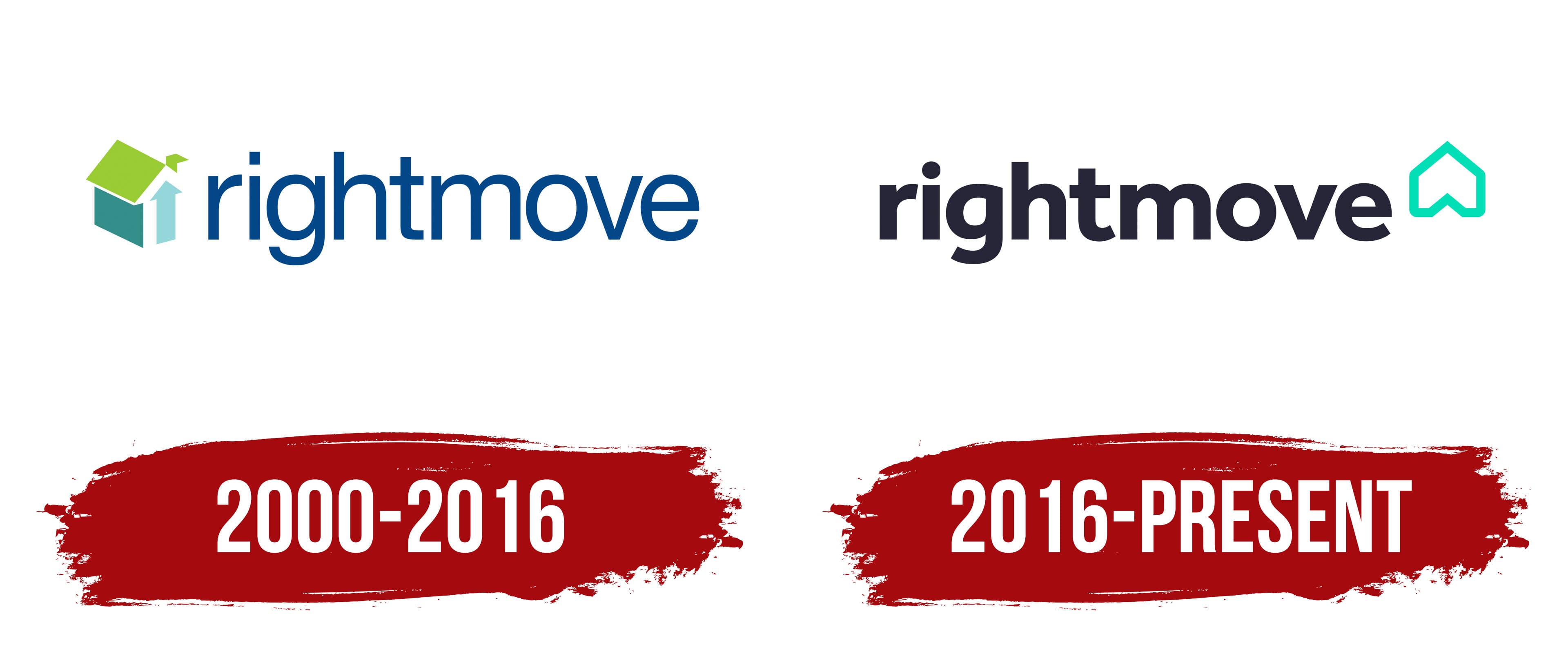
2000 – 2016
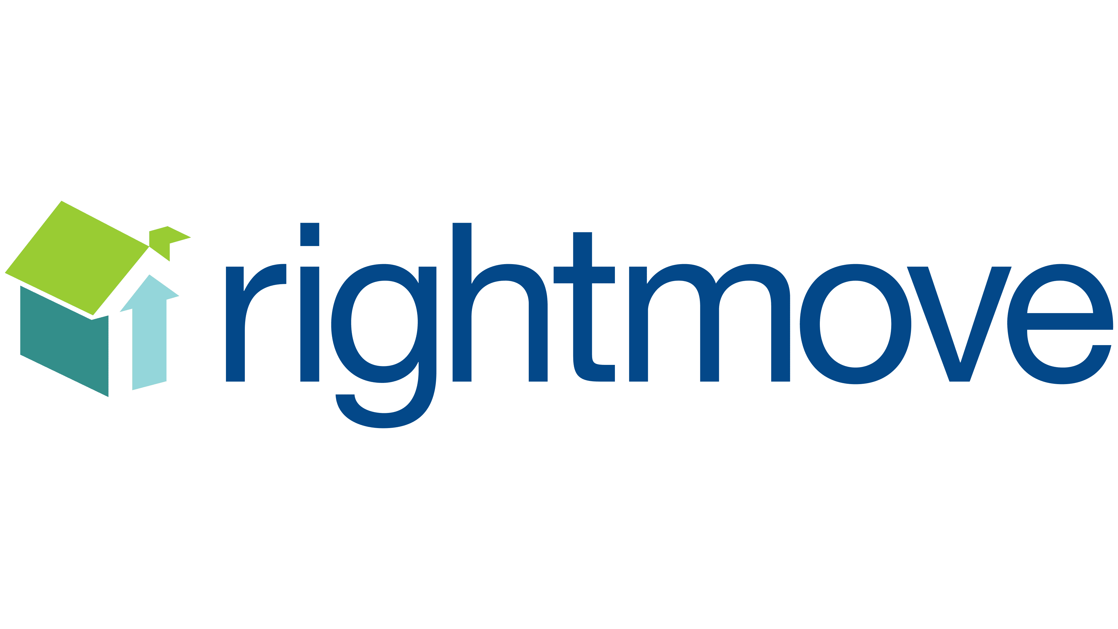
The early Rightmove logo was built around the theme of real estate. It used a house, an arrow, and a short name that reads as “right move.” The name refers to making the right move or taking the right step when searching for a home. The brand uses the phrase “make your move” in its communications.
The old logo appeared with the brand’s launch and remained a familiar identifier for website users for many years. It consisted of a three-dimensional figure on the left and the rightmove wordmark on the right. The name appeared in lowercase blue letters. The sans-serif typeface had an even stroke width and resembled Frutiger or Myriad.
A house-like form appeared on the left. It consisted of four geometric sections and had a three-dimensional appearance. The upper section resembled a light green roof with a short arrow-shaped extension on the right. The left side was greenish turquoise, while the front featured a tall light turquoise upward-pointing arrow.
The house and arrow connected the logo to home searches and moving to a new address. The blue text established a professional tone, while the green and turquoise section softened the presentation and suited the themes of home, choice, and the user’s personal step.
2016 – today
On December 13, 2016, Rightmove introduced a new logo and identity created by The Team. The update retained the idea of a house and arrow but presented it in a simpler form for the website, apps, and digital materials. The phrase “find your happy” became part of the communications, connecting the home search with finding a personal place to live.
The word Rightmove appears as a single name in lowercase letters. The wordmark uses Effra, a sans-serif typeface with solid, even strokes. Its form resembles Circular, Avenir, or Google Sans. The color is dark with a blue undertone.
A turquoise-green form appears beside the name. It resembles an outlined arrow and a house at the same time. The upper point looks like a roof, while the side lines extend downward. The complete structure resembles the frame of a house with an upward-pointing arrow. The line maintains the same thickness throughout.
The Team combined a house, a direction marker, and a suggestion of an inverted heart within one symbol. The house refers to real estate, the arrow to searching and moving, and the heart to the idea of “find your happy.” Compared with the old version, the logo became lighter and better suited to a service for buying, renting, and selling homes.