 Thales Logo PNG
The Thales logo is text-based but effectively represents the aerospace industry. The simple emblem effectively conveys the heightened precision, meticulousness, and authority of one of the leading producers of radar systems and software for military applications.
Thales was formed in 2000 through the merger of Thomson-CSF and Alcatel, although its roots go back to 1893, when Compagnie Française Thomson-Houston was founded in France. By the end of the 20th century, Thomson-CSF had become active in electronics, aerospace, defense systems, communications, and satellite technologies.
After the reorganization, Thales focused on high-technology markets and expanded through acquisitions. In 2001, it bought Racal Electronics in the United Kingdom, strengthening its defense electronics and communications business. In 2002, it signed a cooperation agreement with EADS, now Airbus Group, in air defense systems. In 2005, the company acquired ADI Limited in Australia, increasing its presence in the Asia-Pacific region.
In 2006, Thales sold its consumer electronics division to concentrate on aerospace, defense, transport, and security. In 2007, it acquired 25% of DCNS, later Naval Group, and kept its role in Thales Alenia Space. In 2009, it bought nCipher, a British cryptography specialist. Further moves included the acquisition of Tampa Microwave in 2011, the acquisition of a cybersecurity and data protection business in 2014, and the sale of its optoelectronics division to Safran in 2016.
The Gemalto acquisition, announced in 2017 and completed in 2019, became the largest deal in Thales’ history, valued at 4.8 billion euros. It expanded the company’s work in digital identity, biometrics, cybersecurity, and data protection. Later milestones included the Syracuse 4A military satellite in 2021, AI and big data systems in 2022, quantum communications work, and a 2024 smart-city security platform leveraging IoT, data analysis, and artificial intelligence.
Meaning and History
What is Thales?
It is a French multinational company that designs and develops electrical systems and services for the aerospace, defense, transportation, and security markets. The company offers a range of products and solutions, including avionics, satellite systems, cybersecurity, defense electronics, and railway signaling. It is known for its advanced technologies focused on developing cutting-edge solutions that enhance safety across various mission-critical sectors. The company operates globally, serving clients in governments, institutions, and the private sector.
2000 – today
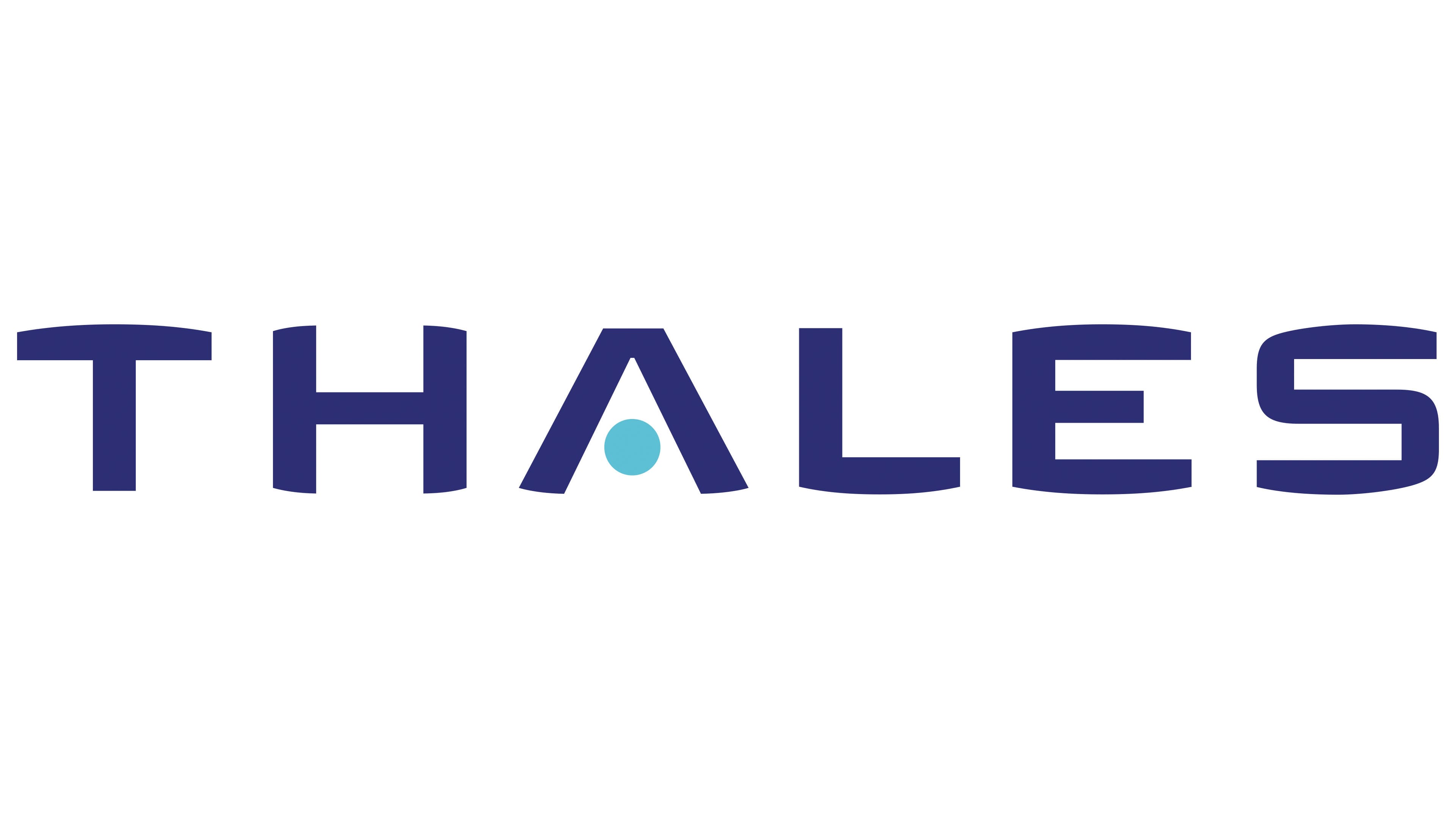
High-precision technologies can be represented through various visual identity styles, effectively conveying the company’s character. It’s not always necessary to use technical hints; sometimes, focusing on a friendly design for the personal mark is enough. This is the approach taken by the Thales logo. It is a wordmark through which the leading industry corporation expresses itself: its approach to work, worldview, atmosphere, marketing mechanisms, and more.
The strong, strict, and practical emblem consists of the company’s name. It is infused with positive energy that helps the brand stand out through its unique font. The distinctive feature of the font lies in the slightly rounded strokes at the top and bottom, creating a classic “fisheye” effect. This allows the company to convey seriousness through a somewhat playful style.
The curved strokes give the letters a sense of security; they resemble a “safety cushion,” providing protection, an added advantage for the Thales logo. Meanwhile, the opposite parts of the strokes are not rounded but straight, creating contrast and adding powerful dynamism.
Although the emblem is primarily a wordmark, it includes one drawn element, a large blue dot inside the “A.” The circle is integrated into the glyph, replacing the horizontal bar and conveying the concept of the aerospace corporation. Essentially, the blue dot symbolizes our planet, while the sides of the letter, resembling an upward-pointing triangle, protect it. It’s a stylized world within a world. This creates a distinctive style and makes the mark energetic and vivid, emphasizing the company’s field of activity.
The font is uppercase, grotesque, and bold. It adds a fresh meaning to the visual identity and forms a new conceptual image. The text is dark blue, evoking the night sky and conveying trust, security, and reliability. This shade harmonizes perfectly with the light blue, highlighting that the symbol inside the “A” represents a stylized Earth. It is a timeless mark that creates a superior visual identity. The harmonious palette, form, and font balance make it instantly recognizable.