


 Toll House Logo PNG
The Toll House logo embodies all the charm of delicious homemade cookies, chocolate chips, and original sweet morsels. It conveys a range of feelings and an inexhaustible number of pleasant sensations while showcasing simplicity and originality in a unified tandem. This is why the taste of superior cookies is always associated with love and care. The original Nestlé inscription on the identity emphasizes the reliability and high quality of the products.
Toll House began in 1930, when Ruth Wakefield and her husband Kenneth bought a small inn in Whitman, Massachusetts. The building had once served as a toll stop and horse-changing station, so they named it Toll House Inn. Ruth ran the kitchen and became known for fresh meals, desserts, and a practical style of home cooking.
In 1938, while adapting a cookie recipe, Ruth added chopped Nestle semi-sweet chocolate to the dough. She expected the chocolate to melt into the batter, but the pieces kept their shape during baking. The result became the chocolate chip cookie, first called the Toll House Crunch Cookie. She printed the recipe in her Toll House Tried and True Recipes booklet, which helped it move beyond the inn.
In 1939, Ruth Wakefield signed an agreement allowing her recipe to appear on chocolate packaging. The cookie gained wider attention in the 1940s, when American soldiers received homemade batches in wartime care packages and shared them overseas. In the 1950s, packaged semi-sweet morsels made the recipe easier for home bakers. They turned the cookie into a common American dessert.
From the 1960s through the 1990s, Toll House expanded from baking chocolate into chips, refrigerated dough, ready-to-bake formats, and new cookie varieties. In the 2000s and 2010s, the range expanded to include ready-made cookies, gluten-free products, organic lines, and online recipe content. From 2020 to 2023, the brand introduced cleaner-label products, edible cookie dough, plant-based morsels, baking guides, and a Heritage Collection tied to Ruth Wakefield’s original recipe.
Meaning and History
Many who have tried just one bite of this delightful treat become lifelong admirers. Even competitors acknowledge the excellent qualities of all product offerings. Trust in these unique treats grew as the producer systematically introduced new products. Popularity soared, and the famous cookies began appearing in every kitchen, becoming a beloved component of the most delicious baked goods.
Nestlé emphasized variety, offering many excellent ingredients that became essential for future pies and cakes. Because of this, the brand has excellent prospects for further development, and the identity will continue to play a significant role in this.
What is Toll House?
It is a Nestlé brand, best known for its chocolate chips and cookie dough. It originated at the Toll House Inn in Whitman, Massachusetts, where Ruth Wakefield invented the iconic chocolate chip cookie recipe. The brand’s products are widely used in baking, especially for making chocolate chip cookies. The brand offers a variety of baking products, including semi-sweet chocolate chips, ready-made cookie dough, and other baking ingredients. It is synonymous with home baking and is trusted for its quality and consistency. The products are available in supermarkets, grocery stores, and online retailers, making it easy for consumers to prepare delicious treats at home.
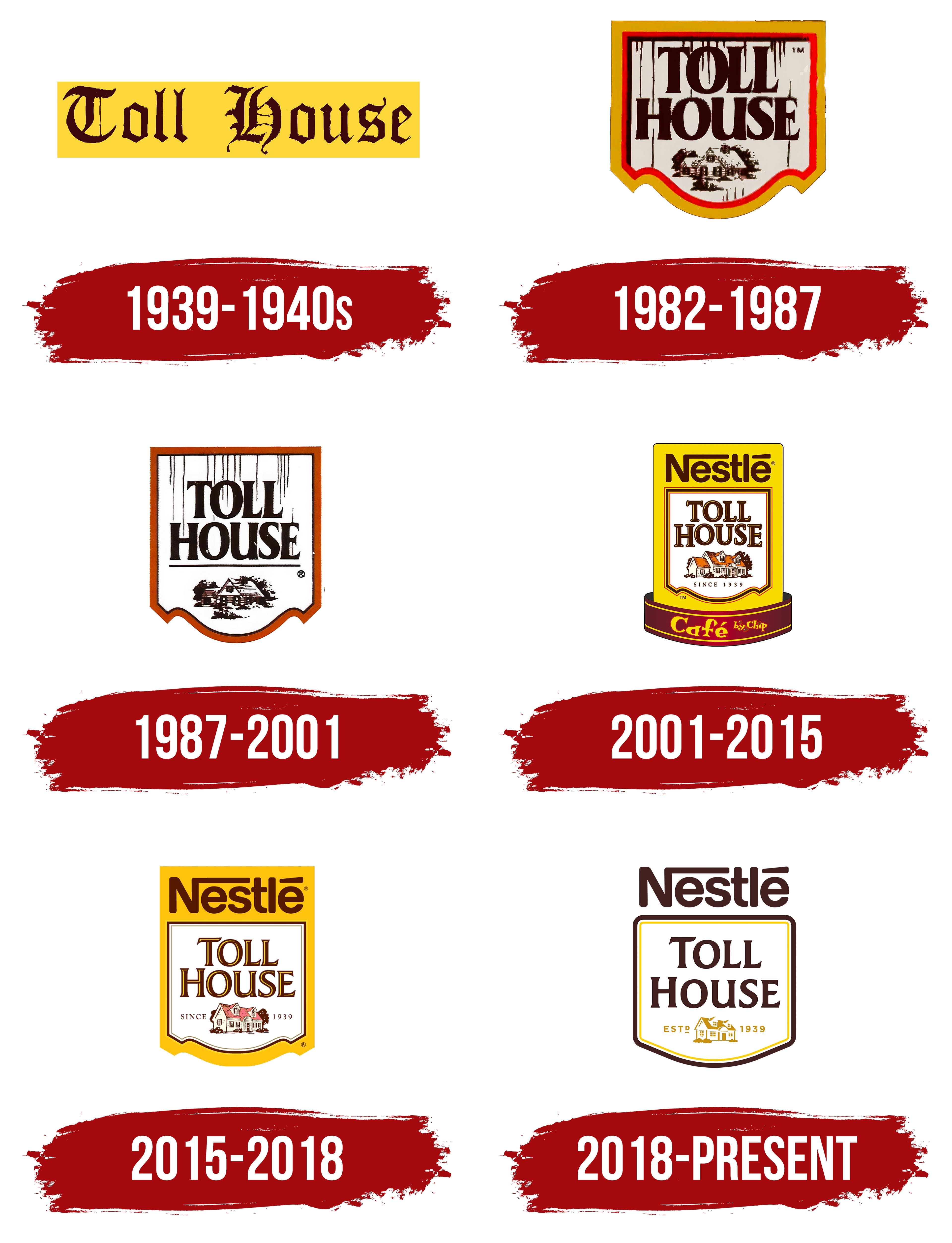
1939 – 1940s
The small company’s beginnings date back to 1939. Then, customers were first offered chocolate chip cookies under the simple name “Toll House Crunch Cookies.” Nestlé acquired the brand during the same period, marking the start of significant global transformations in developing this unique treat.
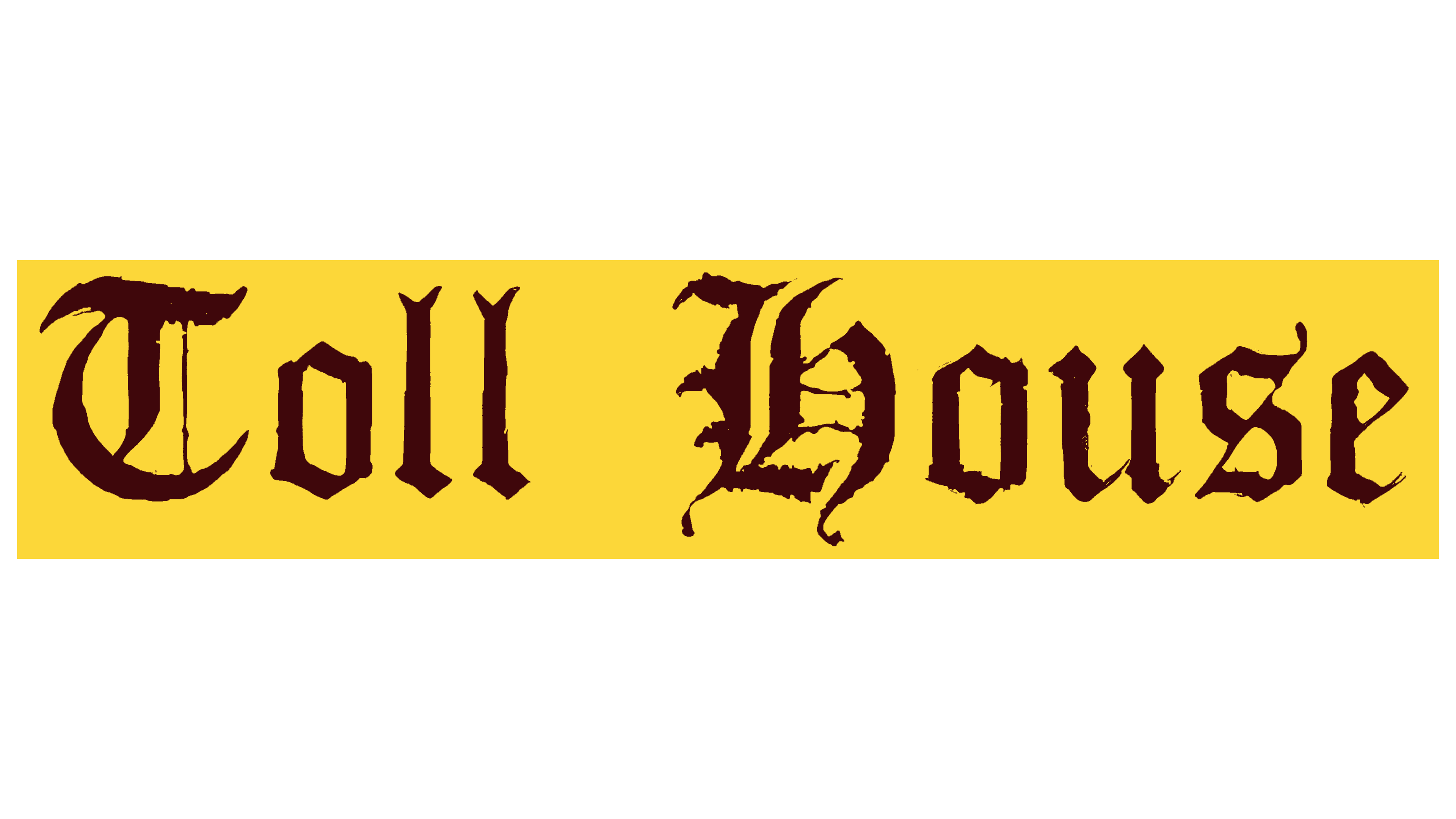
A stylish identity was introduced. The first logo was enchantingly beautiful, with the word “enchanting” being a key theme in the original symbol. A glance at the text made it clear that each letter was wrapped in mystery and legend.
The unconventional font with long flourishes on the letters and the golden sheen of the text element on a black background evoked many associations: knights, princes, and princesses. This aspect emphasized that “Toll House” is a story, a reservoir of memories, and a treasure trove of traditions. The large letters were easy to read. The chocolate, with its dark brown color, held fundamental significance, evoking the taste and uniqueness of the chocolate chip cookies. The sunny yellow background gleamed with gold, evoking the most pleasant nostalgic memories of homemade treats.
1982 – 1987
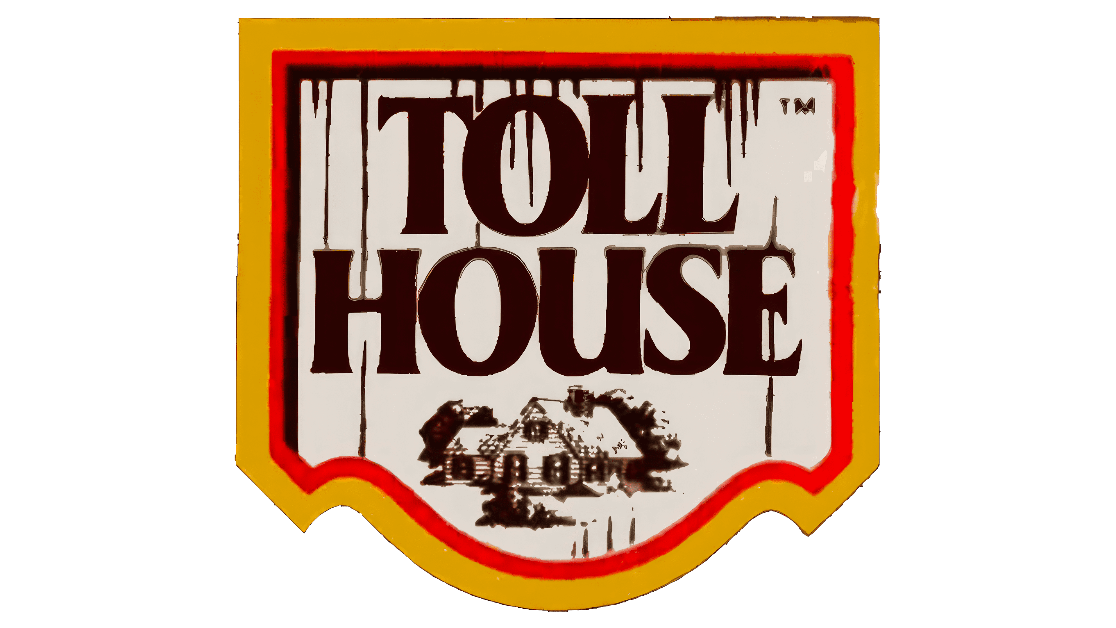
In 1982, the logo underwent significant changes, acquiring a more pronounced associative character. The shape and background changed, and the brand name is now displayed in two lines. The key elements became a house drawing and a shield, while the color scheme remained the same.
The logo’s shape is a shield, symbolizing protection and order. The shield surrounds the brand name, creating some of America’s best treats. The shield’s straight angles and red border draw attention to all its elements. In the center is a house with walls designed in a Provence style, evoking warm, nostalgic childhood memories and conveying coziness and the best moments of life.
The text enhances the visual effect. It is clear, and the capital letters look prominent and presentable. The brown tone of the font is associated with chocolate, the main ingredient of Toll House cookies.
1987 – 2001
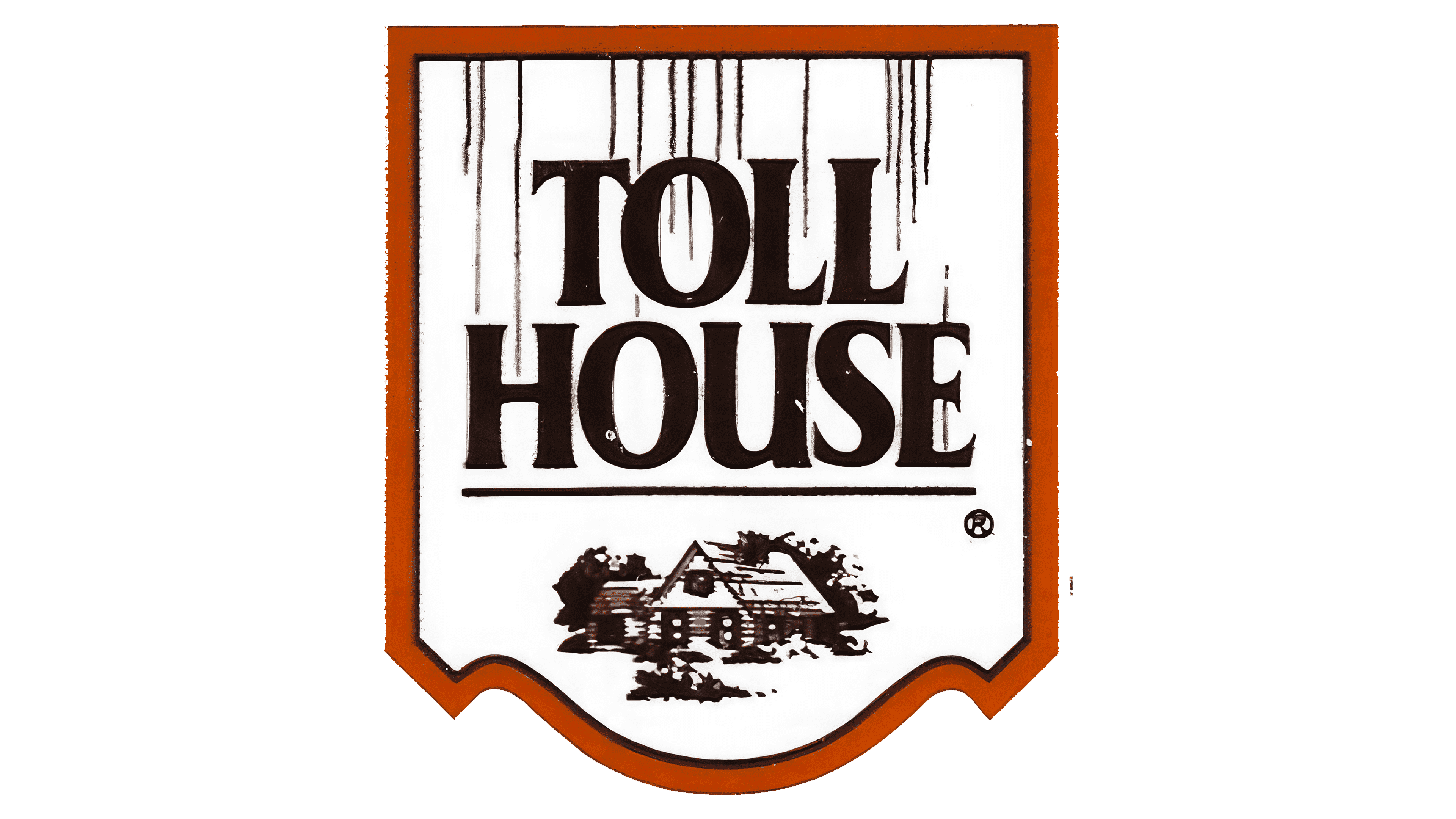
The next transformation of the logo appeared different: it became gentler, calmer, and more memorable. The main elements remained, but all additional elements and the background disappeared, making the logo more concise.
The focus shifted towards restraint and simplicity. The shield looks even more reliable because it eliminates brightness, conveying reliability, confidence, and strength. This demonstrates that the brand is focused on its customers and creates only quality products. The name “Toll House” in a dark tone symbolizes the era and a beloved product essential for creating the most delicious homemade treats.
The detailed depiction of the house emphasizes the value of traditions. Every stroke enhances the designers’ perception of the emotions embedded in the logo.
2001 – 2015
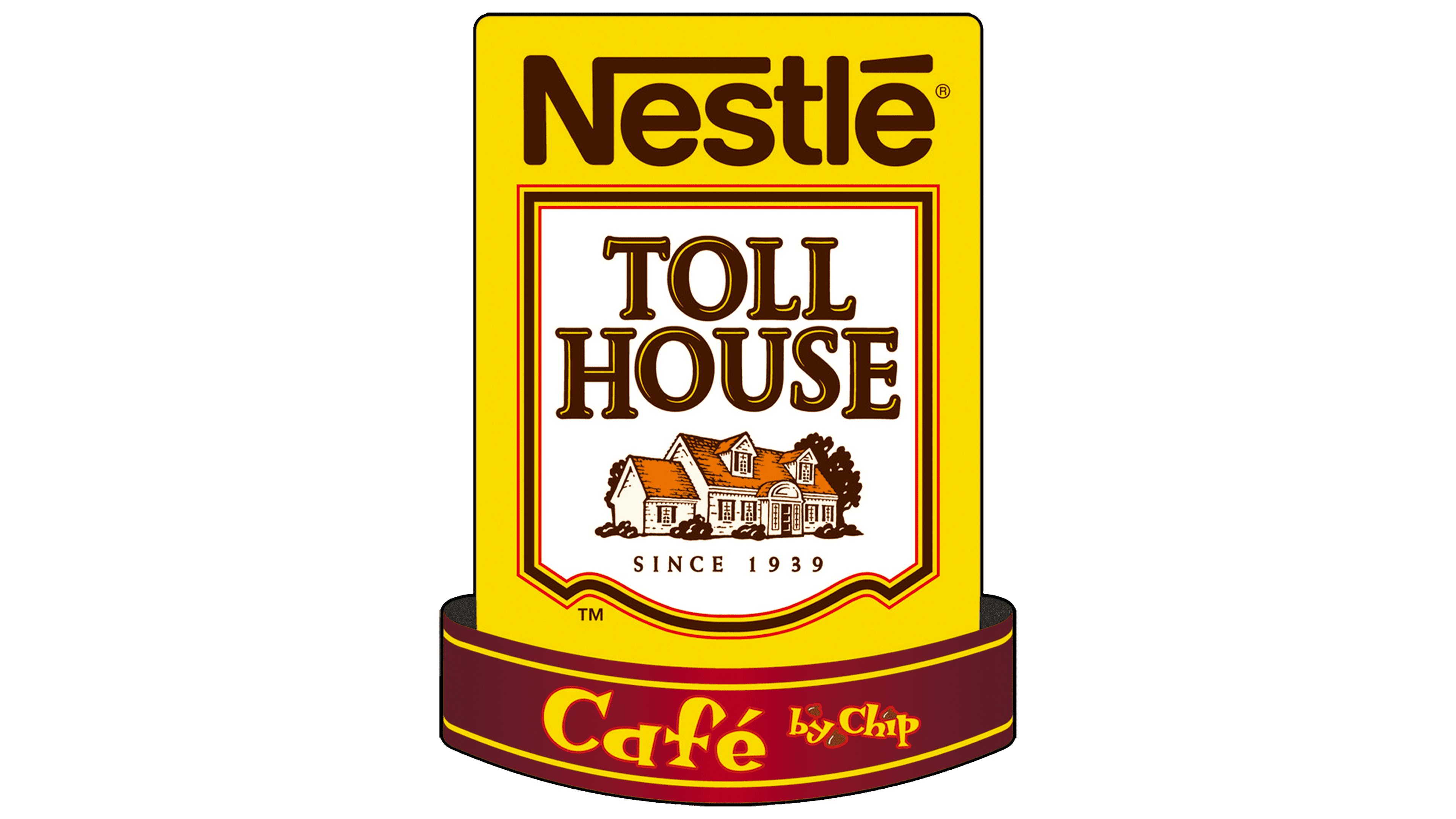
In 2001, significant changes in the brand identity occurred, which can be considered revolutionary. The new concept retained past trends, but the visual aspect now predominates.
The new logo emphasizes the brand’s reliability and has greater symbolic significance. Subtle hints of company information, like rays of sunshine, inspire trust. The name “Toll House” is centered in the logo. Elements from the past, such as the shield, house, and brand name, remain. The word “Nestlé” shines beautifully in traditional lettering at the forefront. The shield symbolizes the connection between the past and the present. The founding year, 1939, is highlighted in brown letters on a white background, reminiscent of chocolate.
The slogan “Café by Chip,” at the bottom of the logo, provides detailed information and underscores the company’s new phase of development and its unwavering drive toward the future. Thanks to a bright, rich color palette, the primary colors are yellow, white, and dark brown. The logo’s overall perception is at its highest.
2015 – 2018
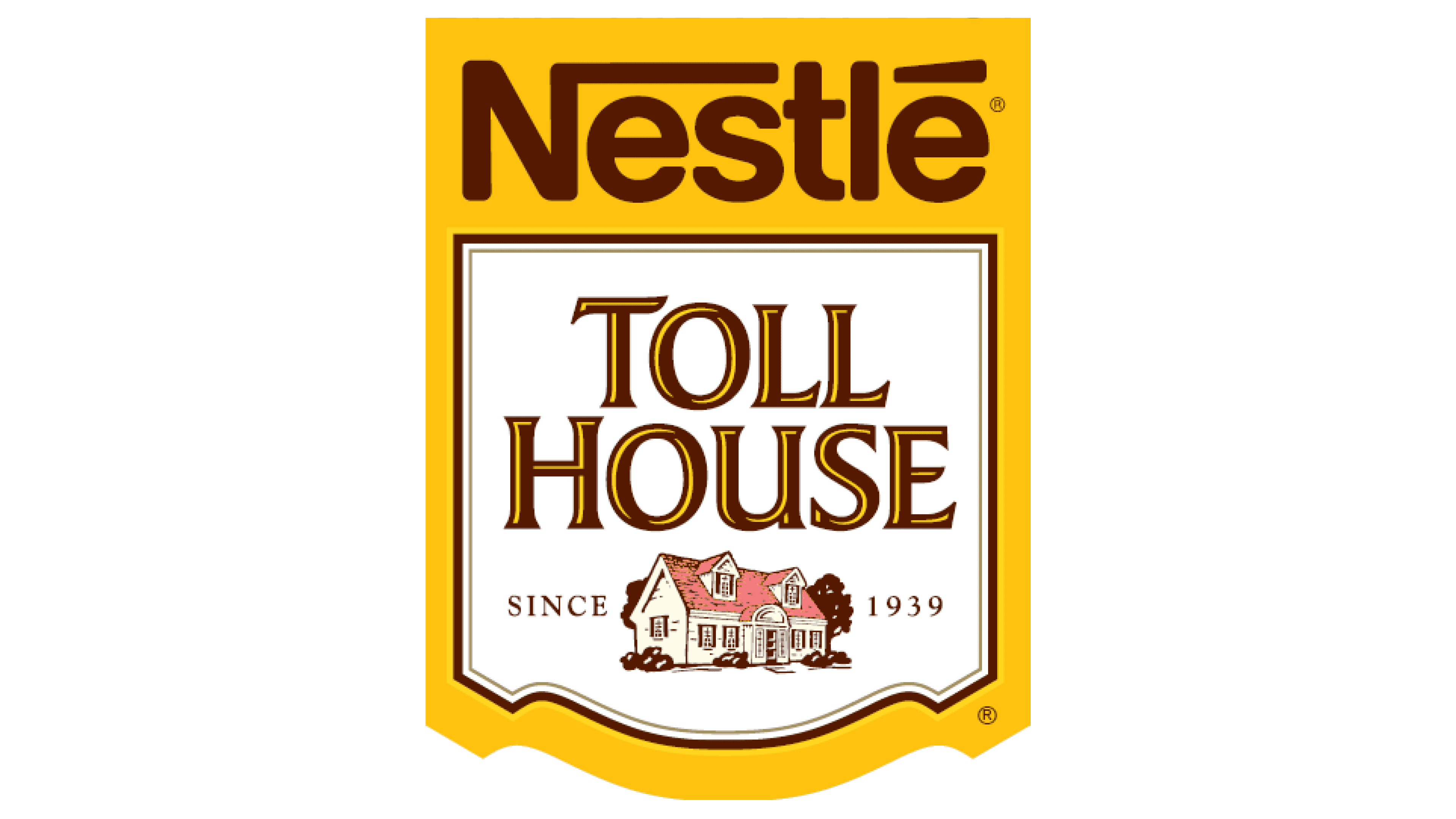
In 2015, lovers of sweet cookies and admirers of luxurious confectionery witnessed a logo modification. It wasn’t completely changed; instead, the identity focused on conciseness, with the emphasis shifted slightly. Extraneous elements became insignificant. Only the essence and content remained.
Yellow became the primary color, drawing attention and evoking warmth and sunshine. It envelops all informational blocks and attracts the eye. The word “Nestlé” is highlighted in chocolate color. Three familiar informational blocks in the middle of the shield indicate the brand, home comfort, and high product quality. The white background symbolizes tenderness and purity. The brand name is in chocolate-yellow capital letters and arranged in two lines.
The beautiful house on the logo symbolizes the ideal home for every customer. The founding date emphasizes that Toll House is a reliable friend and helper.
2018 – today
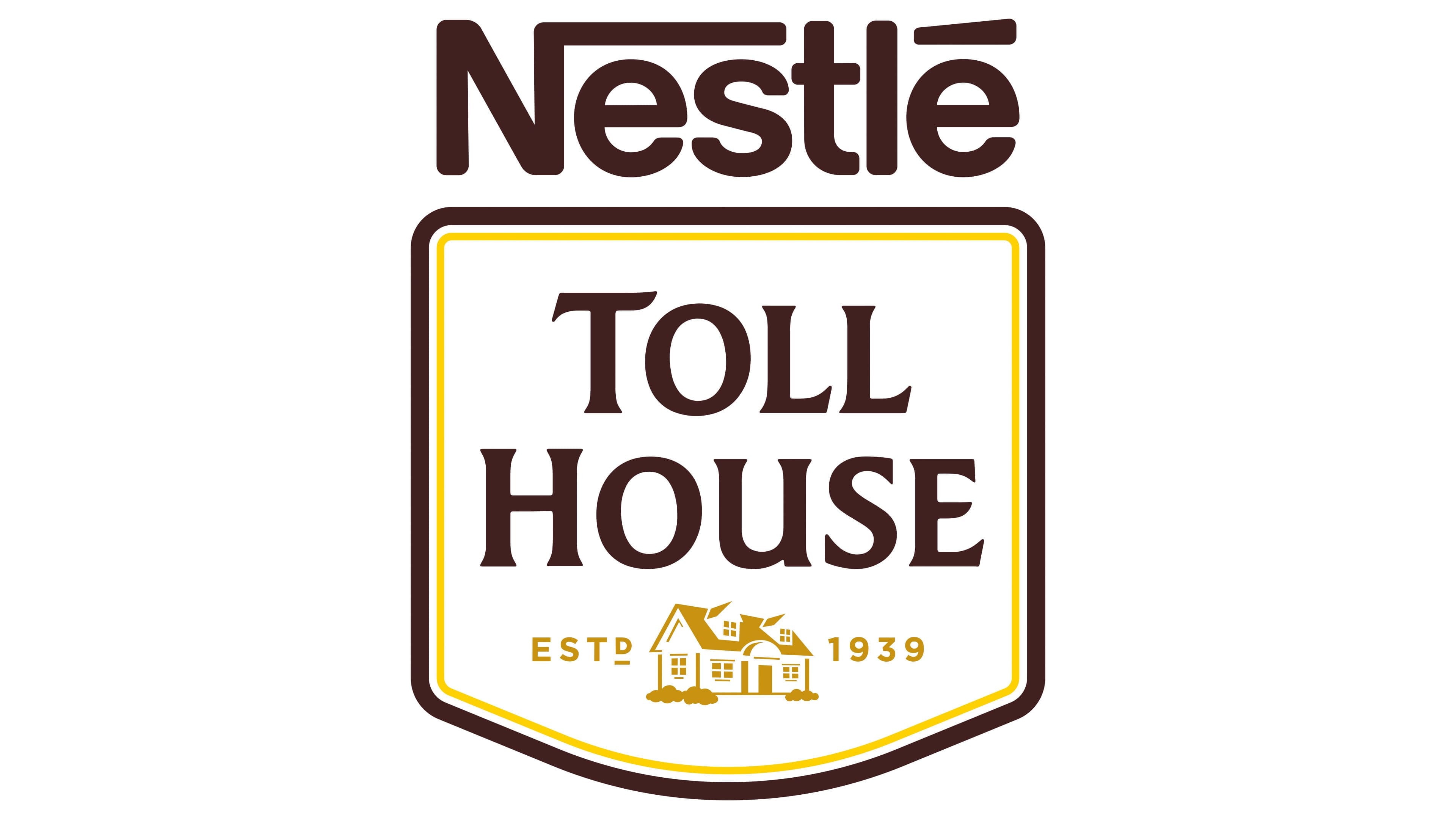
The brand identity in the latest version of the logo becomes the foundation of everything. Customer trust is paramount for every manufacturing company, so each logo element is detailed. The restrained tonality emphasizes the insignificance of decorative elements. Four key elements, the most informative, are highlighted. Three of them are enclosed in the familiar shield. On a white background in the central area, the brand name “Toll House” is written in dark color. Below is a classic house, reflecting the absence of excess. The founding date is displayed in the same tone as the house. Separate and prominently above the shield is the company name “Nestlé.” The yellow, brown, and white colors give the logo a special dynamism and liveliness.