 Tumi Logo PNG
The Tumi logo reflects the company’s commitment to product quality. Every stroke is like a masterpiece of craftsmanship, resulting in excellent creations. The emblem is a testament to attention to detail and showcases the perfection of their luggage, suitcases, and other signature products.
Tumi was founded in 1975 in New Jersey by Charlie Clifford, a former Peace Corps volunteer. His time in Peru influenced the company’s name, taken from Tumi, a Peruvian sun god. The first business model was based on importing leather goods from South America. Early products included briefcases and leather travel bags, positioned around careful workmanship and practical use.
In 1983, the company introduced its first luggage line made from ballistic nylon, a military-grade material known for strength. During the 1980s, Tumi expanded into business cases, travel accessories, premium department stores, and specialized luggage retailers. In the 1990s, it entered foreign markets, opened offices abroad, and began selling products in Europe and Asia. The first soft-sided suitcase line appeared in 1994, widening the range beyond leather goods.
Doughty Hanson & Co. acquired Tumi in 2004, providing the company with additional resources for expansion. In 2007, Tumi launched its first women’s collection, focused on luggage and accessories for female travelers. In 2012, the company went public on the New York Stock Exchange. In 2013, it introduced the Tegra-Lite® series, made with Tegris®, a lightweight, high-durability material.
In 2016, Tumi was acquired by Samsonite International S.A. for $1.8 billion. New launches followed, including Global Locator in 2017, recycled-material products in 2018, electronic accessories in 2019, 19 Degree Aluminum in 2020, and the Connected line in 2021. In 2023, flagship stores opened in Tokyo, Seoul, and Paris. In 2024, Alpha Flex introduced modular luggage and bags for business travelers.
Meaning and History
What is Tumi?
It is a premium American brand known for quality luggage, bags, and travel accessories. The company offers a range of products, including suitcases, backpacks, briefcases, travel kits, and other accessories designed for business and leisure travelers. The brand is recognized for its durable materials, innovative design, and functional features, including multi-functional compartments and built-in charging ports. The products use advanced technology and high-quality materials, such as ballistic nylon, for durability and performance. The company offers stylish and practical travel solutions that enhance customers’ travel experience.
1975 – today
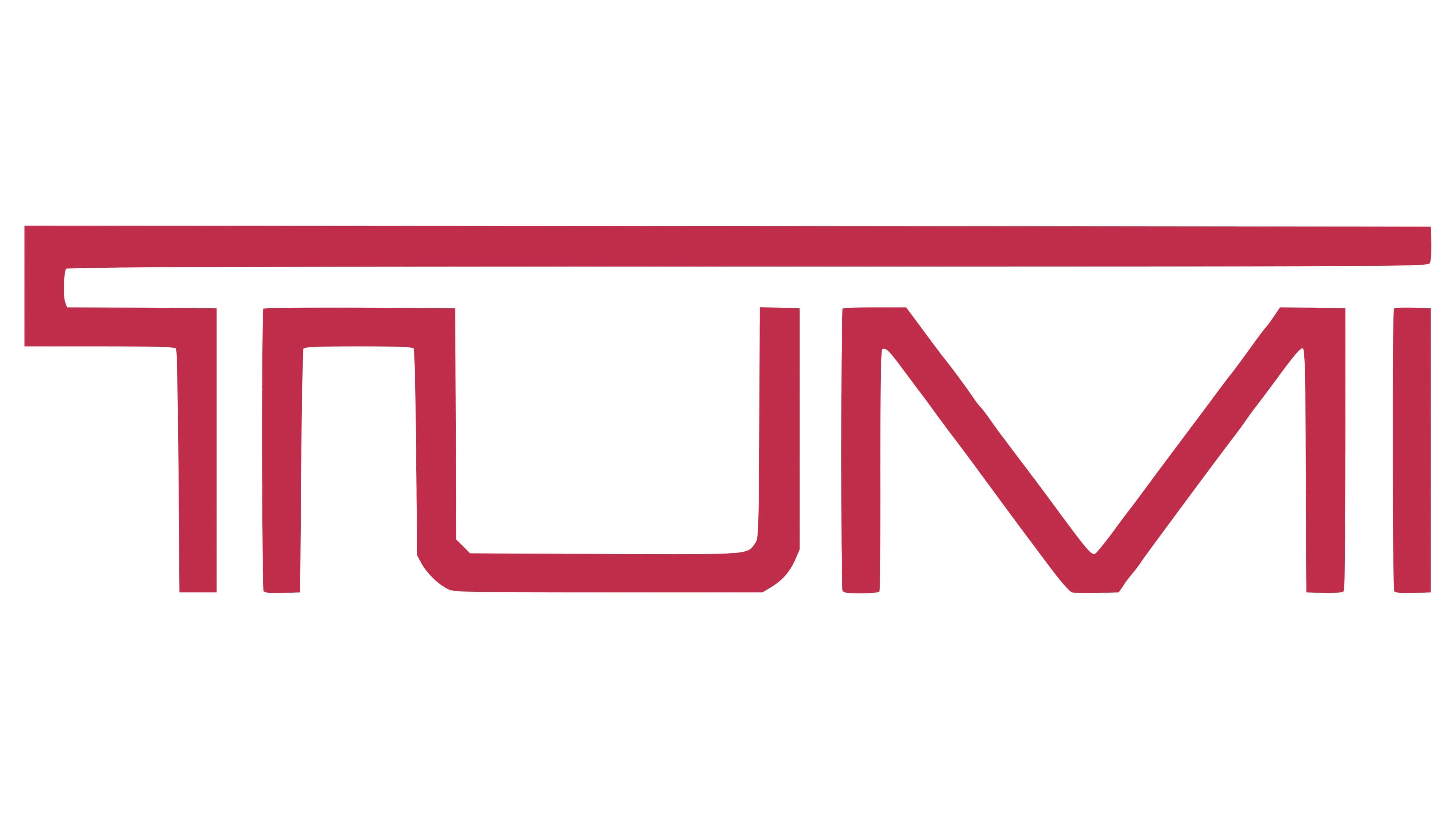
The core element of the Tumi logo is a distinctive term taken from Peruvian national traditions. It refers to a ceremonial knife once used in sacred sacrifices. The inscription features a unique shape and essentially represents a drawn element. This interesting blend of text and graphics is original, creating a unique symbol.
The logo consists solely of the name. This format is intentional because a small logo with minimal details effectively becomes a trademark that the manufacturer thoughtfully uses to label each bag. It functions not only as an official symbol but also as an individual mark and sign. Through it, the American company confirms the authenticity of its products and highlights their original origin.
The inscription is created with a custom font – geometric, bold, chiseled, and strict. All letters are uppercase, slightly flattened at the top and bottom, giving them a wide appearance. This is particularly noticeable with the “M,” which occupies a lot of space, while other glyphs are narrower in comparison. For example, the minimalist “I” looks like a single column. However, two other characters are connected and form parts of each other:
- The “T” consists of two curved lines (the left line forms the upper part of the letter, and the right one forms the lower part).
- The “U” is formed from a single line of complex configuration (it has a bracket shape).
The longest stroke in the “T” is its top, extending far to the right and encompassing the entire inscription. This graphic technique conveys a sense of care and protection, fitting well with the luxury brand’s concept. Meanwhile, the “U” and part of the adjacent letter’s leg resemble a backward “2.” Most glyphs have 90-degree angles, so the emblem looks strict, reflecting that the company approaches the production of bags and suitcases with a businesslike attitude and adheres to all technological standards.
The logo also skillfully uses negative space. On closer inspection, one can see two “T” s: one outlined, formed by parallel red lines, and the other, white, positioned between them. The other glyphs are red and lack a double structure.
The contrasting colors are chosen for their brightness and pleasant charm, which do not occur when combined with black. Red and white, on the other hand, evoke positive feelings without internal tension and emotional strain. They reflect the luxury travel bags and suitcases brand’s confidence, openness, friendliness, and approachability.