 UScellular Logo PNG
Mobile coverage reaches cities, suburbs, and remote regions, enabling calls and internet access in diverse environments. Operators are expanding coverage and maintaining network operations for users outside major urban centers. The UScellular logo represents a company that provides mobile and internet services across the United States, including small towns and rural areas.
United States Cellular Corporation was established on December 23, 1983, as a subsidiary of Telephone and Data Systems Inc. in Chicago. In October 1984, it formed its management team. In June 1985, the company began operations in Knoxville, Tennessee. In August of the same year, it began operations in Tulsa, Oklahoma. The first president was Rubin Hornaek. The company developed mobile communication systems across the United States, focusing on the Midwest and the Northeast.
In 1988, United States Cellular was listed on the American Stock Exchange under the ticker USM. In the late 1990s, the company rebranded as US Cellular. The new brand reflected its goal of becoming a modern national mobile operator.
In the 1990s and 2000s, the operator participated in spectrum license auctions. It strengthened its presence in rural areas. This focus on less urbanized regions helped the company become one of the five largest mobile operators in the United States.
In the 2010s, US Cellular invested in 4G LTE. The company built infrastructure in sparsely populated communities with support from government programs. In November 2024, the company launched the 5G standard in the Mid-Atlantic region. The company built the network using Samsung solutions, including vRAN and mmWave.
On May 28, 2024, T-Mobile US announced it would acquire most of US Cellular’s wireless assets. The deal included subscribers, retail divisions, and some spectrum. The Federal Communications Commission approved the agreement on July 11, 2025. The deal closed on August 1, 2025. After that, the company focused its operations on managing spectrum and communications infrastructure.
Meaning and History
What is UScellular?
It is an American mobile network operator headquartered in Chicago and part of Telephone and Data Systems. The company ranks fifth in the US market and owns its own network covering rural, suburban, and small-town areas across the Midwest, South, and New England. Its services include voice communication, LTE and 5G internet, roaming, data transfer, and Fixed Wireless solutions for homes and corporate services.
1983 – 1999
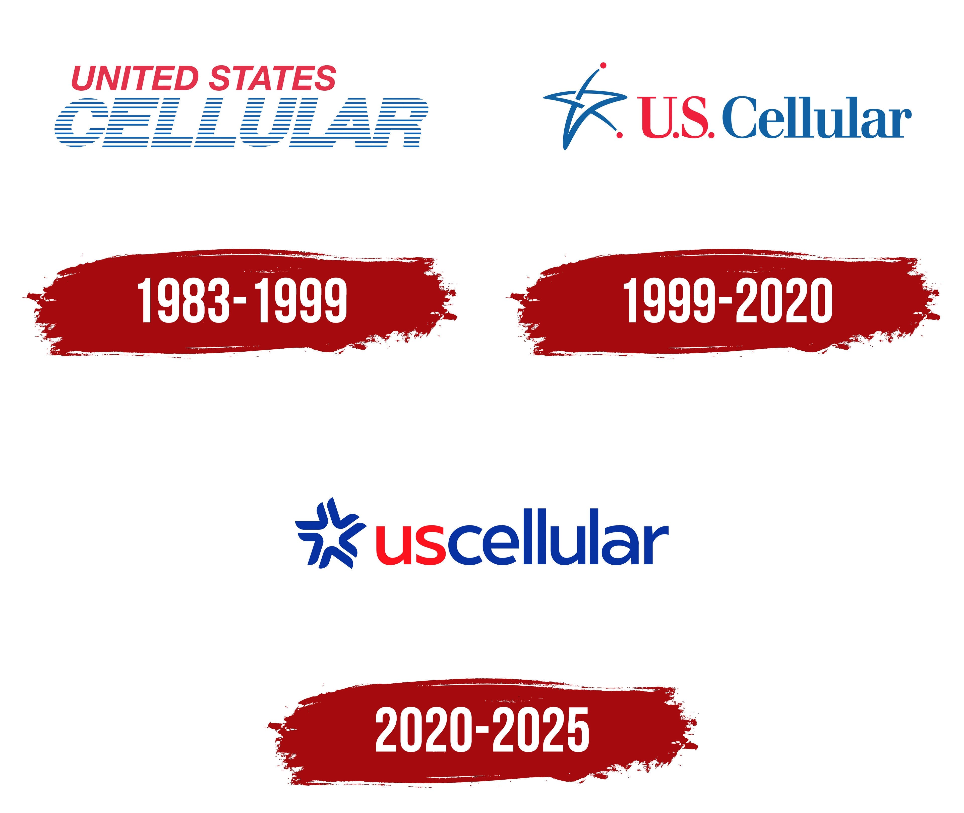
UScellular’s earliest branding presented the company as United States Cellular. The logo had no separate emblem. Its two lines differed in color, size, and letter construction. UNITED STATES appeared above the larger CELLULAR lettering.
The name reflected the operator’s origins and business. “United States” identified its home country, while “Cellular” referred to mobile communications. The company grew out of a division of the American group Telephone and Data Systems, established in 1983 as United States Cellular Corporation. Its headquarters were in Chicago. Customer service began in 1985, when the company launched networks in Knoxville, Tennessee, and Tulsa, Oklahoma.
The upper line was bright red with a solid fill. Its sans-serif capitals had even strokes and a slight rightward slant, resembling a modified Helvetica Oblique. Blue CELLULAR lettering also used slanted capitals, but thin, equal horizontal lines replaced solid strokes. White gaps ran throughout the height of the broad letters while preserving the word’s outline.
1999 – 2020
By 1999, customers, employees, and industry representatives were already calling the operator US Cellular. The company tested dozens of name options and settled on the familiar shortened form. It maintained a connection to United States Cellular by replacing the lengthy “United States” with the initials “U.S.” Beginning May 9, 1999, operations previously known as United States Cellular, Central Florida Cellular, and, in some markets, Cellular One were brought under a shared brand. The update aimed to unify regional identities and improve operator recognition.
For the first time, a separate symbol appeared beside the name. To the left, flowing blue lines formed an asymmetrical five-pointed star tilted slightly to the right. The curved bands intersected and tapered to points. Two red dots sat apart from the lines, one above the upper point and the other near the lower-right point. The star and name formed a horizontal logo that served as the company’s primary identifier until 2020.
US Cellular appeared on one line, replacing the earlier slanted, horizontally striped lettering. The capital US initials were red, while Cellular, with an initial capital “C” followed by lowercase letters, was blue. Serifs and contrasting stroke widths distinguished the new lettering, which resembled heavy versions of Times New Roman or Georgia.
2020 – 2025
The UScellular update introduced on September 24, 2020, connected the operator’s name to its involvement in local communities. The company worked with MullenLowe on the identity. The new look was intended to reflect modern communications technology and services while maintaining an emphasis on customer relationships. The company removed periods and spaces from the name. UScellular became the standard spelling in text, while the logo used the single lowercase word “uscellular.”
The new spelling brought out two meanings in the opening letters. “US” refers to the United States, while “us” refers to people collectively. Red “us” and blue “cellular” form a single word, continuing the earlier name’s color distinction. The upright sans-serif letters have nearly uniform stroke widths and resemble Google Sans and Product Sans. A blue star made of five separate curved segments replaced the intersecting lines and red dots on the left. The segments taper to their ends and converge around a white pentagonal opening, yet remain separate.
The segmented emblem represents people joining their efforts to bring about positive change. Together with the meaning of “us,” it conveys UScellular’s involvement in the communities it serves. The star and red-and-blue combination maintained a connection to the previous logo despite changes to the typography and symbol.
In August 2025, T-Mobile acquired UScellular’s wireless business, and the consumer brand began a phased transition to its new owner’s name. The infrastructure company United States Cellular Corporation was renamed Array Digital Infrastructure. It continued operating its communications towers and retained spectrum assets. The legal entity’s name change and the wireless brand’s transition proceeded as separate parts of the integration.