![]() Veeam Logo PNG
Veeam Logo PNG
The Veeam logo combines creativity and individuality, representing the company and conveying an atmosphere of high professionalism. The emblem reflects the essence of IT technologies that simplify user interaction with data synchronization and management programs.
Veeam: Brand overview
Ratmir Timashev and Andrei Baronov, two businessmen, founded a software company, Veeam, in Baar, Switzerland, in 2006. The founders had the skills and resources to start a new business because they had previously founded and sold Aelita Software to Quest Software. The company initially concentrated on creating solutions for VMware virtual machine management. Its debut offering, Monitor, was made available in 2007, enabling administrators to monitor VMware virtual machine performance.
Backup & Replication, the flagship product, was unveiled in 2008. Because of its effectiveness and simplicity, this virtual environment data backup and recovery technology quickly became well-known. Backup & Replication developed as the company’s main offering and the cornerstone of further expansion.
The company joined the Microsoft Hyper-V solutions market in 2009, greatly expanding its potential clientele. In 2010, it launched ONE, a complete solution for virtual infrastructure monitoring, reporting, and capacity planning, as part of its ongoing effort to broaden its product line.
In 2011, the firm exceeded a significant milestone: 25,000 clients globally, a sign that the market is beginning to recognize its capabilities. The company presented the idea of “Modern Data Protection” in 2012, highlighting the significance of a thorough strategy for data protection in virtual settings.
Backup & Replication v7 was released in 2013 and featured improved data protection features in hybrid environments and cloud platform support. Availability Suite was introduced in 2014, combining the functionality of Backup & Replication and ONE as part of its ongoing strategy to expand into the enterprise solutions market.
The company experienced tremendous growth in 2015, surpassing 150,000 customers globally and booking $1 billion in total revenue. In 2016, it increased its market share in the physical server space by releasing solutions for Linux and Windows Server backup and recovery.
With the release of Availability Suite v10 in 2017, additional features for data protection in cloud environments were added, including support for Microsoft Azure and Amazon Web Services. The company achieved a noteworthy milestone in 2018 when its yearly revenue surpassed $1 billion, confirming its position as the industry leader in data protection products.
In 2019, the company was purchased by the financial group Insight Partners for $5 billion, gaining access to more resources for growth and development. In 2020, the company continued broadening its line of products with fresh approaches to containerized apps and cloud data security.
A pivotal moment happened in January 2020 when the investment group Insight Partners purchased the business for $5 billion. This was one of the biggest software industry deals ever, signaling a new stage in its growth. The business remained independent and ran under the prior management even after the ownership changed.
Version 11 of Backup & Replication, the flagship solution, was released in 2021. This release included over 200 new features and improvements, including better ransomware defense, enhanced cloud service support, and expanded container backup capabilities. These developments reinforced Backup & Replication’s standing as a pioneer in backup and data recovery solutions.
In 2022, the company made great progress in growing its cloud services. To provide better protection for data within the Microsoft ecosystem, such as Teams, SharePoint Online, and OneDrive for Business, it launched Backup for Microsoft 365 v6.
In 2023, the company concentrated on developing its products’ machine learning and artificial intelligence technology. It unveiled new AI tools to anticipate data problems and optimize backup and recovery procedures.
2024 was a year of significant alliances. Thanks to partnerships it entered into with leading cloud providers and equipment manufacturers, its solutions may now be further integrated with a wider range of platforms and infrastructures.
Meaning and History
![]()
What is Veeam?
It provides backup, disaster recovery, and intelligent data management software for virtual, physical, and multi-cloud infrastructures. The company’s products help organizations ensure data availability and protection across multiple environments, including on-premises, cloud, and hybrid systems. It is known for its Veeam Availability Suite product, which offers comprehensive backup and recovery solutions and monitoring and analytics tools. The company provides high recovery speed, data loss prevention, proven recoverability, data utilization, and full visibility to help enterprises maintain continuous operations and meet data protection requirements.
2006 – 2008
![]()
To creatively represent a serious industry in a clear and visually appealing way, Veeam has combined sharp color contrast and graphical smoothness in its emblem. With its striking color scheme, clear structure, and simple form, the logo makes it obvious that this is an exceptional player in the IT field.
The color contrast combines black and bright green, effectively capturing attention. These colors work well together, balancing each other and setting a tone for a progressive perception of the brand, as its products are virtual rather than physical. This approach is intended to convey the modernity and innovation of the company’s digital developments.
- The first half of the name, “vee,” is in black, representing the letter “V,” which stands for “Virtual.”
- The second part, “am,” is in green, representing the letter “M” from the word “Machine.”
Thus, the Veeam logo is based on an abbreviation presented in a phonetic form, reflecting how the letters in the acronym are pronounced. This significantly influenced the brand’s identity, creating a new word. The visual style is primarily text-based—minimalist, modern, and vivid, thanks to the optimal color palette and its harmonious combination with the font.
Several features of the typeface are worth noting. First, all letters are lowercase, though they are large. They feature 90-degree angles that blend harmoniously with smooth curves. Second, the letters “e” and “a” are remarkably similar. The designers noticed this and aimed to emphasize it in the logo. Upon closer inspection, you can see that they almost appear as mirror reflections of each other, with only the side curve preventing full symmetry.
Beneath the name is a bold stripe that adds a sense of dynamism to the emblem, as it visually appears to be in motion. The curve enhances this effect: a short vertical stroke flows smoothly into a long horizontal line. A similar curve exists in the top right corner (at the “m”). It balances the logo and gives it a sense of cohesion.
2008 – 2017
![]()
Minor changes to the Veeam logo have significantly impacted its recognition among clients. This is primarily because they reflect the refined concept of the IT company, which wanted to showcase its seriousness, professionalism, and importance in the virtual world. At the same time, the company aimed to maintain its familiar “face” so that users could easily identify its products among competitors. The task was accomplished simply and effectively—by changing the color.
As a result, the emblem became less playful and less bright than before. Two important steps were taken to achieve this:
- The bright green color was shifted to a calmer spectrum—it became darker, deeper, more restrained, and businesslike;
- The name was recolored in black, symbolizing seriousness, sophistication, elegance, and strength.
Despite the minimal adjustment, the logo radiates a different tone, creating a sense of novelty and practicality. The sharp edges of the letters with clean angles remain a highlight of the visual identity. The curves also remain untouched: the upper one on the right (on the “m”) and the lower one on the left (at the transition from the vertical stripe to the horizontal). They maintain visual balance so the glyphs don’t seem too rigid or dry, as the smooth contours convey a calm atmosphere.
The lowercase font represents the accessibility of the company’s services to all users: it is compact, informal, and simple. At the same time, the letters appear innovative, as they have a non-classical shape, combining assertiveness and softness, reliability and delicacy, utility and aesthetics. The smooth edges, rounded curves, and the straight line at the bottom emphasize the developers’ precision and attention to detail in creating software.
2017 – 2023
![]()
This is a very intriguing version of the Veeam logo that combines both uppercase and lowercase letters in a single word: both “e” s are lowercase, while “V,” “A,” and “M” are uppercase. Despite the difference in case, all the glyphs are the same size—they don’t vary in height. The smooth strokes create a sense of confidence and reliability, showcasing the high capabilities of a company tied to digital technologies.
The most massive letter is “M.” It is so wide that it takes up one and a half times more space than the others. Its curved tops smoothly transition into the lower strokes, giving the impression that it consists of a single line bent to follow the needed shape. Interestingly, the left leg of the glyph ends with a point, while the right one finishes with a rounded edge, which adds another unique aspect to the emblem.
The neighboring “A” is missing a small segment of its crossbar, making the stroke open-ended and hinting at the freedom of action for clients who use Veeam’s original software. Both ends of this symbol are rounded, and the top is curved, giving the impression that the right leg flows seamlessly into the left, creating a sense of continuous cyclicity and unity. The capital “V” is designed in a similar style. But the most rounded of all are the two “e” s. They are ring-shaped, bold, and smooth.
The mix of uppercase and lowercase glyphs, soft contours, and rounded elements give the logo a playful feel, which doesn’t entirely match the company’s specialization. This dissonance is striking, as it isn’t justified by the brand’s concept, which centers on precision and forward-thinking, qualities not fully reflected here. However, other elements hint at active growth.
For instance, green balances the situation, symbolizing continuous growth, youth, the pursuit of fresh ideas, and the drive toward new heights. Combined with the modern, rounded font, it evokes a sense of natural balance, harmony, perpetual motion, and progress. Paired with a white background, the green adds additional softness. It encourages a positive perception, showing the company’s reliability and confirming its high level of professionalism. Thin, smooth lines give the emblem a sense of lightness and elegance.
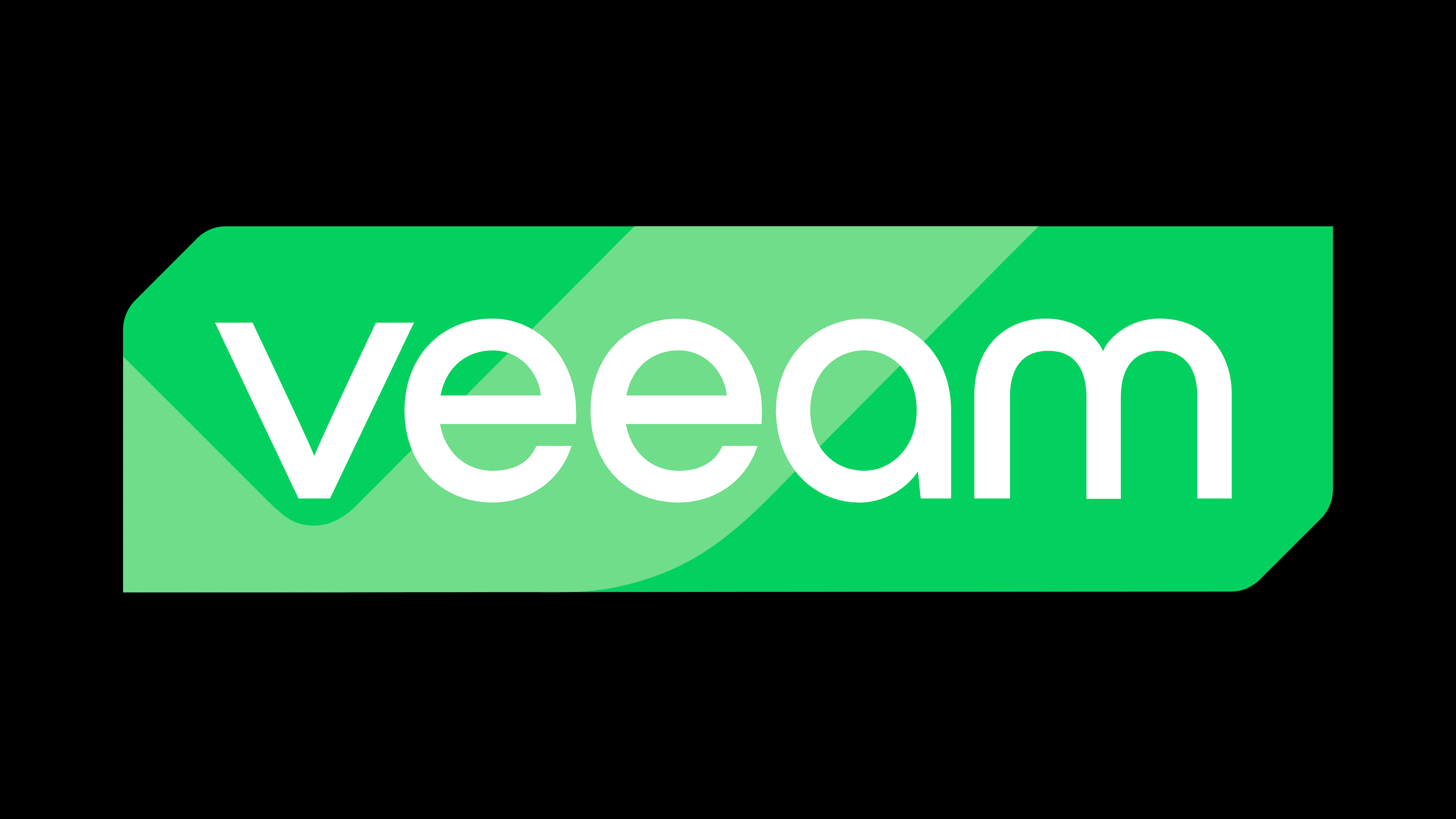
2023 – today
![]()
This version of the Veeam logo is characterized by creativity. It is visible in every detail, even in the standard grotesque font used for the inscription. The design of the visual identity has radically changed, elevating the brand to a higher level of style and presentation.
The most significant changes occurred in the background: it has essentially appeared for the first time, as it was previously absent as a full-fledged element. Now, the name is placed within a horizontal rectangle with two cut-off corners. These corners echo earlier versions of the emblem, where there were rounded edges at the top right and bottom left. Now, the corners are reversed—top left and bottom right. This format added unity and purpose to the sign, as the cuts look harmonious and support the internal dynamism of the logo.
A similar effect is introduced by the wide whitish stripe, curved in the shape of a boomerang. It is located on the left side of the rectangle, taking up a lot of space. On its background, the second “e” is fully visible, while the first “e” and “a” are partially shown. However, the smoothly curved line is not just a ribbon but a fragment of the letter “v,” which stands at the beginning of the name. The remaining geometric figure is colored in a pastel green—light and slightly powdered. It fills the space with powerful energy, hinting at youthful enthusiasm, growth, and hard work.
The precise and straight edges of the rectangle contrast with the rounded font, featuring smooth outlines of the glyphs. The inscription is made in bold letters with soft contours, except for the “v,” which has no rounded strokes—only straight lines. This is done to highlight and draw attention to it, as it represents the abbreviation for “Virtual”—the main specialization of the IT company.
The other characters are smooth, sleek, and rounded. They are unified by the absence of serifs and the use of lowercase, as the emblem continues to be built on lowercase glyphs, demonstrating the accessibility of the company’s products to most users. The white name on a light green background evokes a sense of joy, cheerfulness, and good spirits.