


 VIZIO Logo PNG
The VIZIO logo resembles curved antennas and wires, symbolizing technological excellence and the company’s advanced approach. Every element of the emblem reflects a commitment to innovation and high quality. The sharp lines and modern design embody engineering precision and clarity in sound and image, which are the brand’s top priorities. The minimalist style and carefully chosen color scheme emphasize the clarity, functionality, and high standards inherent to the company.
VIZIO was founded in Irvine, California, in 2002 by William Wang, a former Princeton Graphics employee. The business first operated as V Inc. and sold only 3,500 plasma televisions during its first year. Wang built the company around large screens, solid picture quality, and prices below those of established manufacturers.
A major change came in 2004, when a retail agreement with Costco gave the brand national exposure. That year VIZIO entered the flat-panel market with its first LCD television. Sales passed one million units annually by 2006, and in 2007 the company became North America’s leading LCD TV seller, ahead of Samsung and Sony.
VIZIO moved into home-theater audio in 2008, then introduced LED and internet-connected televisions in 2009. It tested 3D TVs in 2010 and laptops and tablets in 2012, though computers never matched the television business. The P-Series brought 4K Ultra HD models in 2014, followed by quantum-dot technology in 2015.
LeEco announced a $2 billion acquisition in 2016, but the deal collapsed over regulatory problems. In 2017, VIZIO settled claims involving viewing-data collection and agreed to improve disclosure. SmartCast 3.0 arrived in 2018, OLED models followed in 2019, and the company joined the New York Stock Exchange in 2021 with a valuation near $4 billion. In 2022, it continued improving picture and sound. By 2023, its operations covered televisions, soundbars, smart-TV software, and targeted advertising based on viewing data.
Meaning and History
What is VIZIO?
This American electronics giant revolutionized home entertainment by offering affordable, multifunctional televisions and sound systems. Now, customers looking for the latest display technologies without exceeding their budget choose this brand. The company offers a wide range of products, from high-quality soundbars to smart TVs with modern designs. The SmartCast technology, which easily integrates with mobile devices and streaming services, turns the brand’s TVs into full-fledged entertainment hubs, providing access to content from popular providers.
2002 – 2004

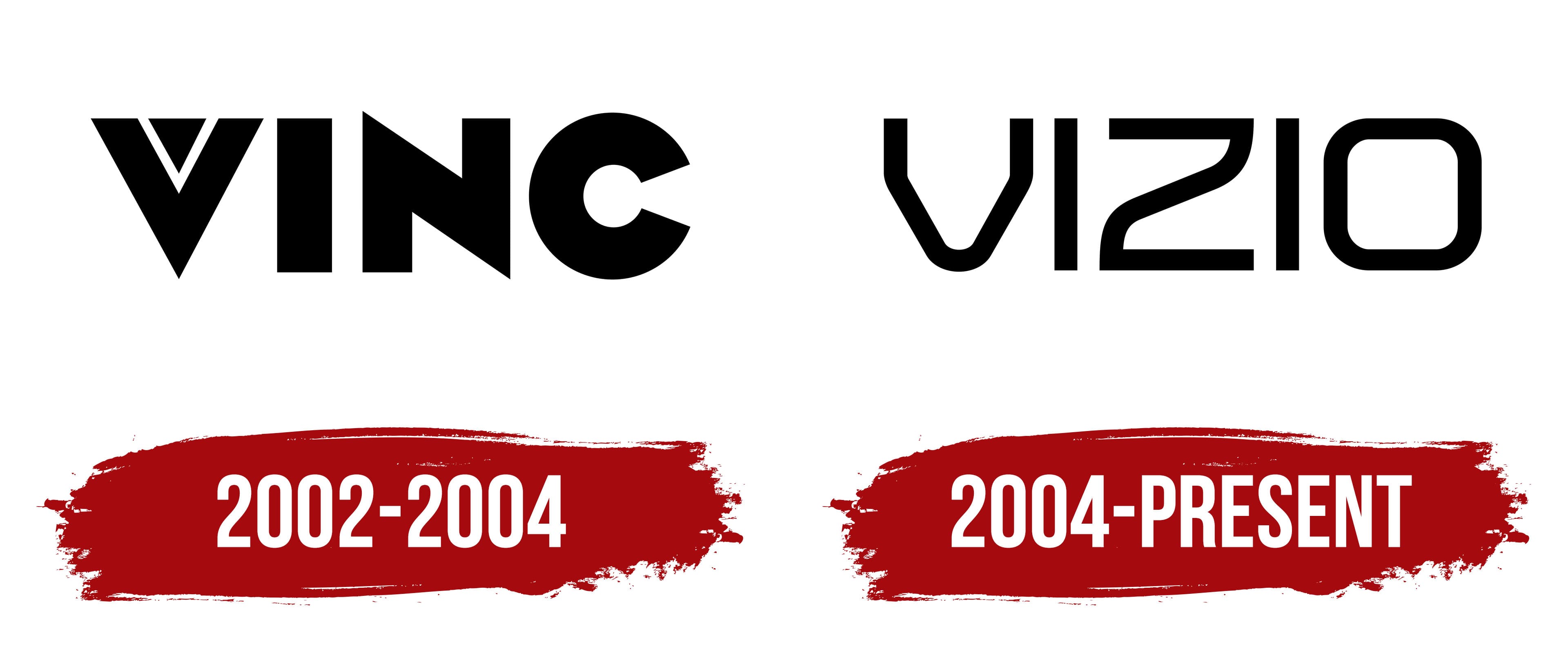
The company’s original emblem features the letter “V,” which stands for “vision” and represents foresight and outlook. The logo seamlessly integrates with “Inc,” giving it unity and completeness. The bold font emphasizes the company’s stability and confidence in providing essential goods and services in its field, as well as the reliability of its products.
The pointed ends of the glyphs hint at the brand’s uniqueness and selectivity, showcasing its ability to incorporate the latest technologies and highlight its modern positioning. A distinctive feature of the logo is a small triangle embedded in the “V.” This element symbolizes the company’s two key directions: video and sound. The white lines of the triangle, resembling wave paths, cut through the black background, converging at the center and evoking an image on a screen.
2004 – today
The Vizio logo reflects the brand’s evolution and pursuit of modernity and minimalism. When the brand changed its name to Vizio, it was decided to use a style that would convey innovation and technological progress. The visual mark is designed in a minimalist style, consisting of clean lines and refined glyphs. This highlights the company’s commitment to concise, functional solutions that also align with current trends.
The letters in the logo have strict shapes with soft curves, reminiscent of the contours of modern technological devices. For example, LCDs and wires, with streamlined, ergonomic forms, are reflected in this font. This symbolizes smoothness and technological simplicity, which are important for a brand that creates accessible, intuitive technology.
The emblem’s color scheme is black, emphasizing the stability, reliability, and high quality of the company’s products. Black is often used in electronics because it visually reduces objects, making them look stylish and modern. It also suggests that the company’s technology is becoming increasingly thin and light.