 Weyerhaeuser Logo PNG
The forestry industry is built on a long cycle, from growing timber to processing it and delivering it to construction sites. Trees grow for decades, after which the material is used in construction and in manufacturing wood products. The Weyerhaeuser logo is associated with a company that manages forest lands, harvests timber, and supplies materials to the construction industry.
Frederick Weyerhaeuser founded Weyerhaeuser in January 1900. He purchased 360,000 hectares of forest in the state of Washington from the Northern Pacific Railway Company for $ 5.4 million. This transaction became the largest in American timber industry history. The company began operations with logging and building sawmills in the Pacific Northwest.
In 1931, Weyerhaeuser opened a plant in Longview. It became one of the world’s largest, processing hundreds of thousands of cubic meters of wood per year. By the mid-20th century, the company had introduced reforestation practices and began planting millions of trees.
In 1963, Weyerhaeuser was listed on the New York Stock Exchange. In the 1970s and 1980s, the company expanded production and began manufacturing paper and cardboard. In 2002, it acquired Willamette Industries for $ 6.1 billion. In 2007, Weyerhaeuser sold its paper business to Domtar and focused on timber operations.
In 2008, the company was reorganized into a real estate investment trust (REIT). In 2013, Weyerhaeuser acquired Longview Timber. In 2016, it purchased Plum Creek Timber for 8.4 billion dollars and became the largest private forest owner in the United States.
In 2020, during the construction boom, lumber prices rose sharply. The company achieved record profits. In the following years, it modernized production facilities and sold part of the land for commercial development.
The company manages about 4.5 million hectares of forest land in the United States and Canada. It produces lumber, plywood, and wood panels for the construction industry and remains a leading player in the global timber market.
Meaning and History
What is Weyerhaeuser?
A major forest products corporation and real estate investment trust (REIT) managing about 11 million acres of timberlands in the United States. The main activities include forest management and timber sales, lumber and engineered wood production, and land development for residential and commercial projects. Its production facilities manufacture TimberStrand® materials, plywood, OSB panels, and construction beams. The company is among the largest suppliers of wood products in North America.
1900s – 1959
The Weyerhaeuser surname was known in the forest products industry before the company was established in Washington State. Its founder was born in Germany as Friedrich Weyerhaeuser and moved to the United States in 1852. In America, he was known as Frederick. Over several decades, he built a large network of logging and wood-processing businesses. By the founding of Weyerhaeuser Timber Company on January 18, 1900, the entrepreneur’s surname already carried an established business reputation.
The company was founded on the purchase of 900,000 acres of timberland in Washington, approximately 364,000 hectares, from Northern Pacific Railway. Weyerhaeuser acquired the land with 15 partners. At the time, the transaction was the largest private land purchase in U.S. history. The word “Timber” referred to construction timber and wood, identifying the harvesting and sale of raw materials. It later removed “Timber” as manufacturing expanded, while the founder’s surname remained.
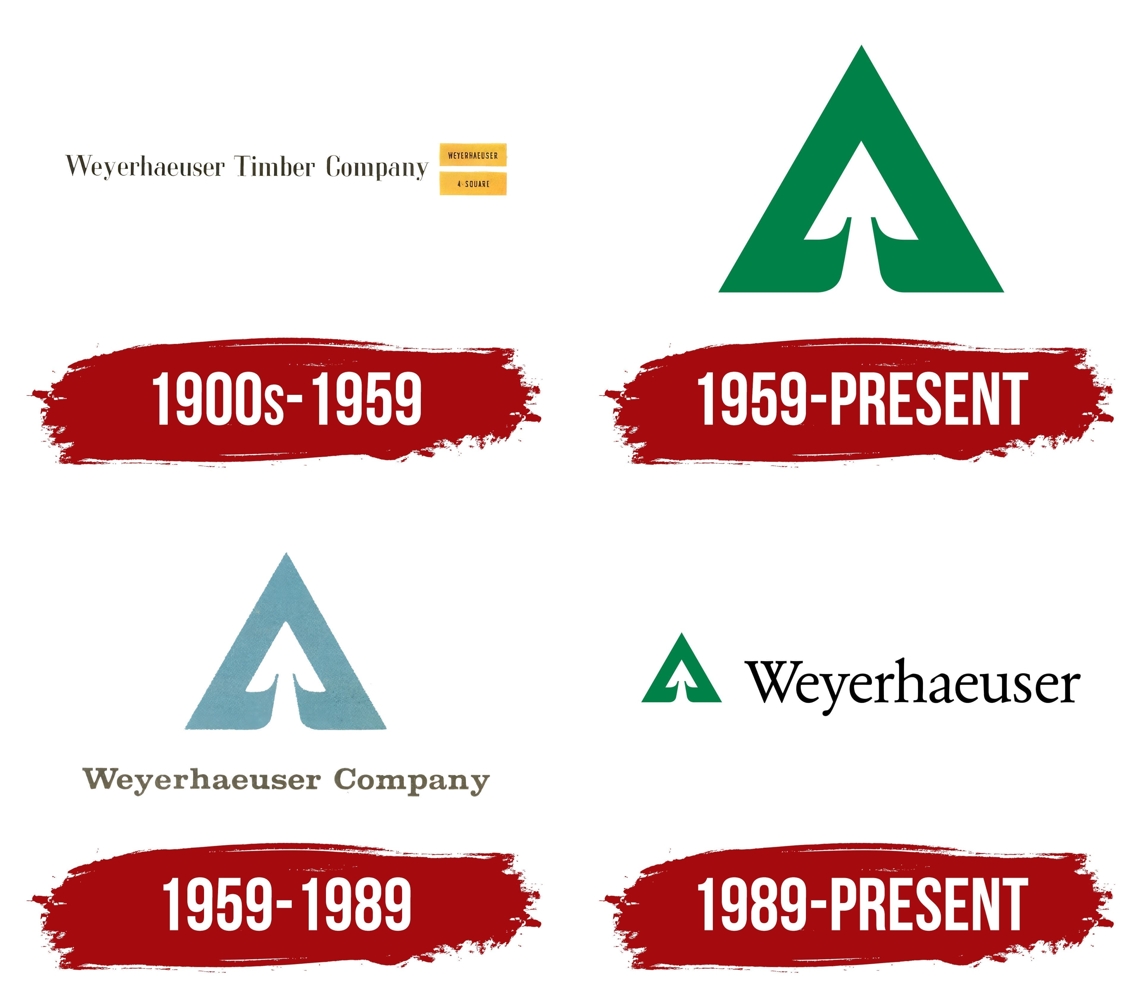
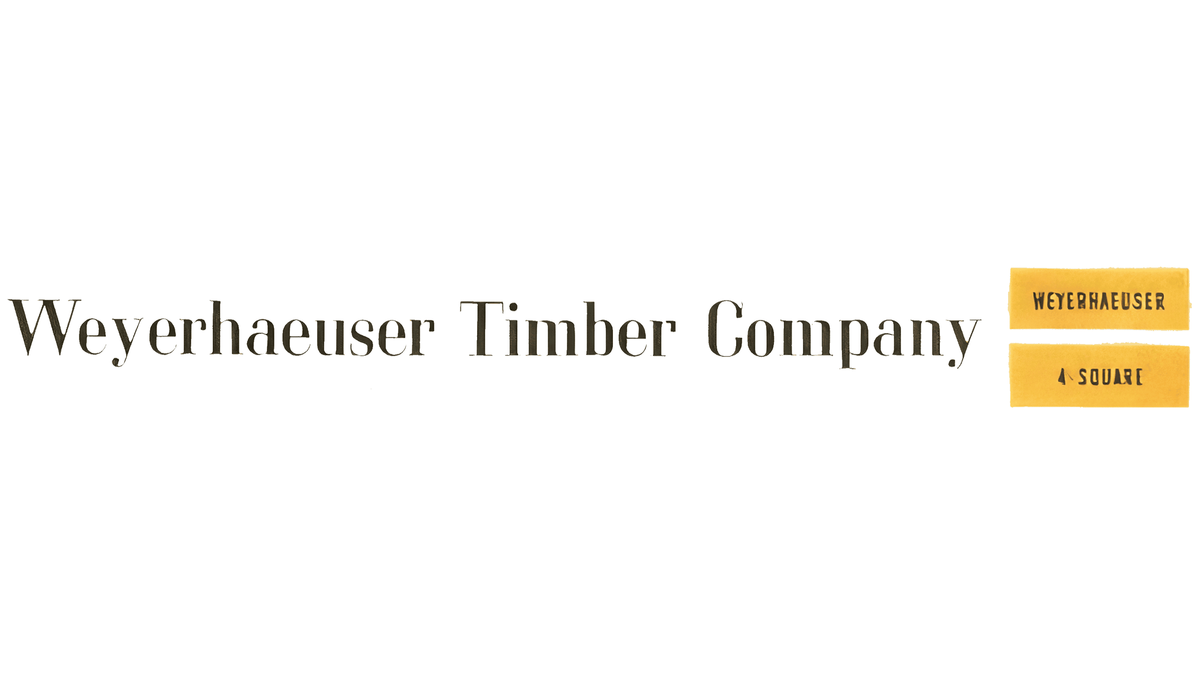
The early logo used the full name Weyerhaeuser Timber Company. The 3 words were set in a dark brown serif typeface. The initial “W,” “T,” and “C” were uppercase, followed by lowercase letters. The elongated letters combined thick main strokes with thin connecting strokes. The wordmark identified the manufacturer through the family name and a reference to the timber industry.
In the 1920s, the 4-Square Lumber product brand appeared alongside the corporate name. It referred to a system of graded lumber and helped distinguish wood by quality, dimensions, and processing. Yellow stamps bearing the Weyerhaeuser and 4-Square names were applied to products and reproduced in the trade press.
When displayed together, two yellow blocks sat to the right of the full name. The upper block contained uppercase “WEYERHAEUSER,” and the lower one read “4 SQUARE.” Their shapes resembled product labels. Their placement beside the main wordmark connected the manufacturer to the lumber preparation and grading system.
1959 – today
By the late 1950s, Weyerhaeuser had expanded manufacturing beyond lumber. The company produced plywood, wood pulp, paperboard, packaging, fiberboard, particleboard, insulation, and other products. Wood remained the primary raw material, while “Timber” in the name represented only part of the product range. In 1958, Weyerhaeuser Sales Company was incorporated into the parent organization. Weyerhaeuser International was established as a separate entity for overseas operations.
Announcements of the change from Weyerhaeuser Timber Company to Weyerhaeuser Company began on August 24, 1959. The first reports of the renaming featured a new emblem. The shortened legal name took effect on September 1. The American firm Lippincott & Margulies developed the identity, and Russell Sandgren designed the emblem.
An upward-pointing green triangle formed the design’s outer shape. A white cutout inside formed a conifer crown. The crown’s pointed top echoed the triangle’s peak, while branches spread below it in smooth curves. A narrow green projection at the base represented the trunk. The angular outer contour combined with rounded cutouts, bringing together the tree and its geometric foundation.
The emblem was introduced as a standalone image. Green was its only color, while white spaces formed the internal silhouette. The natural coloring connected the design to wood as a raw material. It distinguished it from early black wordmarks and yellow product stamps.
The conifer recalled timber harvesting and tree planting on logged land. By 1959, Weyerhaeuser was already practicing scientific forestry and developing nurseries and tree farms. In 1941, its Clemons Tree Farm had become the first certified tree farm in the United States. Reforestation gave the tree image an additional meaning connected to the company.
1959 – 1989
In 1959, Weyerhaeuser added the full company name to its triangular emblem. The large tree image appeared above the line “Weyerhaeuser Company,” whose length was matched to the size of the upper component. The founder’s surname and the word “Company” presented the corporate name. The standalone emblem continued to be used as an abbreviated company identifier.
The wordmark was set in Clarendon Bold. The heavy, slightly squat letters had substantial slab serifs. Their forms resembled stamps on lumber and markings on construction materials. This lettering connected the name to Weyerhaeuser’s manufacturing environment.
In one version, a gray-blue emblem was paired with dark olive lettering close to gray-brown in tone. The triangle and the tree inside retained their previous construction. The primary corporate version remained green. The company prepared black-and-white versions for single-color reproduction.
Over the following decades, the logo appeared on products, vehicles, business documents, manufacturing buildings, and company ships. In the early 1960s, the shipping division used a yellow tree on a blue flag. Changing the colors adapted the emblem for maritime use while preserving its overall shape.
1989 – today
In 1989, Weyerhaeuser reorganized and refocused on timberlands, wood products, pulp, and paper. A logo update accompanied the changes. The triangular tree was retained, while the wordmark was shortened to Weyerhaeuser. “Company” remained part of the legal name, while the founder’s surname took precedence in commercial branding.
The heavy Clarendon Bold used in the 1959 version was replaced with Garamond No. 2 in the Garamond Nr 2 SH Book style. The light serif lettering combined thick main strokes with thin connecting strokes, gently curved serifs, and elongated lowercase letters. The initial “W” remained uppercase. The black wordmark appeared lighter than the previous version with its heavy slab serifs.
The smaller emblem moved to the left, and the name appeared on a single line to the right. The horizontal logo suited narrow formats, packaging, and business documents. The tree received the green shade Pantone 348, distinguishing the image from the black text.
The emblem’s internal construction remained unchanged. The conifer fit within a triangular shape resembling an upward-pointing arrowhead. The image continued to be used separately on products, buildings, vehicles, and divisional materials. An extended version of the logo included the italic phrase “The future is growing.” The primary version retained the tree and company name.