 Admiral Group plc Logo PNG
Car, home, and travel insurance involve issuing policies and providing support after an incident. These services help cover expenses and manage everyday risks. The Admiral Group logo represents an insurance company that provides policies and serves customers across various insurance segments.
Admiral Group was founded in 1991 in Cardiff. The company originated within the Brockbank Group. American entrepreneur Henry Engelhardt initiated the project. He aimed to create a direct-to-consumer insurance company. Operations began on January 2, 1993. The company had 57 employees. Its business model was based on technology that reduced costs and simplified the insurance process.
In 1999, management led by Engelhardt bought Admiral from Brockbank with support from Barclays Private Equity. In 2002, the company launched the price comparison website Confused.com. In 2004, the company held its initial public offering on the London Stock Exchange. The market capitalization reached 711 million pounds.
By 2006, the company began international expansion. Admiral Seguros was established in Spain. ConTe opened in Italy. L’olivier Assurance began operating in France. In the United States, the company created the Elephant Auto brand. In 2010, the company began offering loans under the Admiral Loans brand, expanding its financial division.
In 2016, co-founder David Stevens became CEO. Under his leadership, the group joined the FTSE 100 index and expanded its international operations. In 2021, Milena Mondini de Focatiis became CEO. That same year, the company sold the Penguin Portals division, which included Confused.com and Rastreator.
In 2023, Admiral acquired the French tech company Luko. In 2024, the company increased its profits and customer base. It served more than eleven million clients in the United Kingdom, Europe, and the United States.
In the spring of 2025, Admiral announced the sale of its U.S. division, Elephant Auto. The company focused on its U.K. and European operations. By August, profit before tax reached £ 521 million. The figure rose by sixty-nine percent. The number of customers grew by ten percent.
Admiral Group remained a leading FTSE 100 member and a major player in the British insurance market. The company implements a strategy called Admiral 2.0. It focuses on digital technology and analytical tools.
Meaning and History
What is Admiral Group plc?
A British insurance group from Cardiff specializing in auto, home, and travel insurance as well as financial services. It serves millions of customers through the brands Admiral, Elephant, Diamond, and Bell in the United Kingdom and Balumba, ConTe, L’olivier, and Elephant Auto abroad. Main revenue comes from online sales and direct service channels.
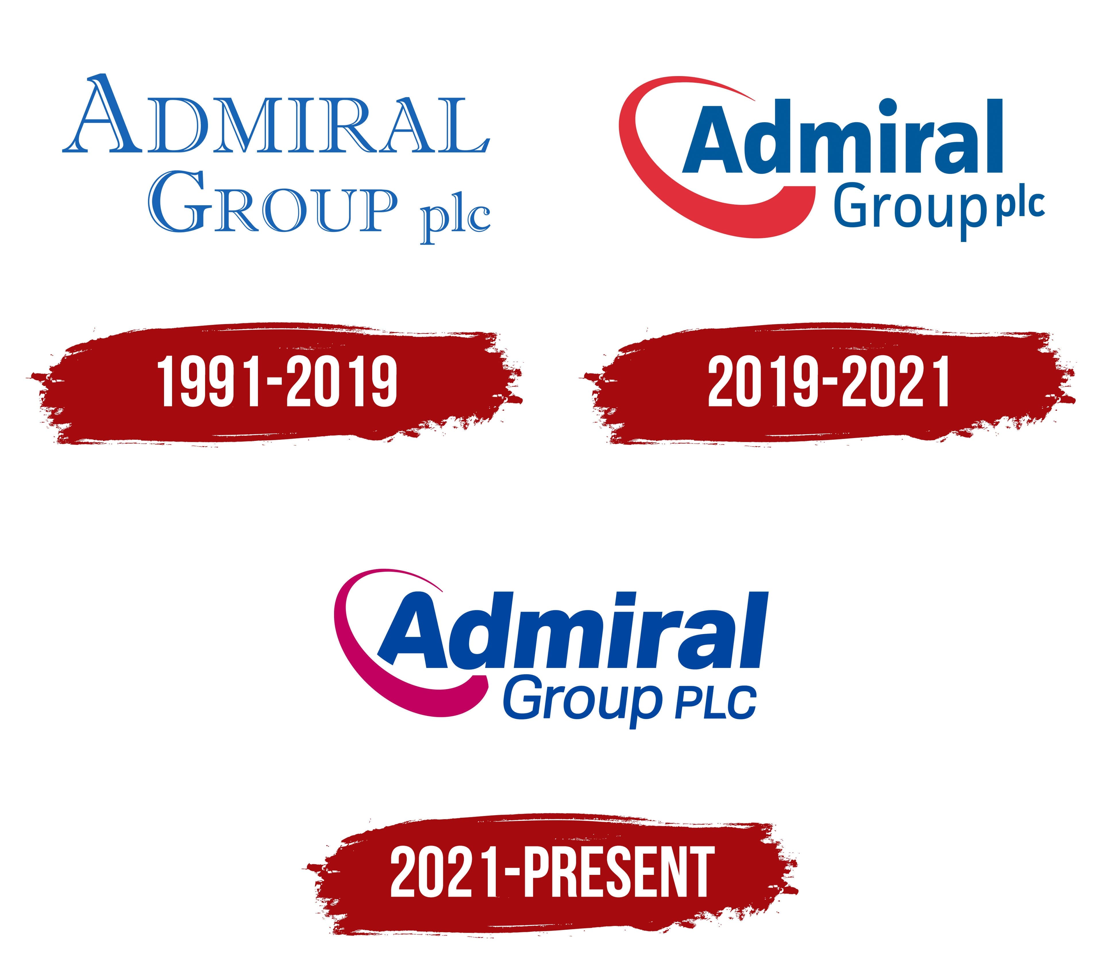
1991 – 2019
Admiral’s history began in 1991, when insurance group Brockbank invited Henry Engelhardt to establish a telephone-based auto insurance business. Engelhardt had previously worked for Churchill Insurance. Preparing the project took about 1.5 years.
Sales under the Admiral brand began in Cardiff on January 2, 1993. The company had 57 employees. It sold its first policy over the phone at 9:10 a.m. Corporate materials identify 1993 as the year of Admiral’s founding and commercial launch, while 1991 marks the beginning of the project’s development.
In 1999, Admiral’s management bought the business from Brockbank Group. Admiral Group Limited was formed following the transaction. The name ADMIRAL GROUP plc refers to the parent organization established after the Admiral insurance brand.
Henry Engelhardt proposed the name. The Guardian linked the idea to his interest in words associated with the British establishment and senior titles. Churchill had previously been named according to a similar principle. The English word “admiral” refers to one of the highest naval ranks. In the official explanation, the maritime connection is limited to the name’s meaning.
Archived annual reports confirm use of the blue logo in 2008, 2009, and 2012. Admiral materials show its continued use through 2017. The documented period covers at least 2008–2017. The 1991–2019 dating extends beyond the corporate records located during the research.
The logo consisted solely of the Admiral Group plc name arranged across 2 lines. ADMIRAL appeared on top. GROUP and the abbreviation “plc” occupied the lower line. The arrangement separated the insurance brand’s name from the parent group designation and its public company status.
ADMIRAL appeared in blue uppercase letters with thin serifs. The initial “A” was enlarged. White lines ran inside the strokes, following the letter edges and forming a double outline. The decorative treatment turned the lettering into a complete composition.
The lower line was smaller. GROUP appeared in uppercase letters, with the initial “G” larger than the remaining characters. The lowercase abbreviation “plc” was positioned on the right. All parts used a serif typeface resembling a traditional Roman style.
Blue unified the 2 levels, while the white lines gave the letters a layered appearance. The large ADMIRAL name took the primary position, GROUP identified the organization’s scale, and “plc” communicated its legal status. The compact 2-line version appeared on report covers and in corporate materials.
2019 – 2021
The Admiral Group plc logo featured a red arc and a blue wordmark. The arc surrounded the first letter, followed the left edge, and continued beneath the word Admiral. Its shape resembled an open oval orbit or a broad brushstroke.
The upper end of the arc was thin and pointed. It sat above the capital “A” with a small gap between them. The line then curved to the left and gradually grew thicker. Its lower section extended to the right beneath the name, forming the composition’s base. The oval outline remained open on the right.
Admiral appeared in a heavy sans-serif typeface. The initial “A” was uppercase, followed by lowercase letters. The characters had thick, even strokes, tight spacing, and a dark blue color. The initial “A” entered the inner area of the red arc, while the rest of the name extended to the right.
The Group plc line appeared beneath the right half of Admiral. Group began with a capital “G,” followed by lowercase letters. Its lettering was thinner and lighter than the main wordmark. The abbreviation “plc” was smaller and slightly raised above the baseline.
These size differences established the hierarchy within the corporate name. Admiral held the primary position, Group identified the organization as a group of companies, and “plc” indicated its status as a public corporation. The lower line was concentrated on the right, leaving open space near the red arc.
The logo used red and dark blue. The red arc contrasted with the blue lettering, while the matching text color connected the 2 lines. White space inside the oval separated the outline from the initial “A.”
2021 – today
Admiral Group plc updated its corporate logo in 2021. The name, the Group PLC line, and the arc surrounding the first letter remained. The designers revised the colors, typeface, letter slant, and proportions of the curved figure. Archived documents from 2021 confirm use of the updated version.
The corporate logo differs from the branding used by the Admiral insurance business. The group’s media library presents the 2 versions separately. Admiral serves customer-facing operations, while Admiral Group plc represents the parent company, its brands, and its divisions.
The red arc changed to a rich raspberry color with a pink undertone. The blue lettering became brighter. The revised color scheme retained the red-and-blue combination associated with the previous version and gave the logo a lighter appearance.
Admiral occupies the upper level. The initial “A” is uppercase, followed by lowercase letters. The name uses a heavy sans-serif typeface with thick lines and smooth internal transitions. All letters lean to the right. Revised proportions make the wordmark tighter and more compact.
The Group PLC line sits beneath the right half of the name. Group begins with a capital “G,” followed by lowercase letters. Its weight is lighter and its size smaller than Admiral. The abbreviation “PLC” appears in uppercase letters and is nearly the same height as Group. In the previous version, “plc” consisted of smaller lowercase letters.
Both lines use the same blue color. The large Admiral word carries the primary name. At the same time, Group PLC identifies the parent company and its status as a public corporation.
The raspberry arc sits on the left and surrounds the initial “A.” Its upper end is shorter and thinner than before. It appears above the letter with a narrow gap separating the line from the text. The arc then curves to the left and gradually thickens.
The lower section is rounded and passes beneath the first half of Admiral. It ends before reaching the right edge of the wordmark. The lower line extended farther in the previous logo. The updated figure resembles an open oval or a broad brushstroke.
The composition retains a horizontal structure. The raspberry arc occupies the left side, Admiral extends to the right, and Group PLC is placed below. Open gaps separate the lettering from the arc.