


 Apple Uikit Logo PNG
The Apple UIKit logo reflects the essence of a toolset designed to create intuitive, well-thought-out user interfaces. At the same time, it highlights the framework’s practicality, enabling easy customization of elements and adaptation to various screens.
UIKit began in 2008, when Apple introduced it with the first SDK for iPhone OS. The framework became the main system for building application interfaces, covering windows, views, controls, navigation, and user interaction. In 2009, version 3.0 improved gesture handling and added copy and paste, giving developers more options for complex mobile software and richer on-screen interaction patterns.
After the iPad launch in 2010, Apple adapted UIKit for larger screens and universal applications. New components, including UIPopoverController and UISplitViewController, supported tablet layouts. The 2013 redesign changed standard controls, animations, blur, and transparency. Between 2014 and 2015, Auto Layout, adaptive interfaces, and size classes improved support for different display formats and reduced the need for separate layouts.
Updates in 2016 and 2017 added drag and drop, 3D Touch, and new APIs for navigation and application state. In 2019, macOS Catalyst let developers move existing mobile apps to the Mac while reusing much of their interface code, extending the framework beyond phones and tablets.
From 2020 to 2023, UIKit continued to receive updates for new platform features and revisions to established components. SwiftUI grew as an alternative, but UIKit remained part of the core iOS development stack, including older projects and applications that relied on mature interface APIs across several generations of devices in production environments.
Meaning and History
What is Apple UIKit?
This is a tool for creating user interfaces in mobile applications. It provides developers with ready-made elements such as buttons, tables, text fields, and features for handling touch interactions, animations, and screen orientation management. With its help, applications look and function as users of these devices expect. This tool assists developers in creating convenient, adaptive interfaces, ensuring smooth user interactions.
2007 – today
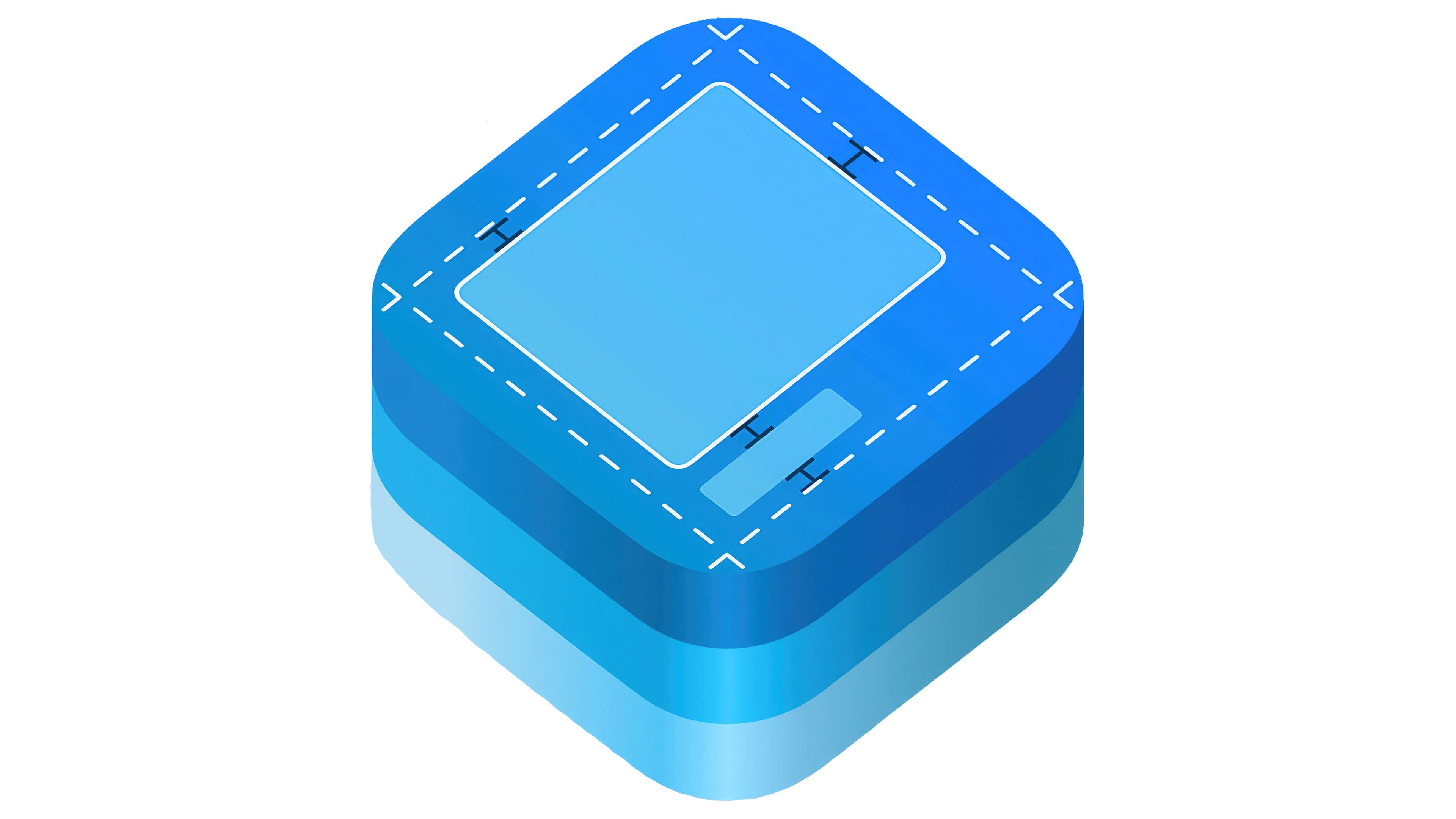
The UIKit logo follows the style of Apple icons, characterized by simple geometric shapes, minimalism, a limited color palette, and a three-dimensional effect. The design features a schematic representation of an app window, a key symbol that captures the essence of the framework. The absence of unnecessary details highlights the simplicity and functionality of the tools used to create user interfaces.
The main element of the Apple UIKit emblem is a large blue square with rounded corners, representing the graphical interface of an application as a whole. Inside are stylized interface elements:
- A large rectangle is outlined with a solid white line, symbolizing the main application window that displays primary information.
- A small rectangle in the bottom corner represents a button, switch, text field, or control element.
- A diamond made of dashed lines represents guidelines that assist in arranging and aligning structural parts of the interface.
The logo suggests that UIKit allows developers to precisely adjust and position every element. The black “H” shapes placed between the geometric figures act as spacers, helping establish equal spacing between components and ensuring a neat, consistent appearance across devices.
Interestingly, the primary square with rounded corners features multiple layers: two additional levels in lighter blue shades are visible from the side. This layered structure reflects the idea that an application interface is not a single flat layer but a complex, multi-layered system where elements can overlap.
The logo predominantly uses a blue palette, with black and white as secondary colors. Blue is associated with technology, reliability, and stability, making Apple UIKit subconsciously perceived as an efficient and reliable set of professional tools for creating GUIs. The minimalist color scheme emphasizes the absence of unnecessary components that could complicate interaction with the framework.