


 Bad Robot Productions Logo PNG
The Bad Robot Productions logo symbolizes technological progress and a possible future where robots take on a significant portion of human activities. It represents innovation, a drive toward the advanced and unusual, which aligns perfectly with the company’s spirit. The emblem conveys the ambition and creativity characteristic of the studio’s films, which often explore mystical plots and science fiction themes. The logo’s visual image hints at worlds where the boundaries between humans and technology are blurred, reflecting bold, unconventional projects that raise questions about the future of humanity.
Bad Robot Productions was founded in 1998 by producer Bryan Burk and writer-director J. J. Abrams. The company was created mainly for television production. Its first major project was Felicity, which premiered the same year on The WB and was created by Abrams with Matt Reeves. In 2001, the studio released Alias with Jennifer Garner, adding another successful scripted series to its early record.
A major stage began in 2004, when Bad Robot signed an exclusive television agreement with Touchstone Television, later ABC Studios. That same year, Lost premiered and became one of the company’s most visible projects, expanding its reputation beyond conventional network drama. In 2006, the studio moved into feature films through a partnership with Paramount Pictures, opening a new part of its business.
The film division gained wider attention with Cloverfield in 2008, a found-footage project that performed well commercially. In 2009, Abrams directed the reboot of Star Trek, which strengthened Bad Robot’s position in studio filmmaking. Television work continued with Fringe, while Super 8, made with Steven Spielberg, followed in 2011. In 2013, the company signed a production deal with Warner Bros. Television.
Another major Hollywood moment came in 2015, when Abrams directed Star Wars: The Force Awakens. In 2017, Bad Robot announced a division focused on interactive entertainment and video games. In 2019, the company signed a large production agreement with WarnerMedia for films, television, and other content. Around 2020 and 2022, the studio remained active with series projects, franchise development, and expansion of its gaming work.
Meaning and History
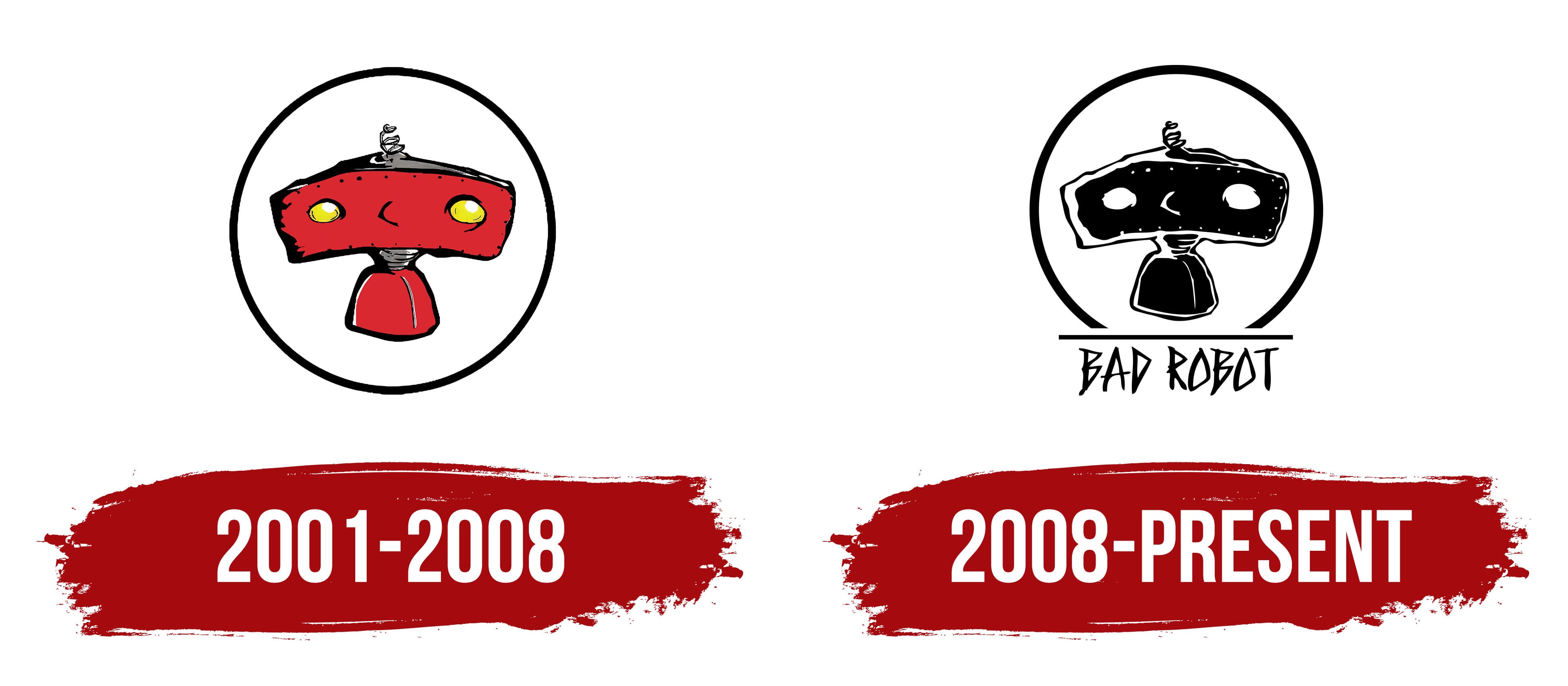
What is Bad Robot Productions?
This American film company is a dominant force in the entertainment industry, known for its innovative narrative approaches that challenge genre expectations. The studio specializes in creating storylines grounded in deep character development and skillfully blends science fiction with detective elements. Its works are renowned for complex plots and unexpected twists, attracting a wide audience. With the talent for creating captivating worlds, the company is a leader in producing successful TV shows and major film franchises that continue to dominate the film industry.
2001 – 2008
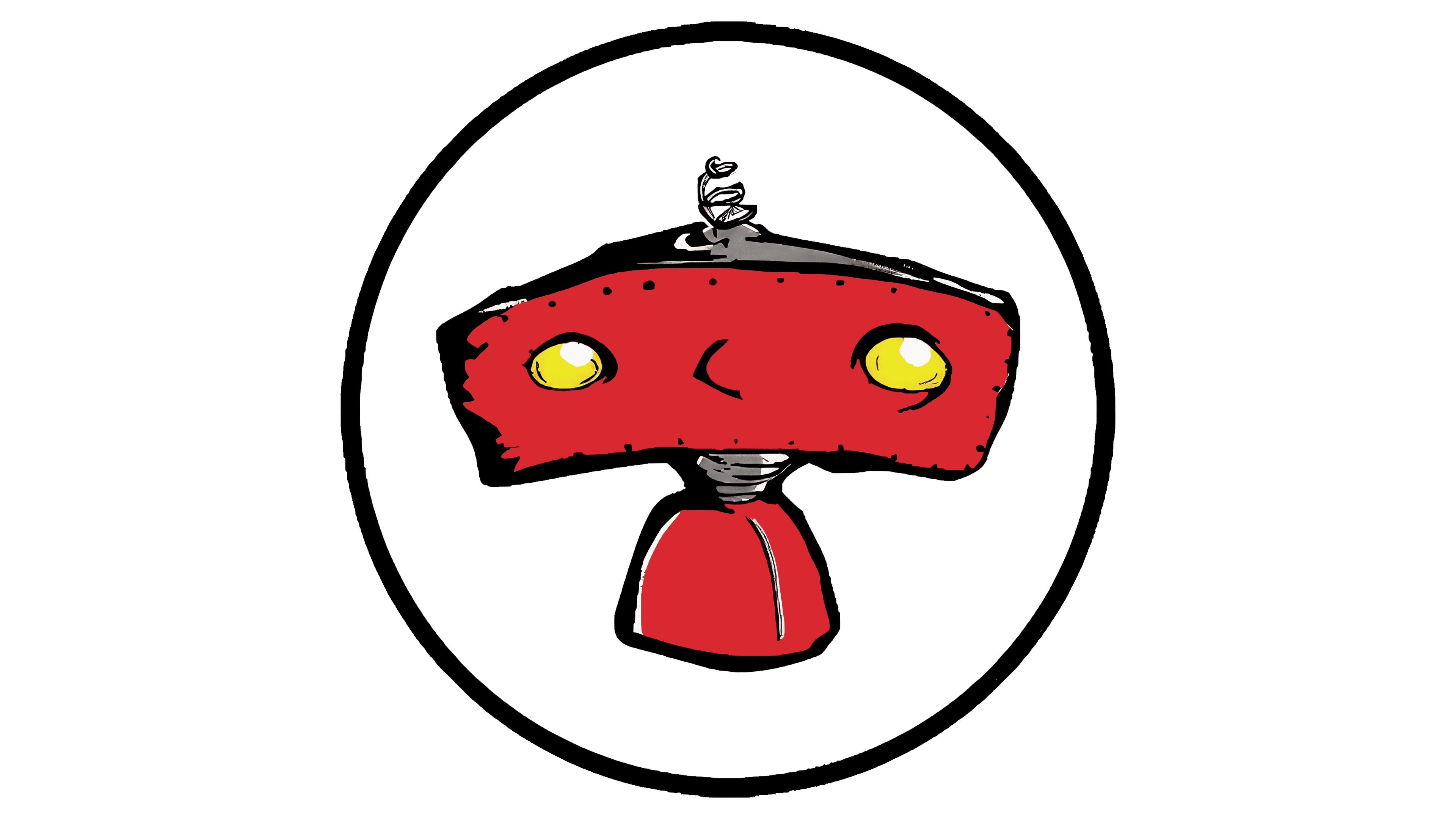
The studio’s first emblem features an unusual red robot enclosed in a circle. Only the upper part of the character is visible: the head with bright light bulbs instead of eyes, and the neck. The image creates the impression of a small robotic portrait, made with imagination and a creative spark. This character was created by the studio’s founder, J.J. Abrams, and became the symbol of Bad Robot Productions. It appears as a silhouette in the final frames of the studio’s films, and its appearance is accompanied by a moment when the robot turns to face the viewer. At that moment, the children’s voices exclaim, “Bad Robot.” Interestingly, the voices in this scene are those of Abrams’ children, which adds a special warmth and personal involvement to the company’s signature introduction.
2008 – today
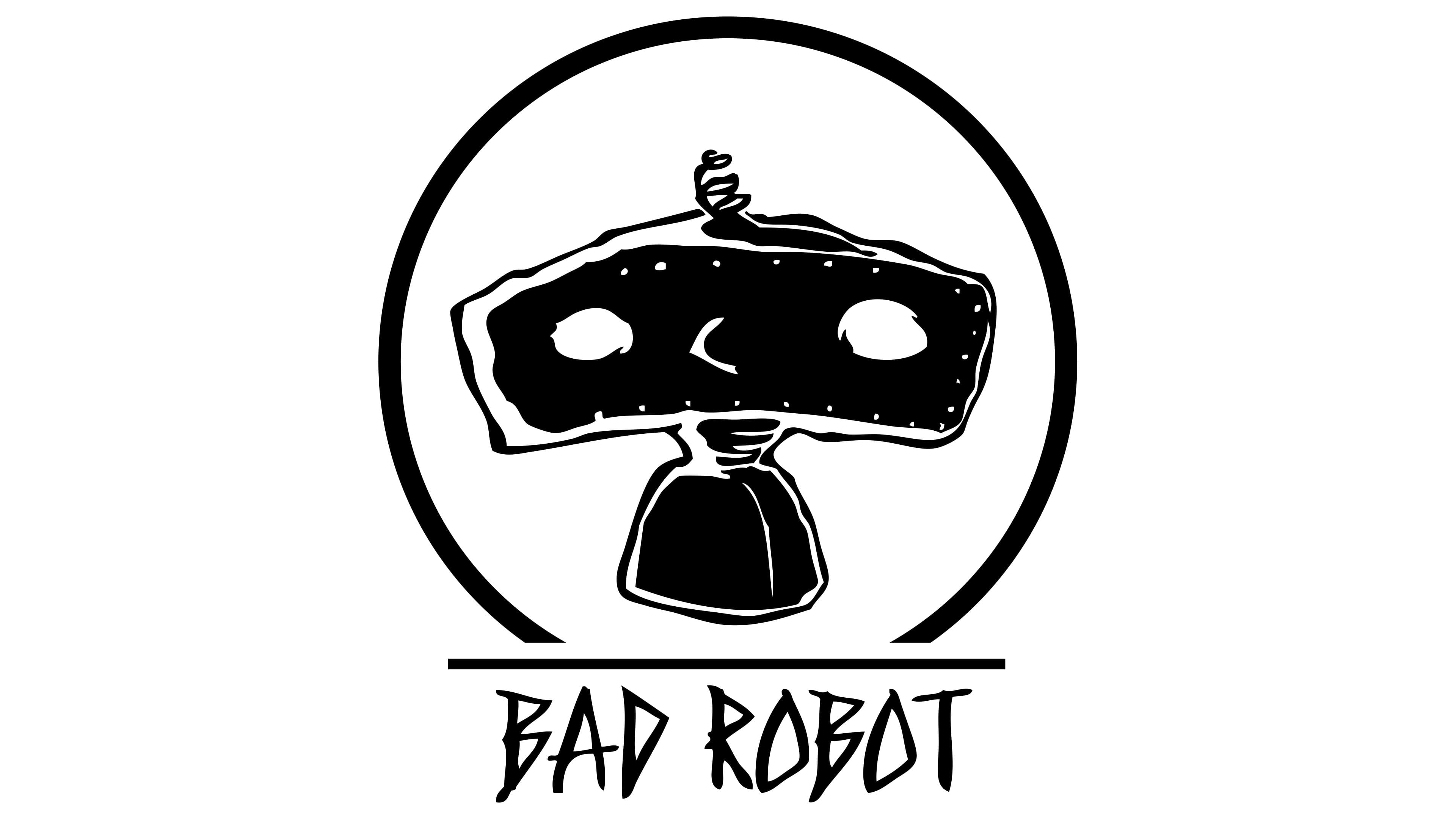
After Paramount Pictures and Warner Bros. Television acquired the company, the logo changed to a black-and-white version. This style creates a feeling of something mysterious and slightly ominous, which fits perfectly with the themes of many projects released by the studio. The black-and-white color was chosen not just for minimalism but to add drama, emphasizing the idea of a “bad robot” in contrast to pop culture’s classic “good” robots.
The hand-drawn, somewhat crooked font used for the “Bad Robot” lettering looks as if it were made by hand, messy, sharp, and unpolished. This conveys a sense of something unruly and chaotic, which also aligns with the image of the robot shown above. There is no precision like that of typical machines or robots. This “bad” robot stands out for its unconventional, strange nature.
The robot itself shows simplicity in form; it doesn’t appear to be a highly technological or detailed character, quite the opposite. Even its head is crooked, giving the impression that it was hastily assembled or made from scraps. The cord on its head, resembling an antenna, doesn’t add a high-tech element; instead, it evokes something old and forgotten. The robot’s eyes are empty, as if plotting something or lost in thought, which adds to the mystery and is slightly unsettling.
In 2008, when the company released shows like “Fringe” and movies like “Cloverfield,” this dark emblem style proved a very fitting fit. These projects were filled with themes of horror, mystery, and the unknown, and the image of the “bad robot” perfectly reflected the overall mood of these works. This robot symbolizes something unpredictable that can spiral out of control.