 Banco de Chile Logo PNG
Financial transactions in Chile include account management, lending, and processing payments that support daily life and business. These services are provided through a banking system integrated into the country’s economy. The Banco de Chile logo represents a bank that provides financial services to individual and corporate clients, including transaction processing and asset management.
Banco de Chile was founded on October 28, 1893. This resulted from the merger of three leading banks in the country. These included the Bank of Valparaíso, the National Bank of Chile, and the Agricultural Bank. The new institution immediately took a key position in the country’s financial system. Management was concentrated in Santiago.
In its early decades, the bank financed industry, agriculture, and trade. It issued its own banknotes until the Central Bank of Chile was created in 1926. By the mid-20th century, Banco de Chile had an extensive branch network and connections with international banks. It served both the domestic economy and foreign trade.
In the 1970s, Salvador Allende’s government nationalized the bank. After 1973, during the Pinochet reforms, the organization returned to private ownership. This restored its status as the country’s leading financial institution.
In the early 2000s, the controlling stake was acquired by the Quiñenco Group, owned by the Luksic family. Later, an alliance was formed with Citigroup. It brought international management standards and modern banking technologies.
In 2008, the bank acquired Citibank Chile’s retail assets. This greatly expanded the client base and strengthened its position in the private banking market. In 2009, the bank became the subject of a court case. The case concerned the investigation of Augusto Pinochet’s financial assets.
Since the late 2010s, Banco de Chile has been investing in digital transformation. The bank is developing online services and mobile platforms. By 2024, the number of digital clients exceeded 2.1 million people.
Banco de Chile remains the country’s second-largest financial institution, after Santander Chile. It has branches in Chile and representative offices in the United States, Brazil, Mexico, and Hong Kong. The organization remains a key participant in the Latin American banking market.
Meaning and History
What is Banco De Chile?
One of the country’s largest private commercial banks, it has about $59 billion in assets, operates nearly 400 branches and 1,400 ATMs, and offers a full range of online services. It serves individual and corporate clients and provides loans, deposits, cards, investments, leasing, factoring, and insurance. The group is among the country’s five largest banks and competes with Banco Santander Chile, BancoEstado, Banco BCI, and Scotiabank Chile.
1878 – 1893

The name Banco de Chile emerged from the merger of three banks with different histories. On October 28, 1893, Banco de Valparaíso, Banco Nacional de Chile, and Banco Agrícola joined the new organization. Operations began on January 2, 1894, with principal offices in Santiago and Valparaíso. Banco de Chile is Spanish for “Bank of Chile.” The country’s name replaced the merged institutions’ names.
One predecessor was Banco Agrícola, meaning “Agricultural Bank,” founded in 1868. Its wordmark consisted of dark gray BANCO AGRÍCOLA lettering. The tall, narrow uppercase sans-serif letters were tightly spaced, with uniform height and straight vertical strokes. The lettering resembled Trade Gothic Rough or Stenciletta. The accent over the “Í” preserved the Spanish spelling of agrícola.
1860 – 1893

Among the banks that became part of Banco de Chile’s history, Banco de Valparaíso represented the port city of Valparaíso. The shorter city-based name was adopted in 1860, replacing Banco de Depósitos y Descuentos de Valparaíso. Its logo displayed BANCO DE VALPARAISO on a single line, without a separate symbol.
The black uppercase serif letters resembled Clarendon Typewriter or Courier. All letters were the same height, while generous spacing stretched the three words horizontally. The arrangement made the name look like a typeset heading on an official document.
1865 – 1893
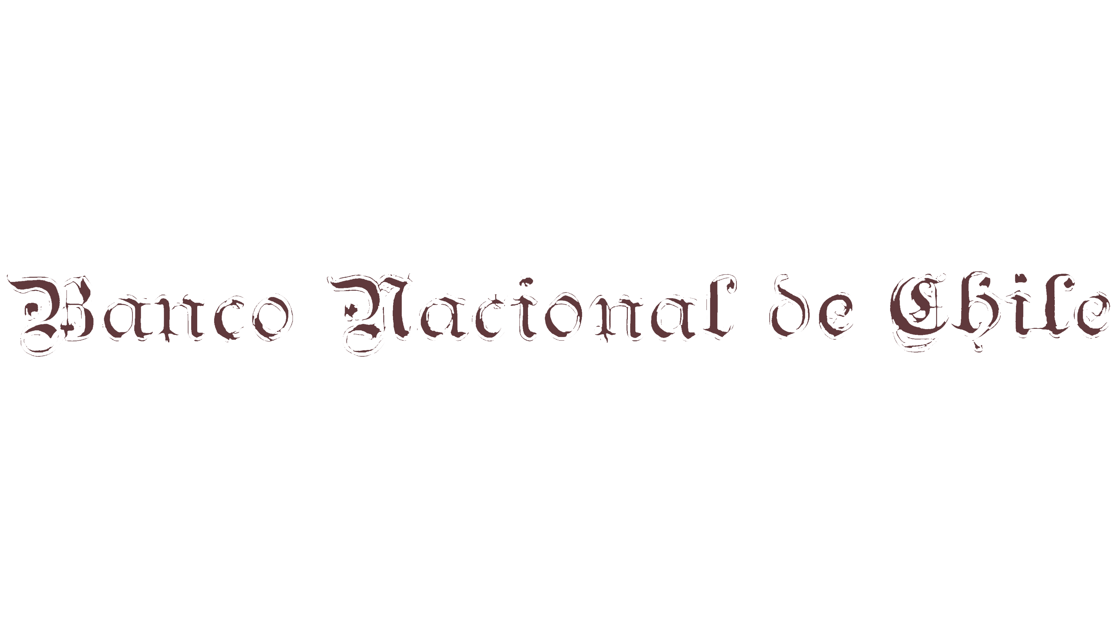
The historic Banco Nacional de Chile lettering belonged to the third bank that later became part of Banco de Chile. Established in 1865, its name meant “National Bank of Chile.” The logo rendered all four words in Gothic-inspired lettering.
The initial “B,” “N,” and “C” rose above the other letters and ended in curls and flourishes. The smaller letters had angular forms, pointed endings, and fine light lines within their dark strokes. The lettering belonged to the blackletter tradition and resembled textura. Its dark burgundy color evoked ink lettering in an old European manuscript.
1893 – 1949
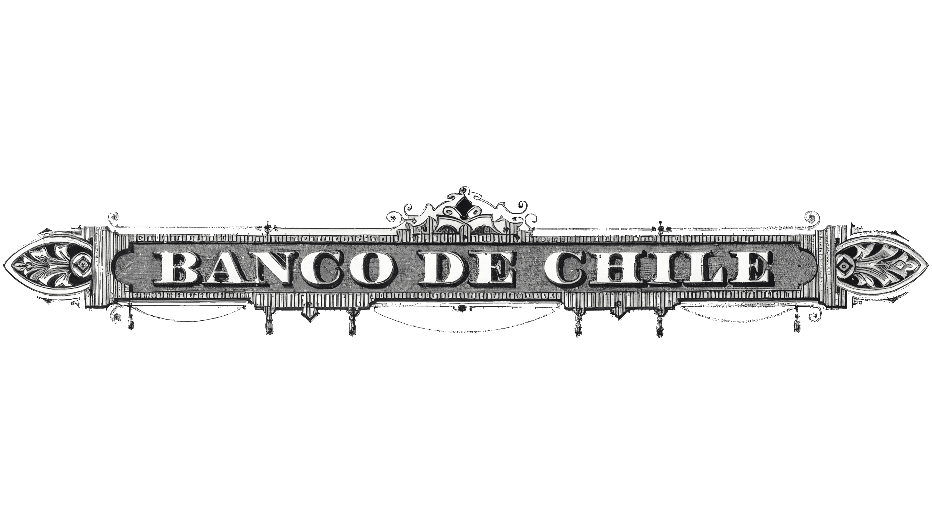
After the three institutions merged, the Banco de Chile name received its own ornamental frame. In the early logo, large BANCO DE CHILE lettering occupied a dark horizontal band inside an elongated border. Unlike its predecessors’ separate wordmarks, the name became part of a unified design resembling an engraved plaque on a building facade.
The uppercase letters were bold and upright, with short serifs and slightly softened endings. Their construction resembled Clarendon or Egyptian-style typefaces. Light areas along the tops contrasted with shadows on the right and below, creating a raised effect within the black-and-white artwork. Hatching of varying density added depth to the lettering.
Symmetrical, elongated ornaments with pointed leaves and scrolls appeared on either side of the frame. Thin parallel lines outlined the main rectangle. A small decorative crest rose above the center, combining ornamental lines, curls, and a triangular peak with a darker teardrop-shaped detail. Short decorative projections hung from the lower edge. The substantial frame made the merged bank’s name look like a complete emblem.
1950 – 1991
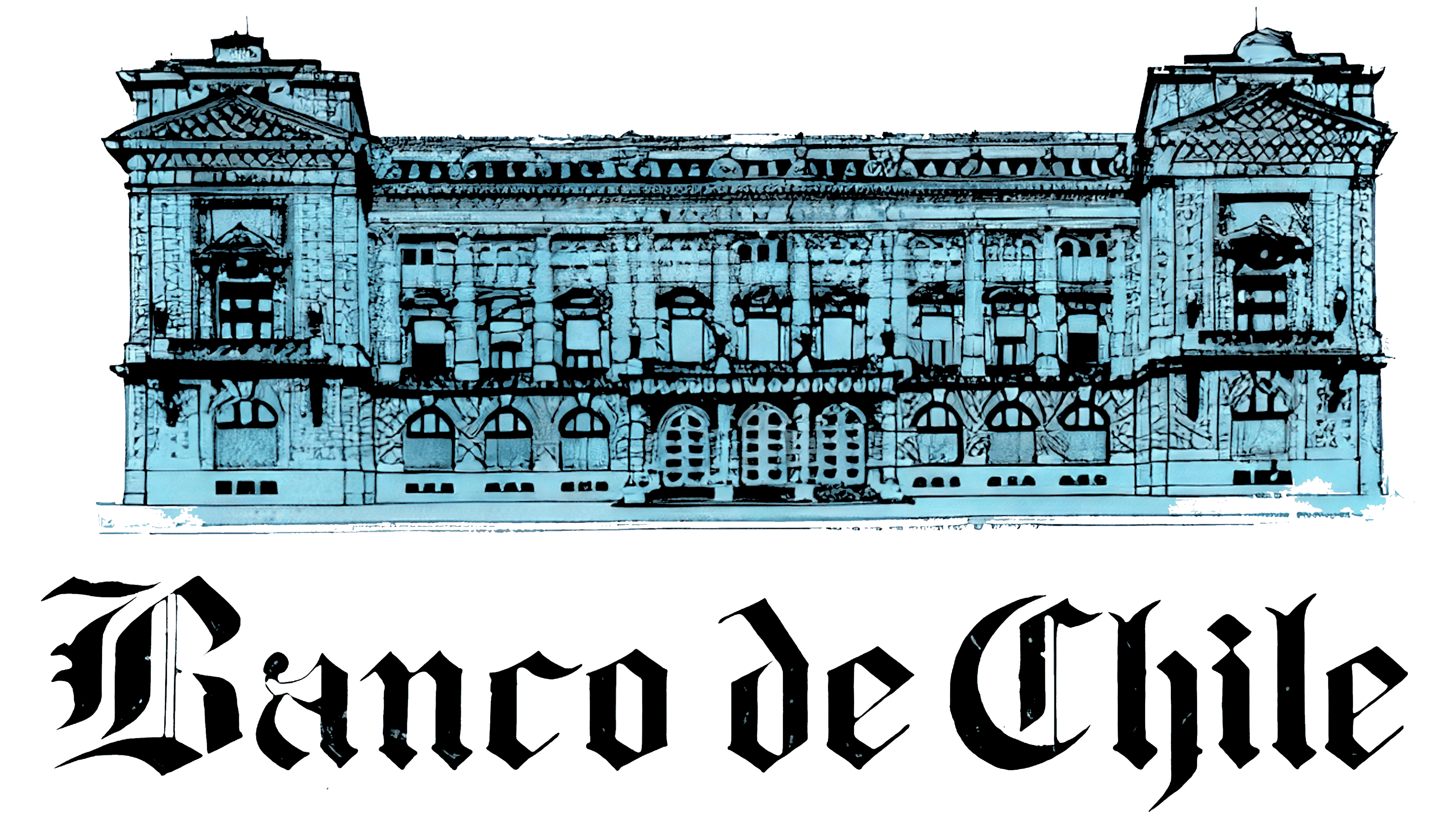
In the next Banco de Chile logo, a building illustration occupied the upper half of the composition. The facade was shown head-on, with elongated horizontal proportions. Two projecting sections with triangular pediments flanked the main entrance. Fine black lines and hatching depicted arched windows, columns, cornices, and stucco details. A light blue fill within the black outlines gave the facade the appearance of an architectural engraving.
Black Banco de Chile lettering appeared beneath the building. Enlarged initial “B” and “C” letters stood out from the surrounding text, with spaces separating the words. The Gothic lettering belonged to the blackletter family and resembled Textura or Old English. Thick vertical strokes, fine internal lines, and pointed endings created dense lettering that contrasted with the pale architectural illustration above.
1991 – today

In 1991, Banco de Chile began unifying its visual identity. Management linked the update to changes in the banking market and the need to strengthen brand recognition. Blue became the corporate color, replacing the brown previously used on forms, business documents, and branch interiors. The logo was part of the broader change.
The Banco de Chile name now appeared without the building illustration or ornamental frame. The Gothic lettering remained, but the letterforms became more regular and retained fewer small decorative lines. The entire name was rendered in dark blue. The lettering resembled Fette Fraktur or Old English Text.
The enlarged “B” and “C” established the line’s proportions. The “B” upper flourish extended above the neighboring letters, while narrow, light gaps separated its internal strokes. The “C” combined a broad outer contour with fine lines inside. The lowercase letters had heavy vertical strokes and angular joins, and the dot over the “i” was diamond-shaped. The preposition “de” used the same style, uniting the three words into a single wordmark.